How to Create a Stunning Circular Bar Plot in Python Using Matplotlib
Circular Bar Plot in Python is an eye-catching and informative way to visualize data in a radial format. This article will guide you through the process of creating a Circular Bar Plot in Python using the popular data visualization library, Matplotlib. We’ll explore various aspects of Circular Bar Plots, from basic concepts to advanced customization techniques, all while providing easy-to-understand examples and code snippets.
Understanding Circular Bar Plots in Python
A Circular Bar Plot in Python, also known as a radial bar chart or polar bar plot, is a unique visualization that displays data in a circular format. Unlike traditional bar charts, which use rectangular bars, Circular Bar Plots use arc-shaped bars arranged around a central point. This type of plot is particularly useful for displaying cyclical data, comparing multiple categories, or simply adding a visually appealing twist to your data presentation.
Let’s start with a basic example of a Circular Bar Plot in Python:
import matplotlib.pyplot as plt
import numpy as np

# Data for the Circular Bar Plot
categories = ['A', 'B', 'C', 'D', 'E']
values = [25, 40, 30, 55, 45]

# Convert to radians
angles = np.linspace(0, 2*np.pi, len(categories), endpoint=False)

# Close the plot
values = np.concatenate((values, [values[0]]))
angles = np.concatenate((angles, [angles[0]]))

# Create the plot
fig, ax = plt.subplots(figsize=(8, 8), subplot_kw=dict(projection='polar'))
ax.bar(angles, values, width=0.5, align='center')

# Set the labels
ax.set_xticks(angles[:-1])
ax.set_xticklabels(categories)

plt.title('Basic Circular Bar Plot in Python - how2matplotlib.com')
plt.show()
Output:
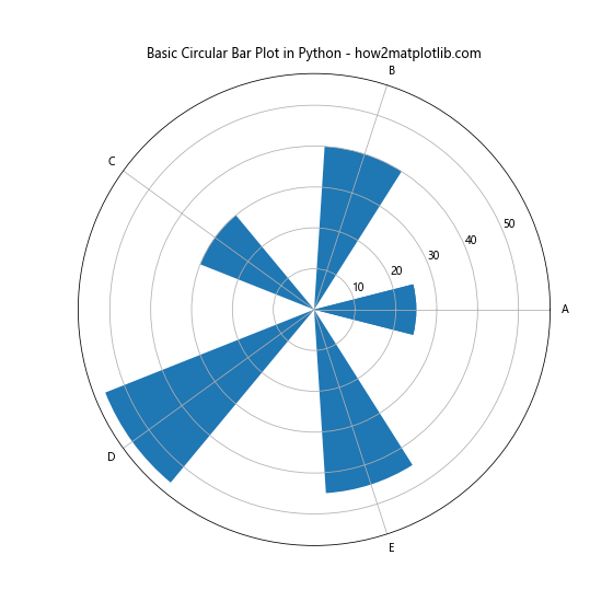
In this example, we create a simple Circular Bar Plot in Python using Matplotlib. We define categories and their corresponding values, convert the angles to radians, and use the bar function with a polar projection to create the circular bars. The set_xticks and set_xticklabels functions are used to set the category labels around the plot.
Customizing Colors in Circular Bar Plots
One of the key aspects of creating an attractive Circular Bar Plot in Python is color customization. Matplotlib offers various ways to add colors to your plot, enhancing its visual appeal and making it easier to interpret the data.
Here’s an example of how to customize colors in a Circular Bar Plot:
import matplotlib.pyplot as plt
import numpy as np

categories = ['Category A', 'Category B', 'Category C', 'Category D', 'Category E']
values = [30, 45, 60, 35, 50]

angles = np.linspace(0, 2*np.pi, len(categories), endpoint=False)
values = np.concatenate((values, [values[0]]))
angles = np.concatenate((angles, [angles[0]]))

fig, ax = plt.subplots(figsize=(8, 8), subplot_kw=dict(projection='polar'))

colors = plt.cm.viridis(np.linspace(0, 1, len(categories)))
bars = ax.bar(angles[:-1], values[:-1], width=0.5, align='center', color=colors)

ax.set_xticks(angles[:-1])
ax.set_xticklabels(categories)

plt.title('Colorful Circular Bar Plot in Python - how2matplotlib.com')
plt.show()
Output:
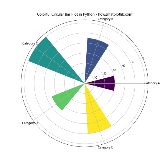
In this example, we use the viridis colormap to generate a range of colors for our bars. The plt.cm.viridis function creates a color gradient, which we then apply to our bars using the color parameter in the bar function. This results in a visually appealing Circular Bar Plot in Python with each bar having a distinct color.
Adding Labels to Circular Bar Plots
Adding labels to your Circular Bar Plot in Python can greatly enhance its readability and information content. Let’s look at how we can add value labels to each bar:
import matplotlib.pyplot as plt
import numpy as np

categories = ['A', 'B', 'C', 'D', 'E']
values = [25, 40, 30, 55, 45]

angles = np.linspace(0, 2*np.pi, len(categories), endpoint=False)
values = np.concatenate((values, [values[0]]))
angles = np.concatenate((angles, [angles[0]]))

fig, ax = plt.subplots(figsize=(8, 8), subplot_kw=dict(projection='polar'))
bars = ax.bar(angles[:-1], values[:-1], width=0.5, align='center')

ax.set_xticks(angles[:-1])
ax.set_xticklabels(categories)

# Add value labels
for angle, value in zip(angles[:-1], values[:-1]):
    ax.text(angle, value, f'{value}', ha='center', va='bottom')

plt.title('Circular Bar Plot with Labels in Python - how2matplotlib.com')
plt.show()
Output:

In this example, we use a loop to add text labels to each bar. The ax.text function is used to place the text at the appropriate angle and radius. The ha='center' and va='bottom' parameters ensure that the text is centered horizontally and aligned to the bottom of each bar.
Creating Multi-level Circular Bar Plots
Circular Bar Plots in Python can be extended to display multiple levels of data, creating a more complex and informative visualization. Here’s an example of a multi-level Circular Bar Plot:
import matplotlib.pyplot as plt
import numpy as np

categories = ['A', 'B', 'C', 'D', 'E']
inner_values = [20, 35, 30, 35, 27]
outer_values = [25, 40, 35, 45, 30]

angles = np.linspace(0, 2*np.pi, len(categories), endpoint=False)

fig, ax = plt.subplots(figsize=(10, 10), subplot_kw=dict(projection='polar'))

# Inner bars
ax.bar(angles, inner_values, width=0.5, bottom=0.0, alpha=0.5, label='Inner')

# Outer bars
ax.bar(angles, outer_values, width=0.5, bottom=inner_values, alpha=0.5, label='Outer')

ax.set_xticks(angles)
ax.set_xticklabels(categories)

plt.title('Multi-level Circular Bar Plot in Python - how2matplotlib.com')
plt.legend()
plt.show()
Output:
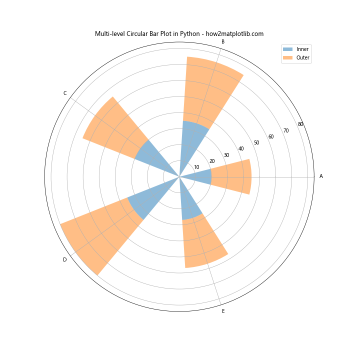
In this multi-level Circular Bar Plot in Python, we create two sets of bars: an inner set and an outer set. The bottom parameter in the bar function is used to stack the outer bars on top of the inner bars. We also use the alpha parameter to make the bars slightly transparent, allowing both levels to be visible.
Customizing the Radial Axis in Circular Bar Plots
The radial axis in a Circular Bar Plot in Python can be customized to better suit your data and design preferences. Here’s an example of how to modify the radial axis:
import matplotlib.pyplot as plt
import numpy as np

categories = ['Jan', 'Feb', 'Mar', 'Apr', 'May', 'Jun']
values = [10, 20, 30, 40, 50, 60]

angles = np.linspace(0, 2*np.pi, len(categories), endpoint=False)
values = np.concatenate((values, [values[0]]))
angles = np.concatenate((angles, [angles[0]]))

fig, ax = plt.subplots(figsize=(8, 8), subplot_kw=dict(projection='polar'))
ax.plot(angles, values)
ax.fill(angles, values, alpha=0.3)

ax.set_xticks(angles[:-1])
ax.set_xticklabels(categories)

# Customize radial axis
ax.set_ylim(0, 70)
ax.set_yticks(np.arange(10, 71, 20))
ax.set_yticklabels(['10%', '30%', '50%', '70%'])

plt.title('Circular Bar Plot with Custom Radial Axis - how2matplotlib.com')
plt.show()
Output:
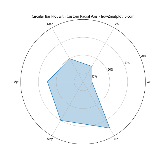
In this example, we customize the radial axis by setting specific limits with set_ylim, defining custom tick locations with set_yticks, and setting custom tick labels with set_yticklabels. This allows us to present the data in a more meaningful way, such as showing percentages instead of raw values.
Adding a Legend to Circular Bar Plots
When working with multiple datasets or categories in your Circular Bar Plot in Python, adding a legend can greatly improve the plot’s interpretability. Here’s how you can add a legend to your Circular Bar Plot:
import matplotlib.pyplot as plt
import numpy as np

categories = ['A', 'B', 'C', 'D', 'E']
values1 = [25, 40, 30, 55, 45]
values2 = [20, 35, 40, 50, 30]

angles = np.linspace(0, 2*np.pi, len(categories), endpoint=False)

fig, ax = plt.subplots(figsize=(8, 8), subplot_kw=dict(projection='polar'))

ax.bar(angles, values1, width=0.4, align='center', alpha=0.5, label='Dataset 1')
ax.bar(angles, values2, width=0.4, align='edge', alpha=0.5, label='Dataset 2')

ax.set_xticks(angles)
ax.set_xticklabels(categories)

plt.title('Circular Bar Plot with Legend - how2matplotlib.com')
plt.legend(loc='upper right', bbox_to_anchor=(1.3, 1.1))
plt.show()
Output:
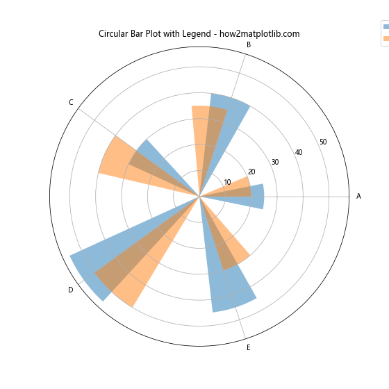
In this example, we create two sets of bars using different datasets. We use the label parameter in the bar function to assign labels to each dataset. The plt.legend() function is then used to display the legend. The loc and bbox_to_anchor parameters are used to position the legend outside the plot area.
Creating Stacked Circular Bar Plots
Stacked Circular Bar Plots in Python allow you to display multiple related datasets in a single bar, showing both individual values and totals. Here’s an example of how to create a stacked Circular Bar Plot:
import matplotlib.pyplot as plt
import numpy as np

categories = ['A', 'B', 'C', 'D', 'E']
values1 = [20, 30, 25, 40, 35]
values2 = [15, 25, 20, 30, 25]
values3 = [10, 15, 15, 20, 15]

angles = np.linspace(0, 2*np.pi, len(categories), endpoint=False)

fig, ax = plt.subplots(figsize=(8, 8), subplot_kw=dict(projection='polar'))

ax.bar(angles, values1, width=0.5, label='Layer 1', alpha=0.8)
ax.bar(angles, values2, width=0.5, bottom=values1, label='Layer 2', alpha=0.8)
ax.bar(angles, values3, width=0.5, bottom=np.array(values1)+np.array(values2), label='Layer 3', alpha=0.8)

ax.set_xticks(angles)
ax.set_xticklabels(categories)

plt.title('Stacked Circular Bar Plot in Python - how2matplotlib.com')
plt.legend(loc='upper right', bbox_to_anchor=(1.3, 1.1))
plt.show()
Output:
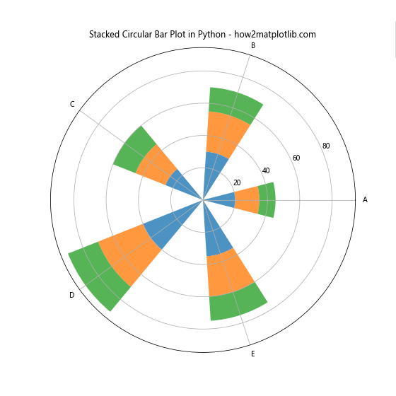
In this stacked Circular Bar Plot in Python, we create three layers of bars using the bottom parameter to stack them on top of each other. Each layer is given a different color and label, allowing for easy differentiation between the datasets.
Animating Circular Bar Plots
Adding animation to your Circular Bar Plot in Python can create a dynamic and engaging visualization. Here’s an example of how to create a simple animation of a Circular Bar Plot:
import matplotlib.pyplot as plt
import numpy as np
from matplotlib.animation import FuncAnimation

categories = ['A', 'B', 'C', 'D', 'E']
values = [0, 0, 0, 0, 0]

angles = np.linspace(0, 2*np.pi, len(categories), endpoint=False)

fig, ax = plt.subplots(figsize=(8, 8), subplot_kw=dict(projection='polar'))
bars = ax.bar(angles, values, width=0.5, align='center')

ax.set_xticks(angles)
ax.set_xticklabels(categories)

def update(frame):
    values = np.random.randint(0, 100, 5)
    for bar, value in zip(bars, values):
        bar.set_height(value)
    return bars

anim = FuncAnimation(fig, update, frames=50, interval=200, blit=True)

plt.title('Animated Circular Bar Plot in Python - how2matplotlib.com')
plt.show()
Output:
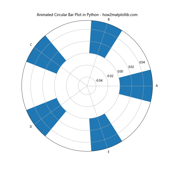
In this example, we use Matplotlib’s FuncAnimation to create an animation. The update function generates random values for each frame and updates the height of the bars accordingly. The frames parameter determines the number of frames in the animation, and interval sets the delay between frames in milliseconds.
Creating Circular Bar Plots with Subplots
When you need to compare multiple Circular Bar Plots in Python side by side, using subplots can be very effective. Here’s an example of how to create multiple Circular Bar Plots using subplots:
import matplotlib.pyplot as plt
import numpy as np

categories = ['A', 'B', 'C', 'D', 'E']
values1 = [25, 40, 30, 55, 45]
values2 = [35, 30, 45, 40, 50]

angles = np.linspace(0, 2*np.pi, len(categories), endpoint=False)

fig, (ax1, ax2) = plt.subplots(1, 2, figsize=(16, 8), subplot_kw=dict(projection='polar'))

ax1.bar(angles, values1, width=0.5, align='center')
ax1.set_xticks(angles)
ax1.set_xticklabels(categories)
ax1.set_title('Subplot 1')

ax2.bar(angles, values2, width=0.5, align='center')
ax2.set_xticks(angles)
ax2.set_xticklabels(categories)
ax2.set_title('Subplot 2')

plt.suptitle('Circular Bar Plots with Subplots - how2matplotlib.com')
plt.tight_layout()
plt.show()
Output:
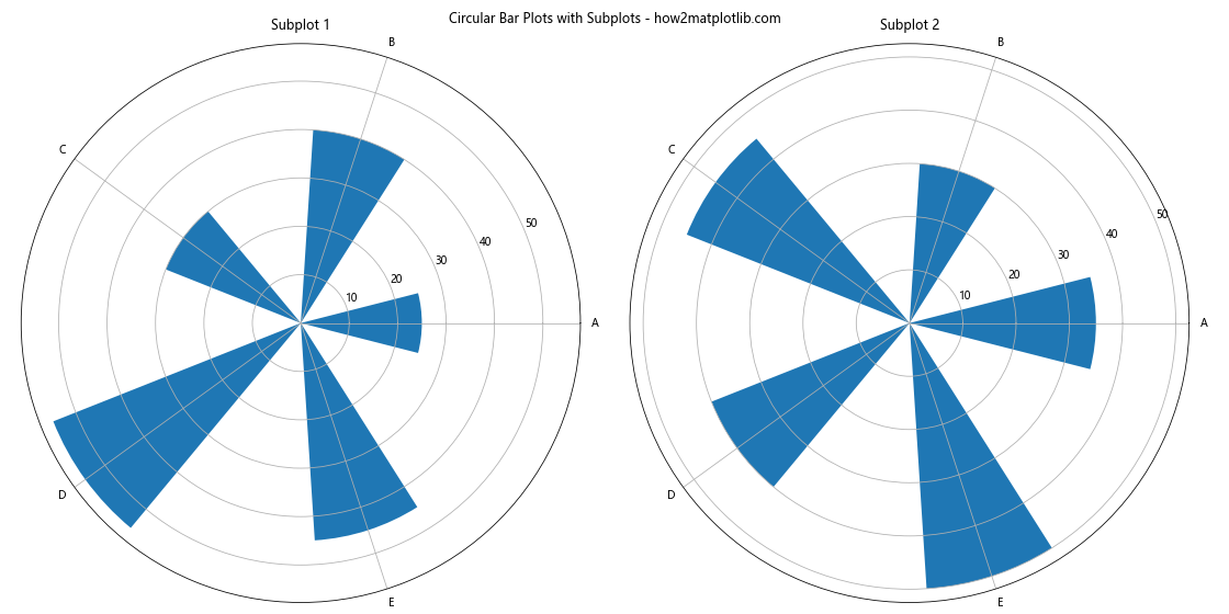
In this example, we create two Circular Bar Plots in Python side by side using plt.subplots(). Each subplot is given its own axis object (ax1 and ax2), allowing us to customize them independently. We use plt.suptitle() to add an overall title to the figure.
Adding Data Labels to Circular Bar Plots
To make your Circular Bar Plot in Python more informative, you can add data labels directly on the bars. Here’s an example of how to do this:
import matplotlib.pyplot as plt
import numpy as np

categories = ['A', 'B', 'C', 'D', 'E']
values = [25, 40, 30, 55, 45]

angles = np.linspace(0, 2*np.pi, len(categories), endpoint=False)

fig, ax = plt.subplots(figsize=(8, 8), subplot_kw=dict(projection='polar'))
bars = ax.bar(angles, values,width=0.5, align='center')

ax.set_xticks(angles)
ax.set_xticklabels(categories)

# Add data labels
for angle, value in zip(angles, values):
    ax.text(angle, value, f'{value}', ha='center', va='bottom')

plt.title('Circular Bar Plot with Data Labels - how2matplotlib.com')
plt.show()
Output:

In this example, we use a loop to add text labels to each bar using the ax.text() function. The labels are positioned at the top of each bar, displaying the corresponding value.
Customizing Bar Width in Circular Bar Plots
The width of the bars in a Circular Bar Plot in Python can significantly impact the overall appearance of the visualization. Here’s how you can customize the bar width:
import matplotlib.pyplot as plt
import numpy as np

categories = ['A', 'B', 'C', 'D', 'E', 'F', 'G', 'H']
values = [25, 40, 30, 55, 45, 35, 50, 20]

angles = np.linspace(0, 2*np.pi, len(categories), endpoint=False)

fig, ax = plt.subplots(figsize=(10, 10), subplot_kw=dict(projection='polar'))
bars = ax.bar(angles, values, width=0.7, align='center')

ax.set_xticks(angles)
ax.set_xticklabels(categories)

plt.title('Circular Bar Plot with Custom Bar Width - how2matplotlib.com')
plt.show()
Output:
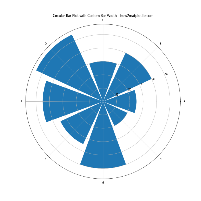
In this example, we set the width parameter in the ax.bar() function to 0.7, creating wider bars. Adjusting this value allows you to control the spacing between bars and the overall appearance of your Circular Bar Plot in Python.
Creating Grouped Circular Bar Plots
Grouped Circular Bar Plots in Python allow you to compare multiple datasets side by side for each category. Here’s an example of how to create a grouped Circular Bar Plot:
import matplotlib.pyplot as plt
import numpy as np

categories = ['A', 'B', 'C', 'D', 'E']
values1 = [25, 40, 30, 55, 45]
values2 = [20, 35, 25, 50, 40]

angles = np.linspace(0, 2*np.pi, len(categories), endpoint=False)

fig, ax = plt.subplots(figsize=(10, 10), subplot_kw=dict(projection='polar'))

ax.bar(angles, values1, width=0.4, align='edge', label='Group 1')
ax.bar(angles + 0.4, values2, width=0.4, align='edge', label='Group 2')

ax.set_xticks(angles + 0.2)
ax.set_xticklabels(categories)

plt.title('Grouped Circular Bar Plot in Python - how2matplotlib.com')
plt.legend()
plt.show()
Output:
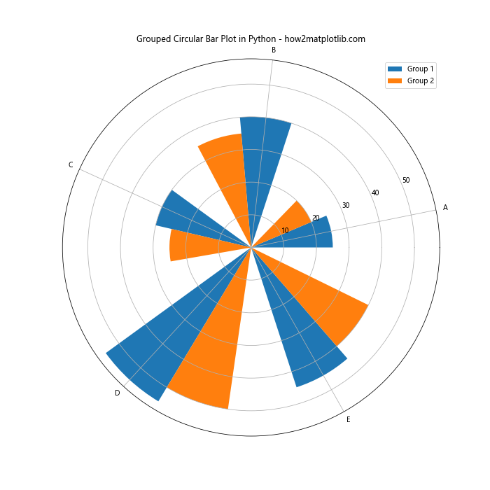
In this example, we create two sets of bars, offsetting the second set by adding 0.4 to the angles. This creates a grouped effect, allowing for easy comparison between the two datasets for each category.
Adding a Color Gradient to Circular Bar Plots
Adding a color gradient to your Circular Bar Plot in Python can enhance its visual appeal and potentially convey additional information. Here’s how you can create a Circular Bar Plot with a color gradient:
import matplotlib.pyplot as plt
import numpy as np

categories = ['A', 'B', 'C', 'D', 'E', 'F', 'G', 'H']
values = [25, 40, 30, 55, 45, 35, 50, 20]

angles = np.linspace(0, 2*np.pi, len(categories), endpoint=False)

fig, ax = plt.subplots(figsize=(10, 10), subplot_kw=dict(projection='polar'))

cmap = plt.cm.get_cmap('viridis')
colors = cmap(np.linspace(0, 1, len(categories)))

bars = ax.bar(angles, values, width=0.5, align='center', color=colors)

ax.set_xticks(angles)
ax.set_xticklabels(categories)

plt.title('Circular Bar Plot with Color Gradient - how2matplotlib.com')
plt.colorbar(plt.cm.ScalarMappable(cmap=cmap), label='Value')
plt.show()
In this example, we use the ‘viridis’ colormap to create a gradient of colors for our bars. We then add a colorbar to the plot to show the relationship between colors and values.
Creating a Circular Bar Plot with Negative Values
Circular Bar Plots in Python can also represent negative values. Here’s an example of how to create a Circular Bar Plot that includes both positive and negative values:
import matplotlib.pyplot as plt
import numpy as np

categories = ['A', 'B', 'C', 'D', 'E', 'F', 'G', 'H']
values = [25, -40, 30, -55, 45, -35, 50, -20]

angles = np.linspace(0, 2*np.pi, len(categories), endpoint=False)

fig, ax = plt.subplots(figsize=(10, 10), subplot_kw=dict(projection='polar'))

bars = ax.bar(angles, np.abs(values), width=0.5, align='center')

for bar, value in zip(bars, values):
    if value < 0:
        bar.set_facecolor('red')
    else:
        bar.set_facecolor('blue')

ax.set_xticks(angles)
ax.set_xticklabels(categories)

plt.title('Circular Bar Plot with Positive and Negative Values - how2matplotlib.com')
plt.show()
Output:

In this example, we use the absolute values of our data for the bar heights, but we color the bars differently based on whether the original value was positive or negative. This allows us to represent both positive and negative values in a Circular Bar Plot in Python.
Customizing Tick Labels in Circular Bar Plots
Customizing the tick labels in your Circular Bar Plot in Python can improve readability and provide more context to your data. Here's an example of how to customize tick labels:
import matplotlib.pyplot as plt
import numpy as np

categories = ['Jan', 'Feb', 'Mar', 'Apr', 'May', 'Jun', 'Jul', 'Aug', 'Sep', 'Oct', 'Nov', 'Dec']
values = [25, 40, 30, 55, 45, 60, 70, 65, 50, 35, 30, 45]

angles = np.linspace(0, 2*np.pi, len(categories), endpoint=False)

fig, ax = plt.subplots(figsize=(10, 10), subplot_kw=dict(projection='polar'))

bars = ax.bar(angles, values, width=0.5, align='center')

ax.set_xticks(angles)
ax.set_xticklabels(categories, fontsize=8)

# Rotate and align the tick labels so they look better
for label, angle in zip(ax.get_xticklabels(), angles):
    if angle in (0, np.pi):
        label.set_horizontalalignment('center')
    elif 0 < angle < np.pi:
        label.set_horizontalalignment('left')
    else:
        label.set_horizontalalignment('right')

plt.title('Circular Bar Plot with Custom Tick Labels - how2matplotlib.com')
plt.show()
Output:
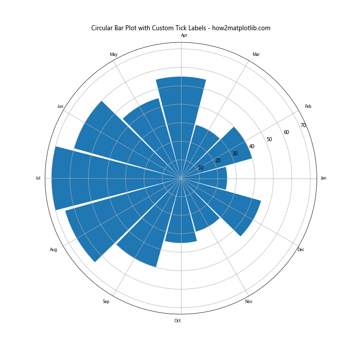
In this example, we customize the tick labels by adjusting their font size and alignment. We use a loop to set the horizontal alignment of each label based on its position around the circle, improving the overall readability of the plot.
Conclusion
Circular Bar Plots in Python offer a unique and visually appealing way to present data. Throughout this article, we've explored various aspects of creating and customizing Circular Bar Plots using Matplotlib. From basic plots to more advanced techniques like adding color gradients, creating animations, and handling negative values, we've covered a wide range of possibilities for this versatile visualization type.
Remember that the key to creating effective Circular Bar Plots in Python is to experiment with different parameters and customizations to find the best representation for your specific data and audience. Whether you're visualizing cyclical data, comparing multiple categories, or simply looking for an eye-catching way to present your information, Circular Bar Plots can be an excellent choice.
As you continue to work with Circular Bar Plots in Python, don't hesitate to combine the techniques we've discussed or explore even more advanced customizations. The flexibility of Matplotlib allows for endless possibilities in data visualization, and Circular Bar Plots are just one of the many tools at your disposal for creating impactful and informative graphics.