How to Change the Datetime Tick Label Frequency for Matplotlib Plots
Changing the Datetime Tick Label Frequency for Matplotlib Plots is an essential skill for data visualization enthusiasts and professionals alike. This article will delve deep into the intricacies of manipulating datetime tick labels in Matplotlib, providing you with a thorough understanding of the subject. We’ll explore various techniques, best practices, and practical examples to help you master the art of Changing the Datetime Tick Label Frequency for Matplotlib Plots.
Understanding the Basics of Changing the Datetime Tick Label Frequency for Matplotlib Plots
Before we dive into the specifics of Changing the Datetime Tick Label Frequency for Matplotlib Plots, it’s crucial to understand the fundamentals. Matplotlib is a powerful plotting library for Python, and its datetime functionality allows us to work with time-based data effectively. When dealing with time series data, Changing the Datetime Tick Label Frequency for Matplotlib Plots becomes essential for creating clear and informative visualizations.
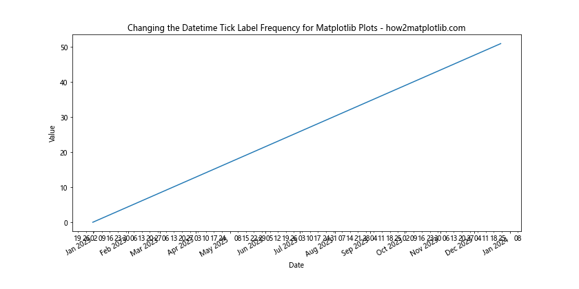
Let’s start with a simple example to illustrate the concept of Changing the Datetime Tick Label Frequency for Matplotlib Plots:
import matplotlib.pyplot as plt
import matplotlib.dates as mdates
import datetime

# Create sample data
dates = [datetime.datetime(2023, 1, 1) + datetime.timedelta(days=i) for i in range(365)]
values = range(365)

# Create the plot
fig, ax = plt.subplots(figsize=(12, 6))
ax.plot(dates, values)

# Format the x-axis
ax.xaxis.set_major_locator(mdates.MonthLocator())
ax.xaxis.set_major_formatter(mdates.DateFormatter('%b %Y'))

# Rotate and align the tick labels
plt.gcf().autofmt_xdate()

# Add labels and title
plt.xlabel('Date')
plt.ylabel('Value')
plt.title('Changing the Datetime Tick Label Frequency for Matplotlib Plots - how2matplotlib.com')

plt.show()
Output:
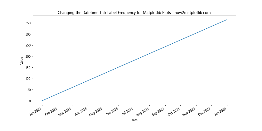
In this example, we’ve created a basic plot with daily data for an entire year. By using MonthLocator() and DateFormatter(), we’ve changed the datetime tick label frequency to display only month labels. This is a simple demonstration of Changing the Datetime Tick Label Frequency for Matplotlib Plots.
Advanced Techniques for Changing the Datetime Tick Label Frequency for Matplotlib Plots
Now that we’ve covered the basics, let’s explore some advanced techniques for Changing the Datetime Tick Label Frequency for Matplotlib Plots. These methods will give you more control over your visualizations and allow you to create custom datetime tick label frequencies.
Using Custom Locators for Changing the Datetime Tick Label Frequency for Matplotlib Plots
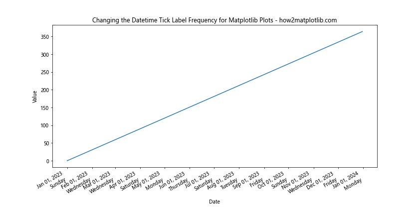
Matplotlib provides various locator classes that can be used for Changing the Datetime Tick Label Frequency for Matplotlib Plots. Let’s look at an example using the YearLocator and MonthLocator:
import matplotlib.pyplot as plt
import matplotlib.dates as mdates
import datetime

# Create sample data
start_date = datetime.datetime(2020, 1, 1)
dates = [start_date + datetime.timedelta(days=i) for i in range(1000)]
values = range(1000)

# Create the plot
fig, ax = plt.subplots(figsize=(12, 6))
ax.plot(dates, values)

# Set major ticks to years and minor ticks to months
ax.xaxis.set_major_locator(mdates.YearLocator())
ax.xaxis.set_minor_locator(mdates.MonthLocator())

# Format major and minor tick labels
ax.xaxis.set_major_formatter(mdates.DateFormatter('%Y'))
ax.xaxis.set_minor_formatter(mdates.DateFormatter('%b'))

# Rotate and align the tick labels
plt.gcf().autofmt_xdate()

# Add labels and title
plt.xlabel('Date')
plt.ylabel('Value')
plt.title('Changing the Datetime Tick Label Frequency for Matplotlib Plots - how2matplotlib.com')

plt.show()
Output:
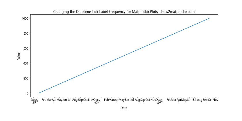
In this example, we’ve used YearLocator() for major ticks and MonthLocator() for minor ticks. This approach allows for a hierarchical display of datetime tick labels, which is particularly useful when Changing the Datetime Tick Label Frequency for Matplotlib Plots with data spanning multiple years.
Custom Tick Intervals for Changing the Datetime Tick Label Frequency for Matplotlib Plots
Sometimes, you may want to set custom intervals when Changing the Datetime Tick Label Frequency for Matplotlib Plots. The MultipleLocator class can be useful for this purpose:
import matplotlib.pyplot as plt
import matplotlib.dates as mdates
import datetime

# Create sample data
start_date = datetime.datetime(2023, 1, 1)
dates = [start_date + datetime.timedelta(days=i) for i in range(90)]
values = range(90)

# Create the plot
fig, ax = plt.subplots(figsize=(12, 6))
ax.plot(dates, values)

# Set custom tick interval (every 10 days)
ax.xaxis.set_major_locator(mdates.DayLocator(interval=10))
ax.xaxis.set_major_formatter(mdates.DateFormatter('%Y-%m-%d'))

# Rotate and align the tick labels
plt.gcf().autofmt_xdate()

# Add labels and title
plt.xlabel('Date')
plt.ylabel('Value')
plt.title('Changing the Datetime Tick Label Frequency for Matplotlib Plots - how2matplotlib.com')

plt.show()
Output:
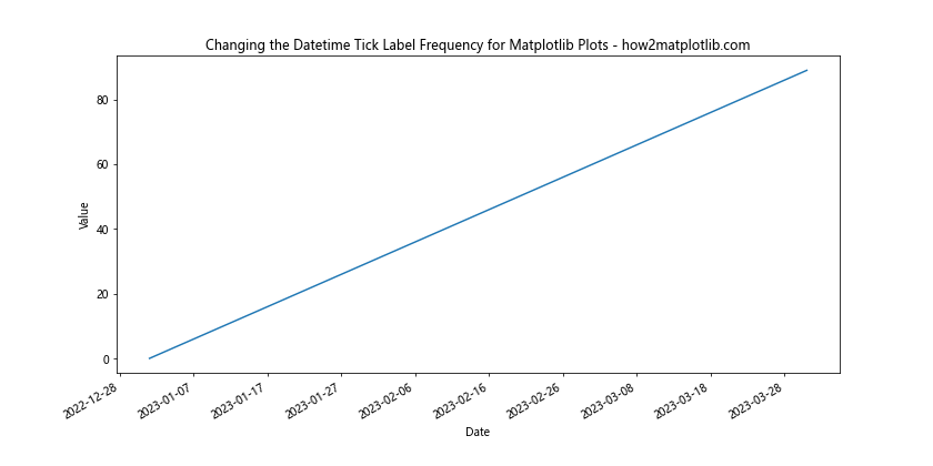
This example demonstrates how to set a custom interval of 10 days when Changing the Datetime Tick Label Frequency for Matplotlib Plots. This technique is particularly useful for datasets with specific time intervals that don’t align with standard date units.
Handling Different Time Scales when Changing the Datetime Tick Label Frequency for Matplotlib Plots
When working with time series data, you’ll often encounter different time scales. Changing the Datetime Tick Label Frequency for Matplotlib Plots needs to adapt to these various scales. Let’s explore how to handle different time scales effectively.
Hourly Data and Changing the Datetime Tick Label Frequency for Matplotlib Plots
When dealing with hourly data, you may want to focus on specific parts of the day. Here’s an example of Changing the Datetime Tick Label Frequency for Matplotlib Plots with hourly data:
import matplotlib.pyplot as plt
import matplotlib.dates as mdates
import datetime

# Create sample hourly data
start_date = datetime.datetime(2023, 5, 1)
dates = [start_date + datetime.timedelta(hours=i) for i in range(168)]  # One week of hourly data
values = range(168)

# Create the plot
fig, ax = plt.subplots(figsize=(12, 6))
ax.plot(dates, values)

# Set major ticks to days and minor ticks to hours
ax.xaxis.set_major_locator(mdates.DayLocator())
ax.xaxis.set_minor_locator(mdates.HourLocator(byhour=[0, 6, 12, 18]))

# Format major and minor tick labels
ax.xaxis.set_major_formatter(mdates.DateFormatter('%Y-%m-%d'))
ax.xaxis.set_minor_formatter(mdates.DateFormatter('%H:%M'))

# Rotate and align the tick labels
plt.gcf().autofmt_xdate()

# Add labels and title
plt.xlabel('Date and Time')
plt.ylabel('Value')
plt.title('Changing the Datetime Tick Label Frequency for Matplotlib Plots - how2matplotlib.com')

plt.show()
Output:
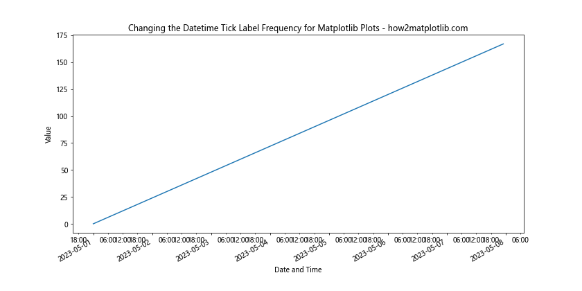
In this example, we’ve set major ticks to show days and minor ticks to show specific hours (0:00, 6:00, 12:00, and 18:00). This approach to Changing the Datetime Tick Label Frequency for Matplotlib Plots allows for a clear representation of hourly data over a week.
Weekly Data and Changing the Datetime Tick Label Frequency for Matplotlib Plots
For datasets spanning multiple weeks or months, you might want to focus on weekly intervals. Here’s how you can approach Changing the Datetime Tick Label Frequency for Matplotlib Plots with weekly data:
import matplotlib.pyplot as plt
import matplotlib.dates as mdates
import datetime

# Create sample weekly data
start_date = datetime.datetime(2023, 1, 1)
dates = [start_date + datetime.timedelta(weeks=i) for i in range(52)]  # One year of weekly data
values = range(52)

# Create the plot
fig, ax = plt.subplots(figsize=(12, 6))
ax.plot(dates, values)

# Set major ticks to months and minor ticks to weeks
ax.xaxis.set_major_locator(mdates.MonthLocator())
ax.xaxis.set_minor_locator(mdates.WeekdayLocator(byweekday=mdates.MONDAY))

# Format major and minor tick labels
ax.xaxis.set_major_formatter(mdates.DateFormatter('%b %Y'))
ax.xaxis.set_minor_formatter(mdates.DateFormatter('%d'))

# Rotate and align the tick labels
plt.gcf().autofmt_xdate()

# Add labels and title
plt.xlabel('Date')
plt.ylabel('Value')
plt.title('Changing the Datetime Tick Label Frequency for Matplotlib Plots - how2matplotlib.com')

plt.show()
Output:
This example demonstrates Changing the Datetime Tick Label Frequency for Matplotlib Plots with weekly data, using months as major ticks and Mondays as minor ticks. This approach provides a clear view of weekly trends within the context of months.
Customizing Tick Label Formats when Changing the Datetime Tick Label Frequency for Matplotlib Plots
When Changing the Datetime Tick Label Frequency for Matplotlib Plots, it’s often necessary to customize the format of the tick labels themselves. Matplotlib provides flexible options for formatting datetime tick labels.
Using strftime Directives for Changing the Datetime Tick Label Frequency for Matplotlib Plots
The strftime directives allow for precise control over the datetime format when Changing the Datetime Tick Label Frequency for Matplotlib Plots. Here’s an example:
import matplotlib.pyplot as plt
import matplotlib.dates as mdates
import datetime

# Create sample data
start_date = datetime.datetime(2023, 1, 1)
dates = [start_date + datetime.timedelta(days=i) for i in range(365)]
values = range(365)

# Create the plot
fig, ax = plt.subplots(figsize=(12, 6))
ax.plot(dates, values)

# Set custom tick locator and formatter
ax.xaxis.set_major_locator(mdates.MonthLocator())
ax.xaxis.set_major_formatter(mdates.DateFormatter('%b %d, %Y\n%A'))

# Rotate and align the tick labels
plt.gcf().autofmt_xdate()

# Add labels and title
plt.xlabel('Date')
plt.ylabel('Value')
plt.title('Changing the Datetime Tick Label Frequency for Matplotlib Plots - how2matplotlib.com')

plt.show()
Output:
In this example, we’ve used a custom format string '%b %d, %Y\n%A' when Changing the Datetime Tick Label Frequency for Matplotlib Plots. This format displays the month abbreviation, day, year, and full weekday name on separate lines, providing a detailed view of the dates.
Localization and Changing the Datetime Tick Label Frequency for Matplotlib Plots
When working with international data, you may need to localize the datetime labels while Changing the Datetime Tick Label Frequency for Matplotlib Plots. Here’s how you can do this:
import matplotlib.pyplot as plt
import matplotlib.dates as mdates
import datetime
import locale

# Set locale to French
locale.setlocale(locale.LC_TIME, 'fr_FR.UTF-8')

# Create sample data
start_date = datetime.datetime(2023, 1, 1)
dates = [start_date + datetime.timedelta(days=i) for i in range(365)]
values = range(365)

# Create the plot
fig, ax = plt.subplots(figsize=(12, 6))
ax.plot(dates, values)

# Set custom tick locator and formatter
ax.xaxis.set_major_locator(mdates.MonthLocator())
ax.xaxis.set_major_formatter(mdates.DateFormatter('%B %Y'))

# Rotate and align the tick labels
plt.gcf().autofmt_xdate()

# Add labels and title
plt.xlabel('Date')
plt.ylabel('Value')
plt.title('Changing the Datetime Tick Label Frequency for Matplotlib Plots - how2matplotlib.com')

plt.show()

# Reset locale
locale.setlocale(locale.LC_TIME, '')
Output:
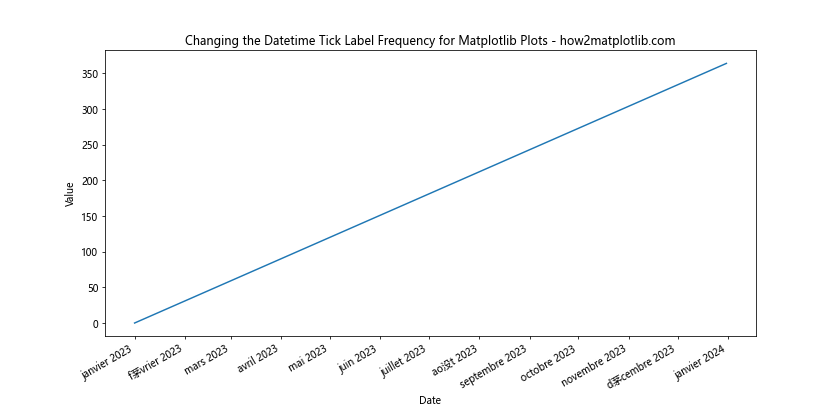
This example demonstrates how to use localization when Changing the Datetime Tick Label Frequency for Matplotlib Plots. By setting the locale to French, the month names will be displayed in French. Remember to reset the locale after plotting to avoid affecting other parts of your program.
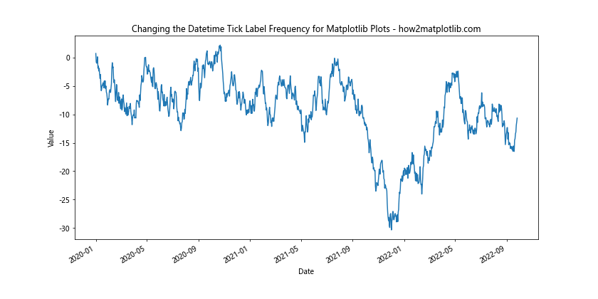
Handling Large Datasets when Changing the Datetime Tick Label Frequency for Matplotlib Plots
When working with large datasets, Changing the Datetime Tick Label Frequency for Matplotlib Plots becomes crucial for maintaining readability and performance. Let’s explore some techniques for handling large datasets effectively.
Auto-scaling and Changing the Datetime Tick Label Frequency for Matplotlib Plots
Matplotlib provides auto-scaling features that can be useful when Changing the Datetime Tick Label Frequency for Matplotlib Plots with large datasets:
import matplotlib.pyplot as plt
import matplotlib.dates as mdates
import datetime
import numpy as np

# Create a large sample dataset
start_date = datetime.datetime(2020, 1, 1)
dates = [start_date + datetime.timedelta(days=i) for i in range(1000)]
values = np.cumsum(np.random.randn(1000))

# Create the plot
fig, ax = plt.subplots(figsize=(12, 6))
ax.plot(dates, values)

# Use AutoDateLocator and AutoDateFormatter
locator = mdates.AutoDateLocator()
formatter = mdates.AutoDateFormatter(locator)

ax.xaxis.set_major_locator(locator)
ax.xaxis.set_major_formatter(formatter)

# Rotate and align the tick labels
plt.gcf().autofmt_xdate()

# Add labels and title
plt.xlabel('Date')
plt.ylabel('Value')
plt.title('Changing the Datetime Tick Label Frequency for Matplotlib Plots - how2matplotlib.com')

plt.show()
Output:
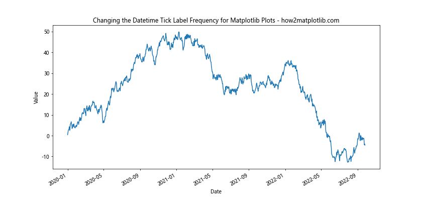
This example uses AutoDateLocator and AutoDateFormatter for automatically Changing the Datetime Tick Label Frequency for Matplotlib Plots based on the data range. This approach is particularly useful for large datasets where manual configuration might be impractical.
Zooming and Changing the Datetime Tick Label Frequency for Matplotlib Plots
When dealing with large datasets, it’s often useful to provide zooming capabilities while Changing the Datetime Tick Label Frequency for Matplotlib Plots. Here’s an example using Matplotlib’s zoom toolkit:
import matplotlib.pyplot as plt
import matplotlib.dates as mdates
import datetime
import numpy as np
from matplotlib.widgets import RectangleSelector

# Create a large sample dataset
start_date = datetime.datetime(2020, 1, 1)
dates = [start_date + datetime.timedelta(days=i) for i in range(1000)]
values = np.cumsum(np.random.randn(1000))

# Create the plot
fig, ax = plt.subplots(figsize=(12, 6))
line, = ax.plot(dates, values)

# Use AutoDateLocator and AutoDateFormatter
locator = mdates.AutoDateLocator()
formatter = mdates.AutoDateFormatter(locator)

ax.xaxis.set_major_locator(locator)
ax.xaxis.set_major_formatter(formatter)

# Rotate and align the tick labels
plt.gcf().autofmt_xdate()

## Add labels and title
plt.xlabel('Date')
plt.ylabel('Value')
plt.title('Changing the Datetime Tick Label Frequency for Matplotlib Plots - how2matplotlib.com')

# Function to update the plot when zooming
def onselect(eclick, erelease):
    xmin, xmax = sorted([eclick.xdata, erelease.xdata])
    ymin, ymax = sorted([eclick.ydata, erelease.ydata])
    ax.set_xlim(xmin, xmax)
    ax.set_ylim(ymin, ymax)
    fig.canvas.draw_idle()

# Create the RectangleSelector object
rect_selector = RectangleSelector(ax, onselect, useblit=True, button=[1],
                                  minspanx=5, minspany=5, spancoords='pixels',
                                  interactive=True)

plt.show()
Output:
This example demonstrates how to implement zooming functionality when Changing the Datetime Tick Label Frequency for Matplotlib Plots. Users can select a rectangular area to zoom in, and the datetime tick labels will automatically adjust to the new range.
Handling Irregular Time Series when Changing the Datetime Tick Label Frequency for Matplotlib Plots
Not all time series data is regular, and Changing the Datetime Tick Label Frequency for Matplotlib Plots needs to account for irregular intervals. Let’s explore how to handle irregular time series data effectively.
Using Irregular Intervals and Changing the Datetime Tick Label Frequency for Matplotlib Plots
Here’s an example of how to handle irregular intervals when Changing the Datetime Tick Label Frequency for Matplotlib Plots:
import matplotlib.pyplot as plt
import matplotlib.dates as mdates
import datetime
import numpy as np

# Create irregular time series data
np.random.seed(0)
start_date = datetime.datetime(2023, 1, 1)
dates = [start_date + datetime.timedelta(days=int(x)) for x in np.cumsum(np.random.randint(1, 10, 100))]
values = np.cumsum(np.random.randn(100))

# Create the plot
fig, ax = plt.subplots(figsize=(12, 6))
ax.plot(dates, values, marker='o')

# Use AutoDateLocator and AutoDateFormatter
locator = mdates.AutoDateLocator()
formatter = mdates.AutoDateFormatter(locator)

ax.xaxis.set_major_locator(locator)
ax.xaxis.set_major_formatter(formatter)

# Rotate and align the tick labels
plt.gcf().autofmt_xdate()

# Add labels and title
plt.xlabel('Date')
plt.ylabel('Value')
plt.title('Changing the Datetime Tick Label Frequency for Matplotlib Plots - how2matplotlib.com')

plt.show()
Output:
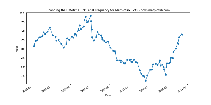
This example demonstrates Changing the Datetime Tick Label Frequency for Matplotlib Plots with irregular time intervals. The AutoDateLocator and AutoDateFormatter automatically adjust to the irregular nature of the data.
Handling Missing Data when Changing the Datetime Tick Label Frequency for Matplotlib Plots
When dealing with real-world data, you may encounter missing values. Here’s how to handle missing data when Changing the Datetime Tick Label Frequency for Matplotlib Plots:
import matplotlib.pyplot as plt
import matplotlib.dates as mdates
import datetime
import numpy as np
import pandas as pd

# Create sample data with missing values
start_date = datetime.datetime(2023, 1, 1)
dates = [start_date + datetime.timedelta(days=i) for i in range(100)]
values = np.random.randn(100)
values[10:20] = np.nan  # Introduce missing values

# Create a pandas Series to handle missing data
ts = pd.Series(values, index=dates)

# Create the plot
fig, ax = plt.subplots(figsize=(12, 6))
ax.plot(ts.index, ts.values, marker='o')

# Use AutoDateLocator and AutoDateFormatter
locator = mdates.AutoDateLocator()
formatter = mdates.AutoDateFormatter(locator)

ax.xaxis.set_major_locator(locator)
ax.xaxis.set_major_formatter(formatter)

# Rotate and align the tick labels
plt.gcf().autofmt_xdate()

# Add labels and title
plt.xlabel('Date')
plt.ylabel('Value')
plt.title('Changing the Datetime Tick Label Frequency for Matplotlib Plots - how2matplotlib.com')

plt.show()
Output:
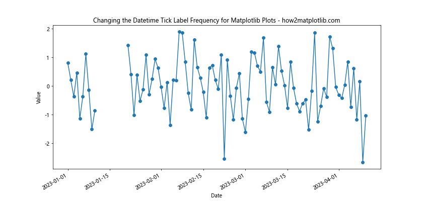
This example shows how to handle missing data when Changing the Datetime Tick Label Frequency for Matplotlib Plots. By using a pandas Series, we can easily plot the data with missing values, and Matplotlib will automatically handle the gaps in the plot.
Advanced Customization Techniques for Changing the Datetime Tick Label Frequency for Matplotlib Plots
For more complex visualizations, you may need to employ advanced customization techniques when Changing the Datetime Tick Label Frequency for Matplotlib Plots. Let’s explore some of these techniques.
Multiple Time Scales and Changing the Datetime Tick Label Frequency for Matplotlib Plots
Sometimes, you may need to display multiple time scales simultaneously when Changing the Datetime Tick Label Frequency for Matplotlib Plots. Here’s an example:
import matplotlib.pyplot as plt
import matplotlib.dates as mdates
import datetime

# Create sample data
start_date = datetime.datetime(2023, 1, 1)
dates = [start_date + datetime.timedelta(days=i) for i in range(365)]
values = range(365)

# Create the plot
fig, ax = plt.subplots(figsize=(12, 6))
ax.plot(dates, values)

# Set up primary x-axis (bottom)
ax.xaxis.set_major_locator(mdates.MonthLocator())
ax.xaxis.set_major_formatter(mdates.DateFormatter('%b'))

# Set up secondary x-axis (top)
ax2 = ax.twiny()
ax2.set_xlim(ax.get_xlim())
ax2.xaxis.set_major_locator(mdates.YearLocator())
ax2.xaxis.set_major_formatter(mdates.DateFormatter('%Y'))

# Rotate and align the tick labels
fig.autofmt_xdate()

# Add labels and title
ax.set_xlabel('Month')
ax2.set_xlabel('Year')
ax.set_ylabel('Value')
ax.set_title('Changing the Datetime Tick Label Frequency for Matplotlib Plots - how2matplotlib.com')

plt.show()
Output:
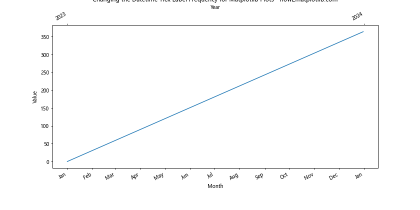
This example demonstrates how to display both months and years when Changing the Datetime Tick Label Frequency for Matplotlib Plots. By using a secondary x-axis, we can show two different time scales simultaneously.
Custom Tick Locations and Changing the Datetime Tick Label Frequency for Matplotlib Plots
For ultimate control over tick placement when Changing the Datetime Tick Label Frequency for Matplotlib Plots, you can specify custom tick locations:
import matplotlib.pyplot as plt
import matplotlib.dates as mdates
import datetime

# Create sample data
start_date = datetime.datetime(2023, 1, 1)
dates = [start_date + datetime.timedelta(days=i) for i in range(365)]
values = range(365)

# Create the plot
fig, ax = plt.subplots(figsize=(12, 6))
ax.plot(dates, values)

# Define custom tick locations
custom_ticks = [
    datetime.datetime(2023, 1, 1),
    datetime.datetime(2023, 3, 15),
    datetime.datetime(2023, 6, 30),
    datetime.datetime(2023, 9, 22),
    datetime.datetime(2023, 12, 31)
]

# Set custom tick locations and format
ax.xaxis.set_major_locator(mdates.DateLocator(dates=custom_ticks))
ax.xaxis.set_major_formatter(mdates.DateFormatter('%b %d, %Y'))

# Rotate and align the tick labels
plt.gcf().autofmt_xdate()

# Add labels and title
plt.xlabel('Date')
plt.ylabel('Value')
plt.title('Changing the Datetime Tick Label Frequency for Matplotlib Plots - how2matplotlib.com')

plt.show()
This example shows how to set custom tick locations when Changing the Datetime Tick Label Frequency for Matplotlib Plots. This technique is useful when you want to highlight specific dates or intervals in your plot.
Best Practices for Changing the Datetime Tick Label Frequency for Matplotlib Plots
When Changing the Datetime Tick Label Frequency for Matplotlib Plots, it’s important to follow best practices to ensure your visualizations are clear, informative, and visually appealing. Here are some key considerations:
- Choose appropriate intervals: When Changing the Datetime Tick Label Frequency for Matplotlib Plots, select intervals that make sense for your data. For example, use daily ticks for weekly data, monthly ticks for yearly data, etc.
Avoid overcrowding: Too many tick labels can make your plot cluttered and hard to read. When Changing the Datetime Tick Label Frequency for Matplotlib Plots, aim for a balance between detail and clarity.
Use clear formatting: Choose date formats that are easy to understand and appropriate for your audience when Changing the Datetime Tick Label Frequency for Matplotlib Plots.
Consider orientation: Rotating tick labels can improve readability, especially for longer date formats. Use
plt.gcf().autofmt_xdate()or manually set rotation when Changing the Datetime Tick Label Frequency for Matplotlib Plots.Utilize minor ticks: Minor ticks can provide additional context without cluttering the plot. Consider using them when Changing the Datetime Tick Label Frequency for Matplotlib Plots.
Be consistent: If you’re creating multiple plots, maintain consistency in how you’re Changing the Datetime Tick Label Frequency for Matplotlib Plots across all of them.
Test with different data ranges: Your method for Changing the Datetime Tick Label Frequency for Matplotlib Plots should work well with different date ranges. Test your code with various datasets to ensure it’s robust.
Troubleshooting Common Issues when Changing the Datetime Tick Label Frequency for Matplotlib Plots
Even experienced developers can encounter issues when Changing the Datetime Tick Label Frequency for Matplotlib Plots. Here are some common problems and their solutions: