How to Master Annotating the End of Lines Using Python and Matplotlib
Annotating the end of lines using Python and Matplotlib is a powerful technique for enhancing data visualizations. This article will explore various methods and best practices for annotating the end of lines in Matplotlib plots, providing detailed explanations and examples to help you master this essential skill.
Understanding the Importance of Annotating the End of Lines
Annotating the end of lines using Python and Matplotlib is crucial for creating informative and visually appealing data visualizations. By adding annotations to the end of lines, you can provide additional context, highlight specific data points, or draw attention to important trends in your plots. This technique is particularly useful when working with time series data, comparing multiple datasets, or presenting complex information in a clear and concise manner.
Getting Started with Annotating the End of Lines
Before diving into specific techniques for annotating the end of lines using Python and Matplotlib, it’s essential to set up your environment and import the necessary libraries. Here’s a basic example to get you started:
import matplotlib.pyplot as plt
import numpy as np

# Create sample data
x = np.linspace(0, 10, 100)
y = np.sin(x)

# Create the plot
plt.figure(figsize=(10, 6))
plt.plot(x, y, label='Sine Wave')
plt.title('Sine Wave Plot - how2matplotlib.com')
plt.xlabel('X-axis')
plt.ylabel('Y-axis')
plt.legend()

# Show the plot
plt.show()
Output:
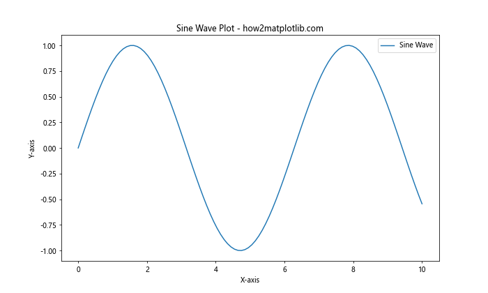
This example creates a simple sine wave plot without any annotations. We’ll use this as a starting point for our exploration of annotating the end of lines using Python and Matplotlib.
Basic Techniques for Annotating the End of Lines
Let’s start with some basic techniques for annotating the end of lines using Python and Matplotlib. These methods will help you add simple annotations to your plots quickly and easily.
Using plt.annotate() to Add Text at the End of a Line
One of the most straightforward ways to annotate the end of a line is by using the plt.annotate() function. This function allows you to add text at a specific point on your plot. Here’s an example:
import matplotlib.pyplot as plt
import numpy as np

x = np.linspace(0, 10, 100)
y = np.sin(x)

plt.figure(figsize=(10, 6))
plt.plot(x, y, label='Sine Wave')
plt.title('Sine Wave with End Annotation - how2matplotlib.com')
plt.xlabel('X-axis')
plt.ylabel('Y-axis')

# Annotate the end of the line
plt.annotate('End of Sine Wave', xy=(x[-1], y[-1]), xytext=(x[-1]+0.5, y[-1]),
             arrowprops=dict(facecolor='black', shrink=0.05))

plt.legend()
plt.show()
Output:
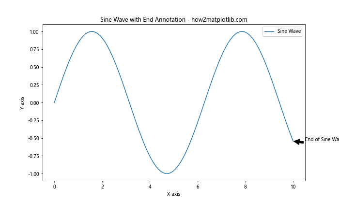
In this example, we use plt.annotate() to add text at the end of the sine wave. The xy parameter specifies the point to annotate, while xytext determines the position of the annotation text. The arrowprops dictionary is used to customize the appearance of the arrow connecting the annotation to the point.
Adding Markers at the End of Lines
Another simple way to annotate the end of lines is by adding markers. Matplotlib provides various marker styles that you can use to highlight specific points on your plot. Here’s an example of annotating the end of lines using Python and Matplotlib with markers:
import matplotlib.pyplot as plt
import numpy as np

x = np.linspace(0, 10, 100)
y1 = np.sin(x)
y2 = np.cos(x)

plt.figure(figsize=(10, 6))
plt.plot(x, y1, label='Sine Wave')
plt.plot(x, y2, label='Cosine Wave')
plt.title('Sine and Cosine Waves with End Markers - how2matplotlib.com')
plt.xlabel('X-axis')
plt.ylabel('Y-axis')

# Add markers at the end of lines
plt.plot(x[-1], y1[-1], 'ro', markersize=10)  # Red circle for sine wave
plt.plot(x[-1], y2[-1], 'bs', markersize=10)  # Blue square for cosine wave

plt.legend()
plt.show()
Output:
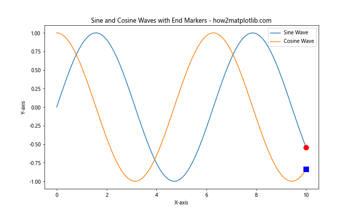
In this example, we use plt.plot() with specific marker styles (‘ro’ for a red circle and ‘bs’ for a blue square) to highlight the endpoints of the sine and cosine waves.
Advanced Techniques for Annotating the End of Lines
Now that we’ve covered the basics, let’s explore some more advanced techniques for annotating the end of lines using Python and Matplotlib. These methods will allow you to create more sophisticated and informative annotations.
Using Text Boxes for End-of-Line Annotations
Text boxes can be a great way to add more detailed information at the end of lines. Matplotlib’s TextArea and AnchoredOffsetbox classes provide powerful tools for creating and positioning text boxes. Here’s an example:
import matplotlib.pyplot as plt
import numpy as np
from matplotlib.offsetbox import AnchoredOffsetbox, TextArea, VPacker

x = np.linspace(0, 10, 100)
y = np.exp(x/10)

plt.figure(figsize=(10, 6))
plt.plot(x, y, label='Exponential Growth')
plt.title('Exponential Growth with Text Box Annotation - how2matplotlib.com')
plt.xlabel('X-axis')
plt.ylabel('Y-axis')

# Create text box for end-of-line annotation
final_value = f"Final Value: {y[-1]:.2f}"
growth_rate = f"Growth Rate: {(y[-1] - y[-2]) / (x[-1] - x[-2]):.2f}"
box = VPacker(children=[TextArea(final_value), TextArea(growth_rate)], align="left", pad=5, sep=5)

anchored_box = AnchoredOffsetbox(loc='lower right', child=box, pad=0.3, frameon=True, bbox_to_anchor=(1, 0.5),
                                 bbox_transform=plt.gca().transAxes, borderpad=0)

plt.gca().add_artist(anchored_box)
plt.legend()
plt.show()
Output:
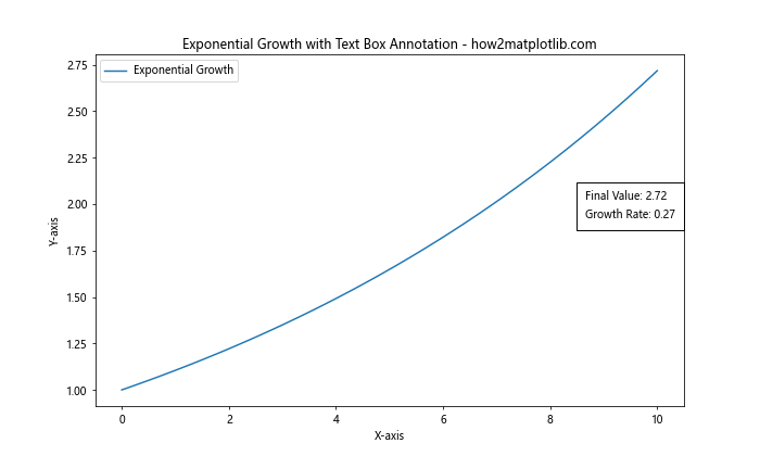
This example demonstrates how to create a text box containing multiple lines of information and anchor it to the end of the exponential growth curve. The VPacker class is used to stack multiple TextArea objects vertically, creating a multi-line text box.
Customizing Annotation Appearance
When annotating the end of lines using Python and Matplotlib, it’s important to consider the visual appeal and readability of your annotations. Matplotlib offers various options for customizing the appearance of annotations. Here’s an example that demonstrates some of these customization options:
import matplotlib.pyplot as plt
import numpy as np

x = np.linspace(0, 10, 100)
y1 = np.sin(x)
y2 = np.cos(x)

plt.figure(figsize=(10, 6))
plt.plot(x, y1, label='Sine Wave')
plt.plot(x, y2, label='Cosine Wave')
plt.title('Customized End-of-Line Annotations - how2matplotlib.com')
plt.xlabel('X-axis')
plt.ylabel('Y-axis')

# Customize sine wave annotation
plt.annotate('Sine End', xy=(x[-1], y1[-1]), xytext=(x[-1]+0.5, y1[-1]+0.2),
             arrowprops=dict(facecolor='red', shrink=0.05, width=2, headwidth=8),
             bbox=dict(boxstyle="round,pad=0.3", fc="yellow", ec="red", lw=2),
             fontsize=12, fontweight='bold')

# Customize cosine wave annotation
plt.annotate('Cosine End', xy=(x[-1], y2[-1]), xytext=(x[-1]+0.5, y2[-1]-0.2),
             arrowprops=dict(facecolor='blue', shrink=0.05, width=2, headwidth=8),
             bbox=dict(boxstyle="square,pad=0.3", fc="lightblue", ec="blue", lw=2),
             fontsize=12, fontweight='bold')

plt.legend()
plt.show()
Output:
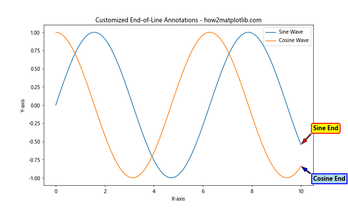
In this example, we customize the appearance of the annotations for both the sine and cosine waves. We use different colors, font styles, arrow properties, and bounding box styles to create visually distinct annotations for each line.
Annotating Multiple Lines Simultaneously
When working with multiple lines in a single plot, it’s often necessary to annotate the end of each line simultaneously. This can be challenging, but Matplotlib provides tools to make this task manageable. Let’s explore some techniques for annotating multiple lines at once.
Using a Loop to Annotate Multiple Lines
One approach to annotating multiple lines is to use a loop to iterate through the lines and add annotations. Here’s an example:
import matplotlib.pyplot as plt
import numpy as np

x = np.linspace(0, 10, 100)
y1 = np.sin(x)
y2 = np.cos(x)
y3 = np.tan(x)

plt.figure(figsize=(12, 8))
lines = [
    plt.plot(x, y1, label='Sine')[0],
    plt.plot(x, y2, label='Cosine')[0],
    plt.plot(x, y3, label='Tangent')[0]
]
plt.title('Multiple Line Annotations - how2matplotlib.com')
plt.xlabel('X-axis')
plt.ylabel('Y-axis')

# Annotate the end of each line
for i, line in enumerate(lines):
    x_end, y_end = line.get_xdata()[-1], line.get_ydata()[-1]
    plt.annotate(f'{line.get_label()} End', xy=(x_end, y_end), xytext=(x_end+0.5, y_end),
                 arrowprops=dict(facecolor=line.get_color(), shrink=0.05),
                 color=line.get_color())

plt.legend()
plt.show()
Output:
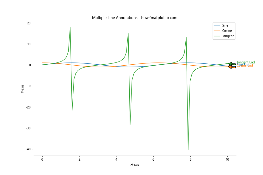
This example demonstrates how to use a loop to annotate the end of multiple lines. We create a list of line objects and then iterate through them, adding an annotation to the end of each line using its label and color.
Annotating Lines with Different Scales
When annotating the end of lines using Python and Matplotlib, you may encounter situations where the lines have significantly different scales. In such cases, it’s important to position the annotations carefully to avoid overlap and ensure readability. Here’s an example that demonstrates how to handle this situation:
import matplotlib.pyplot as plt
import numpy as np

x = np.linspace(0, 10, 100)
y1 = np.exp(x/2)
y2 = np.sin(x) * 10

fig, ax1 = plt.subplots(figsize=(12, 8))
ax2 = ax1.twinx()

line1 = ax1.plot(x, y1, 'b-', label='Exponential')[0]
line2 = ax2.plot(x, y2, 'r-', label='Sine (scaled)')[0]

ax1.set_xlabel('X-axis')
ax1.set_ylabel('Exponential Scale', color='b')
ax2.set_ylabel('Sine Scale', color='r')

plt.title('Annotating Lines with Different Scales - how2matplotlib.com')

# Annotate the end of each line
ax1.annotate('Exp End', xy=(x[-1], y1[-1]), xytext=(x[-1]+0.5, y1[-1]),
             arrowprops=dict(facecolor='blue', shrink=0.05),
             color='blue', va='center')

ax2.annotate('Sine End', xy=(x[-1], y2[-1]), xytext=(x[-1]+0.5, y2[-1]),
             arrowprops=dict(facecolor='red', shrink=0.05),
             color='red', va='center')

fig.legend(loc='upper left')
plt.tight_layout()
plt.show()
Output:

In this example, we use two y-axes to plot lines with different scales. We then annotate each line separately using the appropriate axis object. This approach ensures that the annotations are positioned correctly relative to their respective scales.
Dynamic Annotations for Interactive Plots
When creating interactive plots, you may want to update annotations dynamically based on user input or changing data. Matplotlib provides tools for creating dynamic annotations that can be updated in real-time. Let’s explore some techniques for creating dynamic end-of-line annotations.
Using blitting for Efficient Updates
Blitting is a technique that can significantly improve the performance of dynamic annotations by only redrawing the parts of the plot that have changed. Here’s an example of how to use blitting for efficient updates when annotating the end of lines using Python and Matplotlib:
import matplotlib.pyplot as plt
import numpy as np
from matplotlib.animation import FuncAnimation

fig, ax = plt.subplots(figsize=(10, 6))
x = np.linspace(0, 10, 100)
line, = ax.plot(x, np.sin(x))
annotation = ax.annotate('', xy=(0, 0), xytext=(0.5, 0.5),
                         arrowprops=dict(facecolor='black', shrink=0.05))

ax.set_title('Dynamic End-of-Line Annotation - how2matplotlib.com')
ax.set_xlabel('X-axis')
ax.set_ylabel('Y-axis')

def update(frame):
    y = np.sin(x + frame / 10)
    line.set_ydata(y)
    annotation.xy = (x[-1], y[-1])
    annotation.set_text(f'Value: {y[-1]:.2f}')
    annotation.xyann = (x[-1] + 0.5, y[-1])
    return line, annotation

ani = FuncAnimation(fig, update, frames=np.linspace(0, 2*np.pi, 100),
                    blit=True, interval=50)

plt.show()
Output:
This example creates an animated plot where the sine wave shifts over time, and the end-of-line annotation updates dynamically to reflect the current value. The blit=True parameter in FuncAnimation enables blitting for efficient updates.
Best Practices for Annotating the End of Lines
When annotating the end of lines using Python and Matplotlib, it’s important to follow best practices to ensure your visualizations are clear, informative, and visually appealing. Here are some key considerations:
- Clarity: Ensure that your annotations are easy to read and don’t obscure important data points.
- Consistency: Use a consistent style for annotations throughout your visualization.
- Color Coordination: Match annotation colors to the lines they’re annotating for easy association.
- Positioning: Carefully position annotations to avoid overlap and maintain readability.
- Content: Include relevant and concise information in your annotations.
Let’s apply these best practices in an example:
import matplotlib.pyplot as plt
import numpy as np

x = np.linspace(0, 10, 100)
y1 = np.exp(x/5)
y2 = np.log(x + 1)

plt.figure(figsize=(12, 8))
line1 = plt.plot(x, y1, 'r-', label='Exponential')[0]
line2 = plt.plot(x, y2, 'b-', label='Logarithmic')[0]

plt.title('Best Practices for End-of-Line Annotations - how2matplotlib.com')
plt.xlabel('X-axis')
plt.ylabel('Y-axis')

# Annotate the end of each line
for line, name in zip([line1, line2], ['Exponential', 'Logarithmic']):
    x_end, y_end = line.get_xdata()[-1], line.get_ydata()[-1]
    plt.annotate(f'{name}\nValue: {y_end:.2f}', xy=(x_end, y_end), xytext=(x_end+0.5, y_end),
                 arrowprops=dict(facecolor=line.get_color(), shrink=0.05, width=2, headwidth=8),
                 bbox=dict(boxstyle="round,pad=0.3", fc="white", ec=line.get_color(), lw=2),
                 color=line.get_color(), fontsize=10, fontweight='bold',
                 ha='left', va='center')

plt.legend()
plt.grid(True, linestyle='--', alpha=0.7)
plt.tight_layout()
plt.show()
Output:
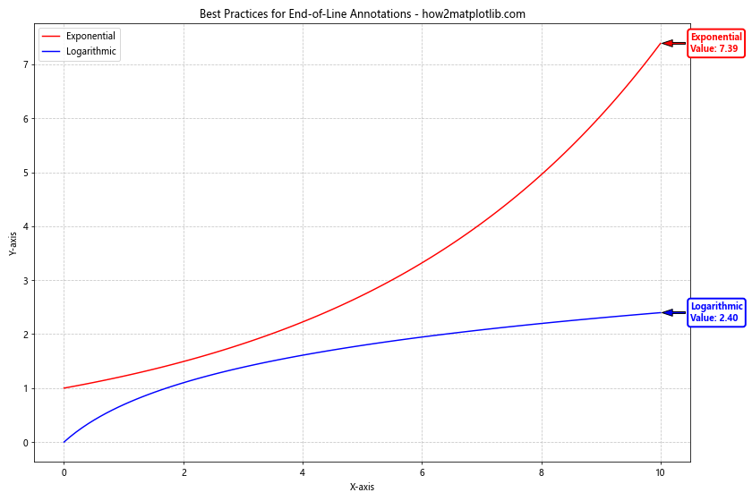
This example demonstrates best practices for annotating the end of lines using Python and Matplotlib:
- Clear and concise annotations with relevant information (function name and final value)
- Consistent style for both annotations
- Color coordination between lines and their annotations
- Careful positioning to avoid overlap
- Use of white backgrounds and rounded boxes for improved readability
Handling Edge Cases When Annotating the End of Lines
When annotating the end of lines using Python and Matplotlib, you may encounter various edge cases that require special handling. Let’s explore some common scenarios and how to address them.
Dealing with Out-of-Bounds Annotations
Sometimes, the end of a line may be close to the edge of the plot, causing annotations to extend beyond the plot boundaries. Here’s an example of how to handle this situation:
import matplotlib.pyplot as plt
import numpy as np

x = np.linspace(0, 10, 100)
y = np.exp(x/2)

fig, ax = plt.subplots(figsize=(10, 6))
line = ax.plot(x, y, label='Exponential Growth')[0]

ax.set_title('Handling Out-of-Bounds Annotations - how2matplotlib.com')
ax.set_xlabel('X-axis')
ax.set_ylabel('Y-axis')

# Annotate the end of the line
x_end, y_end = x[-1], y[-1]
annotation = ax.annotate(f'End Value: {y_end:.2f}', xy=(x_end, y_end), xytext=(x_end+1, y_end),
                         arrowprops=dict(facecolor='black', shrink=0.05),
                         bbox=dict(boxstyle="round,pad=0.3", fc="white", ec="black", lw=1))

# Adjust annotation position if it's out of bounds
def adjust_annotation(event):
    bbox = annotation.get_window_extent()
    if bbox.x1 > fig.bbox.x1:
        annotation.xytext = (x_end-1, y_end)
        annotation.set_ha('right')
        fig.canvas.draw_idle()

fig.canvas.mpl_connect('draw_event', adjust_annotation)

plt.legend()
plt.tight_layout()
plt.show()
Output:
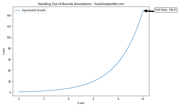
In this example, we use an event handler to check if the annotation extends beyond the right edge of the plot. If it does, we adjust its position to the left side of the endpoint.
Annotating Lines with Discontinuities
When dealing with lines that have discontinuities or gaps, you may need to be careful about where you place your end-of-line annotations. Here’s an example of how to handle this situation:
import matplotlib.pyplot as plt
import numpy as np

x = np.linspace(0, 10, 1000)
y = np.tan(x)

# Create a mask for values where tan(x) is undefined
mask = np.abs(np.cos(x)) > 1e-10

plt.figure(figsize=(12, 8))
plt.plot(x[mask], y[mask], label='Tangent Function')

plt.title('Annotating Lines with Discontinuities - how2matplotlib.com')
plt.xlabel('X-axis')
plt.ylabel('Y-axis')

# Find the last valid point
last_valid_index = np.where(mask)[0][-1]
x_end, y_end = x[last_valid_index], y[last_valid_index]

# Annotate the end of the last continuous segment
plt.annotate(f'Last Valid Point\nValue: {y_end:.2f}', xy=(x_end, y_end), xytext=(x_end+0.5, y_end),
             arrowprops=dict(facecolor='black', shrink=0.05),
             bbox=dict(boxstyle="round,pad=0.3", fc="white", ec="black", lw=1))

plt.legend()
plt.grid(True, linestyle='--', alpha=0.7)
plt.ylim(-10, 10)  # Limit y-axis for better visibility
plt.show()
Output:
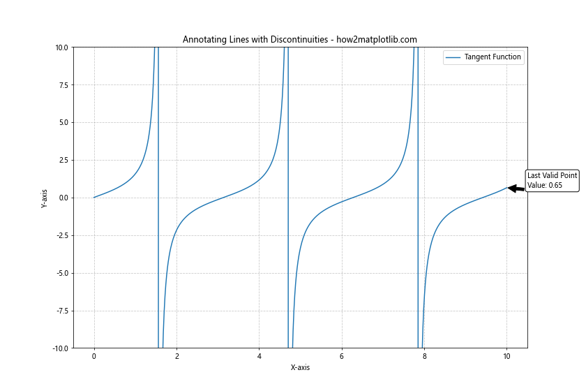
This example demonstrates how to annotate the end of a line with discontinuities (in this case, the tangent function). We find the last valid point before a discontinuity and place our annotation there.
Advanced Annotation Techniques
Let’s explore some advanced techniques for annotating the end of lines using Python and Matplotlib. These methods can help you create more sophisticated and informative visualizations.
Using Annotation Styles from Matplotlib’s Style Sheets
Matplotlib provides various built-in style sheets that can enhance the overall look of your plots, including annotations. Here’s an example of how to use a style sheet when annotating the end of lines:
import matplotlib.pyplot as plt
import numpy as np

plt.style.use('seaborn-darkgrid')

x = np.linspace(0, 10, 100)
y1 = np.sin(x)
y2 = np.cos(x)

plt.figure(figsize=(12, 8))
line1 = plt.plot(x, y1, label='Sine')[0]
line2 = plt.plot(x, y2, label='Cosine')[0]

plt.title('Stylized End-of-Line Annotations - how2matplotlib.com')
plt.xlabel('X-axis')
plt.ylabel('Y-axis')

# Annotate the end of each line
for line, name in zip([line1, line2], ['Sine', 'Cosine']):
    x_end, y_end = line.get_xdata()[-1], line.get_ydata()[-1]
    plt.annotate(f'{name} End: {y_end:.2f}', xy=(x_end, y_end), xytext=(x_end+0.5, y_end),
                 arrowprops=dict(facecolor=line.get_color(), shrink=0.05, width=2, headwidth=8),
                 bbox=dict(boxstyle="round,pad=0.3", fc="white", ec=line.get_color(), alpha=0.8),
                 color=line.get_color(), fontsize=10, fontweight='bold')

plt.legend()
plt.show()
This example uses the ‘seaborn-darkgrid’ style to create a more visually appealing plot with styled annotations.
Creating Custom Annotation Shapes
While Matplotlib provides several built-in annotation shapes, you can also create custom shapes for your end-of-line annotations. Here’s an example using path effects to create a custom annotation shape:
import matplotlib.pyplot as plt
import numpy as np
import matplotlib.patheffects as path_effects

x = np.linspace(0, 10, 100)
y = np.exp(x/5)

plt.figure(figsize=(12, 8))
line = plt.plot(x, y, label='Exponential Growth')[0]

plt.title('Custom Annotation Shapes - how2matplotlib.com')
plt.xlabel('X-axis')
plt.ylabel('Y-axis')

# Create a custom annotation shape
x_end, y_end = x[-1], y[-1]
text = plt.text(x_end, y_end, f'End Value:\n{y_end:.2f}', ha='center', va='center',
                bbox=dict(boxstyle="circle,pad=0.5", fc="yellow", ec="red", lw=2))

# Add path effect for a custom border
text.set_path_effects([
    path_effects.Stroke(linewidth=3, foreground='red'),
    path_effects.Normal()
])

# Add an arrow pointing to the end of the line
plt.annotate('', xy=(x_end, y_end), xytext=(x_end-1, y_end),
             arrowprops=dict(facecolor='red', shrink=0.05, width=2, headwidth=8))

plt.legend()
plt.grid(True, linestyle='--', alpha=0.7)
plt.show()
Output:
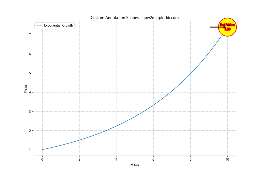
This example creates a custom circular annotation with a red border and yellow fill, demonstrating how to use path effects and custom shapes when annotating the end of lines using Python and Matplotlib.
Combining Annotations with Other Matplotlib Features
To create truly informative and visually appealing plots, it’s often beneficial to combine end-of-line annotations with other Matplotlib features. Let’s explore some examples of how to do this effectively.
Annotations with Subplots
When working with multiple subplots, you may want to annotate the end of lines in each subplot. Here’s an example of how to achieve this:
import matplotlib.pyplot as plt
import numpy as np

x = np.linspace(0, 10, 100)
y1 = np.sin(x)
y2 = np.cos(x)
y3 = np.tan(x)
y4 = np.exp(x/5)

fig, axs = plt.subplots(2, 2, figsize=(14, 10))
fig.suptitle('End-of-Line Annotations with Subplots - how2matplotlib.com', fontsize=16)

plots = [
    (axs[0, 0], x, y1, 'Sine'),
    (axs[0, 1], x, y2, 'Cosine'),
    (axs[1, 0], x, y3, 'Tangent'),
    (axs[1, 1], x, y4, 'Exponential')
]

for ax, x_data, y_data, title in plots:
    line = ax.plot(x_data, y_data, label=title)[0]
    ax.set_title(title)
    ax.set_xlabel('X-axis')
    ax.set_ylabel('Y-axis')

    x_end, y_end = x_data[-1], y_data[-1]
    ax.annotate(f'End: {y_end:.2f}', xy=(x_end, y_end), xytext=(x_end-1, y_end),
                arrowprops=dict(facecolor=line.get_color(), shrink=0.05),
                bbox=dict(boxstyle="round,pad=0.3", fc="white", ec=line.get_color(), lw=1),
                color=line.get_color())

    ax.legend()
    ax.grid(True, linestyle='--', alpha=0.7)

plt.tight_layout()
plt.show()
Output:
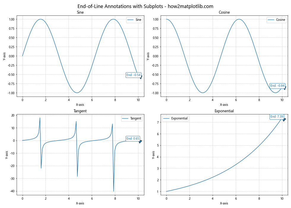
This example demonstrates how to create end-of-line annotations for multiple subplots, each with its own function and annotation style.
Combining Annotations with Colorbars
When working with plots that use colormaps, you can combine end-of-line annotations with colorbars to provide additional information. Here’s an example:
import matplotlib.pyplot as plt
import numpy as np

x = np.linspace(0, 10, 100)
y = np.sin(x)
colors = np.linspace(0, 1, len(x))

fig, ax = plt.subplots(figsize=(12, 8))
scatter = ax.scatter(x, y, c=colors, cmap='viridis', s=50)
line = ax.plot(x, y, 'k--', alpha=0.5)[0]

plt.title('End-of-Line Annotation with Colorbar - how2matplotlib.com')
plt.xlabel('X-axis')
plt.ylabel('Y-axis')

# Add colorbar
cbar = plt.colorbar(scatter)
cbar.set_label('Color Value')

# Annotate the end of the line
x_end, y_end = x[-1], y[-1]
ax.annotate(f'End Point\nValue: {y_end:.2f}\nColor: {colors[-1]:.2f}',
            xy=(x_end, y_end), xytext=(x_end+0.5, y_end),
            arrowprops=dict(facecolor='black', shrink=0.05),
            bbox=dict(boxstyle="round,pad=0.3", fc="white", ec="black", lw=1))

plt.grid(True, linestyle='--', alpha=0.7)
plt.show()
Output:
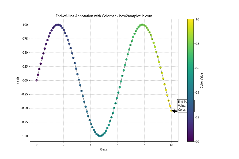
This example combines a scatter plot with a line plot, uses a colorbar to represent an additional dimension of data, and annotates the end of the line with information about both the y-value and the color value.
Troubleshooting Common Issues When Annotating the End of Lines
When annotating the end of lines using Python and Matplotlib, you may encounter some common issues. Let’s discuss these problems and their solutions.
Overlapping Annotations
When annotating multiple lines that end close to each other, annotations may overlap. Here’s an example of how to handle this issue:
import matplotlib.pyplot as plt
import numpy as np
from adjustText import adjust_text

x = np.linspace(0, 10, 100)
y1 = np.sin(x)
y2 = np.cos(x)
y3 = np.sin(x + 0.2)

plt.figure(figsize=(12, 8))
lines = [
    plt.plot(x, y1, label='Sine')[0],
    plt.plot(x, y2, label='Cosine')[0],
    plt.plot(x, y3, label='Shifted Sine')[0]
]

plt.title('Handling Overlapping Annotations - how2matplotlib.com')
plt.xlabel('X-axis')
plt.ylabel('Y-axis')

# Create annotations
texts = []
for line in lines:
    x_end, y_end = line.get_xdata()[-1], line.get_ydata()[-1]
    texts.append(plt.text(x_end, y_end, f'{line.get_label()}: {y_end:.2f}',
                          color=line.get_color(), fontweight='bold'))

# Adjust text positions to avoid overlap
adjust_text(texts, arrowprops=dict(arrowstyle='->', color='red'))

plt.legend()
plt.grid(True, linestyle='--', alpha=0.7)
plt.show()
This example uses the adjustText library to automatically adjust the position of annotations to avoid overlap.
Annotations Not Updating in Dynamic Plots
When creating dynamic plots, you may find that annotations don’t update properly. Here’s an example of how to ensure annotations update correctly:
import matplotlib.pyplot as plt
import numpy as np
from matplotlib.animation import FuncAnimation

fig, ax = plt.subplots(figsize=(12, 8))
x = np.linspace(0, 10, 100)
line, = ax.plot(x, np.sin(x))

ax.set_title('Dynamic End-of-Line Annotation - how2matplotlib.com')
ax.set_xlabel('X-axis')
ax.set_ylabel('Y-axis')

# Create the initial annotation
annotation = ax.annotate('', xy=(0, 0), xytext=(0.5, 0.5),
                         arrowprops=dict(facecolor='black', shrink=0.05))

def update(frame):
    y = np.sin(x + frame / 10)
    line.set_ydata(y)

    # Update the annotation
    x_end, y_end = x[-1],y[-1]
    annotation.xy = (x_end, y_end)
    annotation.set_text(f'Value: {y_end:.2f}')
    annotation.xyann = (x_end + 0.5, y_end)

    return line, annotation

ani = FuncAnimation(fig, update, frames=np.linspace(0, 2*np.pi, 100),
                    blit=True, interval=50)

plt.show()
Output:
This example demonstrates how to update both the line data and the annotation in each frame of an animation, ensuring that the end-of-line annotation stays current.
Advanced Customization Techniques for End-of-Line Annotations
Let’s explore some advanced customization techniques for creating unique and informative end-of-line annotations using Python and Matplotlib.
Using LaTeX in Annotations
Matplotlib supports LaTeX rendering for text, which can be useful for adding mathematical expressions to your annotations. Here’s an example:
import matplotlib.pyplot as plt
import numpy as np

plt.rcParams.update({
    "text.usetex": True,
    "font.family": "serif",
    "font.serif": ["Computer Modern Roman"],
})

x = np.linspace(0, 2*np.pi, 100)
y = np.sin(x)

plt.figure(figsize=(12, 8))
line = plt.plot(x, y, label='Sine Wave')[0]

plt.title('LaTeX Annotation - how2matplotlib.com')
plt.xlabel('X-axis')
plt.ylabel('Y-axis')

# Annotate the end of the line with LaTeX
x_end, y_end = x[-1], y[-1]
plt.annotate(r'$\sin(2\pi) = %.2f$' % y_end,
             xy=(x_end, y_end), xytext=(x_end+0.5, y_end),
             arrowprops=dict(facecolor='black', shrink=0.05),
             bbox=dict(boxstyle="round,pad=0.3", fc="white", ec="black", lw=1))

plt.legend()
plt.grid(True, linestyle='--', alpha=0.7)
plt.show()
This example uses LaTeX to render a mathematical expression in the end-of-line annotation, providing a more professional look for scientific or mathematical plots.
Creating Animated End-of-Line Annotations
You can create animated end-of-line annotations to draw attention to specific data points or trends. Here’s an example:
import matplotlib.pyplot as plt
import numpy as np
from matplotlib.animation import FuncAnimation

fig, ax = plt.subplots(figsize=(12, 8))
x = np.linspace(0, 10, 100)
line, = ax.plot(x, np.sin(x))

ax.set_title('Animated End-of-Line Annotation - how2matplotlib.com')
ax.set_xlabel('X-axis')
ax.set_ylabel('Y-axis')

# Create the initial annotation
annotation = ax.annotate('', xy=(0, 0), xytext=(0.5, 0.5),
                         arrowprops=dict(facecolor='red', shrink=0.05),
                         bbox=dict(boxstyle="round,pad=0.3", fc="yellow", ec="red", lw=2))

def update(frame):
    y = np.sin(x + frame / 10)
    line.set_ydata(y)

    x_end, y_end = x[-1], y[-1]
    annotation.xy = (x_end, y_end)
    annotation.set_text(f'Value: {y_end:.2f}')
    annotation.xyann = (x_end + 0.5 + 0.2 * np.sin(frame), y_end + 0.2 * np.cos(frame))

    return line, annotation

ani = FuncAnimation(fig, update, frames=np.linspace(0, 2*np.pi, 100),
                    blit=True, interval=50)

plt.show()
Output:
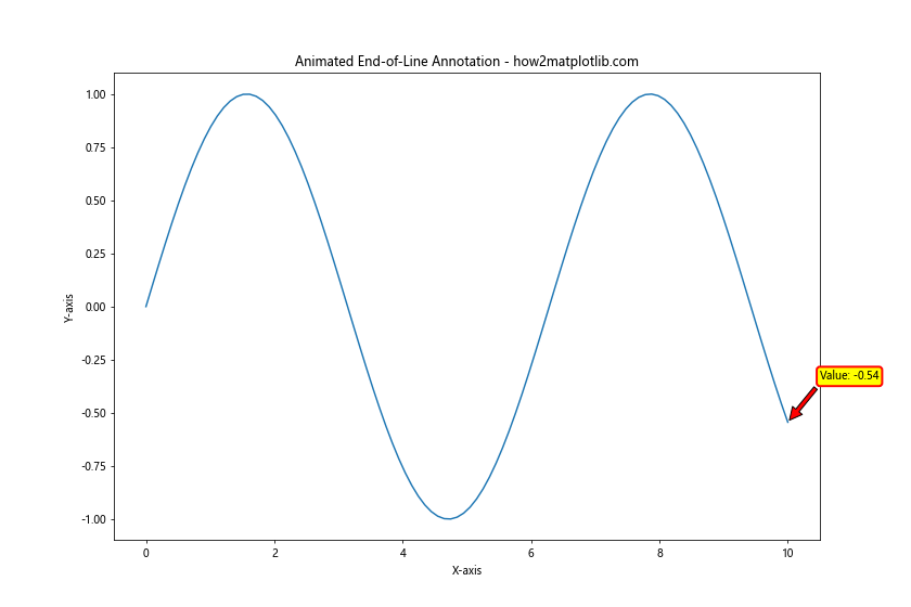
This example creates an animated end-of-line annotation that moves in a circular pattern around the endpoint, drawing attention to the changing value.
Best Practices for Effective End-of-Line Annotations
When annotating the end of lines using Python and Matplotlib, it’s important to follow best practices to ensure your visualizations are clear, informative, and visually appealing. Here are some key guidelines:
- Clarity: Ensure that your annotations are easy to read and don’t obscure important data points.
- Relevance: Include only the most relevant information in your annotations.
- Consistency: Use a consistent style for annotations throughout your visualization.
- Color Coordination: Match annotation colors to the lines they’re annotating for easy association.
- Positioning: Carefully position annotations to avoid overlap and maintain readability.
- Font Size: Use an appropriate font size that is legible but not overpowering.
- Contrast: Ensure there’s enough contrast between the annotation text and its background.
- Simplicity: Avoid cluttering your plot with too many annotations.
Let’s apply these best practices in a comprehensive example:
import matplotlib.pyplot as plt
import numpy as np

plt.style.use('seaborn-whitegrid')

x = np.linspace(0, 10, 100)
y1 = np.exp(x/5)
y2 = np.log(x + 1)
y3 = x**2 / 20

plt.figure(figsize=(14, 10))
lines = [
    plt.plot(x, y1, label='Exponential')[0],
    plt.plot(x, y2, label='Logarithmic')[0],
    plt.plot(x, y3, label='Quadratic')[0]
]

plt.title('Best Practices for End-of-Line Annotations - how2matplotlib.com', fontsize=16)
plt.xlabel('X-axis', fontsize=12)
plt.ylabel('Y-axis', fontsize=12)

# Annotate the end of each line
for i, line in enumerate(lines):
    x_end, y_end = line.get_xdata()[-1], line.get_ydata()[-1]
    plt.annotate(f'{line.get_label()}\nValue: {y_end:.2f}',
                 xy=(x_end, y_end), xytext=(x_end+0.5, y_end),
                 arrowprops=dict(facecolor=line.get_color(), shrink=0.05, width=2, headwidth=8),
                 bbox=dict(boxstyle="round,pad=0.3", fc="white", ec=line.get_color(), lw=2, alpha=0.8),
                 color=line.get_color(), fontsize=10, fontweight='bold',
                 ha='left', va='center')

plt.legend(loc='upper left', fontsize=10)
plt.grid(True, linestyle='--', alpha=0.7)
plt.tight_layout()
plt.show()
This example demonstrates the application of best practices for annotating the end of lines using Python and Matplotlib:
- Clear and concise annotations with relevant information (function name and final value)
- Consistent style for all annotations
- Color coordination between lines and their annotations
- Careful positioning to avoid overlap
- Appropriate font size and weight for readability
- Use of white backgrounds with colored borders for improved contrast
- Limited number of annotations to avoid clutter
Conclusion
Annotating the end of lines using Python and Matplotlib is a powerful technique for enhancing data visualizations and providing valuable insights to your audience. Throughout this comprehensive guide, we’ve explored various methods, best practices, and advanced techniques for creating effective end-of-line annotations.
We’ve covered basic annotation techniques, advanced customization options, handling of edge cases, and integration with other Matplotlib features. By mastering these skills, you’ll be able to create more informative and visually appealing plots that effectively communicate your data’s story.
Remember to always consider the context of your data and the needs of your audience when designing your annotations. With practice and attention to detail, you’ll be able to create professional-quality visualizations that make complex data more accessible and understandable.