How to Create Stunning Animating Scatter Plots in Matplotlib
Animating scatter plots in Matplotlib is a powerful technique for visualizing dynamic data and creating engaging presentations. This article will explore various methods and techniques for animating scatter plots using Matplotlib, providing detailed explanations and easy-to-understand code examples. Whether you’re a data scientist, researcher, or visualization enthusiast, mastering the art of animating scatter plots in Matplotlib will enhance your ability to communicate complex information effectively.
Understanding the Basics of Animating Scatter Plots in Matplotlib
Before diving into the specifics of animating scatter plots in Matplotlib, it’s essential to understand the fundamental concepts. Animating scatter plots involves creating a series of frames that display changes in data points over time or based on other parameters. Matplotlib provides several tools and functions to achieve this, including the animation module and the FuncAnimation class.
Let’s start with a simple example of animating scatter plots in Matplotlib:
import matplotlib.pyplot as plt
import numpy as np
from matplotlib.animation import FuncAnimation

# Create initial data
x = np.random.rand(10)
y = np.random.rand(10)

# Create the figure and axis
fig, ax = plt.subplots()
scatter = ax.scatter(x, y)

# Animation update function
def update(frame):
    x = np.random.rand(10)
    y = np.random.rand(10)
    scatter.set_offsets(np.c_[x, y])
    ax.set_title(f"Frame {frame} - how2matplotlib.com")
    return scatter,

# Create the animation
animation = FuncAnimation(fig, update, frames=50, interval=200, blit=True)

plt.show()
Output:
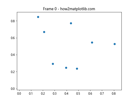
In this example, we create a simple scatter plot with random data points and animate it by updating the positions of the points in each frame. The update function generates new random data for each frame and updates the scatter plot accordingly. The FuncAnimation class is used to create the animation, specifying the figure, update function, number of frames, and interval between frames.
Advanced Techniques for Animating Scatter Plots in Matplotlib
Now that we’ve covered the basics, let’s explore some advanced techniques for animating scatter plots in Matplotlib. These techniques will allow you to create more complex and visually appealing animations.
Animating Color Changes in Scatter Plots
One way to enhance your animated scatter plots is by incorporating color changes. This can be particularly useful when visualizing changes in data attributes over time. Here’s an example of how to animate color changes in a scatter plot:
import matplotlib.pyplot as plt
import numpy as np
from matplotlib.animation import FuncAnimation

# Create initial data
x = np.random.rand(50)
y = np.random.rand(50)
colors = np.random.rand(50)

# Create the figure and axis
fig, ax = plt.subplots()
scatter = ax.scatter(x, y, c=colors, cmap='viridis')

# Animation update function
def update(frame):
    global colors
    colors += 0.02
    colors %= 1
    scatter.set_array(colors)
    ax.set_title(f"Color Animation - Frame {frame} - how2matplotlib.com")
    return scatter,

# Create the animation
animation = FuncAnimation(fig, update, frames=100, interval=50, blit=True)

plt.colorbar(scatter)
plt.show()
Output:
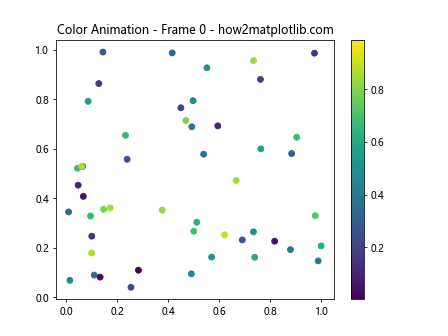
In this example, we create a scatter plot with initial random data points and colors. The update function gradually changes the colors of the points by incrementing the color values. This creates a smooth transition of colors across the scatter plot over time.
Animating Size Changes in Scatter Plots
Another interesting technique for animating scatter plots in Matplotlib is to vary the size of the data points. This can be useful for emphasizing certain data points or showing changes in magnitude over time. Here’s an example:
import matplotlib.pyplot as plt
import numpy as np
from matplotlib.animation import FuncAnimation

# Create initial data
x = np.random.rand(30)
y = np.random.rand(30)
sizes = np.random.randint(10, 100, 30)

# Create the figure and axis
fig, ax = plt.subplots()
scatter = ax.scatter(x, y, s=sizes)

# Animation update function
def update(frame):
    global sizes
    sizes += np.random.randint(-10, 11, 30)
    sizes = np.clip(sizes, 10, 200)
    scatter.set_sizes(sizes)
    ax.set_title(f"Size Animation - Frame {frame} - how2matplotlib.com")
    return scatter,

# Create the animation
animation = FuncAnimation(fig, update, frames=100, interval=100, blit=True)

plt.show()
Output:
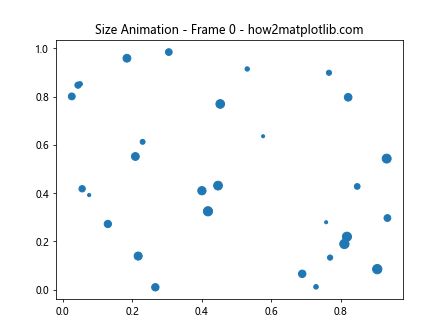
In this example, we create a scatter plot with initial random data points and sizes. The update function randomly increases or decreases the sizes of the points within a specified range. This creates an animation where the data points appear to “breathe” or pulsate.
Incorporating Data-driven Animations in Scatter Plots
Animating scatter plots in Matplotlib becomes even more powerful when the animations are driven by real data. This section will explore techniques for creating data-driven animations that can effectively communicate trends and patterns in your datasets.
Animating Time Series Data in Scatter Plots
Time series data is a common use case for animated scatter plots. By animating the progression of data points over time, you can visualize how relationships between variables change. Here’s an example of animating time series data in a scatter plot:
import matplotlib.pyplot as plt
import numpy as np
from matplotlib.animation import FuncAnimation

# Generate sample time series data
np.random.seed(42)
dates = np.arange('2023-01-01', '2023-12-31', dtype='datetime64[D]')
x = np.cumsum(np.random.randn(365))
y = np.cumsum(np.random.randn(365))

# Create the figure and axis
fig, ax = plt.subplots()
scatter = ax.scatter([], [], c=[], cmap='viridis')
ax.set_xlim(x.min(), x.max())
ax.set_ylim(y.min(), y.max())

# Animation update function
def update(frame):
    scatter.set_offsets(np.c_[x[:frame], y[:frame]])
    scatter.set_array(np.arange(frame))
    ax.set_title(f"Date: {dates[frame]} - how2matplotlib.com")
    return scatter,

# Create the animation
animation = FuncAnimation(fig, update, frames=len(dates), interval=50, blit=True)

plt.colorbar(scatter, label='Day of Year')
plt.xlabel('Variable X')
plt.ylabel('Variable Y')
plt.show()
Output:
In this example, we generate sample time series data for a year. The animation shows the progression of data points over time, with color indicating the day of the year. This type of animation is particularly useful for visualizing seasonal patterns or trends in time series data.
Animating Scatter Plots with Changing Datasets
Another powerful technique for animating scatter plots in Matplotlib is to animate changes between different datasets. This can be useful for comparing distributions or showing how data evolves across different categories. Here’s an example:
import matplotlib.pyplot as plt
import numpy as np
from matplotlib.animation import FuncAnimation

# Generate multiple datasets
np.random.seed(42)
datasets = [np.random.randn(100, 2) + np.array([i, i]) for i in range(5)]

# Create the figure and axis
fig, ax = plt.subplots()
scatter = ax.scatter([], [])
ax.set_xlim(-3, 7)
ax.set_ylim(-3, 7)

# Animation update function
def update(frame):
    scatter.set_offsets(datasets[frame % len(datasets)])
    ax.set_title(f"Dataset {frame % len(datasets) + 1} - how2matplotlib.com")
    return scatter,

# Create the animation
animation = FuncAnimation(fig, update, frames=20, interval=500, blit=True)

plt.show()
Output:
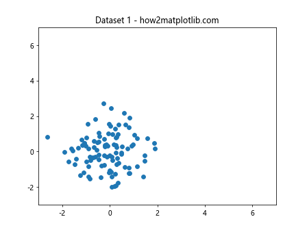
In this example, we create multiple datasets with different distributions. The animation cycles through these datasets, showing how the scatter plot changes for each one. This technique can be particularly useful for comparing different groups or categories in your data.
Enhancing Animated Scatter Plots with Additional Visual Elements
To make your animated scatter plots in Matplotlib even more informative and visually appealing, you can incorporate additional visual elements. This section will explore techniques for adding text, annotations, and other graphical elements to your animations.
Adding Dynamic Text to Animated Scatter Plots
Adding dynamic text to your animated scatter plots can provide context and highlight important information as the animation progresses. Here’s an example of how to incorporate dynamic text in your animations:
import matplotlib.pyplot as plt
import numpy as np
from matplotlib.animation import FuncAnimation

# Generate sample data
np.random.seed(42)
x = np.random.rand(20)
y = np.random.rand(20)
sizes = np.random.randint(50, 200, 20)

# Create the figure and axis
fig, ax = plt.subplots()
scatter = ax.scatter(x, y, s=sizes)
text = ax.text(0.05, 0.95, '', transform=ax.transAxes, va='top')

# Animation update function
def update(frame):
    scatter.set_offsets(np.c_[x + 0.01 * frame, y + 0.01 * np.sin(frame)])
    mean_size = np.mean(sizes)
    text.set_text(f"Frame: {frame}\nMean Size: {mean_size:.2f}\nhow2matplotlib.com")
    return scatter, text

# Create the animation
animation = FuncAnimation(fig, update, frames=100, interval=50, blit=True)

plt.show()
Output:
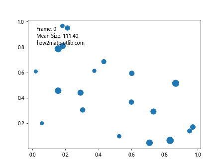
In this example, we add dynamic text to the upper-left corner of the plot. The text updates with each frame, showing the current frame number and the mean size of the data points. This technique can be used to display various statistics or information that changes as the animation progresses.
Incorporating Trails in Animated Scatter Plots
Adding trails to your animated scatter plots can help visualize the path of data points over time. This is particularly useful for tracking movement or changes in position. Here’s an example of how to create trails in an animated scatter plot:
import matplotlib.pyplot as plt
import numpy as np
from matplotlib.animation import FuncAnimation

# Generate sample data
np.random.seed(42)
num_points = 5
x = np.random.rand(num_points)
y = np.random.rand(num_points)
trail_length = 20

# Create the figure and axis
fig, ax = plt.subplots()
scatter = ax.scatter(x, y)
trails = [ax.plot([], [], 'o-', alpha=0.3)[0] for _ in range(num_points)]

# Initialize trail data
trail_data = [[] for _ in range(num_points)]

# Animation update function
def update(frame):
    new_x = x + 0.01 * np.cos(frame * 0.1)
    new_y = y + 0.01 * np.sin(frame * 0.1)

    scatter.set_offsets(np.c_[new_x, new_y])

    for i, (trail, td) in enumerate(zip(trails, trail_data)):
        td.append((new_x[i], new_y[i]))
        if len(td) > trail_length:
            td.pop(0)
        trail.set_data(*zip(*td))

    ax.set_title(f"Trails Animation - Frame {frame} - how2matplotlib.com")
    return [scatter] + trails

# Create the animation
animation = FuncAnimation(fig, update, frames=200, interval=50, blit=True)

plt.show()
Output:
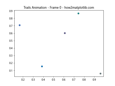
In this example, we create trails for each data point by storing their recent positions and plotting them as fading lines. This technique allows viewers to see the recent history of each point’s movement, making it easier to understand the overall motion patterns in the data.
Advanced Animation Techniques for Scatter Plots in Matplotlib
As we delve deeper into animating scatter plots in Matplotlib, we can explore more advanced techniques that allow for greater customization and interactivity. This section will cover some of these advanced methods to create even more engaging and informative animations.
Creating Interactive Animated Scatter Plots
Interactive animations can greatly enhance the user experience by allowing viewers to control aspects of the animation. Here’s an example of how to create an interactive animated scatter plot with a play/pause button:
import matplotlib.pyplot as plt
import numpy as np
from matplotlib.animation import FuncAnimation
from matplotlib.widgets import Button

# Generate sample data
np.random.seed(42)
x = np.random.rand(50)
y = np.random.rand(50)

# Create the figure and axis
fig, ax = plt.subplots()
scatter = ax.scatter(x, y)
ax.set_xlim(0, 1)
ax.set_ylim(0, 1)

# Animation update function
def update(frame):
    new_x = x + 0.01 * np.cos(frame * 0.1)
    new_y = y + 0.01 * np.sin(frame * 0.1)
    scatter.set_offsets(np.c_[new_x, new_y])
    ax.set_title(f"Interactive Animation - Frame {frame} - how2matplotlib.com")
    return scatter,

# Create the animation
anim = FuncAnimation(fig, update, frames=200, interval=50, blit=True)

# Add play/pause button
ax_button = plt.axes([0.81, 0.05, 0.1, 0.075])
button = Button(ax_button, 'Pause')

def toggle_animation(event):
    if anim.running:
        anim.event_source.stop()
        button.label.set_text('Play')
    else:
        anim.event_source.start()
        button.label.set_text('Pause')
    anim.running ^= True

button.on_clicked(toggle_animation)
anim.running = True

plt.show()
Output:
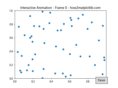
In this example, we add a play/pause button that allows users to control the animation. This type of interactivity can be particularly useful for presentations or when exploring complex datasets.
Animating Scatter Plots with Varying Point Shapes
Another way to add visual interest to your animated scatter plots is by varying the shapes of the data points. This can be used to represent different categories or to highlight specific data points. Here’s an example:
import matplotlib.pyplot as plt
import numpy as np
from matplotlib.animation import FuncAnimation

# Generate sample data
np.random.seed(42)
num_points = 50
x = np.random.rand(num_points)
y = np.random.rand(num_points)
categories = np.random.choice(['A', 'B', 'C'], num_points)

# Create mapping of categories to marker shapes
markers = {'A': 'o', 'B': 's', 'C': '^'}

# Create the figure and axis
fig, ax = plt.subplots()
scatters = {cat: ax.scatter([], [], marker=marker) for cat, marker in markers.items()}

# Animation update function
def update(frame):
    for cat, scatter in scatters.items():
        mask = categories == cat
        new_x = x[mask] + 0.01 * np.cos(frame * 0.1)
        new_y = y[mask] + 0.01 * np.sin(frame * 0.1)
        scatter.set_offsets(np.c_[new_x, new_y])

    ax.set_title(f"Multi-shape Animation - Frame {frame} - how2matplotlib.com")
    return list(scatters.values())

# Create the animation
animation = FuncAnimation(fig, update, frames=200, interval=50, blit=True)

# Add legend
ax.legend(scatters.keys())

plt.show()
Output:
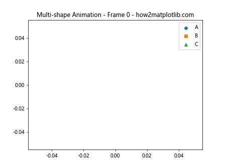
In this example, we create different scatter plot objects for each category,each with a unique marker shape. This allows us to animate different groups of data points independently, making it easier to track and compare different categories within the same animation.
Optimizing Performance for Animated Scatter Plots in Matplotlib
When animating scatter plots in Matplotlib, especially with large datasets, performance can become an issue. This section will explore techniques to optimize your animations for smoother playback and better overall performance.
Using blitting for Faster Animations
Blitting is a technique that can significantly improve the performance of animations in Matplotlib. It works by only redrawing the parts of the plot that have changed, rather than redrawing the entire figure for each frame. Here’s an example of how to implement blitting in your animated scatter plots:
import matplotlib.pyplot as plt
import numpy as np
from matplotlib.animation import FuncAnimation

# Generate sample data
np.random.seed(42)
num_points = 1000
x = np.random.rand(num_points)
y = np.random.rand(num_points)

# Create the figure and axis
fig, ax = plt.subplots()
scatter = ax.scatter(x, y)
ax.set_xlim(0, 1)
ax.set_ylim(0, 1)

# Animation update function
def update(frame):
    new_x = x + 0.01 * np.cos(frame * 0.1)
    new_y = y + 0.01 * np.sin(frame * 0.1)
    scatter.set_offsets(np.c_[new_x, new_y])
    ax.set_title(f"Optimized Animation - Frame {frame} - how2matplotlib.com")
    return scatter,

# Create the animation with blitting
animation = FuncAnimation(fig, update, frames=200, interval=50, blit=True)

plt.show()
Output:
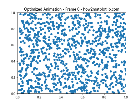
In this example, we set blit=True in the FuncAnimation constructor and ensure that our update function returns the artists that have changed. This allows Matplotlib to optimize the redrawing process, resulting in smoother animations, especially for large datasets.
Using Set Operations for Efficient Updates
When dealing with changing datasets in animated scatter plots, using set operations can be more efficient than recreating the entire scatter plot for each frame. Here’s an example:
import matplotlib.pyplot as plt
import numpy as np
from matplotlib.animation import FuncAnimation

# Generate initial data
np.random.seed(42)
num_points = 100
x = np.random.rand(num_points)
y = np.random.rand(num_points)

# Create the figure and axis
fig, ax = plt.subplots()
scatter = ax.scatter(x, y)
ax.set_xlim(0, 1)
ax.set_ylim(0, 1)

# Animation update function
def update(frame):
    global x, y
    # Remove some points
    mask = np.random.choice([True, False], num_points, p=[0.9, 0.1])
    x = x[mask]
    y = y[mask]

    # Add new points
    new_points = np.random.rand(10, 2)
    x = np.concatenate([x, new_points[:, 0]])
    y = np.concatenate([y, new_points[:, 1]])

    scatter.set_offsets(np.c_[x, y])
    ax.set_title(f"Efficient Update - Frame {frame} - how2matplotlib.com")
    return scatter,

# Create the animation
animation = FuncAnimation(fig, update, frames=100, interval=100, blit=True)

plt.show()
Output:
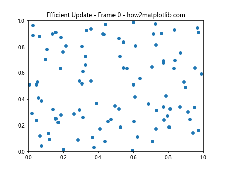
In this example, we efficiently update the scatter plot by removing some existing points and adding new ones, rather than recreating the entire dataset for each frame. This approach can be particularly useful when dealing with dynamic datasets that change over time.
Creating Complex Animated Scatter Plots in Matplotlib
As we continue to explore the possibilities of animating scatter plots in Matplotlib, we can create more complex visualizations that combine multiple techniques. This section will demonstrate how to create advanced animated scatter plots that incorporate various elements and techniques we’ve discussed.
Animated 3D Scatter Plots
Matplotlib also supports 3D scatter plots, which can be animated to create stunning visualizations. Here’s an example of an animated 3D scatter plot:
import matplotlib.pyplot as plt
import numpy as np
from matplotlib.animation import FuncAnimation
from mpl_toolkits.mplot3d import Axes3D

# Generate sample data
np.random.seed(42)
num_points = 100
x = np.random.rand(num_points)
y = np.random.rand(num_points)
z = np.random.rand(num_points)

# Create the figure and 3D axis
fig = plt.figure()
ax = fig.add_subplot(111, projection='3d')
scatter = ax.scatter(x, y, z)

# Animation update function
def update(frame):
    ax.view_init(elev=10., azim=frame)
    ax.set_title(f"3D Animation - Frame {frame} - how2matplotlib.com")
    return scatter,

# Create the animation
animation = FuncAnimation(fig, update, frames=360, interval=50, blit=False)

plt.show()
Output:
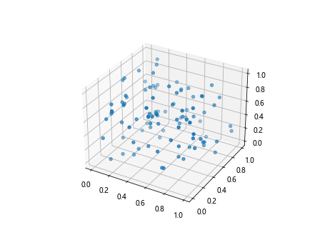
In this example, we create a 3D scatter plot and animate it by rotating the view angle. This technique can be particularly useful for exploring 3D datasets from different perspectives.
Animated Bubble Charts
Bubble charts are a variation of scatter plots where the size of each point represents an additional dimension of data. Here’s an example of an animated bubble chart:
import matplotlib.pyplot as plt
import numpy as np
from matplotlib.animation import FuncAnimation

# Generate sample data
np.random.seed(42)
num_points = 20
x = np.random.rand(num_points)
y = np.random.rand(num_points)
sizes = np.random.randint(20, 1000, num_points)
colors = np.random.rand(num_points)

# Create the figure and axis
fig, ax = plt.subplots()
scatter = ax.scatter(x, y, s=sizes, c=colors, cmap='viridis', alpha=0.6)
ax.set_xlim(0, 1)
ax.set_ylim(0, 1)

# Animation update function
def update(frame):
    new_x = x + 0.01 * np.cos(frame * 0.1)
    new_y = y + 0.01 * np.sin(frame * 0.1)
    new_sizes = sizes + 10 * np.sin(frame * 0.1)
    scatter.set_offsets(np.c_[new_x, new_y])
    scatter.set_sizes(new_sizes)
    ax.set_title(f"Bubble Chart Animation - Frame {frame} - how2matplotlib.com")
    return scatter,

# Create the animation
animation = FuncAnimation(fig, update, frames=200, interval=50, blit=True)

plt.colorbar(scatter)
plt.show()
Output:
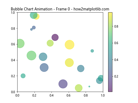
In this example, we create a bubble chart where the size and position of each bubble change over time. This type of visualization can be useful for showing multiple dimensions of data simultaneously.
Best Practices for Animating Scatter Plots in Matplotlib
As we conclude our exploration of animating scatter plots in Matplotlib, it’s important to discuss some best practices to ensure your animations are effective, informative, and visually appealing.
Choosing Appropriate Animation Speed
The speed of your animation can greatly impact its effectiveness. Too fast, and viewers may miss important details; too slow, and they may lose interest. Here’s an example of how to adjust animation speed:
import matplotlib.pyplot as plt
import numpy as np
from matplotlib.animation import FuncAnimation

# Generate sample data
np.random.seed(42)
x = np.random.rand(50)
y = np.random.rand(50)

# Create the figure and axis
fig, ax = plt.subplots()
scatter = ax.scatter(x, y)
ax.set_xlim(0, 1)
ax.set_ylim(0, 1)

# Animation update function
def update(frame):
    new_x = x + 0.01 * np.cos(frame * 0.1)
    new_y = y + 0.01 * np.sin(frame * 0.1)
    scatter.set_offsets(np.c_[new_x, new_y])
    ax.set_title(f"Adjustable Speed - Frame {frame} - how2matplotlib.com")
    return scatter,

# Create the animation with adjustable speed
animation = FuncAnimation(fig, update, frames=200, interval=100, blit=True)

plt.show()
Output:
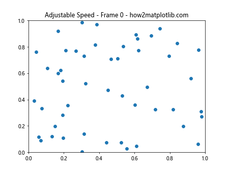
In this example, you can adjust the interval parameter in the FuncAnimation constructor to control the speed of the animation. Experiment with different values to find the right balance for your data and audience.
Adding Context and Labels
To make your animated scatter plots more informative, it’s crucial to add appropriate context and labels. Here’s an example that incorporates various labeling techniques:
import matplotlib.pyplot as plt
import numpy as np
from matplotlib.animation import FuncAnimation

# Generate sample data
np.random.seed(42)
num_points = 50
x = np.random.rand(num_points)
y = np.random.rand(num_points)
categories = np.random.choice(['A', 'B', 'C'], num_points)

# Create the figure and axis
fig, ax = plt.subplots()
scatter = ax.scatter(x, y, c=categories.astype('category').codes, cmap='viridis')
ax.set_xlim(0, 1)
ax.set_ylim(0, 1)

# Add labels and title
ax.set_xlabel('X-axis Label')
ax.set_ylabel('Y-axis Label')
ax.set_title('Animated Scatter Plot - how2matplotlib.com')

# Add legend
legend1 = ax.legend(*scatter.legend_elements(), title="Categories")
ax.add_artist(legend1)

# Animation update function
def update(frame):
    new_x = x + 0.01 * np.cos(frame * 0.1)
    new_y = y + 0.01 * np.sin(frame * 0.1)
    scatter.set_offsets(np.c_[new_x, new_y])
    ax.set_title(f"Labeled Animation - Frame {frame} - how2matplotlib.com")
    return scatter,

# Create the animation
animation = FuncAnimation(fig, update, frames=200, interval=50, blit=False)

plt.tight_layout()
plt.show()
In this example, we add axis labels, a title, and a legend to provide context for the animated scatter plot. These elements help viewers understand the data being presented and make the visualization more informative.
Conclusion
Animating scatter plots in Matplotlib is a powerful technique for visualizing dynamic data and creating engaging presentations. Throughout this article, we’ve explored various methods and techniques for creating animated scatter plots, from basic animations to complex, interactive visualizations.
We’ve covered topics such as:
- Basic animation techniques using FuncAnimation
- Animating color and size changes in scatter plots
- Creating data-driven animations for time series and changing datasets
- Incorporating additional visual elements like text and trails
- Advanced techniques for interactive and 3D animations
- Performance optimization for smooth animations
- Best practices for creating effective and informative animated scatter plots
By mastering these techniques, you can create compelling visualizations that effectively communicate complex information and patterns in your data. Remember to experiment with different approaches and always consider your audience and the story you want to tell with your data.