How to Change the x or y Interval of a Matplotlib Figure
Change the x or y interval of a Matplotlib figure is an essential skill for data visualization enthusiasts and professionals alike. This article will delve deep into the various methods and techniques to effectively change the x or y interval of a Matplotlib figure, providing you with a comprehensive understanding of this crucial aspect of data plotting. We’ll explore different approaches, discuss best practices, and provide numerous examples to help you master the art of customizing your plot intervals.
Understanding the Importance of Changing x or y Intervals
Before we dive into the specifics of how to change the x or y interval of a Matplotlib figure, it’s crucial to understand why this skill is so important. Changing the x or y interval allows you to:
- Focus on specific regions of interest in your data
- Improve the readability of your plots
- Highlight important trends or patterns
- Customize your visualizations to meet specific requirements
By learning how to change the x or y interval of a Matplotlib figure, you’ll gain greater control over your data presentations and be able to create more impactful and informative visualizations.
Basic Concepts: Axes and Limits
To effectively change the x or y interval of a Matplotlib figure, it’s essential to understand the concepts of axes and limits. In Matplotlib, the axes object represents the area where your data is plotted, and the limits define the range of values displayed on each axis.
Let’s start with a simple example to illustrate these concepts:
import matplotlib.pyplot as plt
import numpy as np

x = np.linspace(0, 10, 100)
y = np.sin(x)

plt.figure(figsize=(10, 6))
plt.plot(x, y)
plt.title("How to Change the x or y Interval - how2matplotlib.com")
plt.xlabel("X-axis")
plt.ylabel("Y-axis")
plt.show()
Output:
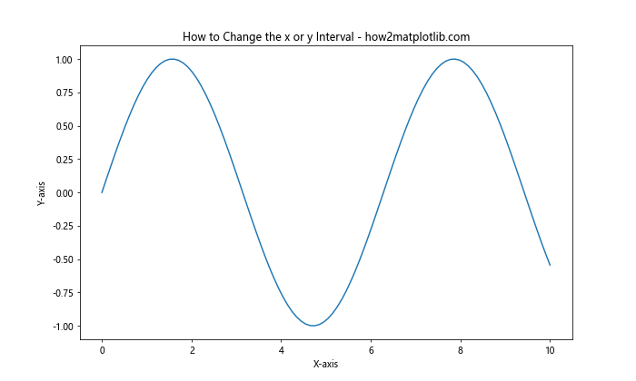
In this example, we’ve created a basic sine wave plot. By default, Matplotlib automatically sets the x and y intervals based on the data. However, you might want to change these intervals to focus on a specific region or improve the overall presentation of your data.
Changing the x Interval Using set_xlim()
One of the most straightforward ways to change the x interval of a Matplotlib figure is by using the set_xlim() method. This method allows you to specify the minimum and maximum values for the x-axis.
Here’s an example of how to change the x interval:
import matplotlib.pyplot as plt
import numpy as np

x = np.linspace(0, 10, 100)
y = np.sin(x)

plt.figure(figsize=(10, 6))
plt.plot(x, y)
plt.title("Change the x Interval - how2matplotlib.com")
plt.xlabel("X-axis")
plt.ylabel("Y-axis")

# Change the x interval
plt.xlim(2, 8)

plt.show()
Output:
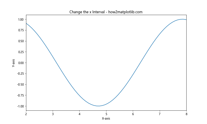
In this example, we’ve used plt.xlim(2, 8) to change the x interval of the Matplotlib figure. This restricts the x-axis to show only the values between 2 and 8, allowing us to focus on a specific portion of the sine wave.
Changing the y Interval Using set_ylim()
Similarly, you can change the y interval of a Matplotlib figure using the set_ylim() method. This method works in the same way as set_xlim(), but for the y-axis.
Let’s modify our previous example to change the y interval:
import matplotlib.pyplot as plt
import numpy as np

x = np.linspace(0, 10, 100)
y = np.sin(x)

plt.figure(figsize=(10, 6))
plt.plot(x, y)
plt.title("Change the y Interval - how2matplotlib.com")
plt.xlabel("X-axis")
plt.ylabel("Y-axis")

# Change the y interval
plt.ylim(-0.5, 0.5)

plt.show()
Output:
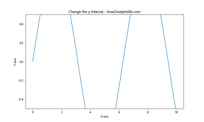
In this example, we’ve used plt.ylim(-0.5, 0.5) to change the y interval of the Matplotlib figure. This restricts the y-axis to show only the values between -0.5 and 0.5, allowing us to zoom in on the central portion of the sine wave.
Changing Both x and y Intervals Simultaneously
Often, you may want to change both the x and y intervals of a Matplotlib figure at the same time. You can do this by calling both set_xlim() and set_ylim() methods in succession.
Here’s an example:
import matplotlib.pyplot as plt
import numpy as np

x = np.linspace(0, 10, 100)
y = np.sin(x)

plt.figure(figsize=(10, 6))
plt.plot(x, y)
plt.title("Change Both x and y Intervals - how2matplotlib.com")
plt.xlabel("X-axis")
plt.ylabel("Y-axis")

# Change both x and y intervals
plt.xlim(2, 8)
plt.ylim(-0.5, 0.5)

plt.show()
Output:

In this example, we’ve changed both the x and y intervals of the Matplotlib figure. This allows us to focus on a specific region of the plot, both horizontally and vertically.
Using axis() to Change x and y Intervals
Another way to change the x or y interval of a Matplotlib figure is by using the axis() method. This method allows you to set both x and y limits in a single function call.
Here’s an example:
import matplotlib.pyplot as plt
import numpy as np

x = np.linspace(0, 10, 100)
y = np.sin(x)

plt.figure(figsize=(10, 6))
plt.plot(x, y)
plt.title("Change Intervals Using axis() - how2matplotlib.com")
plt.xlabel("X-axis")
plt.ylabel("Y-axis")

# Change both x and y intervals using axis()
plt.axis([2, 8, -0.5, 0.5])

plt.show()
Output:
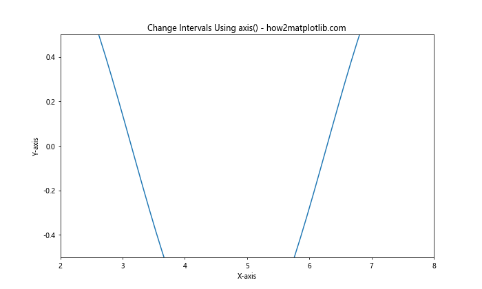
In this example, we’ve used plt.axis([2, 8, -0.5, 0.5]) to change both the x and y intervals of the Matplotlib figure. The first two values (2 and 8) set the x-axis limits, while the last two values (-0.5 and 0.5) set the y-axis limits.
Changing Intervals with Object-Oriented Interface
So far, we’ve been using Matplotlib’s pyplot interface to change the x or y interval of a Matplotlib figure. However, Matplotlib also provides an object-oriented interface that offers more flexibility and control over your plots.
Here’s an example of how to change intervals using the object-oriented interface:
import matplotlib.pyplot as plt
import numpy as np

x = np.linspace(0, 10, 100)
y = np.sin(x)

fig, ax = plt.subplots(figsize=(10, 6))
ax.plot(x, y)
ax.set_title("Object-Oriented Interval Change - how2matplotlib.com")
ax.set_xlabel("X-axis")
ax.set_ylabel("Y-axis")

# Change x and y intervals
ax.set_xlim(2, 8)
ax.set_ylim(-0.5, 0.5)

plt.show()
Output:
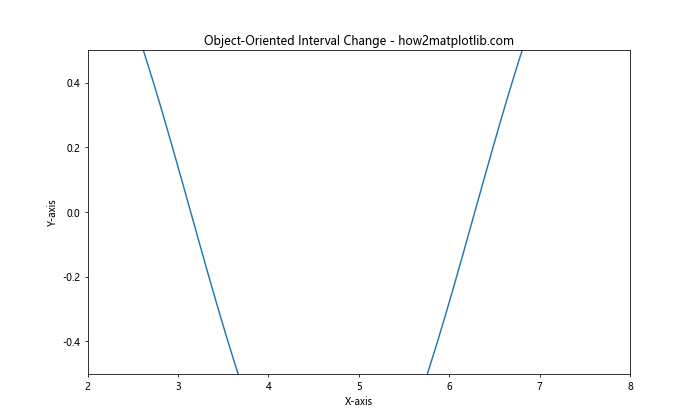
In this example, we’ve used ax.set_xlim() and ax.set_ylim() to change the x and y intervals of the Matplotlib figure. This approach is particularly useful when working with multiple subplots or when you need more fine-grained control over your plot elements.
Changing Intervals Dynamically
Sometimes, you may want to change the x or y interval of a Matplotlib figure dynamically based on your data or user input. Let’s explore how to do this with a simple interactive example:
import matplotlib.pyplot as plt
import numpy as np
from matplotlib.widgets import Slider

x = np.linspace(0, 10, 100)
y = np.sin(x)

fig, ax = plt.subplots(figsize=(10, 6))
line, = ax.plot(x, y)
ax.set_title("Dynamic Interval Change - how2matplotlib.com")
ax.set_xlabel("X-axis")
ax.set_ylabel("Y-axis")

# Add sliders for x and y limits
ax_xmin = plt.axes([0.2, 0.02, 0.6, 0.03])
ax_xmax = plt.axes([0.2, 0.06, 0.6, 0.03])
ax_ymin = plt.axes([0.2, 0.10, 0.6, 0.03])
ax_ymax = plt.axes([0.2, 0.14, 0.6, 0.03])

s_xmin = Slider(ax_xmin, 'X min', 0, 5, valinit=0)
s_xmax = Slider(ax_xmax, 'X max', 5, 10, valinit=10)
s_ymin = Slider(ax_ymin, 'Y min', -1, 0, valinit=-1)
s_ymax = Slider(ax_ymax, 'Y max', 0, 1, valinit=1)

def update(val):
    ax.set_xlim(s_xmin.val, s_xmax.val)
    ax.set_ylim(s_ymin.val, s_ymax.val)
    fig.canvas.draw_idle()

s_xmin.on_changed(update)
s_xmax.on_changed(update)
s_ymin.on_changed(update)
s_ymax.on_changed(update)

plt.show()
Output:
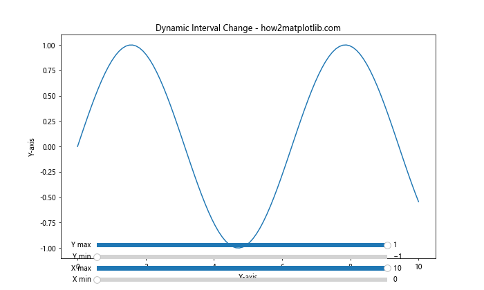
In this example, we’ve created an interactive plot that allows users to dynamically change the x and y intervals using sliders. This demonstrates how you can create more flexible and interactive visualizations by changing the x or y interval of a Matplotlib figure on the fly.
Changing Intervals for Logarithmic Scales
When working with logarithmic scales, changing the x or y interval of a Matplotlib figure requires a slightly different approach. Let’s look at an example of how to change intervals on a logarithmic scale:
import matplotlib.pyplot as plt
import numpy as np

x = np.logspace(0, 5, 100)
y = x**2

fig, ax = plt.subplots(figsize=(10, 6))
ax.loglog(x, y)
ax.set_title("Logarithmic Scale Interval Change - how2matplotlib.com")
ax.set_xlabel("X-axis (log scale)")
ax.set_ylabel("Y-axis (log scale)")

# Change x and y intervals on logarithmic scale
ax.set_xlim(10, 1e4)
ax.set_ylim(1e2, 1e8)

plt.show()
Output:
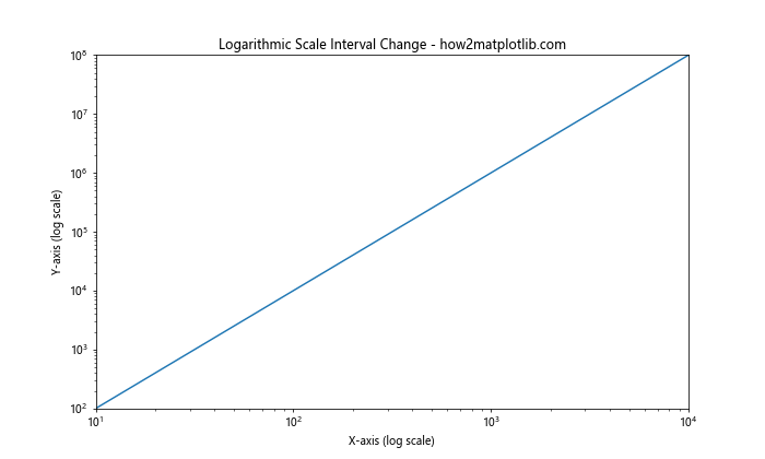
In this example, we’ve used ax.loglog() to create a plot with logarithmic scales on both axes. We then use ax.set_xlim() and ax.set_ylim() to change the x and y intervals. Note that when working with logarithmic scales, you need to specify the limits using the actual values, not the logarithms of those values.
Changing Intervals for Date Axes
When working with time series data, you may need to change the x or y interval of a Matplotlib figure that uses date axes. Here’s an example of how to do this:
import matplotlib.pyplot as plt
import numpy as np
import pandas as pd

dates = pd.date_range(start='2023-01-01', end='2023-12-31', freq='D')
values = np.cumsum(np.random.randn(len(dates)))

fig, ax = plt.subplots(figsize=(12, 6))
ax.plot(dates, values)
ax.set_title("Date Axis Interval Change - how2matplotlib.com")
ax.set_xlabel("Date")
ax.set_ylabel("Value")

# Change x interval for date axis
ax.set_xlim(pd.Timestamp('2023-03-01'), pd.Timestamp('2023-09-30'))

plt.show()
Output:
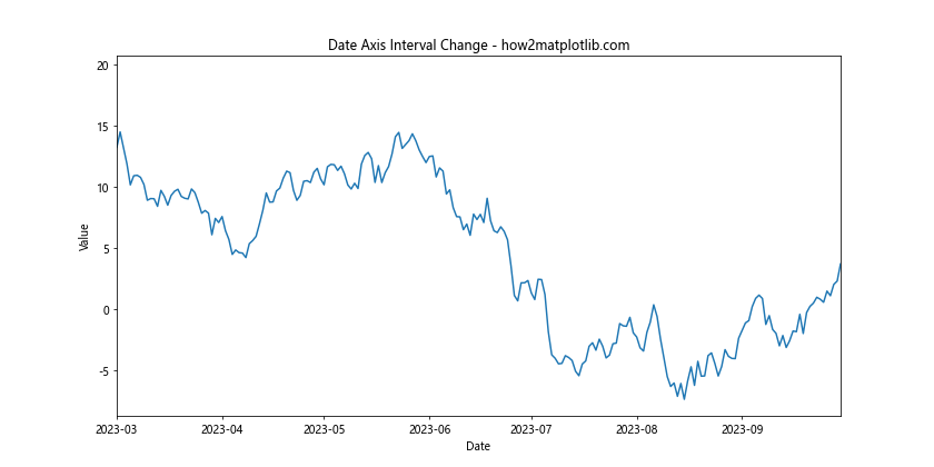
In this example, we’ve created a time series plot and then used ax.set_xlim() to change the x interval. When working with date axes, you need to specify the limits using datetime objects or strings that can be parsed into dates.
Changing Intervals for Polar Plots
Changing the x or y interval of a Matplotlib figure in polar coordinates requires a slightly different approach. Let’s look at an example:
import matplotlib.pyplot as plt
import numpy as np

theta = np.linspace(0, 2*np.pi, 100)
r = np.sin(4*theta)

fig, ax = plt.subplots(figsize=(8, 8), subplot_kw=dict(projection='polar'))
ax.plot(theta, r)
ax.set_title("Polar Plot Interval Change - how2matplotlib.com")

# Change radial limit (equivalent to y-axis in cartesian coordinates)
ax.set_ylim(0, 1.5)

# Change angular limit (equivalent to x-axis in cartesian coordinates)
ax.set_xlim(0, np.pi)

plt.show()
Output:
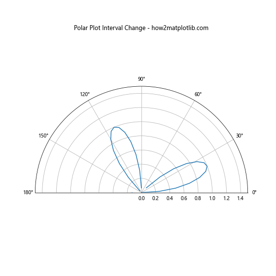
In this example, we’ve created a polar plot and then used ax.set_ylim() to change the radial limit (equivalent to the y-axis in cartesian coordinates) and ax.set_xlim() to change the angular limit (equivalent to the x-axis in cartesian coordinates).
Changing Intervals for 3D Plots
When working with 3D plots, you may need to change the x, y, or z interval of a Matplotlib figure. Here’s an example of how to do this:
import matplotlib.pyplot as plt
import numpy as np

fig = plt.figure(figsize=(10, 8))
ax = fig.add_subplot(111, projection='3d')

x = np.linspace(-5, 5, 100)
y = np.linspace(-5, 5, 100)
X, Y = np.meshgrid(x, y)
Z = np.sin(np.sqrt(X**2 + Y**2))

surf = ax.plot_surface(X, Y, Z, cmap='viridis')
ax.set_title("3D Plot Interval Change - how2matplotlib.com")
ax.set_xlabel("X-axis")
ax.set_ylabel("Y-axis")
ax.set_zlabel("Z-axis")

# Change x, y, and z intervals
ax.set_xlim(-3, 3)
ax.set_ylim(-3, 3)
ax.set_zlim(-0.5, 0.5)

plt.show()
Output:
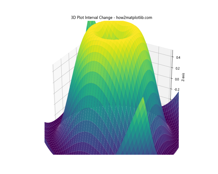
In this example, we’ve created a 3D surface plot and then used ax.set_xlim(), ax.set_ylim(), and ax.set_zlim() to change the x, y, and z intervals respectively.
Changing Intervals with Different Units
Sometimes, you may need to change the x or y interval of a Matplotlib figure using different units than those of your data. Matplotlib provides the ticker module to help with this. Here’s an example:
import matplotlib.pyplot as plt
import numpy as np
from matplotlib import ticker

x = np.linspace(0, 10, 100)
y = np.sin(x)

fig, ax = plt.subplots(figsize=(10, 6))
ax.plot(x, y)
ax.set_title("Interval Change with Different Units - how2matplotlib.com")
ax.set_xlabel("X-axis (radians)")
ax.set_ylabel("Y-axis")

# Change x interval and display in degrees
ax.set_xlim(0, np.pi)
ax.xaxis.set_major_locator(ticker.MultipleLocator(np.pi/4))
ax.xaxis.set_major_formatter(ticker.FuncFormatter(lambda x, p: f"{x*180/np.pi:.0f}°"))

plt.show()
Output:
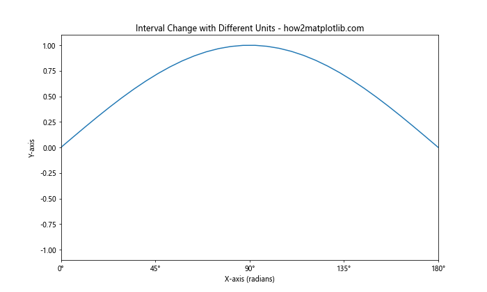
In this example, we’ve changed the x interval to show values from 0 to π radians, but we’ve formatted the x-axis labels to displaythe values in degrees. This demonstrates how you can change the x or y interval of a Matplotlib figure while also modifying the axis labels to use different units.
Changing Intervals with Twin Axes
When working with plots that have twin axes (i.e., two y-axes), you may need to change the intervals for both axes independently. Here’s an example of how to do this:
import matplotlib.pyplot as plt
import numpy as np

x = np.linspace(0, 10, 100)
y1 = np.sin(x)
y2 = np.exp(x/10)

fig, ax1 = plt.subplots(figsize=(10, 6))
ax1.set_title("Twin Axes Interval Change - how2matplotlib.com")
ax1.set_xlabel("X-axis")
ax1.set_ylabel("Y1-axis (sin)")
ax1.plot(x, y1, color='blue')

ax2 = ax1.twinx()
ax2.set_ylabel("Y2-axis (exp)")
ax2.plot(x, y2, color='red')

# Change intervals for both axes
ax1.set_xlim(2, 8)
ax1.set_ylim(-1, 1)
ax2.set_ylim(1, 3)

plt.show()
Output:
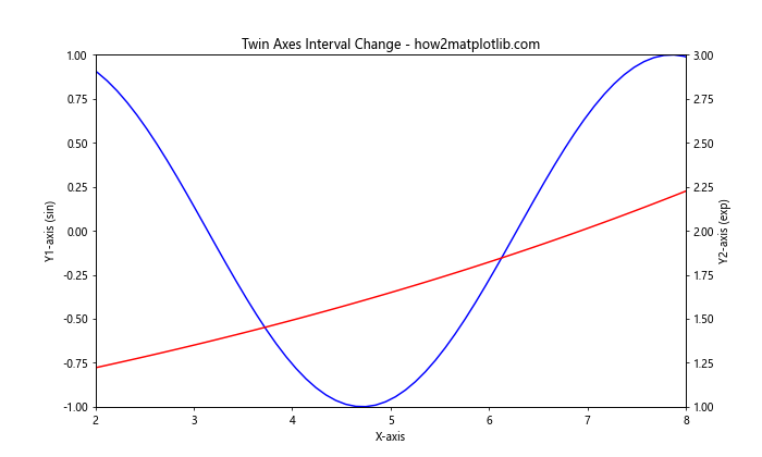
In this example, we’ve created a plot with twin y-axes and then used ax1.set_xlim(), ax1.set_ylim(), and ax2.set_ylim() to change the intervals for the x-axis and both y-axes independently.
Changing Intervals for Subplots
When working with multiple subplots, you may want to change the x or y interval of a Matplotlib figure for each subplot individually. Here’s an example:
import matplotlib.pyplot as plt
import numpy as np

x = np.linspace(0, 10, 100)
y1 = np.sin(x)
y2 = np.cos(x)
y3 = np.tan(x)

fig, (ax1, ax2, ax3) = plt.subplots(3, 1, figsize=(10, 12))
fig.suptitle("Subplots Interval Change - how2matplotlib.com")

ax1.plot(x, y1)
ax1.set_ylabel("sin(x)")
ax1.set_xlim(0, 5)
ax1.set_ylim(-1, 1)

ax2.plot(x, y2)
ax2.set_ylabel("cos(x)")
ax2.set_xlim(2, 7)
ax2.set_ylim(-1, 1)

ax3.plot(x, y3)
ax3.set_xlabel("X-axis")
ax3.set_ylabel("tan(x)")
ax3.set_xlim(4, 9)
ax3.set_ylim(-5, 5)

plt.tight_layout()
plt.show()
Output:
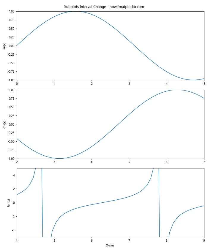
In this example, we’ve created three subplots and used set_xlim() and set_ylim() to change the x and y intervals for each subplot independently.
Changing Intervals with Aspect Ratio Preservation
Sometimes, you may want to change the x or y interval of a Matplotlib figure while preserving the aspect ratio of your plot. This can be particularly important for certain types of visualizations. Here’s an example of how to do this:
import matplotlib.pyplot as plt
import numpy as np

x = np.linspace(0, 10, 100)
y = np.sin(x)

fig, ax = plt.subplots(figsize=(10, 6))
ax.plot(x, y)
ax.set_title("Interval Change with Aspect Ratio Preservation - how2matplotlib.com")
ax.set_xlabel("X-axis")
ax.set_ylabel("Y-axis")

# Change intervals while preserving aspect ratio
ax.set_xlim(2, 8)
ax.set_ylim(-0.5, 0.5)
ax.set_aspect('equal')

plt.show()
Output:
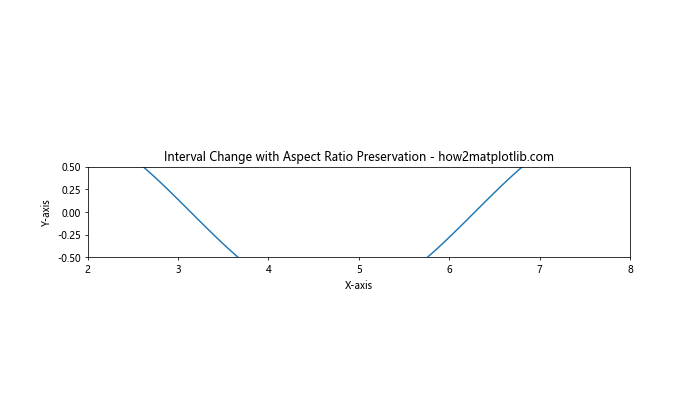
In this example, we’ve used ax.set_aspect('equal') to preserve the aspect ratio of the plot after changing the x and y intervals. This ensures that the visual representation of the data remains proportional.
Changing Intervals with Automatic Adjustment
In some cases, you might want to change the x or y interval of a Matplotlib figure automatically based on your data. Matplotlib provides methods to help with this. Here’s an example:
import matplotlib.pyplot as plt
import numpy as np

x = np.linspace(0, 10, 100)
y = np.sin(x)

fig, ax = plt.subplots(figsize=(10, 6))
ax.plot(x, y)
ax.set_title("Automatic Interval Adjustment - how2matplotlib.com")
ax.set_xlabel("X-axis")
ax.set_ylabel("Y-axis")

# Automatically adjust y-axis to show all data
ax.autoscale(axis='y')

# Manually set x-axis limits
ax.set_xlim(2, 8)

plt.show()
Output:
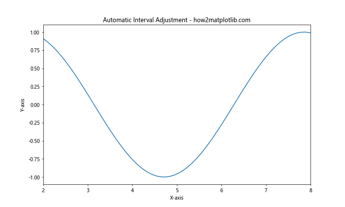
In this example, we’ve used ax.autoscale(axis='y') to automatically adjust the y-axis limits to show all the data, while manually setting the x-axis limits using ax.set_xlim().
Changing Intervals with Margin
When changing the x or y interval of a Matplotlib figure, you might want to add some margin around your data. This can improve the visual appearance of your plot. Here’s how to do it:
import matplotlib.pyplot as plt
import numpy as np

x = np.linspace(0, 10, 100)
y = np.sin(x)

fig, ax = plt.subplots(figsize=(10, 6))
ax.plot(x, y)
ax.set_title("Interval Change with Margin - how2matplotlib.com")
ax.set_xlabel("X-axis")
ax.set_ylabel("Y-axis")

# Change intervals with margin
ax.set_xlim(2, 8)
ax.set_ylim(-1, 1)
ax.margins(x=0.1, y=0.1)

plt.show()
Output:
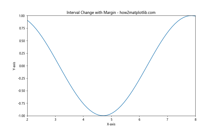
In this example, we’ve used ax.margins(x=0.1, y=0.1) to add a 10% margin around the data on both the x and y axes. This can help prevent data points from being plotted too close to the edges of the plot.
Changing Intervals for Categorical Data
When working with categorical data, changing the x or y interval of a Matplotlib figure requires a slightly different approach. Here’s an example:
import matplotlib.pyplot as plt
import numpy as np

categories = ['A', 'B', 'C', 'D', 'E', 'F', 'G', 'H', 'I', 'J']
values = np.random.rand(10)

fig, ax = plt.subplots(figsize=(10, 6))
ax.bar(categories, values)
ax.set_title("Categorical Data Interval Change - how2matplotlib.com")
ax.set_xlabel("Categories")
ax.set_ylabel("Values")

# Change x interval for categorical data
ax.set_xlim(-0.5, 5.5)

# Change y interval
ax.set_ylim(0, 1)

plt.show()
Output:
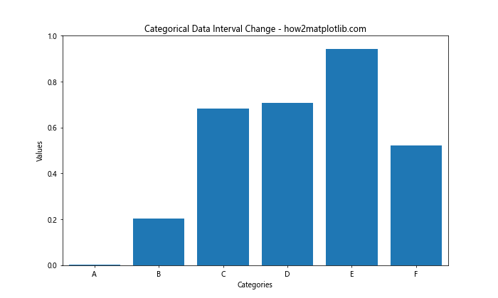
In this example, we’ve created a bar plot with categorical data on the x-axis. To change the x interval, we use ax.set_xlim() with numerical values that correspond to the positions of the categories. The y interval can be changed as usual with ax.set_ylim().
Conclusion
Changing the x or y interval of a Matplotlib figure is a powerful technique that allows you to customize your plots and focus on specific aspects of your data. Throughout this article, we’ve explored various methods to change intervals, including:
- Using
set_xlim()andset_ylim() - Employing the
axis()method - Working with the object-oriented interface
- Changing intervals dynamically
- Adjusting intervals for different types of plots (logarithmic, date axes, polar plots, 3D plots)
- Changing intervals with different units
- Working with twin axes and subplots
- Preserving aspect ratios and adding margins
- Handling categorical data
By mastering these techniques, you’ll be able to create more effective and informative visualizations that highlight the most important aspects of your data. Remember to experiment with different interval settings to find the best representation for your specific dataset and visualization goals.