How to Change the Line Opacity in Matplotlib
Change the line opacity in Matplotlib is an essential skill for creating visually appealing and informative plots. Matplotlib offers various ways to adjust the transparency of lines, allowing you to create more sophisticated and layered visualizations. In this comprehensive guide, we’ll explore different methods to change the line opacity in Matplotlib, providing detailed explanations and easy-to-understand examples along the way.
Understanding Line Opacity in Matplotlib
Before we dive into the specifics of how to change the line opacity in Matplotlib, it’s important to understand what opacity means in the context of data visualization. Opacity, also known as alpha, refers to the transparency of an element in a plot. When you change the line opacity in Matplotlib, you’re adjusting how see-through the line appears.
The opacity value ranges from 0 to 1, where:
- 0 means completely transparent (invisible)
- 1 means completely opaque (solid)
Any value between 0 and 1 will result in a semi-transparent line. This feature is particularly useful when you need to change the line opacity in Matplotlib to show overlapping data or to emphasize certain aspects of your plot.
Let’s start with a basic example of how to change the line opacity in Matplotlib:
import matplotlib.pyplot as plt
import numpy as np

x = np.linspace(0, 10, 100)
y = np.sin(x)

plt.figure(figsize=(8, 6))
plt.plot(x, y, label='how2matplotlib.com', alpha=0.5)
plt.title('Change the Line Opacity in Matplotlib')
plt.xlabel('X-axis')
plt.ylabel('Y-axis')
plt.legend()
plt.show()
Output:
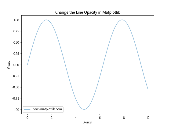
In this example, we’ve set the alpha parameter to 0.5 when calling the plot function. This changes the line opacity in Matplotlib to 50%, making the line semi-transparent. The alpha parameter is a simple and effective way to change the line opacity in Matplotlib for the entire line at once.
Methods to Change the Line Opacity in Matplotlib
Now that we understand the basics, let’s explore different methods to change the line opacity in Matplotlib. We’ll cover various techniques and scenarios where adjusting line opacity can enhance your visualizations.
1. Using the alpha parameter in plot()
The most straightforward way to change the line opacity in Matplotlib is by using the alpha parameter in the plot() function. This method applies a uniform opacity to the entire line.
import matplotlib.pyplot as plt
import numpy as np

x = np.linspace(0, 10, 100)
y1 = np.sin(x)
y2 = np.cos(x)

plt.figure(figsize=(8, 6))
plt.plot(x, y1, label='Sine - how2matplotlib.com', alpha=0.7)
plt.plot(x, y2, label='Cosine - how2matplotlib.com', alpha=0.3)
plt.title('Change the Line Opacity in Matplotlib')
plt.xlabel('X-axis')
plt.ylabel('Y-axis')
plt.legend()
plt.show()
Output:
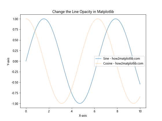
In this example, we’ve plotted two lines with different opacity levels. The sine curve has an opacity of 0.7, while the cosine curve has an opacity of 0.3. This technique is useful when you want to change the line opacity in Matplotlib for multiple lines to show their relative importance or to prevent overlapping lines from obscuring each other.
2. Changing opacity for line collections
When working with line collections in Matplotlib, you can change the line opacity using the set_alpha() method. This is particularly useful when you have multiple lines created as a single collection.
import matplotlib.pyplot as plt
import numpy as np

x = np.linspace(0, 10, 100)
y = np.random.rand(5, 100)

plt.figure(figsize=(8, 6))
lines = plt.plot(x, y.T)
plt.title('Change the Line Opacity in Matplotlib for Line Collections')
plt.xlabel('X-axis')
plt.ylabel('Y-axis')

for line in lines:
    line.set_alpha(0.4)
    line.set_label(f'Line - how2matplotlib.com')

plt.legend()
plt.show()
Output:
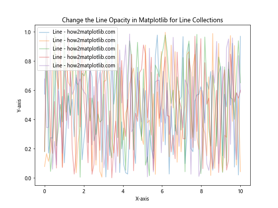
In this example, we’ve created multiple lines using a single plot() call. We then iterate through the resulting line collection and use set_alpha() to change the line opacity in Matplotlib for each line individually.
3. Gradient opacity along a line
Sometimes, you might want to change the line opacity in Matplotlib gradually along the length of the line. This can be achieved using a LineCollection with a color map.
import matplotlib.pyplot as plt
import numpy as np
from matplotlib.collections import LineCollection

x = np.linspace(0, 10, 100)
y = np.sin(x)

points = np.array([x, y]).T.reshape(-1, 1, 2)
segments = np.concatenate([points[:-1], points[1:]], axis=1)

fig, ax = plt.subplots(figsize=(8, 6))
norm = plt.Normalize(0, 1)
lc = LineCollection(segments, cmap='viridis', norm=norm)
lc.set_array(np.linspace(0, 1, len(y)))
lc.set_linewidth(2)

line = ax.add_collection(lc)
fig.colorbar(line, ax=ax)

ax.set_xlim(x.min(), x.max())
ax.set_ylim(-1.1, 1.1)
ax.set_title('Change the Line Opacity in Matplotlib with Gradient')
ax.set_xlabel('X-axis')
ax.set_ylabel('Y-axis')
ax.text(5, -0.5, 'how2matplotlib.com', ha='center')

plt.show()
Output:
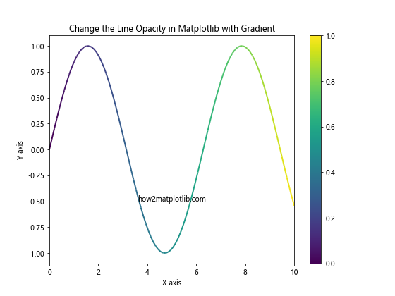
This example demonstrates how to change the line opacity in Matplotlib gradually along the line. We use a LineCollection with a color map to create a gradient effect. The opacity changes from fully transparent at the start of the line to fully opaque at the end.
4. Changing opacity for filled areas
When working with filled areas in Matplotlib, you can change the line opacity and fill opacity separately. This is useful for creating semi-transparent filled areas with distinct outlines.
import matplotlib.pyplot as plt
import numpy as np

x = np.linspace(0, 10, 100)
y1 = np.sin(x)
y2 = np.cos(x)

plt.figure(figsize=(8, 6))
plt.fill_between(x, y1, y2, alpha=0.3, label='Filled area - how2matplotlib.com')
plt.plot(x, y1, color='red', alpha=0.8, label='Upper line - how2matplotlib.com')
plt.plot(x, y2, color='blue', alpha=0.8, label='Lower line - how2matplotlib.com')

plt.title('Change the Line Opacity in Matplotlib for Filled Areas')
plt.xlabel('X-axis')
plt.ylabel('Y-axis')
plt.legend()
plt.show()
Output:
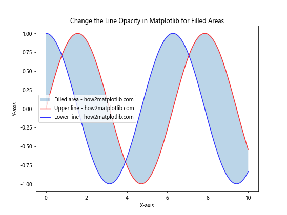
In this example, we’ve used fill_between() to create a filled area between two curves. We’ve set the fill opacity to 0.3 using the alpha parameter. The boundary lines are plotted separately with a higher opacity of 0.8 to make them more visible.
5. Changing opacity for scatter plots
When creating scatter plots, you can change the line opacity in Matplotlib for the marker edges and the marker fill separately.
import matplotlib.pyplot as plt
import numpy as np

x = np.random.rand(50)
y = np.random.rand(50)
sizes = np.random.rand(50) * 1000

plt.figure(figsize=(8, 6))
plt.scatter(x, y, s=sizes, alpha=0.5,
            edgecolors='black', linewidths=2,
            facecolors='blue', label='how2matplotlib.com')

plt.title('Change the Line Opacity in Matplotlib for Scatter Plots')
plt.xlabel('X-axis')
plt.ylabel('Y-axis')
plt.legend()
plt.show()
Output:
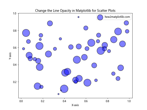
In this scatter plot example, we’ve set the overall opacity of the markers to 0.5 using the alpha parameter. The edge color (black) is fully opaque, while the face color (blue) is affected by the alpha value. This technique allows you to change the line opacity in Matplotlib for the marker edges while also adjusting the fill opacity.
6. Changing opacity for bar plots
Bar plots in Matplotlib also allow you to change the line opacity separately for the bar edges and fills.
import matplotlib.pyplot as plt
import numpy as np

categories = ['A', 'B', 'C', 'D', 'E']
values = np.random.rand(5) * 100

plt.figure(figsize=(8, 6))
bars = plt.bar(categories, values, alpha=0.7,
               edgecolor='black', linewidth=2,
               label='how2matplotlib.com')

for bar in bars:
    bar.set_edgecolor(plt.cm.viridis(bar.get_height() / 100))

plt.title('Change the Line Opacity in Matplotlib for Bar Plots')
plt.xlabel('Categories')
plt.ylabel('Values')
plt.legend()
plt.show()
Output:
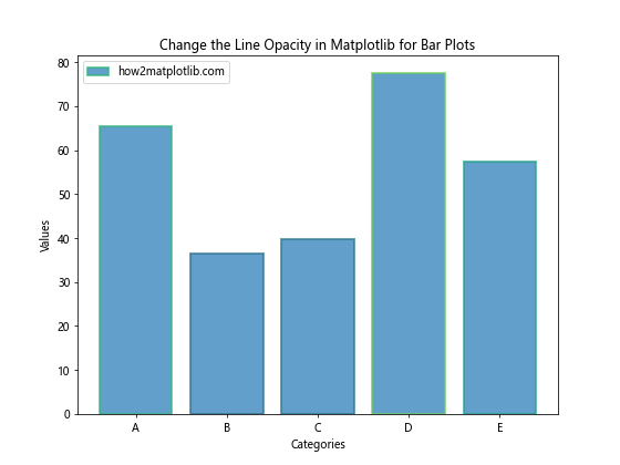
In this bar plot example, we’ve set the fill opacity of the bars to 0.7 using the alpha parameter. The edge color is initially set to black with full opacity. We then iterate through the bars and change the edge color based on the bar height, creating a colorful effect while maintaining the ability to change the line opacity in Matplotlib for the bar edges.
7. Changing opacity for contour plots
Contour plots in Matplotlib allow you to change the line opacity for the contour lines and filled regions separately.
import matplotlib.pyplot as plt
import numpy as np

x = np.linspace(-3, 3, 100)
y = np.linspace(-3, 3, 100)
X, Y = np.meshgrid(x, y)
Z = np.sin(X) * np.cos(Y)

plt.figure(figsize=(8, 6))
cs = plt.contourf(X, Y, Z, levels=20, alpha=0.7, cmap='viridis')
cl = plt.contour(X, Y, Z, levels=20, colors='black', alpha=0.5, linewidths=0.5)

plt.title('Change the Line Opacity in Matplotlib for Contour Plots')
plt.xlabel('X-axis')
plt.ylabel('Y-axis')
plt.colorbar(cs, label='Z values')
plt.text(0, -2.5, 'how2matplotlib.com', ha='center')
plt.show()
Output:
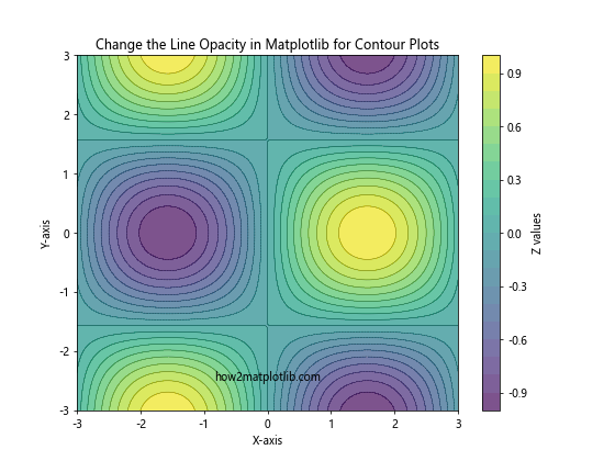
In this contour plot example, we’ve used contourf() to create filled contours with an opacity of 0.7. We then overlay contour lines using contour() with an opacity of 0.5. This technique allows you to change the line opacity in Matplotlib for both the filled regions and the contour lines independently.
8. Changing opacity for 3D plots
When working with 3D plots in Matplotlib, you can change the line opacity for various elements of the plot.
import matplotlib.pyplot as plt
import numpy as np

fig = plt.figure(figsize=(10, 8))
ax = fig.add_subplot(111, projection='3d')

x = np.linspace(-5, 5, 100)
y = np.linspace(-5, 5, 100)
X, Y = np.meshgrid(x, y)
Z = np.sin(np.sqrt(X**2 + Y**2))

surf = ax.plot_surface(X, Y, Z, cmap='viridis', alpha=0.7)
wireframe = ax.plot_wireframe(X, Y, Z, color='black', alpha=0.1)

ax.set_title('Change the Line Opacity in Matplotlib for 3D Plots')
ax.set_xlabel('X-axis')
ax.set_ylabel('Y-axis')
ax.set_zlabel('Z-axis')
fig.colorbar(surf, shrink=0.5, aspect=5, label='Z values')
ax.text(0, 0, -1, 'how2matplotlib.com', ha='center')

plt.show()
Output:
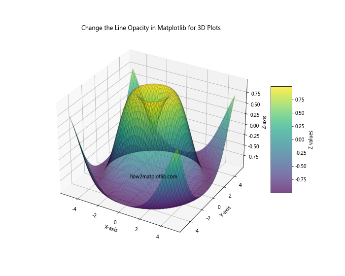
In this 3D plot example, we’ve created a surface plot with an opacity of 0.7 using plot_surface(). We then overlay a wireframe plot with a lower opacity of 0.1 using plot_wireframe(). This combination allows you to change the line opacity in Matplotlib for different components of the 3D visualization.
9. Changing opacity for error bars
Error bars in Matplotlib can have their opacity adjusted to create more visually appealing plots, especially when dealing with overlapping data points.
import matplotlib.pyplot as plt
import numpy as np

x = np.linspace(0, 10, 10)
y = np.sin(x) + np.random.normal(0, 0.1, 10)
yerr = np.random.uniform(0.05, 0.2, 10)

plt.figure(figsize=(8, 6))
plt.errorbar(x, y, yerr=yerr, fmt='o', capsize=5,
             alpha=0.7, ecolor='red', label='Data - how2matplotlib.com')
plt.plot(x, np.sin(x), 'b--', alpha=0.5, label='True sine - how2matplotlib.com')

plt.title('Change the Line Opacity in Matplotlib for Error Bars')
plt.xlabel('X-axis')
plt.ylabel('Y-axis')
plt.legend()
plt.show()
Output:
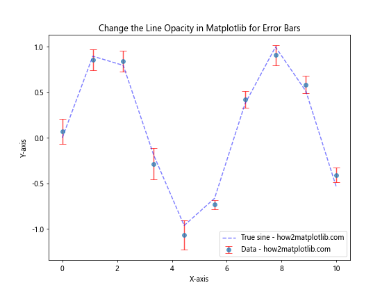
In this error bar example, we’ve set the opacity of the error bars and data points to 0.7 using the alpha parameter in errorbar(). We’ve also plotted the true sine curve with a lower opacity of 0.5 for comparison. This technique allows you to change the line opacity in Matplotlib for both the error bars and the reference line.
10. Changing opacity for histograms
When creating histograms in Matplotlib, you can change the line opacity for the bar edges and fills separately, similar to regular bar plots.
import matplotlib.pyplot as plt
import numpy as np

data1 = np.random.normal(0, 1, 1000)
data2 = np.random.normal(1, 1, 1000)

plt.figure(figsize=(8, 6))
plt.hist(data1, bins=30, alpha=0.5, edgecolor='black', linewidth=1.2, label='Data 1 - how2matplotlib.com')
plt.hist(data2, bins=30, alpha=0.5, edgecolor='red', linewidth=1.2, label='Data 2 - how2matplotlib.com')

plt.title('Change the Line Opacity in Matplotlib for Histograms')
plt.xlabel('Values')
plt.ylabel('Frequency')
plt.legend()
plt.show()
Output:
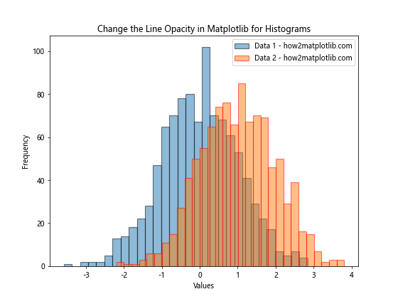
In this histogram example, we’ve plotted two overlapping datasets with an opacity of 0.5 for the fills. The edge colors are set to be fully opaque, allowing you to clearly distinguish between the two distributions. This method demonstrates how to change the line opacity in Matplotlib for histogram edges while also adjusting the fill opacity.
Advanced Techniques to Change the Line Opacity in Matplotlib
Now that we’ve covered the basics, let’s explore some more advanced techniques to change the line opacity in Matplotlib. These methods can help you create even more sophisticated and informative visualizations.
11. Animating opacity changes
You can create animations that change the line opacity in Matplotlib over time, adding a dynamic element to your visualizations.
import matplotlib.pyplot as plt
import numpy as np
from matplotlib.animation import FuncAnimation

fig, ax = plt.subplots(figsize=(8, 6))
x = np.linspace(0, 2 * np.pi, 100)
line, = ax.plot(x, np.sin(x), label='how2matplotlib.com')

def update(frame):
    line.set_alpha(np.abs(np.sin(frame / 10)))
    return line,

ani = FuncAnimation(fig, update, frames=100, interval=50, blit=True)

ax.set_title('Animating Line Opacity Changes in Matplotlib')
ax.set_xlabel('X-axis')
ax.set_ylabel('Y-axis')
ax.legend()

plt.show()
Output:
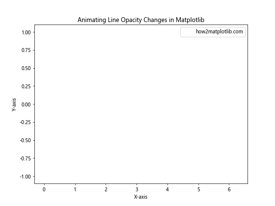
This animation example demonstrates how to change the line opacity in Matplotlib dynamically over time. The opacity of the sine wave oscillates between fully transparent and fully opaque, creating an eye-catching effect.
12. Using custom colormaps for opacity
You can create custom colormaps to change the line opacity in Matplotlib in more complex ways, allowing for greater control over your visualizations.
import matplotlib.pyplot as plt
import numpy as np
from matplotlib.colors import LinearSegmentedColormap

x = np.linspace(0, 10, 100)
y = np.sin(x)

colors = ['red', 'green', 'blue']
n_bins = 100
cmap = LinearSegmentedColormap.from_list('custom_cmap', colors, N=n_bins)

plt.figure(figsize=(8, 6))
for i in range(n_bins):
    alpha = i / n_bins
    plt.plot(x, y + i/10, color=cmap(i/n_bins), alpha=alpha, label=f'Line {i}' if i % 10 == 0 else "")

plt.title('Change the Line Opacity in Matplotlib with Custom Colormaps')
plt.xlabel('X-axis')
plt.ylabel('Y-axis')
plt.legend(loc='upper left', bbox_to_anchor=(1, 1))
plt.text(5, 5, 'how2matplotlib.com', ha='center')
plt.tight_layout()
plt.show()
Output:
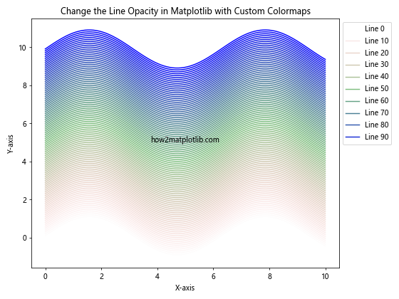
In this example, we’ve created a custom colormap that transitions from red to green to blue. We then use this colormap to change the line opacity in Matplotlib gradually for multiple sine waves, creating a rainbow effect with varying levels of transparency.
13. Changing opacity for polar plots
Polar plots in Matplotlib also support opacity changes, allowing you to create interesting radial visualizations.
import matplotlib.pyplot as plt
import numpy as np

theta = np.linspace(0, 2*np.pi, 100)
r = np.abs(np.sin(2*theta) * np.cos(2*theta))

fig, ax = plt.subplots(figsize=(8, 8), subplot_kw=dict(projection='polar'))
ax.plot(theta, r, alpha=0.7, linewidth=2, label='how2matplotlib.com')
ax.fill(theta, r, alpha=0.3)

ax.set_title('Change the Line Opacity in Matplotlib for Polar Plots')
ax.legend()
plt.show()
Output:
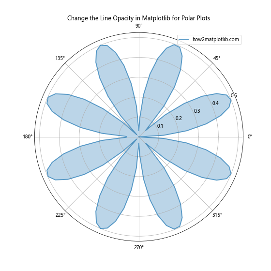
This polar plot example demonstrates how to change the line opacity in Matplotlib for both the line itself and the filled area beneath it. The line has an opacity of 0.7, while the filled area has a lower opacity of 0.3, creating a layered effect.
14. Changing opacity for multiple subplots
When working with multiple subplots, you can change the line opacity in Matplotlib independently for each subplot.
import matplotlib.pyplot as plt
import numpy as np

x = np.linspace(0, 10, 100)
y1 = np.sin(x)
y2 = np.cos(x)
y3 = np.tan(x)

fig, (ax1, ax2, ax3) = plt.subplots(1, 3, figsize=(15, 5))

ax1.plot(x, y1, alpha=0.3, label='Sine - how2matplotlib.com')
ax1.set_title('Low Opacity')
ax1.legend()

ax2.plot(x, y2, alpha=0.6, label='Cosine - how2matplotlib.com')
ax2.set_title('Medium Opacity')
ax2.legend()

ax3.plot(x, y3, alpha=0.9, label='Tangent - how2matplotlib.com')
ax3.set_title('High Opacity')
ax3.legend()

plt.tight_layout()
plt.show()
Output:
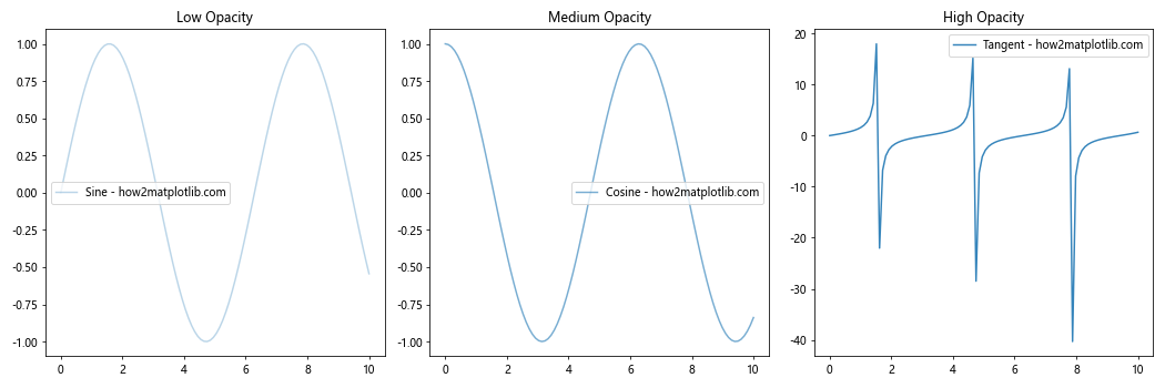
This example shows how to change the line opacity in Matplotlib for multiple subplots. Each subplot displays a different trigonometric function with a different opacity level, demonstrating the visual impact of varying transparency.
Best Practices for Changing Line Opacity in Matplotlib
When working to change the line opacity in Matplotlib, it’s important to keep some best practices in mind:
- Use opacity purposefully: Change the line opacity in Matplotlib to enhance your visualization, not to obscure important information.
Consider color interactions: Remember that overlapping transparent colors can create new colors, which may affect the interpretation of your data.
Balance opacity levels: When using multiple transparent elements, ensure that the overall plot remains clear and readable.
Test different opacity values: Experiment with various opacity levels to find the best balance for your specific data and visualization goals.
Be consistent: If you’re using opacity to represent a specific variable or concept, maintain consistency throughout your visualization or set of visualizations.
Consider accessibility: Ensure that your use of opacity doesn’t make the visualization difficult to interpret for people with visual impairments.
Combine with other techniques: Use opacity in conjunction with other visualization techniques like color, size, and shape to create more informative plots.
Troubleshooting Common Issues When Changing Line Opacity in Matplotlib
When you change the line opacity in Matplotlib, you might encounter some common issues. Here are some problems and their solutions: