How to Change Plot Size in Matplotlib
Change plot size in Matplotlib is an essential skill for data visualization enthusiasts and professionals alike. Matplotlib, a powerful plotting library in Python, offers various methods to adjust the size of your plots. In this comprehensive guide, we’ll explore different techniques to change plot size in Matplotlib, providing you with the knowledge to create visually appealing and properly sized plots for your data visualization needs.
Understanding the Importance of Plot Size in Matplotlib
Before we dive into the specifics of how to change plot size in Matplotlib, it’s crucial to understand why plot size matters. The size of your plot can significantly impact the overall presentation and readability of your data visualization. A well-sized plot ensures that all elements are visible and properly scaled, making it easier for your audience to interpret the information presented.
When you change plot size in Matplotlib, you’re essentially adjusting the canvas on which your plot is drawn. This can affect various aspects of your visualization, including:
- Readability of labels and annotations
- Proportions of plot elements
- Overall impact and visual appeal
- Suitability for different display mediums (e.g., screen, print, presentations)
Now that we understand the importance of plot size, let’s explore the different methods to change plot size in Matplotlib.
Basic Methods to Change Plot Size in Matplotlib
Using figsize Parameter
One of the most straightforward ways to change plot size in Matplotlib is by using the figsize parameter when creating a new figure. This parameter allows you to specify the width and height of the figure in inches.
Here’s a simple example to demonstrate how to change plot size in Matplotlib using the figsize parameter:
import matplotlib.pyplot as plt

# Create a figure with a custom size
plt.figure(figsize=(10, 6))

# Plot some data
x = [1, 2, 3, 4, 5]
y = [2, 4, 6, 8, 10]
plt.plot(x, y)

# Add labels and title
plt.xlabel('X-axis (how2matplotlib.com)')
plt.ylabel('Y-axis (how2matplotlib.com)')
plt.title('Change Plot Size in Matplotlib')

# Display the plot
plt.show()
Output:
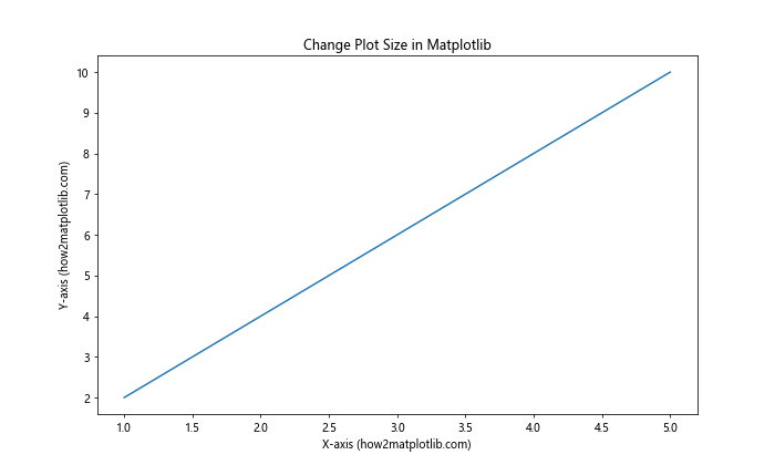
In this example, we use plt.figure(figsize=(10, 6)) to create a figure with a width of 10 inches and a height of 6 inches. This is a simple yet effective way to change plot size in Matplotlib.
Using set_size_inches() Method
Another method to change plot size in Matplotlib is by using the set_size_inches() method. This method allows you to adjust the size of an existing figure.
Here’s an example of how to use set_size_inches() to change plot size in Matplotlib:
import matplotlib.pyplot as plt

# Create a default figure
fig = plt.figure()

# Change the size of the figure
fig.set_size_inches(12, 8)

# Plot some data
x = [1, 2, 3, 4, 5]
y = [2, 4, 6, 8, 10]
plt.plot(x, y)

# Add labels and title
plt.xlabel('X-axis (how2matplotlib.com)')
plt.ylabel('Y-axis (how2matplotlib.com)')
plt.title('Change Plot Size in Matplotlib using set_size_inches()')

# Display the plot
plt.show()
Output:
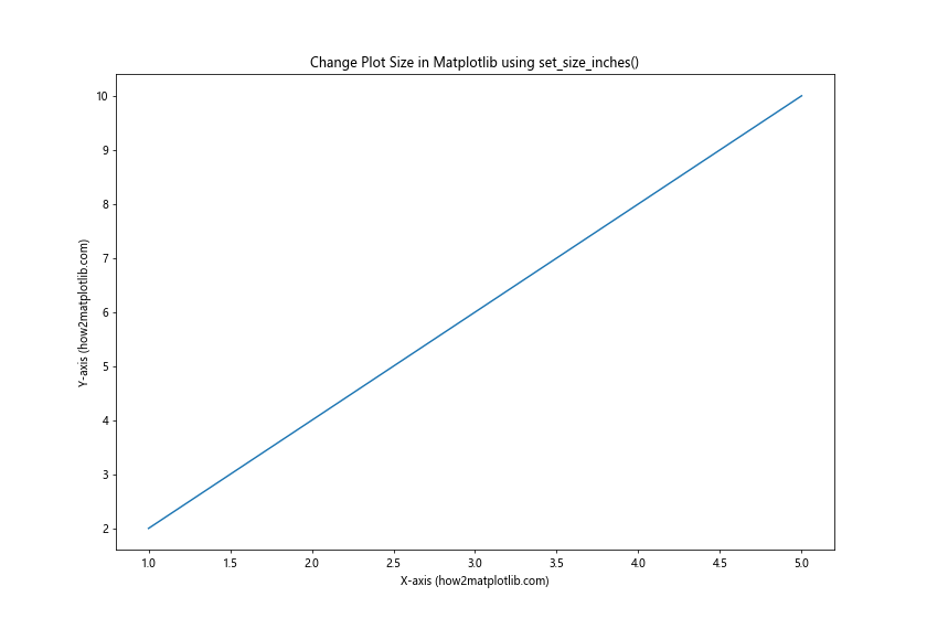
In this example, we first create a default figure using plt.figure(). Then, we use fig.set_size_inches(12, 8) to change the size of the figure to 12 inches wide and 8 inches tall.
Advanced Techniques to Change Plot Size in Matplotlib
Using subplots() Function
The subplots() function in Matplotlib allows you to create a figure and a set of subplots in a single call. This function also provides an easy way to change plot size in Matplotlib.
Here’s an example of how to use subplots() to change plot size in Matplotlib:
import matplotlib.pyplot as plt
import numpy as np

# Create a figure and subplots with custom size
fig, (ax1, ax2) = plt.subplots(1, 2, figsize=(12, 5))

# Generate some data
x = np.linspace(0, 10, 100)
y1 = np.sin(x)
y2 = np.cos(x)

# Plot data on the first subplot
ax1.plot(x, y1)
ax1.set_title('Sine Wave (how2matplotlib.com)')
ax1.set_xlabel('X-axis')
ax1.set_ylabel('Y-axis')

# Plot data on the second subplot
ax2.plot(x, y2)
ax2.set_title('Cosine Wave (how2matplotlib.com)')
ax2.set_xlabel('X-axis')
ax2.set_ylabel('Y-axis')

# Adjust the layout and display the plot
plt.tight_layout()
plt.show()
Output:
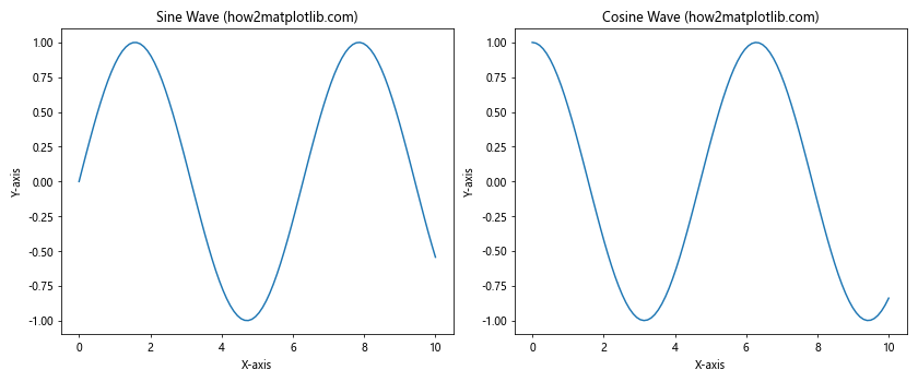
In this example, we use plt.subplots(1, 2, figsize=(12, 5)) to create a figure with two subplots side by side. The figsize parameter is used to change plot size in Matplotlib, setting the overall figure size to 12 inches wide and 5 inches tall.
Using rcParams to Set Default Figure Size
If you want to change plot size in Matplotlib for all your plots in a script or notebook, you can use the rcParams dictionary to set the default figure size.
Here’s an example of how to use rcParams to change plot size in Matplotlib:
import matplotlib.pyplot as plt
import matplotlib as mpl

# Set the default figure size
mpl.rcParams['figure.figsize'] = [10.0, 6.0]

# Create multiple plots with the new default size
for i in range(3):
    plt.figure()
    x = range(10)
    y = [i * j for j in x]
    plt.plot(x, y)
    plt.title(f'Plot {i+1} (how2matplotlib.com)')
    plt.xlabel('X-axis')
    plt.ylabel('Y-axis')

# Display all plots
plt.show()
Output:
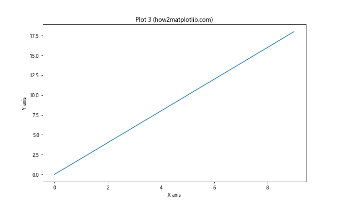
In this example, we use mpl.rcParams['figure.figsize'] = [10.0, 6.0] to set the default figure size to 10 inches wide and 6 inches tall. This setting will apply to all subsequent plots created in the script.
Adjusting Plot Size for Different Types of Plots
Changing Size for Scatter Plots
When working with scatter plots, you might want to change plot size in Matplotlib to accommodate a large number of data points or to highlight specific patterns. Here’s an example of how to adjust the size of a scatter plot:
import matplotlib.pyplot as plt
import numpy as np

# Generate random data
np.random.seed(42)
x = np.random.rand(100)
y = np.random.rand(100)

# Create a figure with a custom size
plt.figure(figsize=(12, 8))

# Create a scatter plot
plt.scatter(x, y, s=50, alpha=0.5)

# Add labels and title
plt.xlabel('X-axis (how2matplotlib.com)')
plt.ylabel('Y-axis (how2matplotlib.com)')
plt.title('Scatter Plot with Custom Size')

# Display the plot
plt.show()
Output:
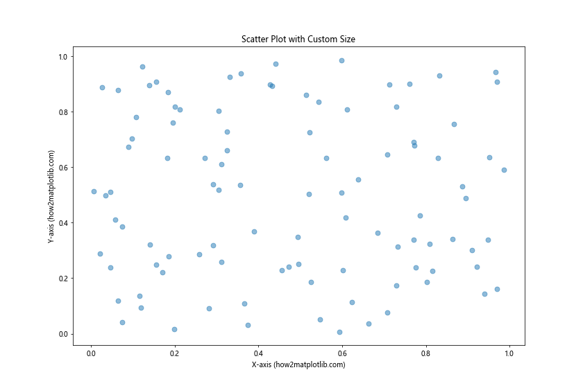
In this example, we use plt.figure(figsize=(12, 8)) to create a larger figure for our scatter plot. This allows us to display a large number of data points without overcrowding.
Adjusting Size for Bar Plots
Bar plots often require careful sizing to ensure that all bars are visible and properly spaced. Here’s an example of how to change plot size in Matplotlib for a bar plot:
import matplotlib.pyplot as plt
import numpy as np

# Generate data
categories = ['A', 'B', 'C', 'D', 'E']
values = np.random.randint(10, 100, size=5)

# Create a figure with a custom size
plt.figure(figsize=(10, 6))

# Create a bar plot
plt.bar(categories, values)

# Add labels and title
plt.xlabel('Categories (how2matplotlib.com)')
plt.ylabel('Values (how2matplotlib.com)')
plt.title('Bar Plot with Custom Size')

# Display the plot
plt.show()
Output:
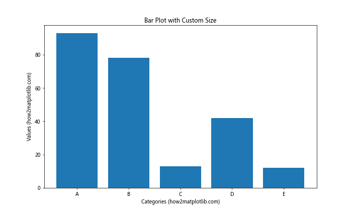
In this example, we use plt.figure(figsize=(10, 6)) to create a figure that’s wide enough to accommodate all the bars in our plot.
Fine-tuning Plot Size and Layout
Using tight_layout() Function
When you change plot size in Matplotlib, you might encounter issues with overlapping labels or titles. The tight_layout() function can help automatically adjust the spacing between plot elements.
Here’s an example of how to use tight_layout() when changing plot size in Matplotlib:
import matplotlib.pyplot as plt
import numpy as np

# Create a figure with subplots
fig, (ax1, ax2) = plt.subplots(2, 1, figsize=(8, 10))

# Generate data
x = np.linspace(0, 10, 100)
y1 = np.sin(x)
y2 = np.cos(x)

# Plot data on the first subplot
ax1.plot(x, y1)
ax1.set_title('Sine Wave (how2matplotlib.com)')
ax1.set_xlabel('X-axis')
ax1.set_ylabel('Y-axis')

# Plot data on the second subplot
ax2.plot(x, y2)
ax2.set_title('Cosine Wave (how2matplotlib.com)')
ax2.set_xlabel('X-axis')
ax2.set_ylabel('Y-axis')

# Adjust the layout
plt.tight_layout()

# Display the plot
plt.show()
Output:
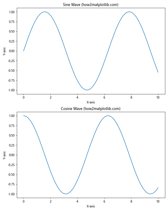
In this example, we use plt.tight_layout() to automatically adjust the spacing between subplots and ensure that all labels and titles are visible.
Using constrained_layout
Another option to fine-tune your plot layout when you change plot size in Matplotlib is to use constrained_layout. This feature provides an alternative to tight_layout() and can sometimes produce better results.
Here’s an example of how to use constrained_layout when changing plot size in Matplotlib:
import matplotlib.pyplot as plt
import numpy as np

# Create a figure with subplots using constrained_layout
fig, axs = plt.subplots(2, 2, figsize=(12, 10), constrained_layout=True)

# Generate data
x = np.linspace(0, 10, 100)
y1 = np.sin(x)
y2 = np.cos(x)
y3 = np.tan(x)
y4 = x**2

# Plot data on the subplots
axs[0, 0].plot(x, y1)
axs[0, 0].set_title('Sine Wave (how2matplotlib.com)')
axs[0, 0].set_xlabel('X-axis')
axs[0, 0].set_ylabel('Y-axis')

axs[0, 1].plot(x, y2)
axs[0, 1].set_title('Cosine Wave (how2matplotlib.com)')
axs[0, 1].set_xlabel('X-axis')
axs[0, 1].set_ylabel('Y-axis')

axs[1, 0].plot(x, y3)
axs[1, 0].set_title('Tangent Wave (how2matplotlib.com)')
axs[1, 0].set_xlabel('X-axis')
axs[1, 0].set_ylabel('Y-axis')

axs[1, 1].plot(x, y4)
axs[1, 1].set_title('Quadratic Function (how2matplotlib.com)')
axs[1, 1].set_xlabel('X-axis')
axs[1, 1].set_ylabel('Y-axis')

# Display the plot
plt.show()
Output:
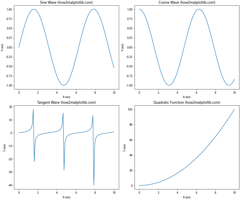
In this example, we use constrained_layout=True when creating the figure and subplots. This automatically adjusts the layout to prevent overlapping elements and ensure proper spacing.
Changing Plot Size for Specific Plot Types
Adjusting Size for Heatmaps
Heatmaps often require careful sizing to ensure that all cells are visible and properly colored. Here’s an example of how to change plot size in Matplotlib for a heatmap:
import matplotlib.pyplot as plt
import numpy as np

# Generate data for the heatmap
data = np.random.rand(10, 12)

# Create a figure with a custom size
plt.figure(figsize=(12, 8))

# Create a heatmap
plt.imshow(data, cmap='viridis', aspect='auto')

# Add a colorbar
plt.colorbar(label='Value')

# Add labels and title
plt.xlabel('X-axis (how2matplotlib.com)')
plt.ylabel('Y-axis (how2matplotlib.com)')
plt.title('Heatmap with Custom Size')

# Display the plot
plt.show()
Output:
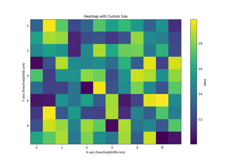
In this example, we use plt.figure(figsize=(12, 8)) to create a larger figure that can accommodate the heatmap and colorbar.
Changing Size for Pie Charts
Pie charts often look best when they’re circular, so it’s important to choose an appropriate size when you change plot size in Matplotlib. Here’s an example:
import matplotlib.pyplot as plt

# Data for the pie chart
sizes = [30, 20, 25, 15, 10]
labels = ['A', 'B', 'C', 'D', 'E']
colors = ['#ff9999', '#66b3ff', '#99ff99', '#ffcc99', '#ff99cc']

# Create a figure with a custom size
plt.figure(figsize=(10, 10))

# Create a pie chart
plt.pie(sizes, labels=labels, colors=colors, autopct='%1.1f%%', startangle=90)

# Ensure the pie chart is circular
plt.axis('equal')

# Add a title
plt.title('Pie Chart with Custom Size (how2matplotlib.com)')

# Display the plot
plt.show()
Output:
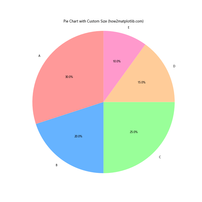
In this example, we use plt.figure(figsize=(10, 10)) to create a square figure, which is ideal for pie charts.
Advanced Techniques for Changing Plot Size in Matplotlib
Using GridSpec for Complex Layouts
When you need more control over the layout of your plots, you can use GridSpec to create complex arrangements. This is particularly useful when you want to change plot size in Matplotlib for individual subplots.
Here’s an example of how to use GridSpec to create a custom layout:
import matplotlib.pyplot as plt
import matplotlib.gridspec as gridspec
import numpy as np

# Create a figure with a custom size
fig = plt.figure(figsize=(12, 8))

# Create a GridSpec layout
gs = gridspec.GridSpec(2, 3, figure=fig)

# Generate some data
x = np.linspace(0, 10, 100)
y1 = np.sin(x)
y2 = np.cos(x)
y3 = np.tan(x)

# Create subplots with different sizes
ax1 = fig.add_subplot(gs[0, :2])
ax1.plot(x, y1)
ax1.set_title('Sine Wave (how2matplotlib.com)')

ax2 = fig.add_subplot(gs[0, 2])
ax2.plot(x, y2)
ax2.set_title('Cosine Wave (how2matplotlib.com)')

ax3 = fig.add_subplot(gs[1, :])
ax3.plot(x, y3)
ax3.set_title('Tangent Wave (how2matplotlib.com)')

# Adjust the layout
plt.tight_layout()

# Display the plot
plt.show()
Output:
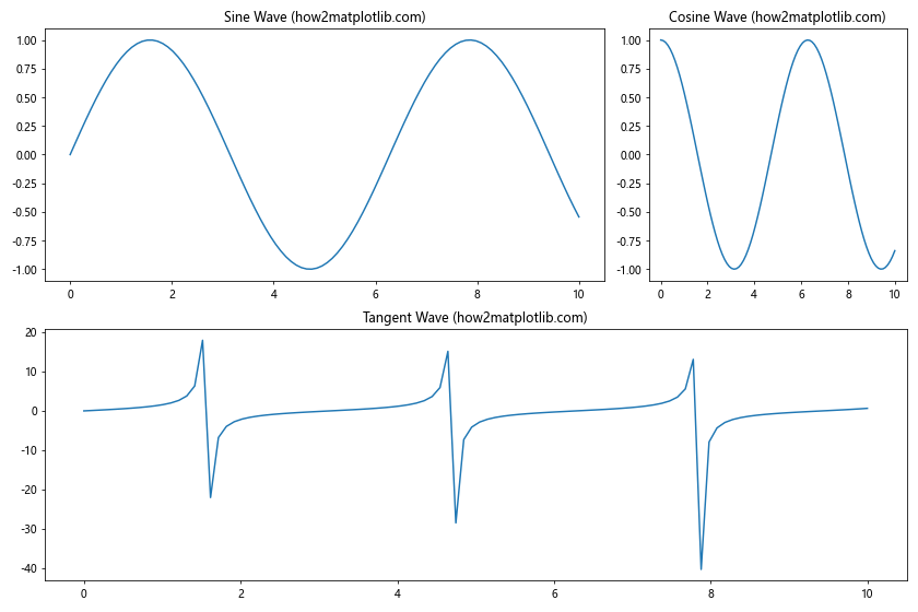
In this example, we use GridSpec to create a layout with three subplots of different sizes. This allows us to change plot size in Matplotlib for individual subplots within the same figure.
Adjusting DPI for High-Resolution Plots
When you change plot size in Matplotlib, you might also want to adjust the DPI (dots per inch) to create high-resolution plots. Here’s an example of how to change plot size in Matplotlib while also adjusting the DPI:
import matplotlib.pyplot as plt
import numpy as np

# Set the figure size and DPI
plt.figure(figsize=(10, 6), dpi=300)

# Generate some data
x = np.linspace(0, 10, 1000)
y = np.sin(x) * np.exp(-0.1 * x)

# Create the plot
plt.plot(x, y)

# Add labels and title
plt.xlabel('X-axis (how2matplotlib.com)')
plt.ylabel('Y-axis (how2matplotlib.com)')
plt.title('High-Resolution Plot with Custom Size and DPI')

# Save the plot as a high-resolution image
plt.savefig('high_res_plot.png', dpi=300, bbox_inches='tight')

# Display the plot
plt.show()
Output:
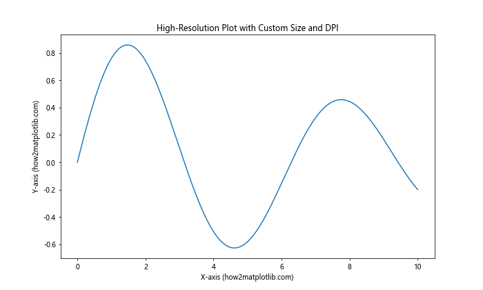
In this example, we use plt.figure(figsize=(10, 6), dpi=300) to create a figure with a custom size and high DPI. We also use plt.savefig() with the same DPI to save the plot as a high-resolution image.
Responsive Plot Sizing in Matplotlib
Using Relative Units for Plot Size
When you change plot size in Matplotlib, you might want to use relative units instead of absolute units to make your plots more responsive to different screen sizes or window dimensions. Here’s an example of how to use relative units:
import matplotlib.pyplot as plt
from matplotlib.figure import Figure
from matplotlib.backends.backend_agg import FigureCanvasAgg

# Create a figure with relative size
fig = Figure(figsize=(0.8, 0.6), tight_layout=True)

# Add a subplot
ax = fig.add_subplot(111)

# Generate some data
x = [1, 2, 3, 4, 5]
y = [2, 4, 6, 8, 10]

# Create the plot
ax.plot(x, y)

# Add labels and title
ax.set_xlabel('X-axis (how2matplotlib.com)')
ax.set_ylabel('Y-axis (how2matplotlib.com)')
ax.set_title('Responsive Plot with Relative Size')

# Create a canvas and render the figure
canvas = FigureCanvasAgg(fig)
canvas.draw()

# Display the plot
plt.imshow(canvas.buffer_rgba())
plt.axis('off')
plt.show()
Output:
In this example, we use relative units (0.8 and 0.6) for the figure size. These values represent a fraction of the available display area, making the plot more responsive to different screen sizes.
Best Practices for Changing Plot Size in Matplotlib
When you change plot size in Matplotlib, it’s important to follow some best practices to ensure your plots are visually appealing and effective. Here are some tips to keep in mind:
- Consider the content: The ideal plot size depends on the type of data you’re visualizing and the amount of detail you need to show.
Maintain aspect ratio: For certain types of plots (e.g., scatter plots, pie charts), maintaining the correct aspect ratio is crucial for accurate interpretation.
Be consistent: If you’re creating multiple plots for a report or presentation, try to use consistent sizes for similar types of plots.
Think about the output medium: Consider where your plot will be displayed (e.g., screen, print, presentation) when deciding on the size.
Use relative units when appropriate: For responsive designs, consider using relative units instead of absolute units.
Don’t forget about labels and titles: Ensure that your plot size allows for readable labels, titles, and annotations.
Test different sizes: Experiment with different sizes to find the best balance between detail and overall visual appeal.
Use tight_layout() or constrained_layout: These functions can help automatically adjust the spacing between plot elements.
Consider using subplots: For complex visualizations, using subplots with different sizes can be more effective than a single large plot.
Pay attention to file size: If you’re saving high-resolution plots, be mindful of the resulting file size, especially for web applications.
Troubleshooting Common Issues When Changing Plot Size in Matplotlib
Even when you follow best practices, you might encounter some issues when you change plot size in Matplotlib. Here are some common problems and their solutions: