Change Grid Interval and Specify Tick Labels in Matplotlib
Matplotlib is a powerful library for creating static, interactive, and animated visualizations in Python. One of the key aspects of creating informative and attractive plots is the ability to control the appearance of grid lines and tick labels. This article will provide a comprehensive guide on how to change the grid interval and specify tick labels in Matplotlib, enhancing the readability and precision of your plots.
Introduction to Matplotlib
Matplotlib is a plotting library for the Python programming language and its numerical mathematics extension NumPy. It provides an object-oriented API for embedding plots into applications using general-purpose GUI toolkits like Tkinter, wxPython, Qt, or GTK. Before diving into the specifics of grid intervals and tick labels, it’s essential to understand some basic concepts of Matplotlib.
Basic Plotting
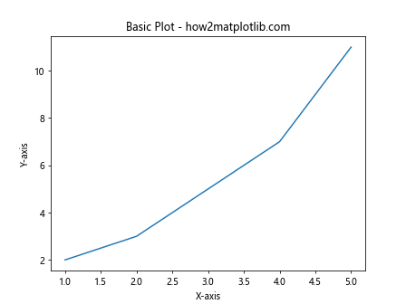
Here is a simple example of how to create a basic line plot in Matplotlib:
import matplotlib.pyplot as plt

x = [1, 2, 3, 4, 5]
y = [2, 3, 5, 7, 11]
plt.plot(x, y)
plt.title("Basic Plot - how2matplotlib.com")
plt.xlabel("X-axis")
plt.ylabel("Y-axis")
plt.show()
Output:
Changing Grid Intervals
Grid lines can be very useful in a plot as they help the reader to better gauge the scale of the plot and make it easier to estimate the values that the data points correspond to. Matplotlib allows you to customize the grid lines, including their intervals.
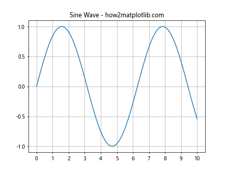
Example 1: Setting Grid Intervals
import matplotlib.pyplot as plt
import numpy as np

x = np.linspace(0, 10, 100)
y = np.sin(x)
plt.plot(x, y)
plt.title("Sine Wave - how2matplotlib.com")
plt.grid(True)
plt.xticks(np.arange(0, 11, 1))
plt.yticks(np.arange(-1, 1.5, 0.5))
plt.show()
Output:
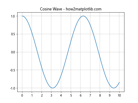
Example 2: Customizing Grid Appearance
import matplotlib.pyplot as plt
import numpy as np

x = np.linspace(0, 10, 100)
y = np.cos(x)
plt.plot(x, y)
plt.title("Cosine Wave - how2matplotlib.com")
plt.grid(True, which='both', color='gray', linestyle='--', linewidth=0.5)
plt.xticks(np.arange(0, 11, 1))
plt.yticks(np.arange(-1, 1.5, 0.5))
plt.show()
Output:
Specifying Tick Labels
Tick labels are the labels used for the ticks, which are the marks along the axis of a plot. Customizing tick labels can be crucial for making plots more readable and informative.
Example 3: Custom Tick Labels
import matplotlib.pyplot as plt
import numpy as np

x = [1, 2, 3, 4, 5]
y = [10, 15, 7, 10, 3]
plt.bar(x, y)
plt.title("Custom Tick Labels - how2matplotlib.com")
plt.xticks(x, ['One', 'Two', 'Three', 'Four', 'Five'])
plt.show()
Output:

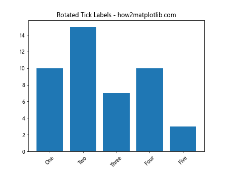
Example 4: Rotating Tick Labels
import matplotlib.pyplot as plt
import numpy as np

x = [1, 2, 3, 4, 5]
y = [10, 15, 7, 10, 3]
plt.bar(x, y)
plt.title("Rotated Tick Labels - how2matplotlib.com")
plt.xticks(x, ['One', 'Two', 'Three', 'Four', 'Five'], rotation=45)
plt.show()
Output:
Advanced Grid and Tick Label Customization
For more advanced plots, you might need to have even more control over the grid and tick labels.
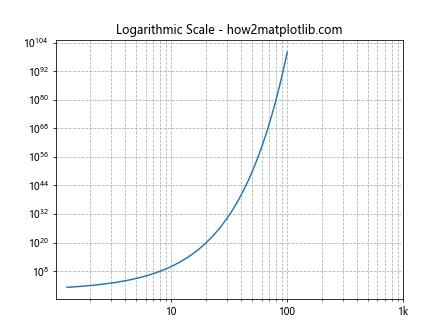
Example 5: Logarithmic Scale with Custom Grid
import matplotlib.pyplot as plt
import numpy as np

x = np.logspace(0.1, 2, 100)
y = np.power(10, x)
plt.plot(x, y)
plt.title("Logarithmic Scale - how2matplotlib.com")
plt.grid(True, which='both', linestyle='--')
plt.xscale('log')
plt.yscale('log')
plt.xticks([10, 100, 1000], ['10', '100', '1k'])
plt.show()
Output:
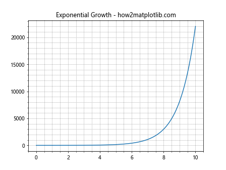
Example 6: Using Minor Ticks
import matplotlib.pyplot as plt
import numpy as np

x = np.linspace(0, 10, 100)
y = np.exp(x)
plt.plot(x, y)
plt.title("Exponential Growth - how2matplotlib.com")
plt.grid(True, which='both', linestyle=':', color='gray')
plt.minorticks_on()
plt.show()
Output:
Conclusion
In this article, we explored various ways to customize grid intervals and specify tick labels in Matplotlib. These techniques are essential for creating plots that are not only visually appealing but also convey the correct information effectively. By adjusting the grid and tick labels, you can enhance the readability and functionality of your visualizations, making your data easier to interpret and understand.
Remember, the key to effective data visualization is not just about showing data but making sure that it communicates the right information in the clearest way possible. Matplotlib provides a robust set of tools to help you achieve this through its customizable plotting framework.