How Can I Make a Scatter Plot Colored by Density in Matplotlib
Creating a scatter plot colored by density using Matplotlib is a powerful way to visualize and understand the distribution and density of your data points. This technique can help highlight areas of concentration where data points are clustered together and can be particularly useful in data analysis and scientific research. In this article, we will explore how to create scatter plots colored by density using Matplotlib, a popular plotting library in Python.
Getting Started with Matplotlib
Before diving into the examples, ensure you have Matplotlib installed in your Python environment. You can install Matplotlib using pip:
pip install matplotlib
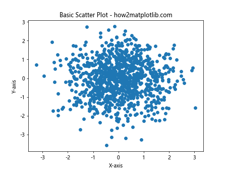
Basic Scatter Plot
Let’s start with a basic scatter plot example. This will serve as a foundation upon which we will build more complex plots.
import matplotlib.pyplot as plt
import numpy as np

x = np.random.randn(1000)
y = np.random.randn(1000)

plt.scatter(x, y)
plt.title("Basic Scatter Plot - how2matplotlib.com")
plt.xlabel("X-axis")
plt.ylabel("Y-axis")
plt.show()
Output:
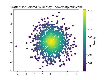
Calculating Density
To color the scatter plot by density, we need to calculate the density of the points. We can do this using the scipy.stats module.
from scipy.stats import gaussian_kde
import matplotlib.pyplot as plt
import numpy as np

x = np.random.randn(1000)
y = np.random.randn(1000)

data = np.vstack([x, y])
kde = gaussian_kde(data)

# Evaluate the density on the points
density = kde(data)

plt.scatter(x, y, c=density)
plt.title("Scatter Plot Colored by Density - how2matplotlib.com")
plt.colorbar(label='Density')
plt.show()
Output:
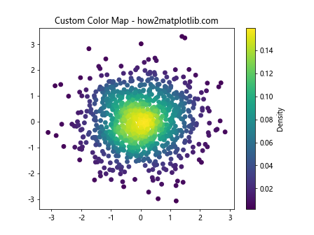
Customizing the Color Map
Matplotlib allows you to customize the color map used in the scatter plot. This can help in better visualizing the density differences.
from scipy.stats import gaussian_kde
import matplotlib.pyplot as plt
import numpy as np

x = np.random.randn(1000)
y = np.random.randn(1000)
data = np.vstack([x, y])
kde = gaussian_kde(data)
density = kde(data)

plt.scatter(x, y, c=density, cmap='viridis')
plt.title("Custom Color Map - how2matplotlib.com")
plt.colorbar(label='Density')
plt.show()
Output:
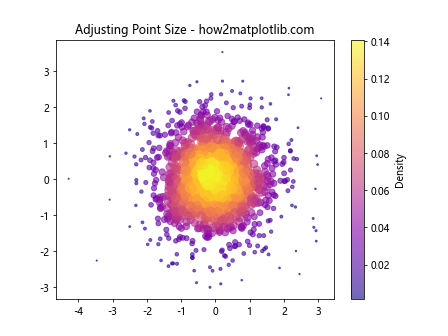
Adjusting Point Size
You can also adjust the size of each point based on the density, making areas of higher density more prominent.
from scipy.stats import gaussian_kde
import matplotlib.pyplot as plt
import numpy as np

x = np.random.randn(1000)
y = np.random.randn(1000)
data = np.vstack([x, y])
kde = gaussian_kde(data)
density = kde(data)

sizes = density * 1000

plt.scatter(x, y, c=density, s=sizes, cmap='plasma', alpha=0.6)
plt.title("Adjusting Point Size - how2matplotlib.com")
plt.colorbar(label='Density')
plt.show()
Output:
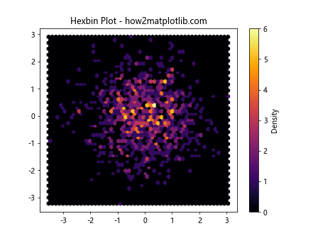
Using Hexbin for Large Datasets
For very large datasets, a scatter plot can become overcrowded. In such cases, using a hexagonal binning plot can be more effective.
from scipy.stats import gaussian_kde
import matplotlib.pyplot as plt
import numpy as np

x = np.random.randn(1000)
y = np.random.randn(1000)

plt.hexbin(x, y, gridsize=50, cmap='inferno')
plt.colorbar(label='Density')
plt.title("Hexbin Plot - how2matplotlib.com")
plt.show()
Output:
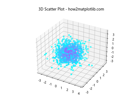
3D Scatter Plot
Creating a 3D scatter plot colored by density can add an extra dimension to your data visualization.
from mpl_toolkits.mplot3d import Axes3D
from scipy.stats import gaussian_kde
import matplotlib.pyplot as plt
import numpy as np

x = np.random.randn(1000)
y = np.random.randn(1000)

z = np.random.randn(1000)
data = np.vstack([x, y, z])
kde = gaussian_kde(data)
density = kde(data)

fig = plt.figure()
ax = fig.add_subplot(111, projection='3d')
ax.scatter(x, y, z, c=density, cmap='cool')
ax.set_title("3D Scatter Plot - how2matplotlib.com")
plt.show()
Output:
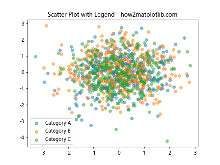
Adding a Legend
For plots where the color represents a specific variable, adding a legend can provide valuable context.
from mpl_toolkits.mplot3d import Axes3D
from scipy.stats import gaussian_kde
import matplotlib.pyplot as plt
import numpy as np

x = np.random.randn(1000)
y = np.random.randn(1000)

# This example assumes you have a 'category' array that categorizes each point
categories = np.random.choice(['A', 'B', 'C'], size=1000)
for category in np.unique(categories):
    ix = np.where(categories == category)
    plt.scatter(x[ix], y[ix], label=f"Category {category}", alpha=0.5)

plt.legend()
plt.title("Scatter Plot with Legend - how2matplotlib.com")
plt.show()
Output:
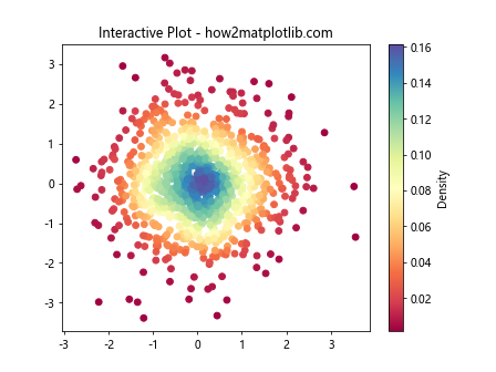
Interactive Plots
For a more interactive analysis, you can use Matplotlib’s integration with Jupyter notebooks to create interactive plots.
from mpl_toolkits.mplot3d import Axes3D
from scipy.stats import gaussian_kde
import matplotlib.pyplot as plt
import numpy as np

x = np.random.randn(1000)
y = np.random.randn(1000)
data = np.vstack([x, y])
kde = gaussian_kde(data)
density = kde(data)

plt.scatter(x, y, c=density, cmap='Spectral')
plt.colorbar(label='Density')
plt.title("Interactive Plot - how2matplotlib.com")
plt.show()
Output:
Saving Plots
Saving your plots for reports or presentations is straightforward with Matplotlib.
plt.scatter(x, y, c=density, cmap='spring')
plt.colorbar(label='Density')
plt.title("Saving Plot - how2matplotlib.com")
plt.savefig('density_scatter_plot.png')
Conclusion
In this article, we explored various ways to create scatter plots colored by density using Matplotlib. We covered basic scatter plots, adjusting color maps, point sizes, using hexbin for large datasets, creating 3D scatter plots, adding legends, making interactive plots, and saving plots. These techniques provide a solid foundation for visualizing and analyzing data distributions and densities.
Remember, visualization is a powerful tool in data analysis, and mastering these techniques can significantly enhance your ability to understand and communicate your data.