How to Optimize Bin Size in Matplotlib Histogram for Data Visualization

How to Optimize Bin Size in Matplotlib Histogram for Data Visualization

Bin size in Matplotlib histogram is a crucial aspect of data visualization that can significantly impact the interpretation of your data. The bin size in Matplotlib histogram determines how your data is grouped and displayed, affecting the overall shape and resolution of your histogram. In this comprehensive guide, we’ll explore various techniques and considerations for selecting the optimal bin size in Matplotlib histogram, providing you with the tools to create more accurate and informative visualizations.

Understanding Bin Size in Matplotlib Histogram

Before diving into the specifics of optimizing bin size in Matplotlib histogram, it’s essential to understand what bin size actually means. In a histogram, bin size refers to the width of each bar or “bin” that represents a range of values in your data. The choice of bin size in Matplotlib histogram can dramatically affect how your data is presented and interpreted.

Let’s start with a simple example to illustrate the concept of bin size in Matplotlib histogram:

import matplotlib.pyplot as plt
import numpy as np

# Generate sample data
data = np.random.normal(0, 1, 1000)

# Create histogram with default bin size
plt.figure(figsize=(10, 6))
plt.hist(data, bins='auto', edgecolor='black')
plt.title('Histogram with Default Bin Size - how2matplotlib.com')
plt.xlabel('Value')
plt.ylabel('Frequency')
plt.show()

Output:

How to Optimize Bin Size in Matplotlib Histogram for Data Visualization

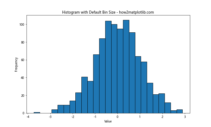
In this example, we’re using the default ‘auto’ bin size in Matplotlib histogram. The ‘auto’ option allows Matplotlib to automatically determine the number of bins based on the data. However, this may not always be the optimal choice for your specific dataset.

The Impact of Bin Size in Matplotlib Histogram

The bin size in Matplotlib histogram plays a crucial role in how your data is represented. A bin size that’s too large can obscure important details in your data distribution, while a bin size that’s too small can introduce noise and make it difficult to discern overall patterns. Let’s examine the impact of different bin sizes on the same dataset:

import matplotlib.pyplot as plt
import numpy as np

# Generate sample data
data = np.random.normal(0, 1, 1000)

# Create subplots
fig, (ax1, ax2, ax3) = plt.subplots(1, 3, figsize=(15, 5))

# Histogram with small bin size
ax1.hist(data, bins=50, edgecolor='black')
ax1.set_title('Small Bin Size - how2matplotlib.com')

# Histogram with medium bin size
ax2.hist(data, bins=20, edgecolor='black')
ax2.set_title('Medium Bin Size - how2matplotlib.com')

# Histogram with large bin size
ax3.hist(data, bins=5, edgecolor='black')
ax3.set_title('Large Bin Size - how2matplotlib.com')

plt.tight_layout()
plt.show()

Output:

How to Optimize Bin Size in Matplotlib Histogram for Data Visualization

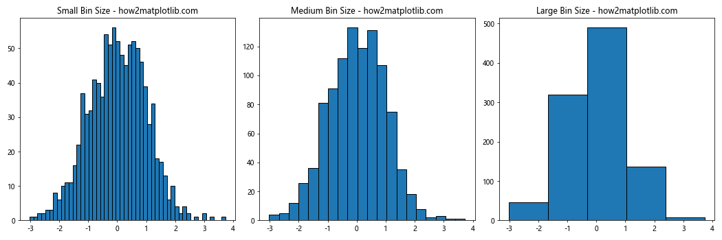
This example demonstrates how different bin sizes in Matplotlib histogram can affect the visualization of the same dataset. The small bin size provides more detail but may introduce noise, while the large bin size gives a smoother appearance but may hide important features of the data distribution.

Techniques for Selecting Bin Size in Matplotlib Histogram

There are several techniques you can use to select an appropriate bin size in Matplotlib histogram. Let’s explore some of these methods:

1. Square Root Choice

The square root choice is a simple rule of thumb for selecting the number of bins. It suggests using the square root of the number of data points as the number of bins.

import matplotlib.pyplot as plt
import numpy as np

# Generate sample data
data = np.random.normal(0, 1, 1000)

# Calculate number of bins using square root choice
num_bins = int(np.sqrt(len(data)))

plt.figure(figsize=(10, 6))
plt.hist(data, bins=num_bins, edgecolor='black')
plt.title(f'Histogram with Square Root Choice ({num_bins} bins) - how2matplotlib.com')
plt.xlabel('Value')
plt.ylabel('Frequency')
plt.show()

Output:

How to Optimize Bin Size in Matplotlib Histogram for Data Visualization

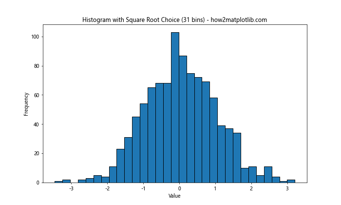
This method provides a reasonable starting point for bin size in Matplotlib histogram, but it may not be optimal for all datasets.

2. Sturges’ Formula

Sturges’ formula is another method for determining the number of bins. It’s defined as:

number of bins = 1 + log2(n)

Where n is the number of data points.

import matplotlib.pyplot as plt
import numpy as np

# Generate sample data
data = np.random.normal(0, 1, 1000)

# Calculate number of bins using Sturges' formula
num_bins = int(1 + np.log2(len(data)))

plt.figure(figsize=(10, 6))
plt.hist(data, bins=num_bins, edgecolor='black')
plt.title(f"Histogram with Sturges' Formula ({num_bins} bins) - how2matplotlib.com")
plt.xlabel('Value')
plt.ylabel('Frequency')
plt.show()

Output:

How to Optimize Bin Size in Matplotlib Histogram for Data Visualization

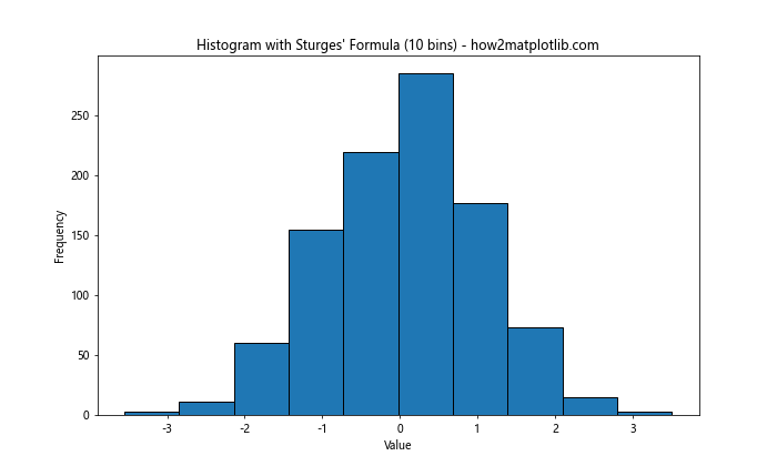
Sturges’ formula tends to work well for normally distributed data but may underestimate the optimal number of bins for skewed distributions.

3. Rice Rule

The Rice Rule is another method for determining the number of bins in a histogram. It’s defined as:

number of bins = 2 * cube_root(n)

Where n is the number of data points.

import matplotlib.pyplot as plt
import numpy as np

# Generate sample data
data = np.random.normal(0, 1, 1000)

# Calculate number of bins using Rice Rule
num_bins = int(2 * np.cbrt(len(data)))

plt.figure(figsize=(10, 6))
plt.hist(data, bins=num_bins, edgecolor='black')
plt.title(f'Histogram with Rice Rule ({num_bins} bins) - how2matplotlib.com')
plt.xlabel('Value')
plt.ylabel('Frequency')
plt.show()

Output:

How to Optimize Bin Size in Matplotlib Histogram for Data Visualization

The Rice Rule often provides a good balance between detail and smoothness for many datasets.

4. Freedman-Diaconis Rule

The Freedman-Diaconis rule is a more robust method for selecting bin size in Matplotlib histogram. It takes into account both the spread and the sample size of the data. The bin width is calculated as:

bin width = 2 * IQR * n^(-1/3)

Where IQR is the interquartile range and n is the number of data points.

import matplotlib.pyplot as plt
import numpy as np

# Generate sample data
data = np.random.normal(0, 1, 1000)

# Calculate bin width using Freedman-Diaconis rule
iqr = np.subtract(*np.percentile(data, [75, 25]))
bin_width = 2 * iqr * len(data)**(-1/3)
num_bins = int((max(data) - min(data)) / bin_width)

plt.figure(figsize=(10, 6))
plt.hist(data, bins=num_bins, edgecolor='black')
plt.title(f'Histogram with Freedman-Diaconis Rule ({num_bins} bins) - how2matplotlib.com')
plt.xlabel('Value')
plt.ylabel('Frequency')
plt.show()

Output:

How to Optimize Bin Size in Matplotlib Histogram for Data Visualization

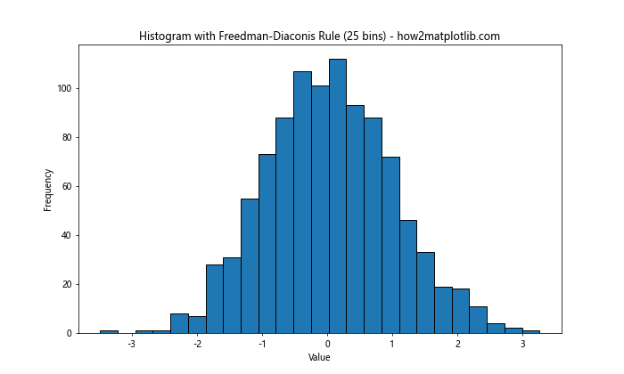
The Freedman-Diaconis rule is particularly useful for datasets with outliers or non-normal distributions.

Advanced Techniques for Bin Size in Matplotlib Histogram

While the methods discussed above provide good starting points for selecting bin size in Matplotlib histogram, there are more advanced techniques you can use to fine-tune your visualizations.

1. Using numpy’s histogram function

Numpy’s histogram function provides more control over bin size and edges. You can use it in combination with Matplotlib to create more customized histograms:

import matplotlib.pyplot as plt
import numpy as np

# Generate sample data
data = np.random.normal(0, 1, 1000)

# Calculate histogram using numpy
hist, bin_edges = np.histogram(data, bins='auto')

plt.figure(figsize=(10, 6))
plt.stairs(hist, bin_edges, fill=True)
plt.title('Histogram using numpy and matplotlib - how2matplotlib.com')
plt.xlabel('Value')
plt.ylabel('Frequency')
plt.show()

Output:

How to Optimize Bin Size in Matplotlib Histogram for Data Visualization

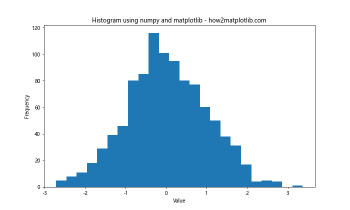
This method allows you to separate the calculation of the histogram from its visualization, giving you more flexibility in how you present your data.

2. Using different bin sizes for different ranges

Sometimes, you might want to use different bin sizes for different ranges of your data. This can be particularly useful when dealing with data that has varying densities across its range:

import matplotlib.pyplot as plt
import numpy as np

# Generate sample data
data = np.concatenate([np.random.normal(0, 1, 1000), np.random.normal(10, 0.5, 500)])

# Define custom bin edges
bin_edges = np.concatenate([np.arange(-5, 5, 0.5), np.arange(5, 15, 0.2)])

plt.figure(figsize=(12, 6))
plt.hist(data, bins=bin_edges, edgecolor='black')
plt.title('Histogram with Variable Bin Sizes - how2matplotlib.com')
plt.xlabel('Value')
plt.ylabel('Frequency')
plt.show()

Output:

How to Optimize Bin Size in Matplotlib Histogram for Data Visualization

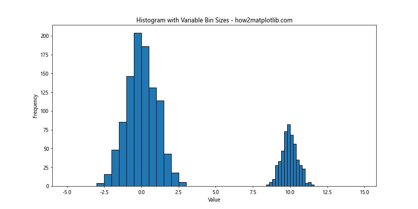
In this example, we use smaller bin sizes for the range where we expect more data points, allowing for a more detailed view of that region.

3. Using logarithmic binning

For data that spans several orders of magnitude, logarithmic binning can be useful:

import matplotlib.pyplot as plt
import numpy as np

# Generate sample data
data = np.random.lognormal(0, 1, 1000)

# Create logarithmically spaced bins
bins = np.logspace(np.log10(data.min()), np.log10(data.max()), 20)

plt.figure(figsize=(10, 6))
plt.hist(data, bins=bins, edgecolor='black')
plt.xscale('log')
plt.title('Histogram with Logarithmic Binning - how2matplotlib.com')
plt.xlabel('Value (log scale)')
plt.ylabel('Frequency')
plt.show()

Output:

How to Optimize Bin Size in Matplotlib Histogram for Data Visualization

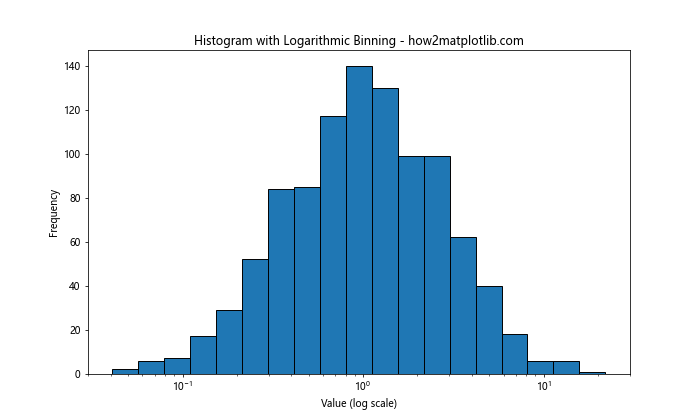
This approach can reveal patterns in data that might be obscured with linear binning.

Considerations for Bin Size in Matplotlib Histogram

When selecting the bin size in Matplotlib histogram, there are several factors to consider:

  1. Data Distribution: The shape of your data distribution can influence the optimal bin size. Skewed or multimodal distributions may require different approaches compared to normal distributions.

  2. Sample Size: The number of data points in your dataset can affect the choice of bin size. Larger datasets generally allow for more bins without introducing excessive noise.

  3. Purpose of Visualization: Consider what you’re trying to communicate with your histogram. Are you looking for fine details or overall trends?

  4. Domain Knowledge: Understanding the context of your data can help in selecting an appropriate bin size. Some fields may have standard practices or meaningful intervals that should be considered.

Let’s explore these considerations with some examples:

Dealing with Skewed Data

When working with skewed data, standard bin size selection methods may not always be optimal. Here’s an example of how you might approach this:

import matplotlib.pyplot as plt
import numpy as np
from scipy import stats

# Generate skewed data
data = stats.skewnorm.rvs(a=5, loc=5, scale=2, size=1000)

# Calculate number of bins using Freedman-Diaconis rule
iqr = np.subtract(*np.percentile(data, [75, 25]))
bin_width = 2 * iqr * len(data)**(-1/3)
num_bins = int((max(data) - min(data)) / bin_width)

plt.figure(figsize=(10, 6))
plt.hist(data, bins=num_bins, edgecolor='black')
plt.title('Histogram of Skewed Data - how2matplotlib.com')
plt.xlabel('Value')
plt.ylabel('Frequency')
plt.show()

Output:

How to Optimize Bin Size in Matplotlib Histogram for Data Visualization

In this case, the Freedman-Diaconis rule is used as it’s more robust to outliers and non-normal distributions.

Handling Large Datasets

For large datasets, you might need to balance between detail and computational efficiency. Here’s an approach using numpy’s histogram function:

import matplotlib.pyplot as plt
import numpy as np

# Generate a large dataset
data = np.random.normal(0, 1, 1000000)

# Calculate histogram using numpy
hist, bin_edges = np.histogram(data, bins='auto')

plt.figure(figsize=(10, 6))
plt.stairs(hist, bin_edges, fill=True)
plt.title('Histogram of Large Dataset - how2matplotlib.com')
plt.xlabel('Value')
plt.ylabel('Frequency')
plt.show()

Output:

How to Optimize Bin Size in Matplotlib Histogram for Data Visualization

This method can be more efficient for very large datasets as it separates the histogram calculation from the plotting.

Advanced Visualization Techniques with Bin Size in Matplotlib Histogram

Once you’ve selected an appropriate bin size in Matplotlib histogram, there are several advanced visualization techniques you can use to enhance your histograms:

1. Kernel Density Estimation (KDE)

KDE can be used alongside histograms to provide a smooth estimate of the probability density function of your data:

import matplotlib.pyplot as plt
import numpy as np
from scipy import stats

# Generate sample data
data = np.random.normal(0, 1, 1000)

# Create histogram
plt.figure(figsize=(10, 6))
plt.hist(data, bins='auto', density=True, alpha=0.7, edgecolor='black')

# Add KDE
kde = stats.gaussian_kde(data)
x_range = np.linspace(data.min(), data.max(), 100)
plt.plot(x_range, kde(x_range), 'r-', lw=2)

plt.title('Histogram with KDE - how2matplotlib.com')
plt.xlabel('Value')
plt.ylabel('Density')
plt.show()

Output:

How to Optimize Bin Size in Matplotlib Histogram for Data Visualization

This combination can provide both a detailed view of the data distribution and a smooth estimate of its underlying probability density.

2. Cumulative Histograms

Cumulative histograms can be useful for understanding the distribution of your data in a different way:

import matplotlib.pyplot as plt
import numpy as np

# Generate sample data
data = np.random.normal(0, 1, 1000)

plt.figure(figsize=(10, 6))
plt.hist(data, bins='auto', cumulative=True, density=True, edgecolor='black')
plt.title('Cumulative Histogram - how2matplotlib.com')
plt.xlabel('Value')
plt.ylabel('Cumulative Frequency')
plt.show()

Output:

How to Optimize Bin Size in Matplotlib Histogram for Data Visualization

Cumulative histograms show the running total of frequencies and can be particularly useful for comparing distributions.

3. 2D Histograms

For bivariate data, 2D histograms can be a powerful visualization tool:

import matplotlib.pyplot as plt
import numpy as np

# Generate bivariate normal data
mean = [0, 0]
cov = [[1, 0.5], [0.5, 1]]
x, y = np.random.multivariate_normal(mean, cov, 10000).T

plt.figure(figsize=(10, 8))
plt.hist2d(x, y, bins=50, cmap='viridis')
plt.colorbar(label='Frequency')
plt.title('2D Histogram - how2matplotlib.com')
plt.xlabel('X Value')
plt.ylabel('Y Value')
plt.show()

Output:

How to Optimize Bin Size in Matplotlib Histogram for Data Visualization

2D histograms allow you to visualize the joint distribution of two variables, with the color intensity representing the frequency of data points in each bin.

Best Practices for Bin Size in Matplotlib Histogram

When working with bin size in Matplotlib histogram, it’s important to follow some best practices to ensure your visualizations are accurate and informative:

  1. Experiment with different bin sizes: Don’t settle for the first bin size you try. Experiment with different options to see which best represents your data.

  2. Consider the purpose of your visualization: The optimal bin size may depend on whether you’re exploring data, presenting findings, or making comparisons.

  3. Be consistent: When comparing multiple histograms, use the same bin size for all of them4. Document your choices: Always document the method you used to select your bin size, especially in scientific or professional contexts.

  4. Use domain knowledge: If there are standard practices or meaningful intervals in your field, consider incorporating them into your bin size selection.

Let’s look at some examples that demonstrate these best practices:

Comparing Multiple Distributions

When comparing multiple distributions, it’s crucial to use the same bin size for all histograms:

import matplotlib.pyplot as plt
import numpy as np

# Generate sample data
data1 = np.random.normal(0, 1, 1000)
data2 = np.random.normal(2, 1.5, 1000)

# Calculate optimal bin size using Freedman-Diaconis rule
def fd_bins(data):
    iqr = np.subtract(*np.percentile(data, [75, 25]))
    bin_width = 2 * iqr * len(data)**(-1/3)
    return int((max(data) - min(data)) / bin_width)

num_bins = max(fd_bins(data1), fd_bins(data2))

plt.figure(figsize=(12, 6))

plt.subplot(1, 2, 1)
plt.hist(data1, bins=num_bins, edgecolor='black', alpha=0.7)
plt.title('Distribution 1 - how2matplotlib.com')
plt.xlabel('Value')
plt.ylabel('Frequency')

plt.subplot(1, 2, 2)
plt.hist(data2, bins=num_bins, edgecolor='black', alpha=0.7)
plt.title('Distribution 2 - how2matplotlib.com')
plt.xlabel('Value')
plt.ylabel('Frequency')

plt.tight_layout()
plt.show()

Output:

How to Optimize Bin Size in Matplotlib Histogram for Data Visualization

In this example, we calculate the optimal bin size for both datasets and use the larger of the two for both histograms. This ensures a fair comparison between the distributions.

Incorporating Domain Knowledge

Sometimes, the nature of your data might suggest a particular bin size. For example, if you’re working with age data, you might want to use 5-year or 10-year bins:

import matplotlib.pyplot as plt
import numpy as np

# Generate sample age data
ages = np.random.normal(40, 15, 1000).astype(int)
ages = np.clip(ages, 0, 100)  # Clip ages to 0-100 range

# Create histogram with 5-year bins
plt.figure(figsize=(10, 6))
plt.hist(ages, bins=range(0, 105, 5), edgecolor='black')
plt.title('Age Distribution (5-year bins) - how2matplotlib.com')
plt.xlabel('Age')
plt.ylabel('Frequency')
plt.xticks(range(0, 105, 10))
plt.show()

Output:

How to Optimize Bin Size in Matplotlib Histogram for Data Visualization

This approach uses domain knowledge (common age groupings) to create a meaningful and easily interpretable histogram.

Common Pitfalls with Bin Size in Matplotlib Histogram

While working with bin size in Matplotlib histogram, there are several common pitfalls to avoid:

  1. Using too few bins: This can obscure important features of your data distribution.
  2. Using too many bins: This can introduce noise and make it difficult to discern overall patterns.
  3. Ignoring the nature of your data: Different types of data may require different approaches to bin size selection.
  4. Failing to consider the impact of outliers: Outliers can significantly affect the optimal bin size.

Let’s look at some examples that illustrate these pitfalls and how to avoid them:

The Impact of Outliers

Outliers can significantly affect the appearance of your histogram. Here’s an example of how to handle them:

import matplotlib.pyplot as plt
import numpy as np

# Generate sample data with outliers
data = np.concatenate([np.random.normal(0, 1, 990), np.random.uniform(10, 15, 10)])

plt.figure(figsize=(12, 6))

plt.subplot(1, 2, 1)
plt.hist(data, bins='auto', edgecolor='black')
plt.title('Histogram with Outliers - how2matplotlib.com')
plt.xlabel('Value')
plt.ylabel('Frequency')

plt.subplot(1, 2, 2)
plt.hist(data, bins='auto', edgecolor='black', range=(data.mean() - 3*data.std(), data.mean() + 3*data.std()))
plt.title('Histogram without Outliers - how2matplotlib.com')
plt.xlabel('Value')
plt.ylabel('Frequency')

plt.tight_layout()
plt.show()

Output:

How to Optimize Bin Size in Matplotlib Histogram for Data Visualization

In this example, we show how outliers can distort the histogram and demonstrate a method for focusing on the main part of the distribution.

Handling Different Types of Data

Different types of data may require different approaches to bin size selection. For example, categorical data might require a different approach than continuous data:

import matplotlib.pyplot as plt
import numpy as np

# Generate categorical data
categories = ['A', 'B', 'C', 'D', 'E']
data = np.random.choice(categories, size=1000)

plt.figure(figsize=(10, 6))
plt.hist(data, bins=len(categories), edgecolor='black')
plt.title('Histogram of Categorical Data - how2matplotlib.com')
plt.xlabel('Category')
plt.ylabel('Frequency')
plt.xticks(range(len(categories)), categories)
plt.show()

Output:

How to Optimize Bin Size in Matplotlib Histogram for Data Visualization

In this case, we use one bin per category, which is appropriate for categorical data.

Advanced Topics in Bin Size for Matplotlib Histogram

As you become more proficient with bin size in Matplotlib histogram, you may want to explore some advanced topics:

1. Dynamic Bin Size Selection

In some cases, you might want to dynamically select the bin size based on the characteristics of your data. Here’s an example that compares different bin size selection methods:

import matplotlib.pyplot as plt
import numpy as np
from scipy import stats

def fd_bins(data):
    iqr = np.subtract(*np.percentile(data, [75, 25]))
    bin_width = 2 * iqr * len(data)**(-1/3)
    return int((max(data) - min(data)) / bin_width)

# Generate sample data
data = np.random.normal(0, 1, 1000)

methods = {
    'Square Root': int(np.sqrt(len(data))),
    'Sturges': int(1 + np.log2(len(data))),
    'Rice': int(2 * np.cbrt(len(data))),
    'Freedman-Diaconis': fd_bins(data)
}

plt.figure(figsize=(15, 10))

for i, (method, num_bins) in enumerate(methods.items(), 1):
    plt.subplot(2, 2, i)
    plt.hist(data, bins=num_bins, edgecolor='black')
    plt.title(f'{method} ({num_bins} bins) - how2matplotlib.com')
    plt.xlabel('Value')
    plt.ylabel('Frequency')

plt.tight_layout()
plt.show()

Output:

How to Optimize Bin Size in Matplotlib Histogram for Data Visualization

This script compares different bin size selection methods, allowing you to see how they perform on your specific dataset.

2. Adaptive Histograms

Adaptive histograms adjust the bin size based on the local density of the data. While Matplotlib doesn’t have built-in support for adaptive histograms, you can implement a simple version:

import matplotlib.pyplot as plt
import numpy as np

def adaptive_hist(data, min_bins=10, max_bins=100):
    hist, bin_edges = np.histogram(data, bins='auto')
    while len(bin_edges) < max_bins:
        new_edges = []
        for i in range(len(bin_edges) - 1):
            if hist[i] > np.mean(hist):
                new_edges.extend([bin_edges[i], (bin_edges[i] + bin_edges[i+1]) / 2])
            else:
                new_edges.append(bin_edges[i])
        new_edges.append(bin_edges[-1])
        new_hist, new_edges = np.histogram(data, bins=new_edges)
        if len(new_edges) == len(bin_edges):
            break
        hist, bin_edges = new_hist, new_edges
    return hist, bin_edges

# Generate sample data
data = np.concatenate([np.random.normal(0, 1, 1000), np.random.normal(5, 0.5, 500)])

# Create adaptive histogram
hist, bin_edges = adaptive_hist(data)

plt.figure(figsize=(10, 6))
plt.stairs(hist, bin_edges, fill=True)
plt.title('Adaptive Histogram - how2matplotlib.com')
plt.xlabel('Value')
plt.ylabel('Frequency')
plt.show()

Output:

How to Optimize Bin Size in Matplotlib Histogram for Data Visualization

This adaptive histogram uses smaller bins in areas of high data density and larger bins in areas of low density.

Conclusion

Selecting the appropriate bin size in Matplotlib histogram is a crucial aspect of data visualization that can significantly impact the interpretation of your data. Throughout this article, we’ve explored various techniques for determining optimal bin sizes, from simple rules of thumb to more advanced methods.

We’ve seen how different bin sizes can affect the appearance of histograms and how factors such as data distribution, sample size, and the purpose of the visualization should influence your choice of bin size. We’ve also discussed best practices, common pitfalls to avoid, and advanced topics like dynamic bin size selection and adaptive histograms.

Remember that there’s no one-size-fits-all solution for bin size in Matplotlib histogram. The best approach often involves experimenting with different methods and considering the specific characteristics and context of your data. By understanding the principles and techniques discussed in this article, you’ll be well-equipped to create informative and accurate histograms that effectively communicate the insights in your data.

Like(0)