Best Fit Line with Matplotlib
Matplotlib is a popular Python library for creating visualizations of data. One common task in data visualization is to plot a best fit line for a set of data points. In this article, we will explore how to create a best fit line using Matplotlib.
Example 1: Simple Scatter Plot
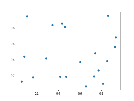
First, let’s create a simple scatter plot using Matplotlib. We will plot 20 random data points and visualize them on a graph.
import matplotlib.pyplot as plt
import numpy as np

x = np.random.rand(20)
y = np.random.rand(20)

plt.scatter(x, y)
plt.show()
Output:
Example 2: Adding Best Fit Line
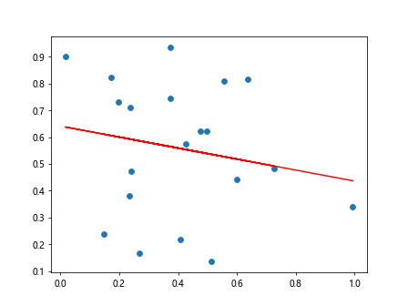
Next, let’s add a best fit line to the scatter plot. We will use numpy’s polyfit function to calculate the coefficients of the best fit line and then plot it on the graph.
import matplotlib.pyplot as plt
import numpy as np

# Generate random data points
x = np.random.rand(20)
y = np.random.rand(20)

# Calculate best fit line coefficients
coefficients = np.polyfit(x, y, 1)

# Plot scatter plot
plt.scatter(x, y)

# Plot best fit line
plt.plot(x, np.polyval(coefficients, x), color='red')
plt.show()
Output:
Example 3: Customizing Best Fit Line
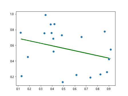
You can customize the appearance of the best fit line by changing the color, line style, and width. Here is an example of customizing the best fit line to be a dashed green line with increased line width.
import matplotlib.pyplot as plt
import numpy as np

# Generate random data points
x = np.random.rand(20)
y = np.random.rand(20)

# Calculate best fit line coefficients
coefficients = np.polyfit(x, y, 1)

# Plot scatter plot
plt.scatter(x, y)

# Plot customized best fit line
plt.plot(x, np.polyval(coefficients, x), color='green', linestyle='dashed', linewidth=2)
plt.show()
Output:
Example 4: Best Fit Line for Non-linear Data
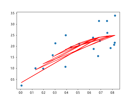
In some cases, the data may not follow a linear trend. We can still fit a best fit line using polynomial regression. Here is an example of fitting a polynomial best fit line of degree 2 to the data.
import matplotlib.pyplot as plt
import numpy as np

# Generate non-linear data points
x = np.random.rand(20)
y = np.square(x) + x + 2*np.random.rand(20)

# Fit polynomial best fit line
coefficients = np.polyfit(x, y, 2)

# Plot scatter plot
plt.scatter(x, y)

# Plot polynomial best fit line
plt.plot(x, np.polyval(coefficients, x), color='red')
plt.show()
Output:
Example 5: Displaying Equation of Best Fit Line
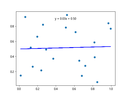
You can display the equation of the best fit line on the graph by adding a text annotation. Here is an example of displaying the equation of the best fit line on the graph.
import matplotlib.pyplot as plt
import numpy as np

# Generate random data points
x = np.random.rand(20)
y = np.random.rand(20)

# Calculate best fit line coefficients
coefficients = np.polyfit(x, y, 1)

# Plot scatter plot
plt.scatter(x, y)

# Plot best fit line
plt.plot(x, np.polyval(coefficients, x), color='blue')

# Display equation of best fit line
equation = f'y = {coefficients[0]:.2f}x + {coefficients[1]:.2f}'
plt.text(0.5, 0.9, equation, ha='center', va='center', transform=plt.gca().transAxes)
plt.show()
Output:
Example 6: Handling Missing Data
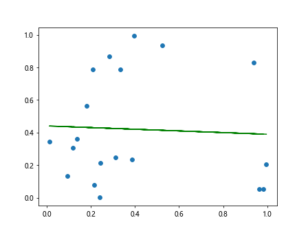
If your dataset contains missing values, you can handle them by removing the corresponding data points before fitting the best fit line. Here is an example of how to handle missing data points in the dataset.
import matplotlib.pyplot as plt
import numpy as np

# Generate random data points with missing values
x = np.random.rand(20)
y = np.random.rand(20)
y[5] = np.nan

# Remove missing values
valid_indices = ~np.isnan(y)
x = x[valid_indices]
y = y[valid_indices]

# Fit best fit line
coefficients = np.polyfit(x, y, 1)

# Plot scatter plot
plt.scatter(x, y)

# Plot best fit line
plt.plot(x, np.polyval(coefficients, x), color='green')
plt.show()
Output:
Example 7: Residual Analysis
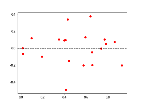
Residual analysis can be used to evaluate the goodness of fit of the best fit line. You can plot the residuals (the differences between the observed and predicted values) to check for any patterns or outliers. Here is an example of how to perform residual analysis.
import matplotlib.pyplot as plt
import numpy as np

# Generate random data points
x = np.random.rand(20)
y = np.random.rand(20)

# Calculate best fit line coefficients
coefficients = np.polyfit(x, y, 1)

# Calculate residuals
residuals = y - np.polyval(coefficients, x)

# Plot residuals
plt.scatter(x, residuals, color='red')
plt.axhline(y=0, color='black', linestyle='dashed')
plt.show()
Output:
Example 8: 3D Scatter Plot with Best Fit Plane
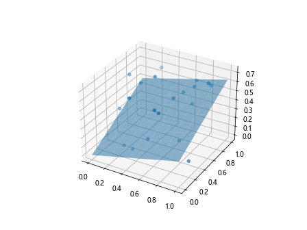
If your data is in three dimensions, you can create a 3D scatter plot and fit a best fit plane to the data points. Here is an example of creating a 3D scatter plot with a best fit plane.
import matplotlib.pyplot as plt
import numpy as np
from mpl_toolkits.mplot3d import Axes3D

# Generate random 3D data points
x = np.random.rand(20)
y = np.random.rand(20)
z = np.random.rand(20)

# Fit best fit plane
coefficients = np.polyfit(x, y, 1)
X, Y = np.meshgrid(np.linspace(0, 1, 10), np.linspace(0, 1, 10))
Z = coefficients[0]*X + coefficients[1]*Y

# Create 3D scatter plot
fig = plt.figure()
ax = fig.add_subplot(111, projection='3d')
ax.scatter(x, y, z)

# Plot best fit plane
ax.plot_surface(X, Y, Z, alpha=0.5)
plt.show()
Output:
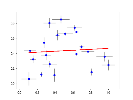
Example 9: Best Fit Line with Error Bars
When there is uncertainty in the data points, you can plot error bars along with the best fit line to indicate the level of uncertainty. Here is an example of plotting a best fit line with error bars.
import matplotlib.pyplot as plt
import numpy as np

# Generate data points with uncertainty
x = np.random.rand(20)
y = np.random.rand(20)
x_error = 0.1*np.random.rand(20)
y_error = 0.1*np.random.rand(20)

# Fit best fit line
coefficients = np.polyfit(x, y, 1)

# Plot scatter plot with error bars
plt.errorbar(x, y, xerr=x_error, yerr=y_error, fmt='o', color='blue', ecolor='gray')

# Plot best fit line
plt.plot(x, np.polyval(coefficients, x), color='red')
plt.show()
Output:
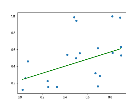
Example 10: Weighted Best Fit Line
If some data points are more reliable than others, you can assign weights to the data points when fitting the best fit line. Here is an example of fitting a weighted best fit line to the data points.
import matplotlib.pyplot as plt
import numpy as np

# Generate random data points with weights
x = np.random.rand(20)
y = np.random.rand(20)
weights = np.random.rand(20)

# Fit weighted best fit line
coefficients = np.polyfit(x, y, 1, w=weights)

# Plot scatter plot
plt.scatter(x, y)

# Plot weighted best fit line
plt.plot(x, np.polyval(coefficients, x), color='green')
plt.show()
Output:
In this article, we have covered various aspects of creating a best fit line with Matplotlib. By using the examples provided, you can easily visualize and analyze the trend of your data points. Experiment with different customization options and techniques to gain deeper insights from your data visualization.