Bar Chart using Matplotlib
Bar charts are a common way to display data in a visual format, where the length of the bars represents the value being presented. In this article, we will explore how to create bar charts using Matplotlib, a popular Python library for data visualization.
Introduction to Bar Charts
Bar charts are useful for comparing categories of data. They are commonly used to show the distribution of numerical data across different categories.
Example 1: Simple Bar Chart
import matplotlib.pyplot as plt

# Data
categories = ['A', 'B', 'C', 'D']
values = [10, 20, 15, 25]

# Create bar chart
plt.bar(categories, values)
plt.show()
Output:

In this example, we create a simple bar chart using Matplotlib. We specify the categories on the x-axis and the corresponding values on the y-axis.
Example 2: Horizontal Bar Chart
import matplotlib.pyplot as plt

# Data
categories = ['A', 'B', 'C', 'D']
values = [10, 20, 15, 25]

# Create horizontal bar chart
plt.barh(categories, values)
plt.show()
Output:
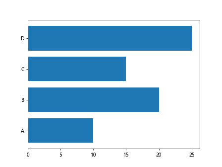
In this example, we create a horizontal bar chart by using the barh function instead of bar.
Customizing Bar Charts
Matplotlib provides various options for customizing the appearance of bar charts, such as changing the colors, labels, and styles.
Example 3: Customizing Bar Colors
import matplotlib.pyplot as plt

# Data
categories = ['A', 'B', 'C', 'D']
values = [10, 20, 15, 25]

# Create bar chart with custom colors
colors = ['red', 'green', 'blue', 'orange']
plt.bar(categories, values, color=colors)
plt.show()
Output:
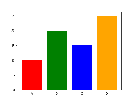
In this example, we customize the bar colors by specifying a list of colors in the color parameter of the bar function.
Example 4: Adding Labels to Bars
import matplotlib.pyplot as plt

# Data
categories = ['A', 'B', 'C', 'D']
values = [10, 20, 15, 25]

# Create bar chart with labels
plt.bar(categories, values)
for i, value in enumerate(values):
    plt.text(i, value + 1, str(value), ha='center')
plt.show()
Output:
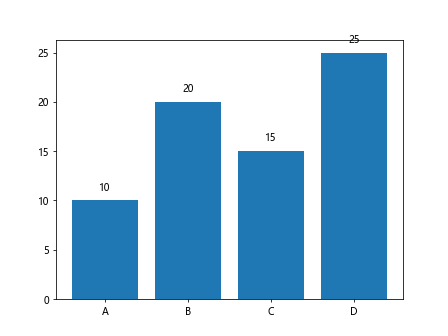
In this example, we add labels to the bars by iterating over the values and using the text function to display the values on the bars.
Grouped Bar Charts
Grouped bar charts are useful for comparing multiple series of data across different categories.
Example 5: Grouped Bar Chart
import matplotlib.pyplot as plt

# Data
categories = ['A', 'B', 'C', 'D']
values1 = [10, 20, 15, 25]
values2 = [15, 25, 20, 30]

# Create grouped bar chart
bar_width = 0.35
plt.bar(categories, values1, bar_width, label='Series 1')
plt.bar([x + bar_width for x in range(len(categories))], values2, bar_width, label='Series 2')
plt.legend()
plt.show()
Output:
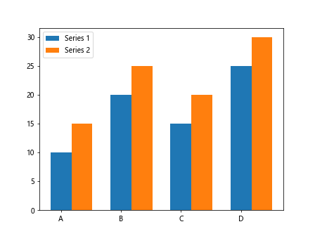
In this example, we create a grouped bar chart with two series of data. We use the bar function twice, once for each series, and shift the bars horizontally to create the grouped effect.
Stacked Bar Charts
Stacked bar charts are useful for showing the total and individual contributions of different categories to a whole.
Example 6: Stacked Bar Chart
import matplotlib.pyplot as plt

# Data
categories = ['A', 'B', 'C', 'D']
values1 = [10, 20, 15, 25]
values2 = [5, 10, 8, 12]

# Create stacked bar chart
plt.bar(categories, values1, label='Series 1')
plt.bar(categories, values2, bottom=values1, label='Series 2')
plt.legend()
plt.show()
Output:
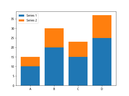
In this example, we create a stacked bar chart by using the bottom parameter in the second bar function to specify the starting point for the bars.
Bar Chart with Error Bars
Error bars can be added to bar charts to show the variability or uncertainty in the data.
Example 7: Bar Chart with Error Bars
import matplotlib.pyplot as plt

# Data
import numpy as np
categories = ['A', 'B', 'C', 'D']
values = [10, 20, 15, 25]
errors = np.array([1, 2, 1, 3])

# Create bar chart with error bars
plt.bar(categories, values, yerr=errors, capsize=5)
plt.show()
Output:
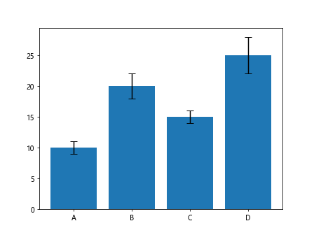
In this example, we add error bars to the bar chart by specifying the error values in the yerr parameter of the bar function.
Bar Chart with Annotations
Annotations can be added to bar charts to provide additional information about the data.
Example 8: Bar Chart with Annotations
import matplotlib.pyplot as plt

# Data
categories = ['A', 'B', 'C', 'D']
values = [10, 20, 15, 25]

# Create bar chart with annotations
plt.bar(categories, values)
for i, value in enumerate(values):
    plt.text(i, value, str(value), ha='center', va='bottom')
plt.show()
Output:

In this example, we add annotations to the bars by using the text function to display the values directly on the bars.
Bar Chart with Different Bar Widths
The width of the bars in a bar chart can be customized to emphasize certain data points.
Example 9: Bar Chart with Different Bar Widths
import matplotlib.pyplot as plt

# Data
categories = ['A', 'B', 'C', 'D']
values = [10, 20, 15, 25]

# Create bar chart with different bar widths
bar_widths = [0.5, 0.75, 0.5, 0.25]
for i, (category, value, width) in enumerate(zip(categories, values, bar_widths)):
    plt.bar(i, value, width=width)
plt.xticks(range(len(categories)), categories)
plt.show()
Output:
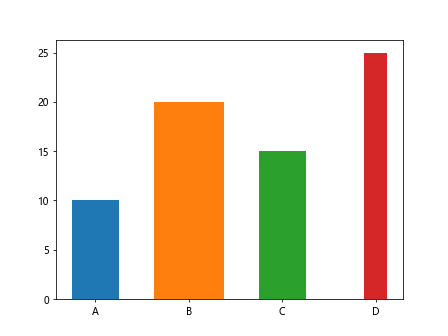
In this example, we create a bar chart with different bar widths by specifying a list of widths in the width parameter of the bar function.
Bar Chart with Logarithmic Scale
Bar charts can also be displayed on a logarithmic scale to better visualize large differences in data values.
Example 10: Bar Chart with Logarithmic Scale
import matplotlib.pyplot as plt

# Data
categories = ['A', 'B', 'C', 'D']
values = [100, 1000, 10000, 100000]

# Create bar chart with logarithmic scale
plt.bar(categories, values)
plt.yscale('log')
plt.show()
Output:
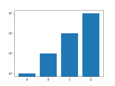
In this example, we create a bar chart with a logarithmic scale on the y-axis by calling the yscale function with the argument 'log'.
Bar Chart using Matplotlib Conclusion
In this article, we have covered the basics of creating bar charts using Matplotlib. We have explored different types of bar charts, customization options, and additional features like annotations and error bars. With these tools, you can effectively visualize and analyze your data using bar charts.Experiment with different styles, colors, and configurations to best convey your data to your audience.