Axis Labels in Matplotlib
Matplotlib is a widely used data visualization library in Python. It provides a great deal of flexibility in creating different types of plots and charts. One important aspect of creating clear and informative plots is labeling the axes. Axis labels help identify the variables being represented in a plot and provide context to understand the data.
In this article, we will explore how to add axis labels to different types of plots using Matplotlib. We will cover the basic syntax, customization options, and provide multiple code examples for each type of plot.
Adding Axis Labels to Plots in Matplotlib
Before diving into the code examples, it’s important to understand the structure of a plot in Matplotlib. A plot typically consists of an X-axis and a Y-axis, which represent the horizontal and vertical axes, respectively. To add labels to these axes, you need to access the respective objects and modify their properties.
To set the labels for the X and Y axes, we use the following methods:
plt.xlabel("x-axis label")
plt.ylabel("y-axis label")
Here, plt represents the pyplot module of the Matplotlib library, which is usually imported as import matplotlib.pyplot as plt.
Let’s now explore different types of plots and see how to add axis labels to each of them.
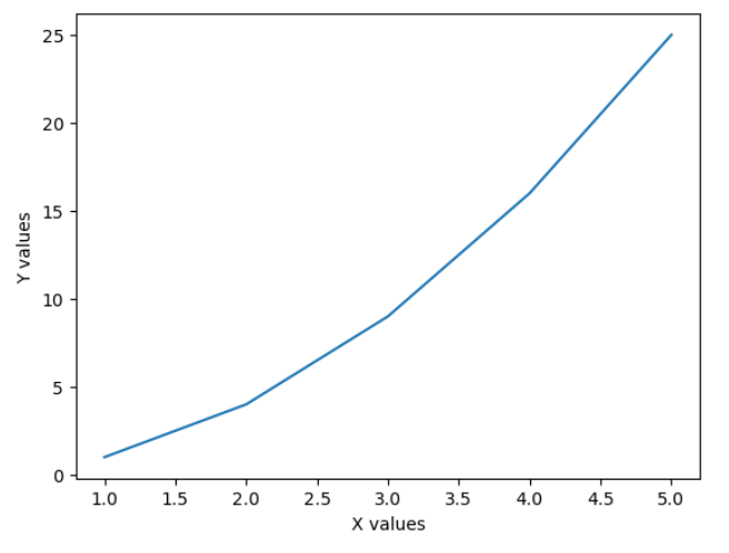
Line Plot
A line plot is a basic type of plot that represents data points connected by straight lines. It is often used to show data trends over time or continuous variables. To add axis labels to a line plot, we can use the xlabel() and ylabel() methods.
Example 1:
import matplotlib.pyplot as plt

# Generate sample data
x = [1, 2, 3, 4, 5]
y = [1, 4, 9, 16, 25]

# Create a line plot
plt.plot(x, y)

# Add axis labels
plt.xlabel("X values")
plt.ylabel("Y values")

# Show the plot
plt.show()
Output:
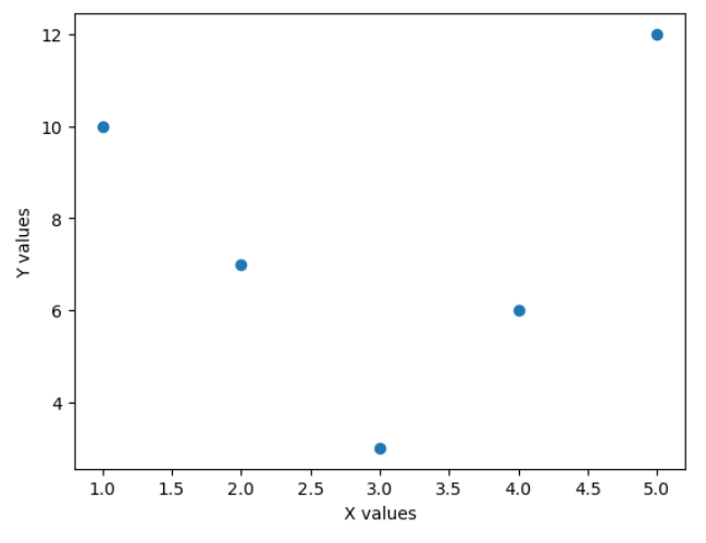
Scatter Plot
A scatter plot displays data points as individual markers on a 2D plane. It is used to investigate relationships between two continuous variables. To add axis labels to a scatter plot, we can use the xlabel() and ylabel() methods.
Example 2:
import matplotlib.pyplot as plt

# Generate sample data
x = [1, 2, 3, 4, 5]
y = [10, 7, 3, 6, 12]

# Create a scatter plot
plt.scatter(x, y)

# Add axis labels
plt.xlabel("X values")
plt.ylabel("Y values")

# Show the plot
plt.show()
Output:
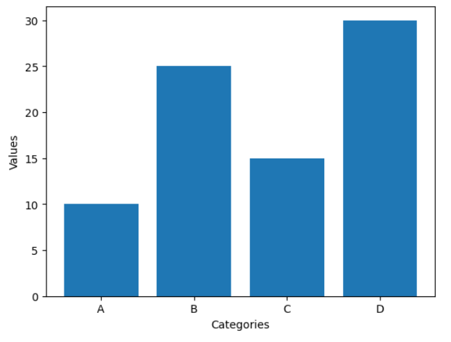
Bar Plot
A bar plot represents categorical data with rectangular bars. It is commonly used to compare different categories or groups. To add axis labels to a bar plot, we can use the xlabel() and ylabel() methods.
Example 3:
import matplotlib.pyplot as plt

# Generate sample data
categories = ["A", "B", "C", "D"]
values = [10, 25, 15, 30]

# Create a bar plot
plt.bar(categories, values)

# Add axis labels
plt.xlabel("Categories")
plt.ylabel("Values")

# Show the plot
plt.show()
Output:
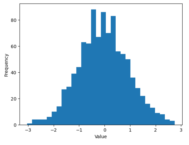
Histogram
A histogram is used to represent the distribution of a dataset by dividing it into bins and displaying the frequency or count of data points within each bin. To add axis labels to a histogram, we can use the xlabel() and ylabel() methods.
Example 4:
import matplotlib.pyplot as plt
import numpy as np

# Generate a random dataset
np.random.seed(0)
data = np.random.randn(1000)

# Create a histogram
plt.hist(data, bins=30)

# Add axis labels
plt.xlabel("Value")
plt.ylabel("Frequency")

# Show the plot
plt.show()
Output:
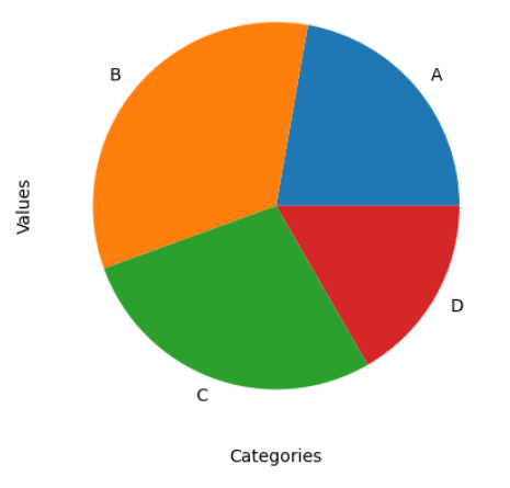
Pie Chart
A pie chart represents data as a circular graph, divided into slices that represent different categories or proportions. To add axis labels to a pie chart, we can use the xlabel() and ylabel() methods.
Example 5:
import matplotlib.pyplot as plt

# Generate sample data
categories = ["A", "B", "C", "D"]
values = [20, 30, 25, 15]

# Create a pie chart
plt.pie(values, labels=categories)

# Add axis labels
plt.xlabel("Categories")
plt.ylabel("Values")

# Show the plot
plt.show()
Output: