Introduction to ax.errorbar
In this article, we will delve into the ax.errorbar method in Matplotlib. ax.errorbar is a function used to plot error bars along with data points on a matplotlib axes object. Error bars are useful for visually representing the uncertainty or variability in data.
Basic Syntax
The basic syntax for using ax.errorbar is as follows:
import matplotlib.pyplot as plt

x = [1, 2, 3, 4, 5]
y = [2, 3, 5, 7, 11]
y_err = [0.2, 0.3, 0.5, 0.7, 1.1]

fig, ax = plt.subplots()
ax.errorbar(x, y, yerr=y_err, fmt='o', ecolor='red', capsize=5)
plt.show()
Output:
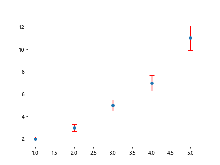
In the above code snippet, we first import the necessary libraries and create some sample data. We then create a figure and axis object using plt.subplots() method. Finally, we call ax.errorbar with the data points x and y, along with the error values y_err, format of the marker fmt, error bar color ecolor, and cap size capsize.
Adjusting Error Bars
Changing Error Bar Color
You can customize the error bar color using the ecolor parameter. Here’s an example:
import matplotlib.pyplot as plt

x = [1, 2, 3, 4, 5]
y = [2, 3, 5, 7, 11]
y_err = [0.2, 0.3, 0.5, 0.7, 1.1]

fig, ax = plt.subplots()
ax.errorbar(x, y, yerr=y_err, fmt='o', ecolor='green', capsize=5)
plt.show()
Output:
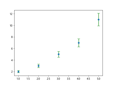
In the above code snippet, we changed the error bar color to green by setting ecolor='green'.
Changing Error Bar Cap Size
You can adjust the size of the caps at the end of the error bars using the capsize parameter. Here’s an example:
import matplotlib.pyplot as plt

x = [1, 2, 3, 4, 5]
y = [2, 3, 5, 7, 11]
y_err = [0.2, 0.3, 0.5, 0.7, 1.1]

fig, ax = plt.subplots()
ax.errorbar(x, y, yerr=y_err, fmt='o', ecolor='blue', capsize=10)
plt.show()
Output:
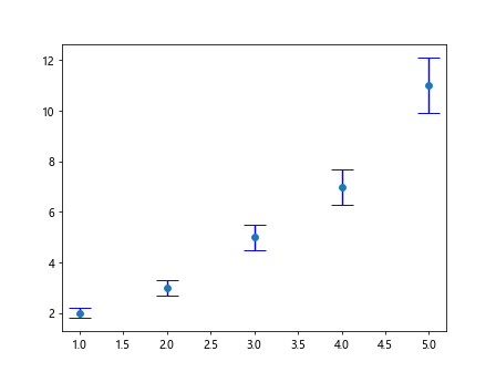
In the above code snippet, we increased the cap size of the error bars to 10 by setting capsize=10.
Adding Labels and Title
You can add labels to the x-axis, y-axis, and a title to the plot using ax.set_xlabel(), ax.set_ylabel() and ax.set_title() methods respectively. Here’s an example:
import matplotlib.pyplot as plt

x = [1, 2, 3, 4, 5]
y = [2, 3, 5, 7, 11]
y_err = [0.2, 0.3, 0.5, 0.7, 1.1]

fig, ax = plt.subplots()
ax.errorbar(x, y, yerr=y_err, fmt='o', ecolor='orange', capsize=8)
ax.set_xlabel('X-axis')
ax.set_ylabel('Y-axis')
ax.set_title('Error Bar Plot')
plt.show()
Output:
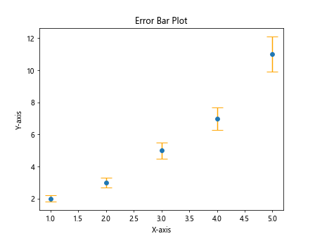
In the above code snippet, we added labels to the x-axis and y-axis, and a title to the plot.
Introduction to ax.errorbar Conclusion
In this article, we covered the basics of using ax.errorbar in Matplotlib to create plots with error bars. We explored how to customize the error bars by changing their color and cap size, as well as adding labels and titles to the plot. This function is essential for visualizing uncertainties in data and conveying the reliability of measurements. Explore further and experiment with different parameters to enhance your data visualization skills.