Introduction to ax.errorbar
In Matplotlib, ax.errorbar is a method used to create error bar plots on a given Axes object. Error bar plots are commonly used in data visualization to show the uncertainty in the data being plotted.
Basic Syntax
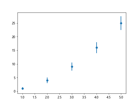
The basic syntax for using ax.errorbar is as follows:
import matplotlib.pyplot as plt

x = [1, 2, 3, 4, 5]
y = [1, 4, 9, 16, 25]
y_err = [0.5, 1, 1.5, 2, 2.5]

fig, ax = plt.subplots()
ax.errorbar(x, y, yerr=y_err)
plt.show()
Output:
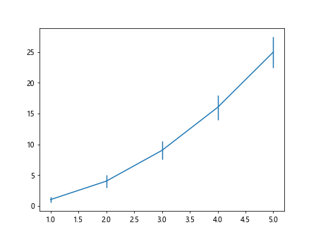
In the code snippet above, we create a simple line plot with error bars on the y-axis. The x and y variables represent the data points, while y_err represents the error values for each point.
Adding Custom Error Bar Styles
You can customize the appearance of the error bars by specifying various parameters in the errorbar method. Here’s an example:
import matplotlib.pyplot as plt

x = [1, 2, 3, 4, 5]
y = [1, 4, 9, 16, 25]
y_err = [0.5, 1, 1.5, 2, 2.5]

fig, ax = plt.subplots()
ax.errorbar(x, y, yerr=y_err, fmt='o', ecolor='red', capsize=5)
plt.show()
Output:
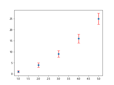
In the code above, we have added red circles at each data point (fmt='o'), specified the error bar color as red (ecolor='red'), and set the size of the error bar caps to 5 (capsize=5).
Customizing Error Bar Line Styles
You can also customize the line style of the error bars by specifying the ls parameter. Here’s an example:
import matplotlib.pyplot as plt

x = [1, 2, 3, 4, 5]
y = [1, 4, 9, 16, 25]
y_err = [0.5, 1, 1.5, 2, 2.5]

fig, ax = plt.subplots()
ax.errorbar(x, y, yerr=y_err, ls='--', color='green')
plt.show()
Output:
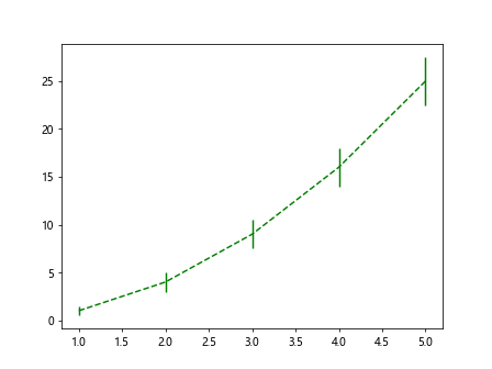
In the code snippet above, we have set the line style of the error bars to dashed (ls='--') and specified the color as green (color='green').
Using Different Marker Styles
You can use different marker styles to represent the data points in the error bar plot. Here’s an example:
import matplotlib.pyplot as plt

x = [1, 2, 3, 4, 5]
y = [1, 4, 9, 16, 25]
y_err = [0.5, 1, 1.5, 2, 2.5]

fig, ax = plt.subplots()
ax.errorbar(x, y, yerr=y_err, fmt='^', markersize=10)
plt.show()
Output:
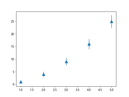
In the code snippet above, we have used triangle markers (fmt='^') with a size of 10 (markersize=10) to represent the data points.
Creating Horizontal Error Bars
You can create horizontal error bars by setting the xerr parameter in the errorbar method. Here’s an example:
import matplotlib.pyplot as plt

x = [1, 2, 3, 4, 5]
y = [1, 4, 9, 16, 25]
x_err = [0.3, 0.4, 0.5, 0.2, 0.1]

fig, ax = plt.subplots()
ax.errorbar(x, y, xerr=x_err, fmt='o', ecolor='purple')
plt.show()
Output:
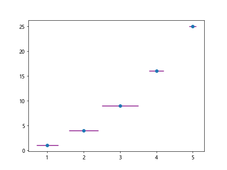
In the code above, we have added horizontal error bars with error values specified in the x_err variable and set the error bar color to purple.
Adding Error Bar Labels
You can add labels to the error bars to provide additional information. Here’s an example:
import matplotlib.pyplot as plt

x = [1, 2, 3, 4, 5]
y = [1, 4, 9, 16, 25]
y_err = [0.5, 1, 1.5, 2, 2.5]

fig, ax = plt.subplots()
ax.errorbar(x, y, yerr=y_err)
for i, (xi, yi, err) in enumerate(zip(x, y, y_err)):
    ax.text(xi, yi+err+0.5, f'{err}', ha='center')
plt.show()
Output:
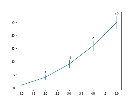
In the code snippet above, we have added labels to the error bars showing the error values above each data point.
Customizing Error Bar Caps
You can customize the style of the error bar caps by specifying the capsize parameter. Here’s an example:
import matplotlib.pyplot as plt

x = [1, 2, 3, 4, 5]
y = [1, 4, 9, 16, 25]
y_err = [0.5, 1, 1.5, 2, 2.5]

fig, ax = plt.subplots()
ax.errorbar(x, y, yerr=y_err, capsize=10)
plt.show()
Output:
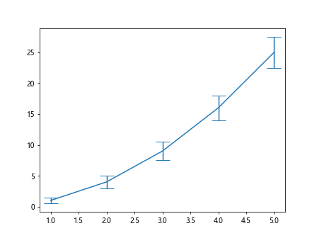
In the code snippet above, we have set the size of the error bar caps to 10 (capsize=10), making them more visible on the plot.
Displaying Error Bars on Log Scale
You can display error bars on a log scale by setting the log parameter. Here’s an example:
import matplotlib.pyplot as plt

x = [1, 2, 3, 4, 5]
y = [1, 4, 9, 16, 25]
y_err = [0.5, 1, 1.5, 2, 2.5]

fig, ax = plt.subplots()
ax.errorbar(x, y, yerr=y_err, fmt='o', logy=True)
plt.show()
In the code above, we have displayed the error bars on a log scale on the y-axis by setting logy=True.
Customizing Error Bar Line Width
You can customize the width of the error bar lines by specifying the linewidth parameter. Here’s an example:
import matplotlib.pyplot as plt

x = [1, 2, 3, 4, 5]
y = [1, 4, 9, 16, 25]
y_err = [0.5, 1, 1.5, 2, 2.5]

fig, ax = plt.subplots()
ax.errorbar(x, y, yerr=y_err, fmt='o', linewidth=2)
plt.show()
Output:

In the code snippet above, we have set the width of the error bar lines to 2 (linewidth=2), making them thicker and more prominent on the plot.
Combining Error Bar Plots with Line Plots
You can combine error bar plots with line plots on the same Axes object. Here’s an example:
import matplotlib.pyplot as plt

x = [1, 2, 3, 4, 5]
y = [1, 4, 9, 16, 25]
y_err = [0.5, 1, 1.5, 2, 2.5]

fig, ax = plt.subplots()
ax.errorbar(x, y, yerr=y_err, fmt='o', label='Data points')
ax.plot(x, y, linestyle='--', color='red', label='Line plot')
ax.legend()
plt.show()
Output:
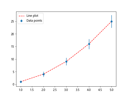
In the code above, we have combined error bar plots with a dashed red line plot on the same Axes object, with a legend to differentiate between the plots.
Overlaying Multiple Error Bar Plots
You can overlay multiple error bar plots on the same Axes object to compare different datasets. Here’s an example:
import matplotlib.pyplot as plt

x1 = [1, 2, 3, 4, 5]
y1 = [1, 4, 9, 16, 25]
y1_err = [0.5, 1, 1.5, 2, 2.5]

x2 = [1, 2, 3, 4, 5]
y2 = [1, 3, 8, 15, 24]
y2_err = [0.3, 0.8, 1.2, 1.5, 2.0]

fig, ax = plt.subplots()
ax.errorbar(x1, y1, yerr=y1_err, fmt='o', label='Dataset 1')
ax.errorbar(x2, y2, yerr=y2_err, fmt='^', label='Dataset 2')
ax.legend()
plt.show()
Output:
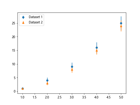
In the code above, we have overlaid two error bar plots representing two different datasets on the same Axes object. Each dataset is represented by a different marker style, with a legend to differentiate between them.
Using Different Error Bar Cap Styles
You can customize the style of the error bar caps by specifying the capstyle parameter. Here’s an example:
import matplotlib.pyplot as plt

x = [1, 2, 3, 4, 5]
y = [1, 4, 9, 16, 25]
y_err = [0.5, 1, 1.5, 2, 2.5]

fig, ax = plt.subplots()
ax.errorbar(x, y, yerr=y_err, fmt='o', capstyle='round')
plt.show()
In the code snippet above, we have set the style of the error bar caps to round (capstyle='round'), giving them a circular appearance.
Adding Error Bar Colors
You can add different colors to the error bars to make them more visually appealing. Here’s an example:
import matplotlib.pyplot as plt

x = [1, 2, 3, 4, 5]
y = [1, 4, 9, 16, 25]
y_err = [0.5, 1, 1.5, 2, 2.5]
colors = ['blue', 'green', 'red', 'purple', 'orange']

fig, ax = plt.subplots()
for i in range(len(x)):
    ax.errorbar(x[i], y[i], yerr=y_err[i], fmt='o', ecolor=colors[i])
plt.show()
Output:
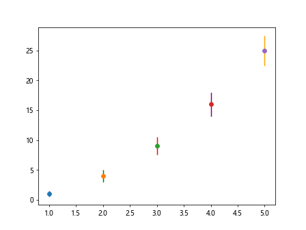
In the code above, we have assigned different colors to each error bar by iterating through a list of colors and setting the ecolor parameter.
Adjusting Error Bar Widths
You can adjust the width of the error bars by specifying the elinewidth parameter. Here’s an example:
import matplotlib.pyplot as plt

x = [1, 2, 3, 4, 5]
y = [1, 4, 9, 16, 25]
y_err = [0.5, 1, 1.5, 2, 2.5]

fig, ax = plt.subplots()
ax.errorbar(x, y, yerr=y_err, fmt='o', elinewidth=2)
plt.show()
Output:
In the code snippet above, we have set the width of the error bars to 2 (elinewidth=2), making them thicker on the plot.
Changing Error Bar Marker Size
You can change the size of the markers used in the error bars by specifying the markersize parameter. Here’s an example:
import matplotlib.pyplot as plt

x = [1, 2, 3, 4, 5]
y = [1, 4, 9, 16, 25]
y_err = [0.5, 1, 1.5, 2, 2.5]

fig, ax = plt.subplots()
ax.errorbar(x, y, yerr=y_err, fmt='o', markersize=8)
plt.show()
Output:

In the code above, we have set the size of the markers in the error bars to 8 (markersize=8), making them larger and more visible on the plot.
Displaying Custom Error Bar Text
You can display custom text on the error bars to provide additional information. Here’s an example:
import matplotlib.pyplot as plt

x = [1, 2, 3, 4, 5]
y = [1, 4, 9, 16, 25]
y_err = [0.5, 1, 1.5, 2, 2.5]

fig, ax = plt.subplots()
ax.errorbar(x, y, yerr=y_err, fmt='o')
for i, (xi, yi, err) in enumerate(zip(x, y, y_err)):
    ax.text(xi-0.1, yi+err+0.5, f'Error: {err}', ha='center')
plt.show()
Output:
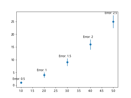
In the code snippet above, we have added custom text to the error bars showing the error values with additional information.
Introduction to ax.errorbar Conclusion
In conclusion, the ax.errorbar method in Matplotlib is a powerful tool for visualizing data with error bars. By customizing various parameters, you can create visually appealing error bar plots to display the uncertainty in your datasets. Experiment with different styles, colors, and marker sizes to create informative and engaging plots for your data analysis projects.