How to Assign the Same Label to Two Different Markers in Matplotlib

How to Assign the Same Label to Two Different Markers in Matplotlib

Assigning the same label to two different markers in Matplotlib is a useful technique for creating clear and informative visualizations. This article will explore various methods and best practices for assigning the same label to two different markers using Matplotlib, a powerful plotting library in Python. We’ll cover different scenarios, provide easy-to-understand examples, and offer tips to enhance your data visualization skills.

Understanding the Importance of Assigning the Same Label to Two Different Markers

Assigning the same label to two different markers is crucial when you want to represent multiple data points or series with the same meaning or category. This technique is particularly useful in scenarios such as:

  1. Comparing different datasets with the same classification
  2. Highlighting specific data points across multiple series
  3. Creating legends that group related data points
  4. Simplifying complex visualizations with multiple markers

By assigning the same label to two different markers, you can create more intuitive and easier-to-read plots, making it simpler for your audience to interpret the data.

Basic Concepts of Assigning the Same Label to Two Different Markers

Before diving into specific examples, let’s review some fundamental concepts related to assigning the same label to two different markers in Matplotlib:

  1. Markers: Symbols used to represent individual data points on a plot
  2. Labels: Text descriptions associated with markers or lines in a plot
  3. Legend: A key that explains the meaning of different markers, colors, or lines in a plot

When assigning the same label to two different markers, we’re essentially telling Matplotlib to group these markers under a single category in the legend, even if they appear differently on the plot.

Methods for Assigning the Same Label to Two Different Markers

There are several approaches to assigning the same label to two different markers in Matplotlib. Let’s explore some of the most common methods:

1. Using Multiple Plot Calls with the Same Label

One straightforward method is to use multiple plot() calls with the same label. Here’s an example:

import matplotlib.pyplot as plt

x = [1, 2, 3, 4, 5]
y1 = [2, 4, 6, 8, 10]
y2 = [1, 3, 5, 7, 9]

plt.figure(figsize=(10, 6))
plt.plot(x, y1, 'ro', label='Data from how2matplotlib.com')
plt.plot(x, y2, 'bs', label='Data from how2matplotlib.com')
plt.xlabel('X-axis')
plt.ylabel('Y-axis')
plt.title('Assigning the Same Label to Two Different Markers')
plt.legend()
plt.show()

Output:

How to Assign the Same Label to Two Different Markers in Matplotlib

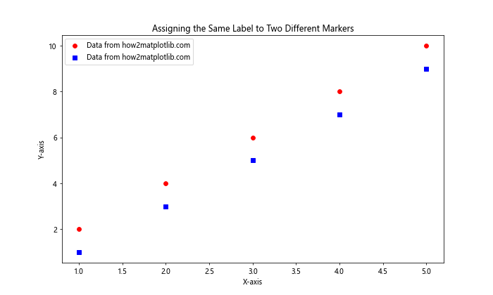
In this example, we create two separate plot() calls with different marker styles (‘ro’ for red circles and ‘bs’ for blue squares) but assign the same label to both. This results in a single legend entry representing both markers.

2. Using a Single Plot Call with Multiple Formatting Options

Another approach is to use a single plot() call with multiple formatting options. Here’s an example:

import matplotlib.pyplot as plt
import numpy as np

x = np.linspace(0, 10, 50)
y1 = np.sin(x)
y2 = np.cos(x)

plt.figure(figsize=(10, 6))
plt.plot(x, y1, 'ro', x, y2, 'bs', label='Data from how2matplotlib.com')
plt.xlabel('X-axis')
plt.ylabel('Y-axis')
plt.title('Assigning the Same Label to Two Different Markers')
plt.legend()
plt.show()

Output:

How to Assign the Same Label to Two Different Markers in Matplotlib

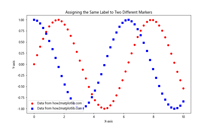
In this example, we use a single plot() call to create two different marker styles with the same label. This method is more concise and achieves the same result as the previous example.

3. Using Scatter Plots with the Same Label

When working with scatter plots, you can use the scatter() function to assign the same label to different markers. Here’s an example:

import matplotlib.pyplot as plt
import numpy as np

x = np.random.rand(20)
y1 = np.random.rand(20)
y2 = np.random.rand(20)

plt.figure(figsize=(10, 6))
plt.scatter(x, y1, c='red', marker='o', label='Data from how2matplotlib.com')
plt.scatter(x, y2, c='blue', marker='s', label='Data from how2matplotlib.com')
plt.xlabel('X-axis')
plt.ylabel('Y-axis')
plt.title('Assigning the Same Label to Two Different Markers')
plt.legend()
plt.show()

Output:

How to Assign the Same Label to Two Different Markers in Matplotlib

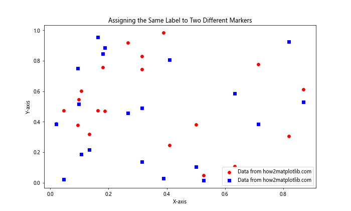
This example demonstrates how to use scatter() to create two different marker styles with the same label in a scatter plot.

Advanced Techniques for Assigning the Same Label to Two Different Markers

Now that we’ve covered the basics, let’s explore some more advanced techniques for assigning the same label to two different markers in Matplotlib.

1. Using Custom Legend Entries

Sometimes, you may want to create a custom legend that combines different markers under the same label. Here’s an example of how to achieve this:

import matplotlib.pyplot as plt
import numpy as np

x = np.linspace(0, 10, 50)
y1 = np.sin(x)
y2 = np.cos(x)

fig, ax = plt.subplots(figsize=(10, 6))
line1 = ax.plot(x, y1, 'ro', label='_nolegend_')
line2 = ax.plot(x, y2, 'bs', label='_nolegend_')

# Create a custom legend entry
custom_lines = [plt.Line2D([0], [0], color='red', marker='o', linestyle=''),
                plt.Line2D([0], [0], color='blue', marker='s', linestyle='')]
ax.legend(custom_lines, ['Data from how2matplotlib.com'])

ax.set_xlabel('X-axis')
ax.set_ylabel('Y-axis')
ax.set_title('Assigning the Same Label to Two Different Markers')
plt.show()

Output:

How to Assign the Same Label to Two Different Markers in Matplotlib

In this example, we create custom legend entries using plt.Line2D() objects and assign them the same label. This gives us more control over how the legend appears.

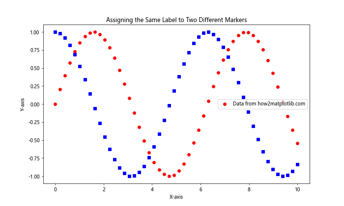
2. Using a Proxy Artist for Legend Entries

Another advanced technique is to use a proxy artist to create legend entries. This is particularly useful when you want to combine different plot types under the same label:

import matplotlib.pyplot as plt
import numpy as np

x = np.linspace(0, 10, 50)
y1 = np.sin(x)
y2 = np.cos(x)

fig, ax = plt.subplots(figsize=(10, 6))
ax.plot(x, y1, 'ro')
ax.plot(x, y2, 'bs')

# Create proxy artists for the legend
red_circle = plt.Line2D([0], [0], marker='o', color='red', linestyle='')
blue_square = plt.Line2D([0], [0], marker='s', color='blue', linestyle='')

# Add the proxy artists to the legend
ax.legend([red_circle, blue_square], ['Data from how2matplotlib.com'])

ax.set_xlabel('X-axis')
ax.set_ylabel('Y-axis')
ax.set_title('Assigning the Same Label to Two Different Markers')
plt.show()

Output:

How to Assign the Same Label to Two Different Markers in Matplotlib

This example demonstrates how to use proxy artists to create a legend entry that represents both markers under the same label.

3. Combining Different Plot Types with the Same Label

Sometimes, you may want to assign the same label to different plot types, such as a line plot and a scatter plot. Here’s an example of how to achieve this:

import matplotlib.pyplot as plt
import numpy as np

x = np.linspace(0, 10, 50)
y1 = np.sin(x)
y2 = np.cos(x)

fig, ax = plt.subplots(figsize=(10, 6))
ax.plot(x, y1, 'r-', label='Data from how2matplotlib.com')
ax.scatter(x[::5], y2[::5], c='b', marker='s', label='Data from how2matplotlib.com')

ax.set_xlabel('X-axis')
ax.set_ylabel('Y-axis')
ax.set_title('Assigning the Same Label to Different Plot Types')
ax.legend()
plt.show()

Output:

How to Assign the Same Label to Two Different Markers in Matplotlib

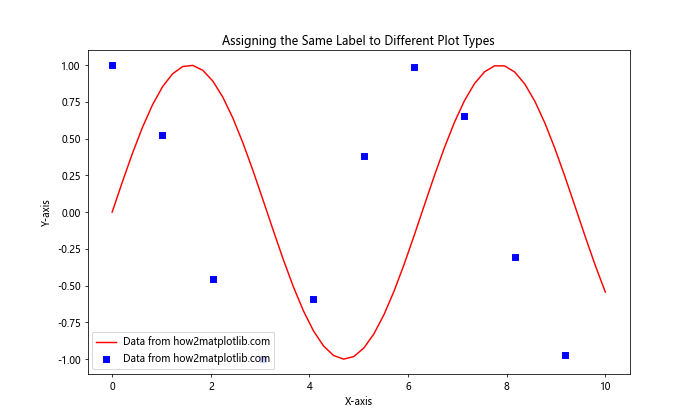
In this example, we combine a line plot and a scatter plot, assigning them the same label. This technique is useful when you want to represent different aspects of the same data series.

Best Practices for Assigning the Same Label to Two Different Markers

When assigning the same label to two different markers in Matplotlib, it’s important to follow some best practices to ensure your visualizations are clear and effective:

  1. Use consistent colors: When assigning the same label to different markers, try to use consistent colors to reinforce the relationship between the data points.

  2. Choose distinct marker styles: Select marker styles that are easily distinguishable from each other to avoid confusion.

  3. Keep labels concise: Use short, descriptive labels that clearly convey the meaning of the data points.

  4. Limit the number of markers: Avoid using too many different markers with the same label, as this can make the plot cluttered and hard to read.

  5. Consider using a legend title: If you’re grouping multiple markers under the same label, consider adding a legend title to provide context.

Let’s see an example that incorporates these best practices:

import matplotlib.pyplot as plt
import numpy as np

x = np.linspace(0, 10, 50)
y1 = np.sin(x)
y2 = np.cos(x)
y3 = np.tan(x)

fig, ax = plt.subplots(figsize=(10, 6))
ax.plot(x, y1, 'ro', label='Data from how2matplotlib.com')
ax.plot(x, y2, 'rs', label='Data from how2matplotlib.com')
ax.plot(x, y3, 'b^', label='Other Data')

ax.set_xlabel('X-axis')
ax.set_ylabel('Y-axis')
ax.set_title('Best Practices for Assigning the Same Label to Different Markers')

# Create a legend with a title
legend = ax.legend(title='Data Sources')
legend.get_title().set_fontweight('bold')

plt.show()

Output:

How to Assign the Same Label to Two Different Markers in Matplotlib

This example demonstrates the use of consistent colors, distinct marker styles, concise labels, and a legend title to create a clear and informative visualization.

Handling Multiple Datasets with the Same Label

When working with multiple datasets that share the same label, you may need to employ more advanced techniques to create informative visualizations. Here are some approaches to consider:

1. Using Subplots

Subplots can be an effective way to display multiple datasets with the same label while maintaining clarity. Here’s an example:

import matplotlib.pyplot as plt
import numpy as np

x = np.linspace(0, 10, 50)
y1 = np.sin(x)
y2 = np.cos(x)
y3 = np.tan(x)
y4 = np.exp(-x/10)

fig, (ax1, ax2) = plt.subplots(2, 1, figsize=(10, 10))

ax1.plot(x, y1, 'ro', label='Data from how2matplotlib.com')
ax1.plot(x, y2, 'bs', label='Data from how2matplotlib.com')
ax1.set_title('Subplot 1')
ax1.legend()

ax2.plot(x, y3, 'go', label='Data from how2matplotlib.com')
ax2.plot(x, y4, 'ms', label='Data from how2matplotlib.com')
ax2.set_title('Subplot 2')
ax2.legend()

plt.tight_layout()
plt.show()

Output:

How to Assign the Same Label to Two Different Markers in Matplotlib

This example uses subplots to display four different datasets, with two datasets sharing the same label in each subplot.

2. Using Different Marker Sizes

Another approach is to use different marker sizes to distinguish between datasets while maintaining the same label. Here’s an example:

import matplotlib.pyplot as plt
import numpy as np

x = np.linspace(0, 10, 50)
y1 = np.sin(x)
y2 = np.cos(x)
y3 = np.tan(x)

plt.figure(figsize=(10, 6))
plt.scatter(x, y1, c='red', s=50, label='Data from how2matplotlib.com')
plt.scatter(x, y2, c='red', s=100, label='Data from how2matplotlib.com')
plt.scatter(x, y3, c='blue', s=75, label='Other Data')

plt.xlabel('X-axis')
plt.ylabel('Y-axis')
plt.title('Using Different Marker Sizes with the Same Label')
plt.legend()
plt.show()

Output:

How to Assign the Same Label to Two Different Markers in Matplotlib

In this example, we use different marker sizes for datasets with the same label to help distinguish between them visually.

Customizing Legend Appearance for Same-Label Markers

When assigning the same label to two different markers, you may want to customize the legend appearance to make it more informative. Here are some techniques to achieve this:

Using a Composite Legend Entry

You can create a composite legend entry that combines multiple markers under a single label. Here’s an example:

import matplotlib.pyplot as plt
import numpy as np
from matplotlib.lines import Line2D

x = np.linspace(0, 10, 50)
y1 = np.sin(x)
y2 = np.cos(x)

fig, ax = plt.subplots(figsize=(10, 6))
ax.plot(x, y1, 'ro', label='_nolegend_')
ax.plot(x, y2, 'bs', label='_nolegend_')

# Create a composite legend entry
legend_elements = [Line2D([0], [0], marker='o', color='r', label='Red Circle', markersize=10, linestyle=''),
                   Line2D([0], [0], marker='s', color='b', label='Blue Square', markersize=10, linestyle='')]

# Add the composite legend entry
ax.legend(handles=legend_elements, title='Data from how2matplotlib.com')

ax.set_xlabel('X-axis')
ax.set_ylabel('Y-axis')
ax.set_title('Composite Legend Entry for Same-Label Markers')
plt.show()

Output:

How to Assign the Same Label to Two Different Markers in Matplotlib

This example creates a composite legend entry that displays both markers under a single title, providing a clear representation of the data sources.

Handling Large Datasets with Same-Label Markers

When working with large datasets that share the same label, it’s important to consider performance and readability. Here are some techniques to handle large datasets effectively:

1. Using Alpha Transparency

When dealing with many data points, using alpha transparency can help visualize overlapping markers. Here’s an example:

import matplotlib.pyplot as plt
import numpy as np

np.random.seed(42)
x = np.random.rand(1000)
y1 = np.random.rand(1000)
y2 = np.random.rand(1000)

plt.figure(figsize=(10, 6))
plt.scatter(x, y1, c='red', alpha=0.5, label='Data from how2matplotlib.com')
plt.scatter(x, y2, c='blue', alpha=0.5, label='Data from how2matplotlib.com')

plt.xlabel('X-axis')
plt.ylabel('Y-axis')
plt.title('Large Datasets with Same-Label Markers')
plt.legend()
plt.show()

Output:

How to Assign the Same Label to Two Different Markers in Matplotlib

This example uses alpha transparency to make it easier to see overlapping data points in large datasets.

2. Using Density Plots

For very large datasets, consider using density plots instead of individual markers. Here’s an example:

import matplotlib.pyplot as plt
import numpy as np
from scipy.stats import gaussian_kde

np.random.seed(42)
x1 = np.random.normal(0, 1, 10000)
y1 = np.random.normal(0, 1, 10000)
x2 = np.random.normal(2, 1, 10000)
y2 = np.random.normal(2, 1, 10000)

fig, ax = plt.subplots(figsize=(10, 6))

# Calculate the point density
xy1 = np.vstack([x1, y1])
z1 = gaussian_kde(xy1)(xy1)

xy2 = np.vstack([x2, y2])
z2 = gaussian_kde(xy2)(xy2)

ax.scatter(x1, y1, c=z1, s=1, cmap='Reds', label='Data from how2matplotlib.com')
ax.scatter(x2, y2, c=z2, s=1, cmap='Blues', label='Data from how2matplotlib.com')

ax.set_xlabel('X-axis')
ax.set_ylabel('Y-axis')
ax.set_title('Density Plot for Large Datasets with Same-Label Markers')
ax.legend()
plt.show()

Output:

How to Assign the Same Label to Two Different Markers in Matplotlib

This example uses density plots to represent large datasets with the same label, providing a clear visualization of data distribution.

Animating Plots with Same-Label Markers

Animations can be a powerful way to visualize data changes over time, even when using the same label for different markers. Here’s an example of how to create an animated plot with same-label markers:

import matplotlib.pyplot as plt
import numpy as np
from matplotlib.animation import FuncAnimation

fig, ax = plt.subplots(figsize=(10, 6))
x = np.linspace(0, 2*np.pi, 100)
line1, = ax.plot([], [], 'ro', label='Data from how2matplotlib.com')
line2, = ax.plot([], [], 'bs', label='Data from how2matplotlib.com')

ax.set_xlim(0, 2*np.pi)
ax.set_ylim(-1.5, 1.5)
ax.legend()

def update(frame):
    y1 = np.sin(x + frame/10)
    y2 = np.cos(x + frame/10)
    line1.set_data(x, y1)
    line2.set_data(x, y2)
    return line1, line2

ani = FuncAnimation(fig, update, frames=100, blit=True)
plt.title('Animated Plot with Same-Label Markers')
plt.xlabel('X-axis')
plt.ylabel('Y-axis')
plt.show()

Output:

How to Assign the Same Label to Two Different Markers in Matplotlib

This example creates an animated plot where two different markers share the same label, demonstrating how data changes over time.

Handling Categorical Data with Same-Label Markers

When working with categorical data, you may need to assign the same label to different markers representing various categories. Here’s an example of how to handle this scenario:

import matplotlib.pyplot as plt
import numpy as np

categories = ['A', 'B', 'C', 'D', 'E']
values1 = [4, 7, 2, 5, 3]
values2 = [6, 3, 4, 2, 5]

x = np.arange(len(categories))
width = 0.35

fig, ax = plt.subplots(figsize=(10, 6))
rects1 = ax.bar(x - width/2, values1, width, label='Data from how2matplotlib.com', color='red')
rects2 = ax.bar(x + width/2, values2, width, label='Data from how2matplotlib.com', color='blue')

ax.set_ylabel('Values')
ax.set_title('Categorical Data with Same-Label Markers')
ax.set_xticks(x)
ax.set_xticklabels(categories)
ax.legend()

plt.show()

Output:

How to Assign the Same Label to Two Different Markers in Matplotlib

This example demonstrates how to use bar plots with the same label for different categories, providing a clear comparison between two datasets.

Conclusion

Assigning the same label to two different markers in Matplotlib is a versatile technique that can greatly enhance the clarity and effectiveness of your data visualizations. Throughout this article, we’ve explored various methods, best practices, and advanced techniques for implementing this approach in different scenarios.

Key takeaways include:

  1. Using multiple plot calls or a single plot call with multiple formatting options to assign the same label to different markers.
  2. Employing custom legend entries and proxy artists for more control over legend appearance.
  3. Combining different plot types under the same label for comprehensive data representation.
  4. Applying best practices such as consistent colors, distinct marker styles, and concise labels.
  5. Handling multiple datasets and large datasets with techniques like subplots, marker sizes, and density plots.
  6. Creating animated plots and working with categorical data while maintaining consistent labeling.

By mastering these techniques, you can create more informative and visually appealing plots that effectively communicate your data insights. Remember to always consider your audience and the specific requirements of your visualization when choosing the most appropriate method for assigning the same label to different markers.

Like(1)

Matplotlib Articles