Aligning Table to X-axis Using Matplotlib in Python
Matplotlib is a powerful library for creating static, interactive, and animated visualizations in Python. One of the useful features of Matplotlib is its ability to display tables alongside plots. This can be particularly handy when you want to align data in a table format with the X-axis of a plot for better comparison and visualization. In this article, we will explore various ways to align tables with the X-axis using Matplotlib, providing detailed examples and complete code snippets.
Introduction to Matplotlib Tables
Matplotlib provides a straightforward approach to add tables to plots. These tables can be used to display additional data related to the plots, enhance the information on the visualizations, or simply to present data in a structured format. Before diving into the specifics of aligning tables with the X-axis, let’s first understand the basic method of creating a table in Matplotlib.
Example 1: Basic Table Creation
import matplotlib.pyplot as plt

data = {'Column 1': [1, 2, 3],
        'Column 2': [4, 5, 6]}

fig, ax = plt.subplots()
ax.table(cellText=data.values(), colLabels=data.keys(), loc='bottom')
plt.show()
Aligning Table with X-axis
Aligning a table with the X-axis involves adjusting the table’s position relative to the plot. This is particularly useful when the table data corresponds directly to the X-axis values or categories.
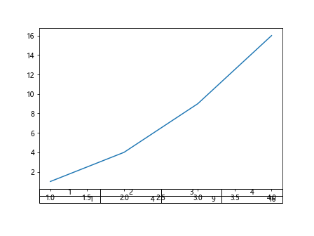
Example 2: Simple Table Aligned with X-axis
import matplotlib.pyplot as plt
import numpy as np

x = np.arange(1, 5)
y = x**2

fig, ax = plt.subplots()
ax.plot(x, y)
ax.table(cellText=[y], colLabels=x, loc='bottom')
plt.subplots_adjust(bottom=0.2)
plt.show()
Output:
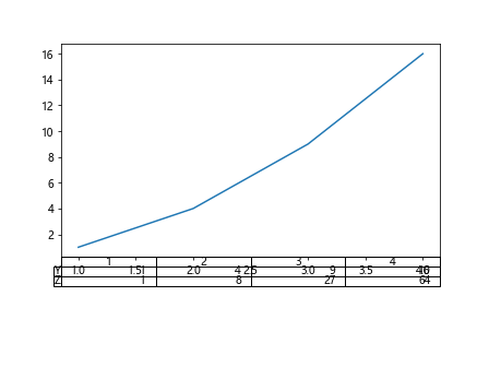
Example 3: Table with Multiple Rows Aligned to X-axis
import matplotlib.pyplot as plt
import numpy as np

x = np.arange(1, 5)
y = x**2
z = x**3

fig, ax = plt.subplots()
ax.plot(x, y)
ax.table(cellText=[y, z], colLabels=x, rowLabels=['Y', 'Z'], loc='bottom')
plt.subplots_adjust(bottom=0.3)
plt.show()
Output:
Customizing Table Appearance
Matplotlib allows extensive customization of tables, which includes modifying the font size, cell colors, and more. This can be crucial when you need the table to be clear and integrate well with the overall design of your plot.
Example 4: Customizing Table Font Size and Color
import matplotlib.pyplot as as plt
import numpy as np

x = np.arange(1, 5)
y = x**2

fig, ax = plt.subplots()
ax.plot(x, y)
table = ax.table(cellText=[y], colLabels=x, loc='bottom', cellLoc='center')
table.auto_set_font_size(False)
table.set_fontsize(10)
table.scale(1, 1.5)
plt.subplots_adjust(bottom=0.2)
plt.show()
Example 5: Adding Color to Table Cells
import matplotlib.pyplot as plt
import numpy as np

x = np.arange(1, 5)
y = x**2

fig, ax = plt.subplots()
ax.plot(x, y)
table = ax.table(cellText=[y], colLabels=x, loc='bottom', cellLoc='center')
table.auto_set_font_size(False)
table.set_fontsize(10)
table.scale(1, 1.5)
cells = table.properties()['child_artists']
for cell in cells:
    cell.set_facecolor('cyan')
plt.subplots_adjust(bottom=0.2)
plt.show()
Dynamic Table Adjustments
Sometimes, the data in the table or the plot might change based on user input or other factors. It’s important to know how to dynamically adjust the table in response to these changes.
Example 6: Dynamically Adjusting Table Position
import matplotlib.pyplot as plt
import numpy as np

x = np.arange(1, 10)
y = np.log(x)

fig, ax = plt.subplots()
ax.plot(x, y)
table = ax.table(cellText=[y], colLabels=x, loc='bottom')
plt.subplots_adjust(bottom=0.2)

def update_table(new_data):
    table._cells.clear()
    table._cellText = [new_data]
    table._autoColumns = range(len(new_data))
    table._update_position()
    plt.draw()

update_table(np.log(x + 1))
plt.show()
Conclusion
In this article, we have explored various methods to align tables with the X-axis in Matplotlib. We covered basic table creation, alignment techniques, customization options, and dynamic adjustments. These examples should provide a solid foundation for integrating tables into your Matplotlib visualizations, enhancing both the aesthetics and the functionality of your plots.