Analyze and Visualize Earthquake Data in Python with Matplotlib
Analyzing and visualizing earthquake data can provide valuable insights into seismic activities and help in understanding the patterns and impacts of earthquakes around the globe. Python, with its powerful libraries such as Matplotlib, makes it easier to handle, analyze, and visualize large datasets. This article will guide you through the process of analyzing and visualizing earthquake data using Python and Matplotlib. We will cover various aspects of data handling and visualization, providing detailed examples with complete, standalone Matplotlib code snippets.
Getting Started with Python and Matplotlib
Before diving into the earthquake data, ensure that you have Python and Matplotlib installed. You can install Matplotlib using pip:
pip install matplotlib
Example 1: Basic Plot of Earthquake Magnitudes
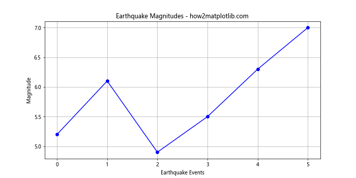
Let’s start by plotting a simple graph of earthquake magnitudes. This example assumes you have a list of magnitudes.
import matplotlib.pyplot as plt

magnitudes = [5.2, 6.1, 4.9, 5.5, 6.3, 7.0]  # Example magnitudes
plt.figure(figsize=(10, 5))
plt.plot(magnitudes, marker='o', linestyle='-', color='b')
plt.title("Earthquake Magnitudes - how2matplotlib.com")
plt.xlabel("Earthquake Events")
plt.ylabel("Magnitude")
plt.grid(True)
plt.show()
Output:
Example 2: Histogram of Earthquake Depths
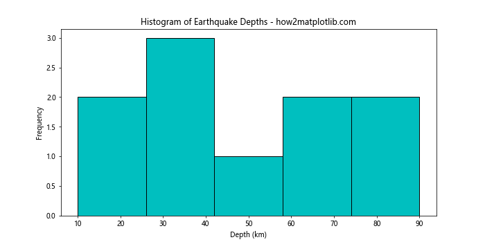
Next, we visualize the distribution of earthquake depths using a histogram.
import matplotlib.pyplot as plt

depths = [10, 20, 50, 40, 35, 70, 90, 30, 60, 80]  # Example depths in km
plt.figure(figsize=(10, 5))
plt.hist(depths, bins=5, color='c', edgecolor='black')
plt.title("Histogram of Earthquake Depths - how2matplotlib.com")
plt.xlabel("Depth (km)")
plt.ylabel("Frequency")
plt.show()
Output:
Example 3: Scatter Plot of Earthquake Magnitudes vs Depths
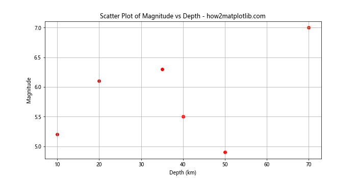
A scatter plot can help visualize the relationship between two variables. Here, we plot earthquake magnitudes against their depths.
import matplotlib.pyplot as plt

magnitudes = [5.2, 6.1, 4.9, 5.5, 6.3, 7.0]
depths = [10, 20, 50, 40, 35, 70]
plt.figure(figsize=(10, 5))
plt.scatter(depths, magnitudes, color='r')
plt.title("Scatter Plot of Magnitude vs Depth - how2matplotlib.com")
plt.xlabel("Depth (km)")
plt.ylabel("Magnitude")
plt.grid(True)
plt.show()
Output:
Example 4: Time Series Plot of Earthquakes
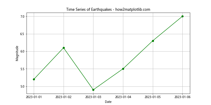
For a time series analysis, we plot earthquake occurrences over time.
import matplotlib.pyplot as plt
import pandas as pd

dates = pd.date_range(start='20230101', periods=6)
magnitudes = [5.2, 6.1, 4.9, 5.5, 6.3, 7.0]
plt.figure(figsize=(10, 5))
plt.plot(dates, magnitudes, marker='o', linestyle='-', color='g')
plt.title("Time Series of Earthquakes - how2matplotlib.com")
plt.xlabel("Date")
plt.ylabel("Magnitude")
plt.grid(True)
plt.show()
Output:
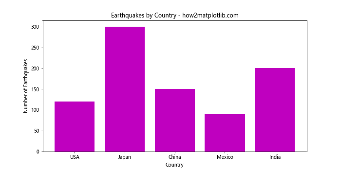
Example 5: Bar Chart of Earthquakes by Country
Visualizing the number of earthquakes by country can be done using a bar chart.
import matplotlib.pyplot as plt

countries = ['USA', 'Japan', 'China', 'Mexico', 'India']
earthquake_counts = [120, 300, 150, 90, 200]
plt.figure(figsize=(10, 5))
plt.bar(countries, earthquake_counts, color='m')
plt.title("Earthquakes by Country - how2matplotlib.com")
plt.xlabel("Country")
plt.ylabel("Number of Earthquakes")
plt.show()
Output:
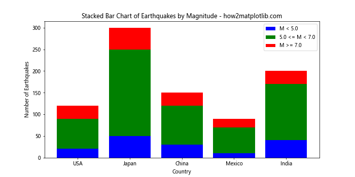
Example 6: Stacked Bar Chart of Earthquakes by Magnitude Range
A stacked bar chart can illustrate the distribution of earthquakes by magnitude range within each country.
import matplotlib.pyplot as plt

countries = ['USA', 'Japan', 'China', 'Mexico', 'India']
low_magnitude = [20, 50, 30, 10, 40]
medium_magnitude = [70, 200, 90, 60, 130]
high_magnitude = [30, 50, 30, 20, 30]
plt.figure(figsize=(10, 5))
plt.bar(countries, low_magnitude, color='b', label='M < 5.0')
plt.bar(countries, medium_magnitude, bottom=low_magnitude, color='g', label='5.0 <= M < 7.0')
plt.bar(countries, high_magnitude, bottom=[i+j for i, j in zip(low_magnitude, medium_magnitude)], color='r', label='M >= 7.0')
plt.title("Stacked Bar Chart of Earthquakes by Magnitude - how2matplotlib.com")
plt.xlabel("Country")
plt.ylabel("Number of Earthquakes")
plt.legend()
plt.show()
Output:
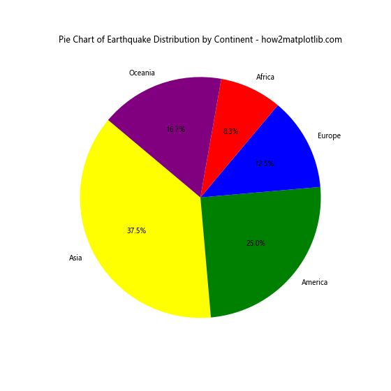
Example 7: Pie Chart of Earthquake Distribution by Continent
A pie chart can represent the proportion of earthquakes occurring on different continents.
import matplotlib.pyplot as plt

continents = ['Asia', 'America', 'Europe', 'Africa', 'Oceania']
earthquake_counts = [450, 300, 150, 100, 200]
plt.figure(figsize=(8, 8))
plt.pie(earthquake_counts, labels=continents, autopct='%1.1f%%', startangle=140, colors=['yellow', 'green', 'blue', 'red', 'purple'])
plt.title("Pie Chart of Earthquake Distribution by Continent - how2matplotlib.com")
plt.show()
Output:
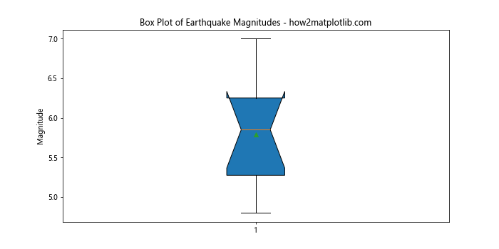
Example 8: Box Plot of Earthquake Magnitudes
A box plot provides a good visualization of the distribution statistics (median, quartiles, outliers) of earthquake magnitudes.
import matplotlib.pyplot as plt

magnitudes = [5.2, 6.1, 4.9, 5.5, 6.3, 7.0, 5.8, 6.4, 4.8, 5.9]
plt.figure(figsize=(10, 5))
plt.boxplot(magnitudes, vert=True, patch_artist=True, notch=True, showmeans=True)
plt.title("Box Plot of Earthquake Magnitudes - how2matplotlib.com")
plt.ylabel("Magnitude")
plt.show()
Output:
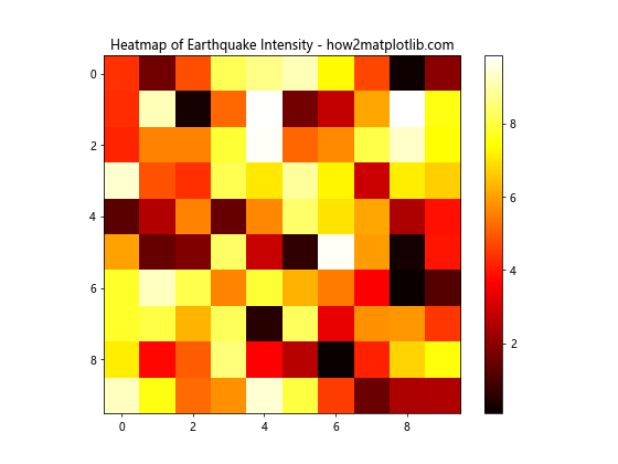
Example 9: Heatmap of Earthquake Intensity
Heatmaps can be used to visualize the intensity of earthquakes across different regions.
import matplotlib.pyplot as plt
import numpy as np

data = np.random.rand(10,10) * 10  # Simulated intensity data
plt.figure(figsize=(8, 6))
plt.imshow(data, cmap='hot', interpolation='nearest')
plt.colorbar()
plt.title("Heatmap of Earthquake Intensity - how2matplotlib.com")
plt.show()
Output:
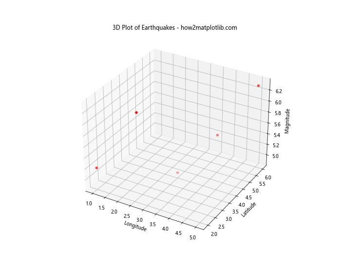
Example 10: 3D Plot of Earthquakes
3D plots can provide a more immersive view of data, such as the location and magnitude of earthquakes.
from mpl_toolkits.mplot3d import Axes3D
import matplotlib.pyplot as plt

fig = plt.figure(figsize=(10, 8))
ax = fig.add_subplot(111, projection='3d')
x = [1, 2, 3, 4, 5]
y = [2, 3, 4, 5, 6]
z = [5.2, 6.1, 4.9, 5.5, 6.3]
ax.scatter(x, y, z, c='r', marker='o')
ax.set_xlabel('Longitude')
ax.set_ylabel('Latitude')
ax.set_zlabel('Magnitude')
plt.title("3D Plot of Earthquakes - how2matplotlib.com")
plt.show()
Output:
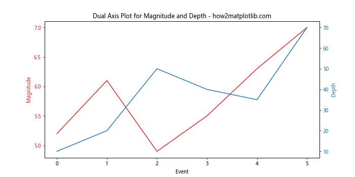
Example 11: Dual Axis Plot for Magnitude and Depth
Sometimes, it’s useful to visualize two different aspects of data on the same plot. Here’s how you can create a plot with dual axes, one for magnitude and another for depth.
import matplotlib.pyplot as plt

fig, ax1 = plt.subplots(figsize=(10, 5))

# Data
magnitudes = [5.2, 6.1, 4.9, 5.5, 6.3, 7.0]
depths = [10, 20, 50, 40, 35, 70]

# Magnitude line
color = 'tab:red'
ax1.set_xlabel('Event')
ax1.set_ylabel('Magnitude', color=color)
ax1.plot(magnitudes, color=color)
ax1.tick_params(axis='y', labelcolor=color)

# Depth line
ax2 = ax1.twinx()
color = 'tab:blue'
ax2.set_ylabel('Depth', color=color)
ax2.plot(depths, color=color)
ax2.tick_params(axis='y', labelcolor=color)

plt.title("Dual Axis Plot for Magnitude and Depth - how2matplotlib.com")
plt.show()
Output:
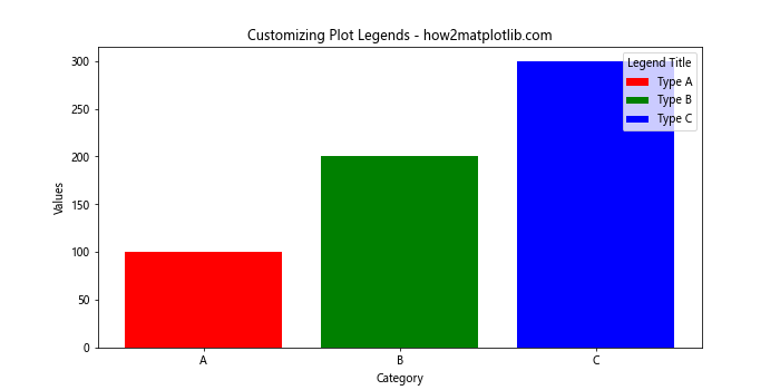
Example 12: Customizing Plot Legends
Customizing legends is crucial for clarity in plots with multiple datasets. Here’s how to customize a plot legend in Matplotlib.
import matplotlib.pyplot as plt

# Data
categories = ['A', 'B', 'C']
values = [100, 200, 300]

plt.figure(figsize=(10, 5))
bars = plt.bar(categories, values, color=['red', 'green', 'blue'])
plt.title("Customizing Plot Legends - how2matplotlib.com")
plt.xlabel("Category")
plt.ylabel("Values")

# Custom legend
plt.legend(bars, ['Type A', 'Type B', 'Type C'], loc='upper right', title="Legend Title")
plt.show()
Output:
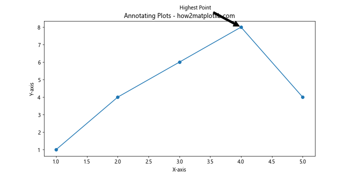
Example 13: Annotating Plots
Annotations can help highlight specific points or features in plots. Here’s how to add annotations.
import matplotlib.pyplot as plt

# Data
x = range(1, 6)
y = [1, 4, 6, 8, 4]

plt.figure(figsize=(10, 5))
plt.plot(x, y, marker='o')
plt.title("Annotating Plots - how2matplotlib.com")
plt.xlabel("X-axis")
plt.ylabel("Y-axis")

# Annotation
plt.annotate('Highest Point', xy=(4, 8), xytext=(3, 9),
             arrowprops=dict(facecolor='black', shrink=0.05))

plt.show()
Output:
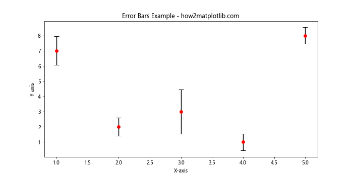
Example 14: Error Bars
Error bars are useful for depicting the variability of data and can be added to plots easily.
import matplotlib.pyplot as plt
import numpy as np

# Data
x = np.arange(1, 6)
y = np.random.randint(1, 10, size=5)
yerr = np.random.uniform(0.5, 1.5, size=5)

plt.figure(figsize=(10, 5))
plt.errorbar(x, y, yerr=yerr, fmt='o', color='r', ecolor='black', capsize=5)
plt.title("Error Bars Example - how2matplotlib.com")
plt.xlabel("X-axis")
plt.ylabel("Y-axis")
plt.show()
Output:
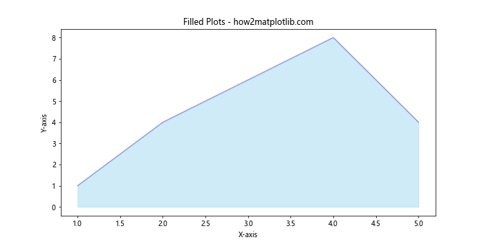
Example 15: Filled Plots
Filled plots can be visually appealing and useful for showing areas under curves.
import matplotlib.pyplot as plt

# Data
x = range(1, 6)
y = [1, 4, 6, 8, 4]

plt.figure(figsize=(10, 5))
plt.fill_between(x, y, color="skyblue", alpha=0.4)
plt.plot(x, y, color="Slateblue", alpha=0.6)
plt.title("Filled Plots - how2matplotlib.com")
plt.xlabel("X-axis")
plt.ylabel("Y-axis")
plt.show()
Output:
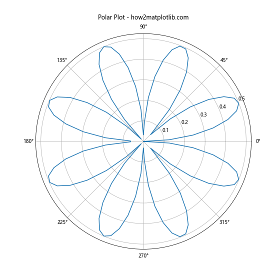
Example 16: Polar Plots
Polar plots are essential for data involving angles and radii. Here’s how to create a basic polar plot.
import matplotlib.pyplot as plt
import numpy as np

# Data
theta = np.linspace(0, 2*np.pi, 100)
r = np.abs(np.sin(2*theta) * np.cos(2*theta))

plt.figure(figsize=(8, 8))
ax = plt.subplot(111, polar=True)
ax.plot(theta, r)
ax.set_title("Polar Plot - how2matplotlib.com", va='bottom')
plt.show()
Output:
Example 17: Step Plots
Step plots are useful for showing changes at specific steps, making them ideal for discrete changes over time.
import matplotlib.pyplot as plt

# Data
x = np.arange(1, 6)
y = np.random.randint(1, 10, size=5)

plt.figure(figsize=(10, 5))
plt.step(x, y, where='mid')
plt.title("Step Plots - how2matplotlib.com")
plt.xlabel("X-axis")
plt.ylabel("Y-axis")
plt.show()
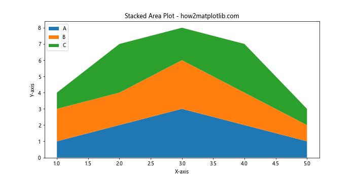
Example 18: Stacked Area Plot
Stacked area plots can show how different components contribute to the whole over time or other dimensions.
import matplotlib.pyplot as plt

# Data
x = range(1, 6)
y1 = [1, 2, 3, 2, 1]
y2 = [2, 2, 3, 2, 1]
y3 = [1, 3, 2, 3, 1]

plt.figure(figsize=(10, 5))
plt.stackplot(x, y1, y2, y3, labels=['A', 'B', 'C'])
plt.legend(loc='upper left')
plt.title("Stacked Area Plot - how2matplotlib.com")
plt.xlabel("X-axis")
plt.ylabel("Y-axis")
plt.show()
Output:
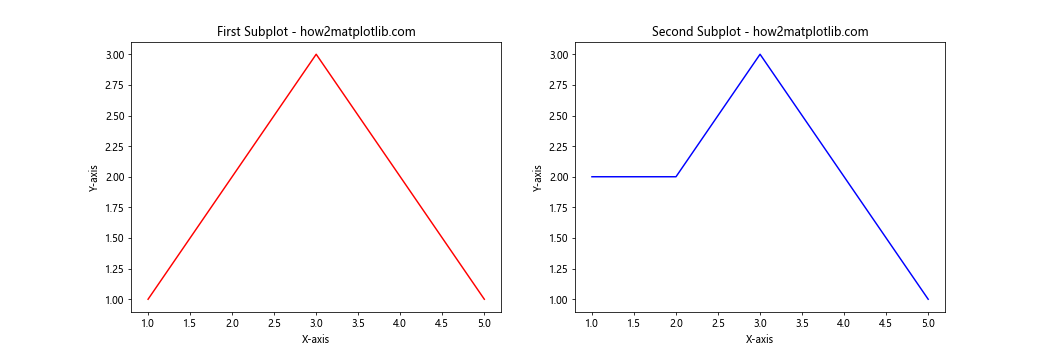
Example 19: Multiple Subplots
Creating multiple subplots can help in comparing different views of data simultaneously.
import matplotlib.pyplot as plt

# Data
x = range(1, 6)
y1 = [1, 2, 3, 2, 1]
y2 = [2, 2, 3, 2, 1]

fig, (ax1, ax2) = plt.subplots(1, 2, figsize=(15, 5))
ax1.plot(x, y1, 'r-')
ax1.set_title("First Subplot - how2matplotlib.com")
ax1.set_xlabel("X-axis")
ax1.set_ylabel("Y-axis")

ax2.plot(x, y2, 'b-')
ax2.set_title("Second Subplot - how2matplotlib.com")
ax2.set_xlabel("X-axis")
ax2.set_ylabel("Y-axis")

plt.show()
Output:
Example 20: Logarithmic Scale
Using a logarithmic scale can be crucial for data spanning several orders of magnitude.
import matplotlib.pyplot as plt

# Data
x = np.linspace(0.1, 15, 400)
y = x ** 2

plt.figure(figsize=(10, 5))
plt.plot(x, y)
plt.yscale('log')
plt.title("Logarithmic Scale Plot - how2matplotlib.com")
plt.xlabel("X-axis")
plt.ylabel("Y-axis")
plt.show()
Conclusion
This comprehensive guide has provided a wide range of examples to help you get started with analyzing and visualizing earthquake data using Python and Matplotlib. From simple plots to more complex visualizations, these examples serve as a foundation for your own data analysis projects. Remember, the key to effective data visualization is not just about presenting data but making it understandable and actionable.