How to Add a Border Around Histogram Bars in Matplotlib
Add a border around histogram bars in Matplotlib to enhance the visual appeal and clarity of your data visualizations. This article will explore various techniques and methods to add borders to histogram bars using Matplotlib, a powerful plotting library in Python. We’ll cover different approaches, customization options, and best practices for creating visually striking histograms with bordered bars.
Understanding the Basics of Adding Borders to Histogram Bars
Before we dive into the specifics of adding borders to histogram bars in Matplotlib, let’s review the fundamental concepts and components involved in this process.
What is a Histogram?
A histogram is a graphical representation of the distribution of numerical data. It consists of bars that represent the frequency or count of data points falling within specific intervals or bins. Histograms are widely used in data analysis and visualization to understand the underlying patterns and characteristics of a dataset.
Why Add Borders to Histogram Bars?
Adding borders to histogram bars serves several purposes:
- Visual distinction: Borders help separate adjacent bars, making it easier to distinguish between them.
- Emphasis: Bordered bars can draw attention to specific data points or ranges.
- Aesthetic appeal: Borders can enhance the overall look of the histogram, making it more visually appealing.
- Data clarity: In cases where bar colors are similar, borders can help delineate individual bars more clearly.
Matplotlib’s Role in Adding Borders
Matplotlib provides various functions and methods to create histograms and customize their appearance. When it comes to adding borders around histogram bars, Matplotlib offers flexibility in terms of border color, width, and style.
Now, let’s explore different techniques to add borders around histogram bars in Matplotlib.
Method 1: Using the edgecolor Parameter
One of the simplest ways to add a border around histogram bars in Matplotlib is by using the edgecolor parameter in the hist() function. This parameter allows you to specify the color of the border for all bars in the histogram.
Here’s an example of how to use the edgecolor parameter:
import matplotlib.pyplot as plt
import numpy as np

# Generate sample data
data = np.random.randn(1000)

# Create a histogram with bordered bars
plt.figure(figsize=(10, 6))
plt.hist(data, bins=30, edgecolor='black', linewidth=1.2)
plt.title('Histogram with Bordered Bars - how2matplotlib.com')
plt.xlabel('Value')
plt.ylabel('Frequency')
plt.show()
Output:
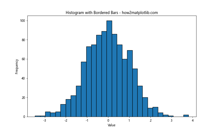
In this example, we generate random data using NumPy and create a histogram using Matplotlib’s hist() function. The edgecolor parameter is set to ‘black’, which adds a black border around each bar. The linewidth parameter controls the thickness of the border.
Method 2: Customizing Individual Bar Edges
While the previous method applies the same border to all bars, you might want to customize the borders for individual bars. This can be achieved by accessing the individual bar objects returned by the hist() function.
Here’s an example demonstrating how to customize individual bar edges:
import matplotlib.pyplot as plt
import numpy as np

# Generate sample data
data = np.random.randn(1000)

# Create a histogram and get the bar objects
fig, ax = plt.subplots(figsize=(10, 6))
n, bins, patches = ax.hist(data, bins=30)

# Customize individual bar edges
for patch in patches:
    patch.set_edgecolor('red')
    patch.set_linewidth(2)

plt.title('Histogram with Customized Bar Edges - how2matplotlib.com')
plt.xlabel('Value')
plt.ylabel('Frequency')
plt.show()
Output:
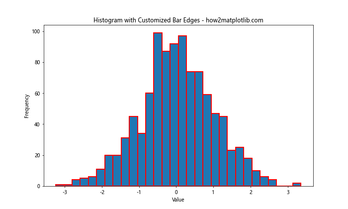
In this example, we iterate through the patches object, which contains individual bar objects. We then use the set_edgecolor() and set_linewidth() methods to customize the border color and width for each bar.
Method 3: Using a Loop to Create Bordered Bars
Another approach to add borders around histogram bars in Matplotlib is to create the bars manually using a loop. This method provides more control over the appearance of each bar and its border.
Here’s an example of how to create a histogram with bordered bars using a loop:
import matplotlib.pyplot as plt
import numpy as np

# Generate sample data
data = np.random.randn(1000)

# Calculate histogram data
counts, bins, _ = plt.hist(data, bins=30)
plt.clf()  # Clear the current figure

# Create bordered bars manually
fig, ax = plt.subplots(figsize=(10, 6))
for count, left, right in zip(counts, bins[:-1], bins[1:]):
    ax.bar(left, count, width=right-left, align='edge', edgecolor='black', linewidth=1.2)

plt.title('Histogram with Bordered Bars (Loop Method) - how2matplotlib.com')
plt.xlabel('Value')
plt.ylabel('Frequency')
plt.show()
Output:
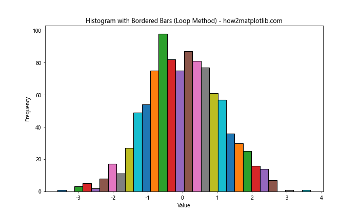
In this example, we first calculate the histogram data using plt.hist(), but we don’t display it. Instead, we use the calculated counts and bins to create bars manually using ax.bar(). This allows us to specify the edgecolor and linewidth for each bar individually.
Method 4: Adding Borders with Different Styles
Matplotlib allows you to customize the style of the border around histogram bars. You can use different line styles, such as solid, dashed, or dotted lines, to create visually interesting borders.
Here’s an example demonstrating how to add borders with different styles:
import matplotlib.pyplot as plt
import numpy as np

# Generate sample data
data = np.random.randn(1000)

# Create a histogram with different border styles
fig, ax = plt.subplots(figsize=(10, 6))
n, bins, patches = ax.hist(data, bins=30)

# Apply different border styles to alternating bars
for i, patch in enumerate(patches):
    if i % 2 == 0:
        patch.set_edgecolor('black')
        patch.set_linestyle('-')  # Solid line
    else:
        patch.set_edgecolor('red')
        patch.set_linestyle('--')  # Dashed line
    patch.set_linewidth(1.5)

plt.title('Histogram with Different Border Styles - how2matplotlib.com')
plt.xlabel('Value')
plt.ylabel('Frequency')
plt.show()
Output:
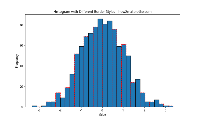
In this example, we apply different border styles to alternating bars. Even-indexed bars have a solid black border, while odd-indexed bars have a dashed red border. This technique can be useful for highlighting specific groups of bars or creating a visually striking histogram.
Method 5: Adding Gradient Borders
To create a more visually appealing histogram, you can add gradient borders to the bars. This technique involves using a color map to assign different colors to the borders based on the bar heights.
Here’s an example of how to add gradient borders to histogram bars:
import matplotlib.pyplot as plt
import numpy as np
from matplotlib.colors import LinearSegmentedColormap

# Generate sample data
data = np.random.randn(1000)

# Create a custom color map
colors = ['#FFA07A', '#FF6347', '#FF4500']
n_bins = 30
cmap = LinearSegmentedColormap.from_list('custom', colors, N=n_bins)

# Create a histogram with gradient borders
fig, ax = plt.subplots(figsize=(10, 6))
n, bins, patches = ax.hist(data, bins=n_bins)

# Apply gradient colors to borders
for count, patch in zip(n, patches):
    color = cmap(count / max(n))
    patch.set_edgecolor(color)
    patch.set_linewidth(2)

plt.title('Histogram with Gradient Borders - how2matplotlib.com')
plt.xlabel('Value')
plt.ylabel('Frequency')
plt.show()
Output:
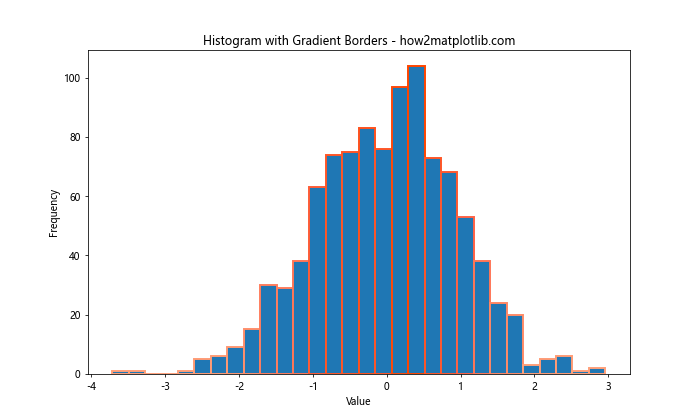
In this example, we create a custom color map using LinearSegmentedColormap. We then apply gradient colors to the borders of the histogram bars based on their heights. This technique creates a visually striking effect that can help highlight the distribution of the data.
Method 6: Adding Borders to Stacked Histograms
When working with stacked histograms, adding borders can help distinguish between different categories or groups. Here’s an example of how to add borders to a stacked histogram:
import matplotlib.pyplot as plt
import numpy as np

# Generate sample data for two groups
data1 = np.random.normal(0, 1, 1000)
data2 = np.random.normal(2, 1, 1000)

# Create a stacked histogram with bordered bars
fig, ax = plt.subplots(figsize=(10, 6))
n, bins, patches = ax.hist([data1, data2], bins=30, stacked=True,
                           edgecolor='black', linewidth=1.2)

plt.title('Stacked Histogram with Bordered Bars - how2matplotlib.com')
plt.xlabel('Value')
plt.ylabel('Frequency')
plt.legend(['Group 1', 'Group 2'])
plt.show()
Output:
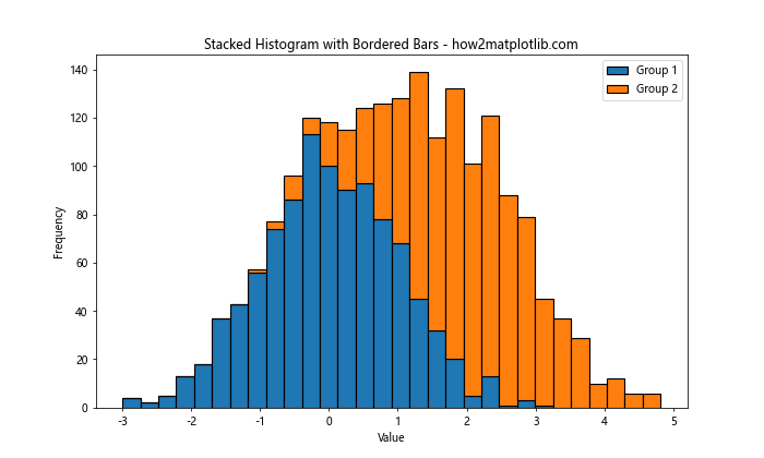
In this example, we create a stacked histogram using two sets of data. The edgecolor and linewidth parameters are applied to all bars in both stacks, creating a clear separation between categories.
Method 7: Adding Borders to Multiple Histograms
When comparing multiple histograms, adding borders can help distinguish between different datasets. Here’s an example of how to add borders to multiple histograms plotted on the same axes:
import matplotlib.pyplot as plt
import numpy as np

# Generate sample data for three groups
data1 = np.random.normal(0, 1, 1000)
data2 = np.random.normal(2, 1, 1000)
data3 = np.random.normal(-2, 1, 1000)

# Create multiple histograms with bordered bars
fig, ax = plt.subplots(figsize=(10, 6))
ax.hist(data1, bins=30, alpha=0.5, edgecolor='black', linewidth=1.2, label='Group 1')
ax.hist(data2, bins=30, alpha=0.5, edgecolor='red', linewidth=1.2, label='Group 2')
ax.hist(data3, bins=30, alpha=0.5, edgecolor='blue', linewidth=1.2, label='Group 3')

plt.title('Multiple Histograms with Bordered Bars - how2matplotlib.com')
plt.xlabel('Value')
plt.ylabel('Frequency')
plt.legend()
plt.show()
Output:
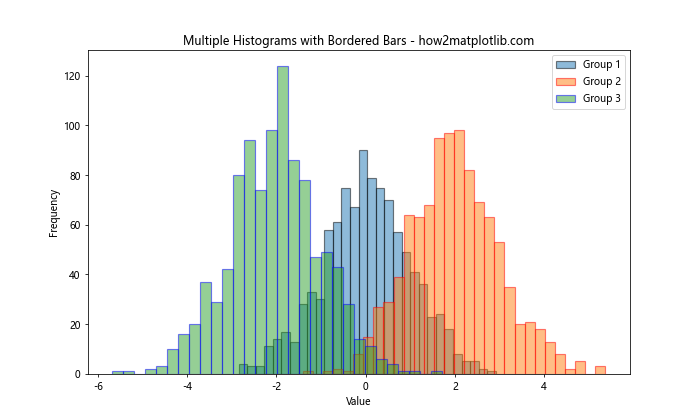
In this example, we plot three histograms on the same axes, each with a different border color. The alpha parameter is used to make the bars semi-transparent, allowing for better visibility of overlapping regions.
Method 8: Adding Borders to Horizontal Histograms
While vertical histograms are more common, horizontal histograms can be useful in certain situations. Here’s how to add borders to a horizontal histogram:
import matplotlib.pyplot as plt
import numpy as np

# Generate sample data
data = np.random.randn(1000)

# Create a horizontal histogram with bordered bars
fig, ax = plt.subplots(figsize=(10, 6))
n, bins, patches = ax.hist(data, bins=30, orientation='horizontal',
                           edgecolor='black', linewidth=1.2)

plt.title('Horizontal Histogram with Bordered Bars - how2matplotlib.com')
plt.xlabel('Frequency')
plt.ylabel('Value')
plt.show()
Output:
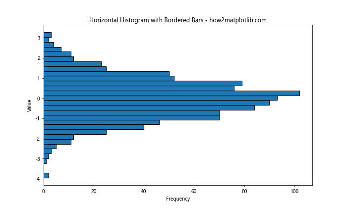
In this example, we use the orientation='horizontal' parameter to create a horizontal histogram. The edgecolor and linewidth parameters are used to add borders to the bars, just as in vertical histograms.
Method 9: Adding Borders to Step Histograms
Step histograms provide a different visual representation of data distribution. Here’s how to add borders to a step histogram:
import matplotlib.pyplot as plt
import numpy as np

# Generate sample data
data = np.random.randn(1000)

# Create a step histogram with bordered steps
fig, ax = plt.subplots(figsize=(10, 6))
n, bins, patches = ax.hist(data, bins=30, histtype='step',
                           edgecolor='black', linewidth=2)

plt.title('Step Histogram with Bordered Steps - how2matplotlib.com')
plt.xlabel('Value')
plt.ylabel('Frequency')
plt.show()
Output:
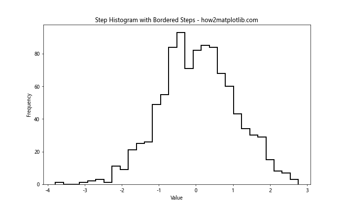
In this example, we use histtype='step' to create a step histogram. The edgecolor and linewidth parameters are used to define the appearance of the steps, effectively creating borders for the histogram.
Method 10: Adding Borders to Cumulative Histograms
Cumulative histograms are useful for showing the cumulative distribution of data. Here’s how to add borders to a cumulative histogram:
import matplotlib.pyplot as plt
import numpy as np

# Generate sample data
data = np.random.randn(1000)

# Create a cumulative histogram with bordered bars
fig, ax = plt.subplots(figsize=(10, 6))
n, bins, patches = ax.hist(data, bins=30, cumulative=True,
                           edgecolor='black', linewidth=1.2)

plt.title('Cumulative Histogram with Bordered Bars - how2matplotlib.com')
plt.xlabel('Value')
plt.ylabel('Cumulative Frequency')
plt.show()
Output:
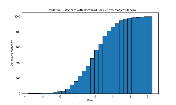
In this example, we use the cumulative=True parameter to create a cumulative histogram. The edgecolor and linewidth parameters are used to add borders to the bars, enhancing the visual representation of the cumulative distribution.
Best Practices for Adding Borders to Histogram Bars
When adding borders around histogram bars in Matplotlib, consider the following best practices:
- Choose appropriate colors: Select border colors that contrast well with the bar fill color and the background.
- Adjust line width: Use an appropriate line width that enhances visibility without overpowering the data.
- Consider data density: For histograms with many bars, thinner borders may be more suitable to avoid visual clutter.
- Be consistent: Maintain consistency in border styles across related visualizations for better comparability.
- Use borders purposefully: Add borders when they enhance the visualization’s clarity or emphasize specific aspects of the data.
Advanced Techniques for Bordered Histograms
Let’s explore some advanced techniques for creating bordered histograms with Matplotlib.
Technique 1: Combining Bordered and Non-Bordered Bars
You can create a histogram where only certain bars have borders, drawing attention to specific data ranges:
import matplotlib.pyplot as plt
import numpy as np

# Generate sample data
data = np.random.randn(1000)

# Create a histogram with selective borders
fig, ax = plt.subplots(figsize=(10, 6))
n, bins, patches = ax.hist(data, bins=30)

# Add borders to bars above a certain threshold
threshold = np.mean(n)
for count, patch in zip(n, patches):
    if count > threshold:
        patch.set_edgecolor('red')
        patch.set_linewidth(2)
    else:
        patch.set_edgecolor('none')

plt.title('Histogram with Selective Borders - how2matplotlib.com')
plt.xlabel('Value')
plt.ylabel('Frequency')
plt.show()
Output:
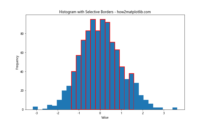
This technique allows you to highlight specific bars that meet certain criteria, such as being above the mean frequency.
Technique 2: Animated Bordered Histograms
You can create animated histograms with changing border colors to visualize data evolution over time:
import matplotlib.pyplot as plt
import numpy as np
from matplotlib.animation import FuncAnimation

# Generate initial data
data = np.random.randn(1000)

# Set up the figure and axis
fig, ax = plt.subplots(figsize=(10, 6))
n, bins, patches = ax.hist(data, bins=30, edgecolor='black', linewidth=1.2)

# Animation update function
def update(frame):
    # Update data
    new_data = np.random.randn(1000) + frame * 0.1

    # Update histogram
    n, _ = np.histogram(new_data, bins)
    for count, patch in zip(n, patches):
        patch.set_height(count)
        patch.set_edgecolor(plt.cm.viridis(count / max(n)))

    ax.set_title(f'Animated Histogram with Bordered Bars - Frame {frame} - how2matplotlib.com')
    return patches

# Create the animation
anim = FuncAnimation(fig, update, frames=50, interval=200, blit=True)

plt.xlabel('Value')
plt.ylabel('Frequency')
plt.show()
Output:
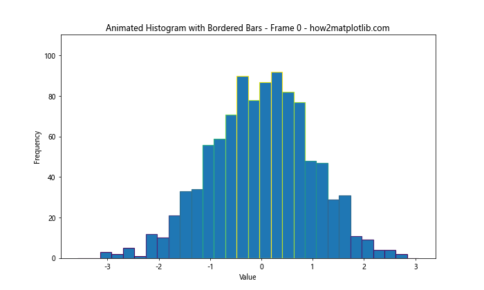
This example creates an animated histogram where the data and border colors change over time, providing a dynamic visualization of evolving data distributions.
Technique 3: Histogram with Error Bars and Borders
Combining error bars with bordered histogram bars can provide additional information about data uncertainty:
import matplotlib.pyplot as plt
import numpy as np

# Generate sample data
data = np.random.randn(1000)

# Calculate histogram data and error
counts, bins, _ = plt.hist(data, bins=30)
bin_centers = (bins[:-1] + bins[1:]) / 2
error = np.sqrt(counts)

# Clear the current figure
plt.clf()

# Create histogram with error bars and borders
fig, ax = plt.subplots(figsize=(10, 6))
ax.bar(bin_centers, counts, width=bins[1]-bins[0], yerr=error,
       edgecolor='black', linewidth=1.2, ecolor='red', capsize=3)

plt.title('Histogram with Error Bars and Borders - how2matplotlib.com')
plt.xlabel('Value')
plt.ylabel('Frequency')
plt.show()
Output:
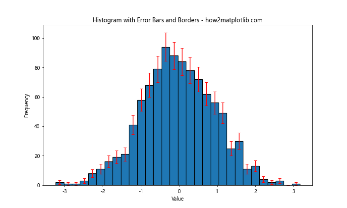
This technique combines bordered histogram bars with error bars, providing a comprehensive view of both the data distribution and its uncertainty.
Troubleshooting Common Issues
When adding borders around histogram bars in Matplotlib, you might encounter some common issues. Here are some problems and their solutions:
- Invisible borders:
- Issue: Borders are not visible despite setting the
edgecolor. - Solution: Ensure that the
linewidthis set to a value greater than 0.
- Issue: Borders are not visible despite setting the
- Overlapping borders:
- Issue: Borders of adjacent bars overlap, creating thick lines between bars.
- Solution: Adjust the
binsparameter or reduce thelinewidthto minimize overlap.
- Inconsistent border colors:
- Issue: Border colors appear different from what was specified.
- Solution: Check for any global color settings or colormaps that might be affecting the border colors.
- Borders not showing in saved figures:
- Issue: Borders are visible on screen but not in saved figures.
- Solution: Increase the DPI (dots per inch) when saving the figure, e.g.,
plt.savefig('histogram.png', dpi=300).
- Borders affecting bar transparency:
- Issue: Adding borders makes semi-transparent bars opaque.
- Solution: Set the
alphavalue for both the bar face color and edge color, e.g.,ax.hist(data, alpha=0.5, edgecolor=(0,0,0,0.5)).
Conclusion
Adding borders around histogram bars in Matplotlib is a powerful technique to enhance the visual appeal and clarity of your data visualizations. Throughout this article, we’ve explored various methods and techniques to achieve this effect, from simple one-line solutions to more advanced customizations.
Key takeaways include:
- The
edgecolorparameter in thehist()function is the simplest way to add borders to all bars. - Individual bar customization can be achieved by accessing the
patchesobject returned byhist(). - Manual creation of bars using
ax.bar()offers the most control over bar and border appearance. - Gradient borders, different styles, and animations can create visually striking histograms.
- Borders can be effectively combined with other histogram types, such as stacked, horizontal, and cumulative histograms.
- Best practices include choosing appropriate colors, adjusting line widths, and using borders purposefully.
By mastering these techniques, you can create more informative and visually appealing histograms that effectively communicate your data insights. Remember to experiment with different approaches and customize your visualizations to best suit your specific data and audience.