Labeling Axes in Matplotlib
Matplotlib is a popular plotting library in Python that allows you to create various types of plots, including line plots, bar plots, scatter plots, and more. One important aspect of creating clear and informative plots is properly labeling the axes. In this article, we will discuss how to label the x and y axes in Matplotlib.
Labeling the X and Y Axes in Matplotlib
In Matplotlib, you can label the x and y axes using the xlabel() and ylabel() functions, respectively. These functions allow you to specify the labels for the x and y axes, which can help provide context and clarity to your plot.
Here is an example of how to label the x and y axes in Matplotlib:
import matplotlib.pyplot as plt

# Create some data
x = [1, 2, 3, 4, 5]
y = [5, 4, 3, 2, 1]

# Plot the data
plt.plot(x, y)

# Label the x and y axes
plt.xlabel('X-axis label')
plt.ylabel('Y-axis label')

plt.show()
Output:
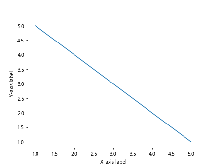
In the above example, we have created a simple line plot using Matplotlib and labeled the x-axis as ‘X-axis label’ and the y-axis as ‘Y-axis label’.
Customizing Axis Labels in Matplotlib
You can customize the appearance of the axis labels in Matplotlib by specifying additional parameters in the xlabel() and ylabel() functions. Some common parameters that you can use to customize the labels include fontsize, fontweight, color, rotation, and labelpad.
Here is an example of how to customize the axis labels in Matplotlib:
import matplotlib.pyplot as plt

# Create some data
x = [1, 2, 3, 4, 5]
y = [5, 4, 3, 2, 1]

# Plot the data
plt.plot(x, y)

# Customize the x-axis label
plt.xlabel('X-axis label', fontsize=12, fontweight='bold', color='blue', rotation=45, labelpad=10)

# Customize the y-axis label
plt.ylabel('Y-axis label', fontsize=12, fontweight='bold', color='green', rotation=90, labelpad=20)

plt.show()
Output:
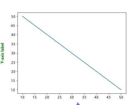
In the above example, we have customized the appearance of the x-axis label by setting the font size to 12, the font weight to ‘bold’, the color to ‘blue’, rotating the label by 45 degrees, and adding a label pad of 10. Similarly, we have customized the y-axis label with different parameters.
Adding Units to Axis Labels in Matplotlib
You can add units to the axis labels in Matplotlib by including the unit information in the label string. This can help provide additional context to your plot and make it more informative.
Here is an example of how to add units to axis labels in Matplotlib:
import matplotlib.pyplot as plt

# Create some data
x = [1, 2, 3, 4, 5]
y = [5, 4, 3, 2, 1]

# Plot the data
plt.plot(x, y)

# Label the x-axis with units
plt.xlabel('Time (s)')

# Label the y-axis with units
plt.ylabel('Distance (m)')

plt.show()
Output:
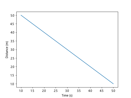
In the above example, we have added units to the x-axis label by including ‘(s)’ for seconds and to the y-axis label by including ‘(m)’ for meters.
Rotating Axis Labels in Matplotlib
You can rotate the axis labels in Matplotlib to improve readability, especially when dealing with long label strings. By rotating the labels, you can prevent overlap and make the plot more visually appealing.
Here is an example of how to rotate the axis labels in Matplotlib:
import matplotlib.pyplot as plt

# Create some data
x = [1, 2, 3, 4, 5]
y = [5, 4, 3, 2, 1]

# Plot the data
plt.bar(x, y)

# Rotate the x-axis labels
plt.xticks(rotation=45)

plt.show()
Output:
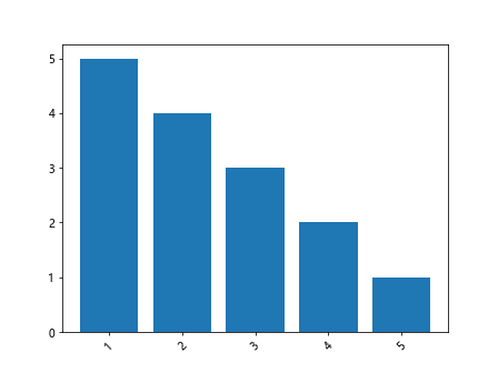
In the above example, we have plotted a bar chart and rotated the x-axis labels by 45 degrees using the xticks() function with the rotation parameter.
Adding Multiple Lines of Labels in Matplotlib
You can add multiple lines of labels to the x and y axes in Matplotlib by including newline characters (\n) in the label strings. This can be useful for displaying complex or multi-line labels on the axes.
Here is an example of how to add multiple lines of labels in Matplotlib:
import matplotlib.pyplot as plt

# Create some data
x = [1, 2, 3, 4, 5]
y = [5, 4, 3, 2, 1]

# Plot the data
plt.plot(x, y)

# Label the x-axis with multiple lines
plt.xlabel('X-axis\nlabel')

# Label the y-axis with multiple lines
plt.ylabel('Y-axis\nlabel')

plt.show()
Output:
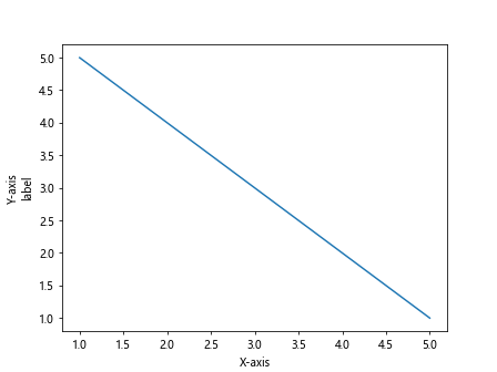
In the above example, we have added multiple lines to the x and y-axis labels by including the newline character (\n) to break the labels into two lines.
Formatting Axis Labels in Matplotlib
You can format the axis labels in Matplotlib to display numeric values in a specific format, such as decimal places, scientific notation, or comma-separated values. This can help improve the readability of the plot and make it more informative.
Here is an example of how to format axis labels in Matplotlib:
import matplotlib.pyplot as plt
import matplotlib.ticker as mticker

# Create some data
x = [1000, 2000, 3000, 4000, 5000]
y = [5, 4, 3, 2, 1]

# Plot the data
plt.plot(x, y)

# Format the x-axis labels as comma-separated values
plt.gca().xaxis.set_major_formatter(mticker.StrMethodFormatter('{x:,.0f}'))

plt.show()
Output:
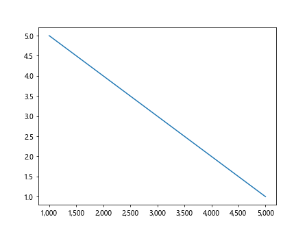
In the above example, we have formatted the x-axis labels as comma-separated values using the StrMethodFormatter from the matplotlib.ticker module. This formatter formats the numeric labels as comma-separated integers with zero decimal places.
Adding a Title to the Axes in Matplotlib
In addition to labeling the x and y axes, you can also add a title to the axes in Matplotlib to provide an overall description of the plot. The title can help summarize the information presented in the plot and give readers a quick overview of the data.
Here is an example of how to add a title to the axes in Matplotlib:
import matplotlib.pyplot as plt

# Create some data
x = [1, 2, 3, 4, 5]
y = [5, 4, 3, 2, 1]

# Plot the data
plt.plot(x, y)

# Add a title to the axes
plt.title('Example Plot')

plt.show()
Output:
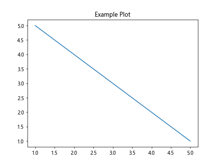
In the above example, we have added a title ‘Example Plot’ to the plot using the title() function in Matplotlib.
Adjusting Axis Limits in Matplotlib
You can adjust the limits of the x and y axes in Matplotlib to zoom in or out on specific regions of the plot. By setting the axis limits manually, you can focus on a particular range of the data and highlight important trends or patterns.
Here is an example of how to adjust the axis limits in Matplotlib:
import matplotlib.pyplot as plt

# Create some data
x = [1, 2, 3, 4, 5]
y = [5, 4, 3, 2, 1]

# Plot the data
plt.plot(x, y)

# Set the x-axis limits
plt.xlim(2, 4)

# Set the y-axis limits
plt.ylim(2, 4)

plt.show()
Output:
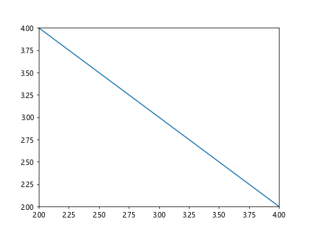
In the above example, we have adjusted the x-axis limits to show only the data points between x=2 and x=4, and the y-axis limits to show only the data points between y=2 and y=4.
Adding Gridlines to the Plot in Matplotlib
You can add gridlines to the plot in Matplotlib to help guide the viewer’s eyes and make it easier to interpret the data. Gridlines can be added to the major andminor ticks on both the x and y axes to provide additional reference points on the plot.
Here is an example of how to add gridlines to the plot in Matplotlib:
import matplotlib.pyplot as plt

# Create some data
x = [1, 2, 3, 4, 5]
y = [5, 4, 3, 2, 1]

# Plot the data
plt.plot(x, y)

# Add gridlines to the plot
plt.grid(True)

plt.show()
Output:
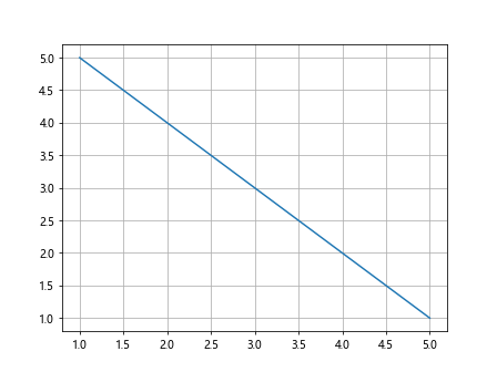
In the above example, we have enabled gridlines on the plot by setting the grid parameter of the grid() function to True. This will add both major and minor gridlines to the plot.
Changing the Appearance of Gridlines in Matplotlib
You can customize the appearance of the gridlines in Matplotlib by specifying additional parameters such as color, linestyle, and linewidth. This allows you to make the gridlines more visually appealing and better suited to your plot.
Here is an example of how to change the appearance of the gridlines in Matplotlib:
import matplotlib.pyplot as plt

# Create some data
x = [1, 2, 3, 4, 5]
y = [5, 4, 3, 2, 1]

# Plot the data
plt.plot(x, y)

# Customize the appearance of the gridlines
plt.grid(color='gray', linestyle='--', linewidth=0.5)

plt.show()
Output:
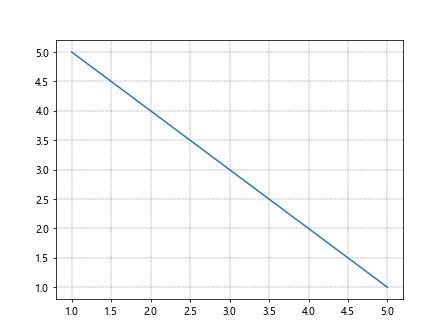
In the above example, we have customized the appearance of the gridlines by setting the color to ‘gray’, the linestyle to ‘–‘ (dashed line), and the linewidth to 0.5 (half a point).
Adding Legends to the Plot in Matplotlib
You can add legends to the plot in Matplotlib to help identify different elements of the plot, such as multiple lines or markers. Legends provide a key to the plot, allowing readers to understand the data more easily.
Here is an example of how to add legends to the plot in Matplotlib:
import matplotlib.pyplot as plt

# Create some data
x = [1, 2, 3, 4, 5]
y1 = [5, 4, 3, 2, 1]
y2 = [1, 2, 3, 4, 5]

# Plot the data
plt.plot(x, y1, label='Line 1')
plt.plot(x, y2, label='Line 2')

# Add a legend to the plot
plt.legend()

plt.show()
Output:
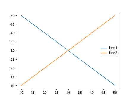
In the above example, we have plotted two lines with labels ‘Line 1’ and ‘Line 2’, and added a legend to the plot using the legend() function. The legend will display the labels next to the corresponding lines.
Customizing the Legend in Matplotlib
You can customize the appearance of the legend in Matplotlib by specifying additional parameters such as location, title, and fontsize. This allows you to control the placement and style of the legend on the plot.
Here is an example of how to customize the legend in Matplotlib:
import matplotlib.pyplot as plt

# Create some data
x = [1, 2, 3, 4, 5]
y1 = [5, 4, 3, 2, 1]
y2 = [1, 2, 3, 4, 5]

# Plot the data
plt.plot(x, y1, label='Line 1')
plt.plot(x, y2, label='Line 2')

# Customize the legend
plt.legend(loc='upper left', title='Legend', fontsize='medium')

plt.show()
Output:
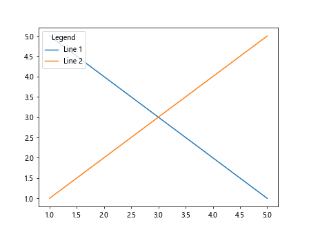
In the above example, we have customized the legend by specifying the location as ‘upper left’, the title as ‘Legend’, and the font size as ‘medium’. This will change the position and style of the legend on the plot.
Conclusion
In this article, we have discussed how to label the x and y axes in Matplotlib using the xlabel() and ylabel() functions. We have also explored various ways to customize and format the axis labels, add units and titles to the axes, and adjust axis limits. Additionally, we covered how to add gridlines and legends to the plot and customize their appearance. By following these techniques and examples, you can create informative and visually appealing plots in Matplotlib.