How to Master plt.subplots and title in Matplotlib
plt.subplots title are essential components of data visualization in Matplotlib. This comprehensive guide will explore the intricacies of using plt.subplots and title functions to create stunning and informative plots. We’ll dive deep into various aspects of these powerful tools, providing numerous examples and explanations to help you master their usage.
Understanding plt.subplots: The Foundation of Multi-Plot Layouts
plt.subplots is a fundamental function in Matplotlib that allows you to create multiple subplots within a single figure. This function is incredibly versatile, enabling you to organize your plots in a grid-like structure. Let’s start with a basic example to illustrate its usage:
import matplotlib.pyplot as plt
import numpy as np

fig, ax = plt.subplots()
x = np.linspace(0, 10, 100)
ax.plot(x, np.sin(x))
ax.set_title("How to use plt.subplots title - how2matplotlib.com")
plt.show()
Output:
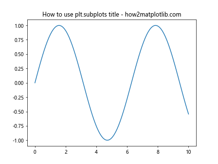
In this example, we use plt.subplots() to create a single subplot. The function returns a tuple containing the figure object (fig) and the axes object (ax). We then plot a sine wave and add a title using the set_title() method.
Exploring plt.subplots Parameters
plt.subplots offers several parameters to customize your plot layout. Let’s examine some of the most commonly used ones:
nrows and ncols
These parameters determine the number of rows and columns in your subplot grid:
import matplotlib.pyplot as plt
import numpy as np

fig, axs = plt.subplots(nrows=2, ncols=2)
x = np.linspace(0, 10, 100)

for i in range(2):
    for j in range(2):
        axs[i, j].plot(x, np.sin(x + i + j))
        axs[i, j].set_title(f"Subplot {i+1},{j+1} - how2matplotlib.com")

plt.tight_layout()
plt.show()
Output:
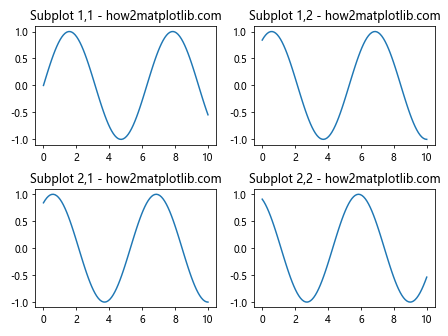
This example creates a 2×2 grid of subplots, each containing a slightly phase-shifted sine wave.
figsize
The figsize parameter allows you to set the overall size of the figure:
import matplotlib.pyplot as plt
import numpy as np

fig, ax = plt.subplots(figsize=(10, 6))
x = np.linspace(0, 10, 100)
ax.plot(x, np.sin(x))
ax.set_title("Custom Figure Size with plt.subplots title - how2matplotlib.com")
plt.show()
Output:
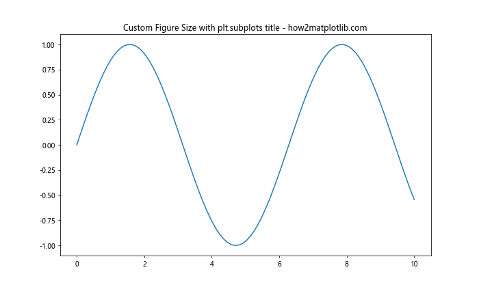
Here, we create a figure with a width of 10 inches and a height of 6 inches.
sharex and sharey
These parameters allow you to share x or y axes across subplots:
import matplotlib.pyplot as plt
import numpy as np

fig, (ax1, ax2) = plt.subplots(nrows=2, sharex=True)
x = np.linspace(0, 10, 100)

ax1.plot(x, np.sin(x))
ax1.set_title("Subplot 1 - how2matplotlib.com")

ax2.plot(x, np.cos(x))
ax2.set_title("Subplot 2 - how2matplotlib.com")

plt.suptitle("Shared X-axis with plt.subplots title")
plt.show()
Output:
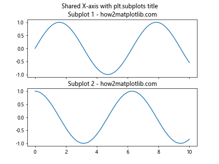
In this example, we create two subplots that share the same x-axis.
Mastering Title Placement and Formatting
Titles are crucial for providing context to your plots. Matplotlib offers various ways to add and customize titles using plt.subplots and title functions.
Adding Titles to Individual Subplots
You can add titles to individual subplots using the set_title() method:
import matplotlib.pyplot as plt
import numpy as np

fig, (ax1, ax2) = plt.subplots(nrows=1, ncols=2)
x = np.linspace(0, 10, 100)

ax1.plot(x, np.sin(x))
ax1.set_title("Sine Wave - how2matplotlib.com")

ax2.plot(x, np.cos(x))
ax2.set_title("Cosine Wave - how2matplotlib.com")

plt.show()
Output:
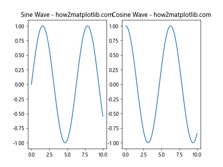
This example demonstrates how to add different titles to two side-by-side subplots.
Adding a Main Title to the Figure
To add a main title to the entire figure, you can use the suptitle() function:
import matplotlib.pyplot as plt
import numpy as np

fig, (ax1, ax2) = plt.subplots(nrows=1, ncols=2)
x = np.linspace(0, 10, 100)

ax1.plot(x, np.sin(x))
ax1.set_title("Sine Wave - how2matplotlib.com")

ax2.plot(x, np.cos(x))
ax2.set_title("Cosine Wave - how2matplotlib.com")

fig.suptitle("Trigonometric Functions - plt.subplots title")
plt.show()
Output:
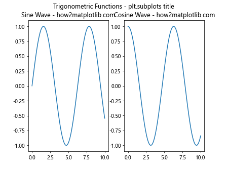
This example adds a main title “Trigonometric Functions” above the two subplots.
Customizing Title Appearance
You can customize the appearance of titles using various parameters:
import matplotlib.pyplot as plt
import numpy as np

fig, ax = plt.subplots()
x = np.linspace(0, 10, 100)
ax.plot(x, np.sin(x))

ax.set_title("Customized Title - how2matplotlib.com",
             fontsize=16,
             fontweight='bold',
             color='red',
             loc='left')

plt.show()
Output:
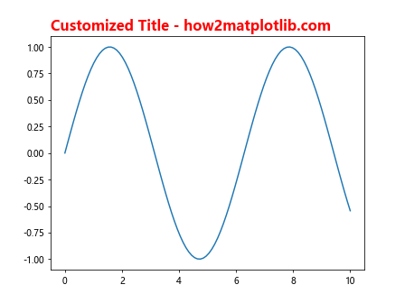
This example demonstrates how to change the font size, weight, color, and position of the title.
Advanced plt.subplots Techniques
Now that we’ve covered the basics, let’s explore some advanced techniques for using plt.subplots and title.
Creating Subplots with Different Sizes
You can create subplots with different sizes using gridspec:
import matplotlib.pyplot as plt
import matplotlib.gridspec as gridspec
import numpy as np

fig = plt.figure(figsize=(12, 8))
gs = gridspec.GridSpec(2, 2, width_ratios=[2, 1], height_ratios=[1, 2])

ax1 = fig.add_subplot(gs[0, 0])
ax2 = fig.add_subplot(gs[0, 1])
ax3 = fig.add_subplot(gs[1, :])

x = np.linspace(0, 10, 100)
ax1.plot(x, np.sin(x))
ax1.set_title("Subplot 1 - how2matplotlib.com")

ax2.plot(x, np.cos(x))
ax2.set_title("Subplot 2 - how2matplotlib.com")

ax3.plot(x, np.tan(x))
ax3.set_title("Subplot 3 - how2matplotlib.com")

fig.suptitle("Different Sized Subplots - plt.subplots title")
plt.tight_layout()
plt.show()
Output:
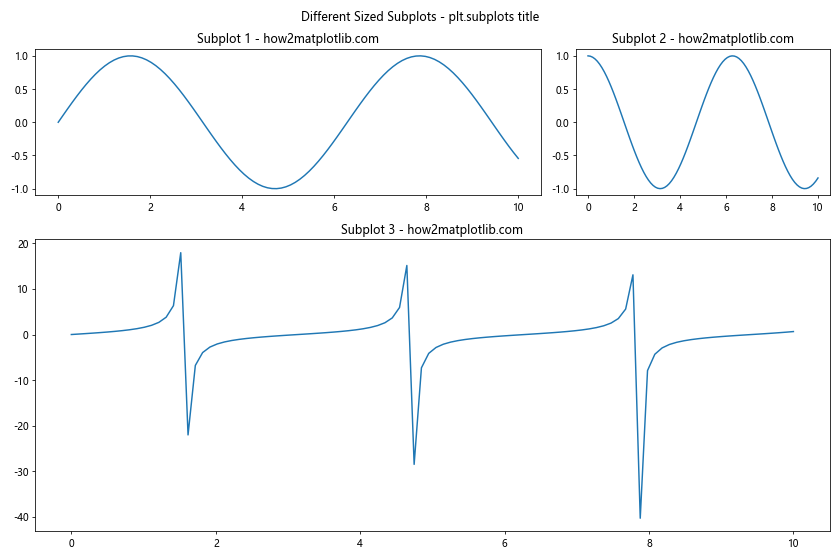
This example creates a layout with three subplots of different sizes.
Adding Subtitles
You can add subtitles to your plots using the text() function:
import matplotlib.pyplot as plt
import numpy as np

fig, ax = plt.subplots()
x = np.linspace(0, 10, 100)
ax.plot(x, np.sin(x))

ax.set_title("Main Title - how2matplotlib.com")
ax.text(0.5, 0.95, "Subtitle using plt.subplots title",
        transform=ax.transAxes, ha='center', va='top')

plt.show()
Output:
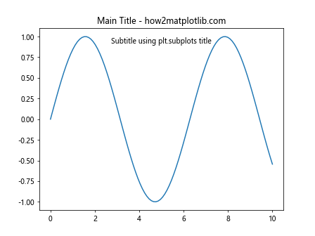
This example adds a subtitle below the main title using the text() function.
Creating Nested Subplots
You can create nested subplots for more complex layouts:
import matplotlib.pyplot as plt
import numpy as np

fig = plt.figure(figsize=(12, 8))
outer_grid = fig.add_gridspec(2, 2)

for i in range(2):
    for j in range(2):
        inner_grid = outer_grid[i, j].subgridspec(2, 2)
        for k in range(2):
            for l in range(2):
                ax = fig.add_subplot(inner_grid[k, l])
                ax.plot(np.random.rand(10))
                ax.set_title(f"Subplot {i}{j}{k}{l} - how2matplotlib.com")

fig.suptitle("Nested Subplots - plt.subplots title")
plt.tight_layout()
plt.show()
Output:
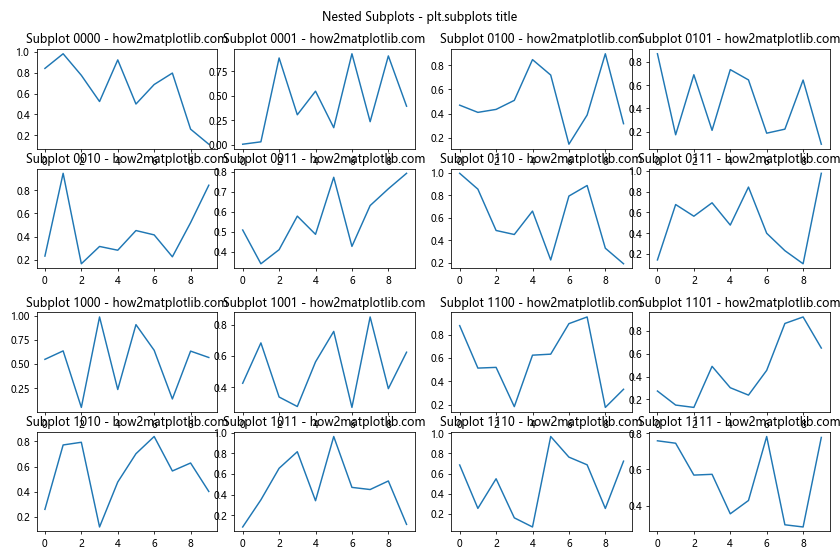
This example creates a 2×2 grid of subplots, each containing its own 2×2 grid of subplots.
Combining plt.subplots with Other Matplotlib Features
plt.subplots can be combined with various other Matplotlib features to create more informative and visually appealing plots.
Adding Colorbars to Subplots
You can add colorbars to individual subplots:
import matplotlib.pyplot as plt
import numpy as np

fig, (ax1, ax2) = plt.subplots(nrows=1, ncols=2, figsize=(12, 5))

data1 = np.random.rand(10, 10)
data2 = np.random.rand(10, 10)

im1 = ax1.imshow(data1, cmap='viridis')
im2 = ax2.imshow(data2, cmap='plasma')

fig.colorbar(im1, ax=ax1)
fig.colorbar(im2, ax=ax2)

ax1.set_title("Subplot 1 - how2matplotlib.com")
ax2.set_title("Subplot 2 - how2matplotlib.com")

fig.suptitle("Colorbars with plt.subplots title")
plt.tight_layout()
plt.show()
Output:
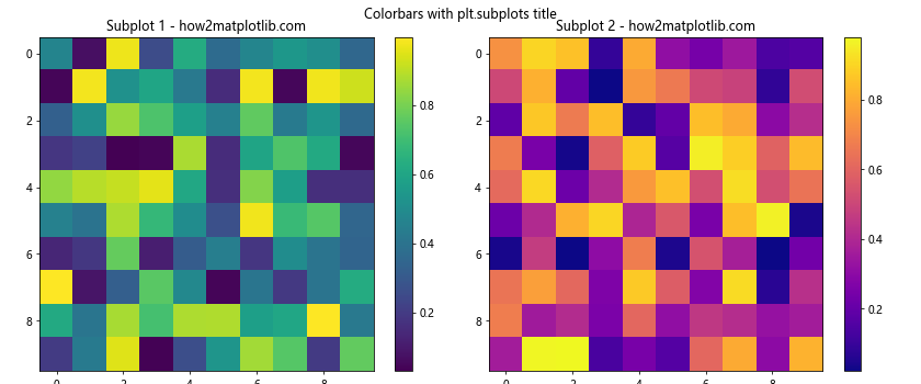
This example creates two subplots with heatmaps and adds a colorbar to each.
Combining Different Plot Types
You can combine different types of plots in a single figure:
import matplotlib.pyplot as plt
import numpy as np

fig, (ax1, ax2, ax3) = plt.subplots(nrows=1, ncols=3, figsize=(15, 5))

x = np.linspace(0, 10, 100)
y = np.sin(x)

ax1.plot(x, y)
ax1.set_title("Line Plot - how2matplotlib.com")

ax2.scatter(x, y)
ax2.set_title("Scatter Plot - how2matplotlib.com")

ax3.bar(x[::10], y[::10])
ax3.set_title("Bar Plot - how2matplotlib.com")

fig.suptitle("Different Plot Types - plt.subplots title")
plt.tight_layout()
plt.show()
Output:
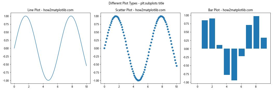
This example creates three subplots with different types of plots: a line plot, a scatter plot, and a bar plot.
Handling Large Numbers of Subplots
When dealing with a large number of subplots, it’s important to manage them efficiently.
Using plt.subplots in a Loop
You can create multiple subplots in a loop:
import matplotlib.pyplot as plt
import numpy as np

fig, axs = plt.subplots(nrows=3, ncols=3, figsize=(12, 12))
x = np.linspace(0, 10, 100)

for i, ax in enumerate(axs.flat):
    ax.plot(x, np.sin(x + i))
    ax.set_title(f"Subplot {i+1} - how2matplotlib.com")

fig.suptitle("Multiple Subplots - plt.subplots title")
plt.tight_layout()
plt.show()
Output:
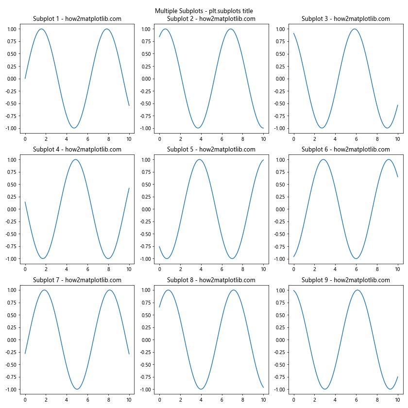
This example creates a 3×3 grid of subplots, each with a slightly phase-shifted sine wave.
Using plt.subplots with pandas DataFrames
You can use plt.subplots with pandas DataFrames to create multiple plots:
import matplotlib.pyplot as plt
import pandas as pd
import numpy as np

# Create a sample DataFrame
df = pd.DataFrame(np.random.randn(100, 4), columns=['A', 'B', 'C', 'D'])

fig, axs = plt.subplots(nrows=2, ncols=2, figsize=(12, 10))

for (col, ax) in zip(df.columns, axs.flat):
    df[col].plot(ax=ax)
    ax.set_title(f"{col} - how2matplotlib.com")

fig.suptitle("DataFrame Plots - plt.subplots title")
plt.tight_layout()
plt.show()
Output:
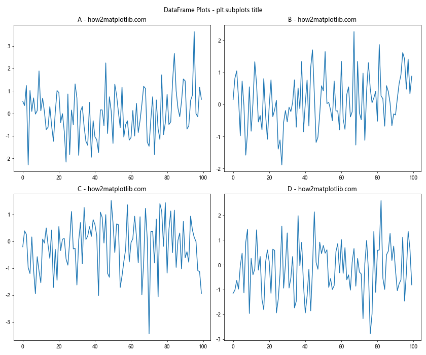
This example creates a 2×2 grid of subplots, each showing a line plot of a different column from a pandas DataFrame.
Fine-tuning plt.subplots and title
To create professional-looking plots, it’s important to fine-tune various aspects of your subplots and titles.
Adjusting Subplot Spacing
You can adjust the spacing between subplots using plt.subplots_adjust():
import matplotlib.pyplot as plt
import numpy as np

fig, axs = plt.subplots(nrows=2, ncols=2, figsize=(10, 10))
x = np.linspace(0, 10, 100)

for i, ax in enumerate(axs.flat):
    ax.plot(x, np.sin(x + i))
    ax.set_title(f"Subplot {i+1} - how2matplotlib.com")

fig.suptitle("Adjusted Spacing - plt.subplots title")
plt.subplots_adjust(wspace=0.5, hspace=0.5)
plt.show()
Output:
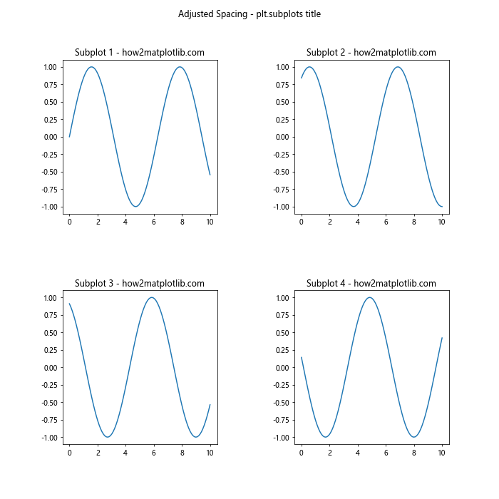
This example increases the horizontal and vertical spacing between subplots.
Rotating Subplot Titles
You can rotate subplot titles for better readability:
import matplotlib.pyplot as plt
import numpy as np

fig, axs = plt.subplots(nrows=2, ncols=2, figsize=(10, 10))
x = np.linspace(0, 10, 100)

for i, ax in enumerate(axs.flat):
    ax.plot(x, np.sin(x + i))
    ax.set_title(f"Subplot {i+1} - how2matplotlib.com", rotation=45, ha='right')

fig.suptitle("Rotated Titles - plt.subplots title")
plt.tight_layout()
plt.show()
Output:
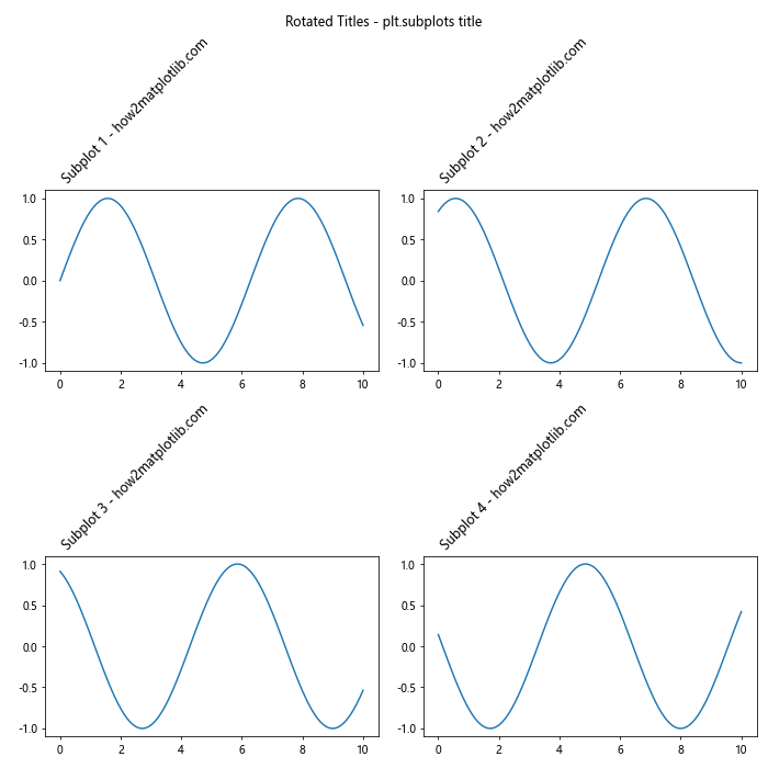
This example rotates the subplot titles by 45 degrees.
Adding Annotations to Subplots
You can add annotations to provide additional information:
import matplotlib.pyplot as plt
import numpy as np

fig, axs = plt.subplots(nrows=2, ncols=2, figsize=(12, 12))
x = np.linspace(0, 10, 100)

for i, ax in enumerate(axs.flat):
    y = np.sin(x + i)
    ax.plot(x, y)
    ax.set_title(f"Subplot {i+1} - how2matplotlib.com")

    max_y = np.max(y)
    max_x = x[np.argmax(y)]
    ax.annotate(f'Max: {max_y:.2f}', xy=(max_x, max_y), xytext=(max_x+1, max_y),
                arrowprops=dict(facecolor='black', shrink=0.05))

fig.suptitle("Annotated Subplots - plt.subplots title")
plt.tight_layout()
plt.show()
Output:
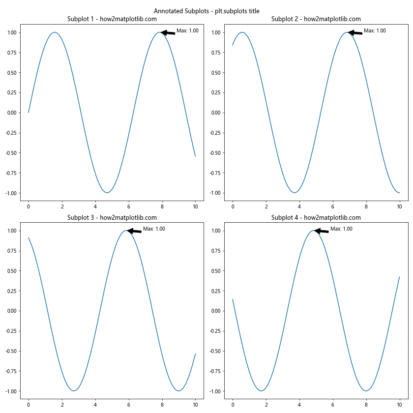
This example adds annotations to each subplot indicating the maximum y-value.
Best Practices for Using plt.subplots and title
To make the most of plt.subplots and title, consider the following best practices:
- Use descriptive titles:Certainly! Here’s the continuation of the article:
Use descriptive titles:
import matplotlib.pyplot as plt
import numpy as np
fig, ax = plt.subplots()
x = np.linspace(0, 10, 100)
ax.plot(x, np.sin(x))
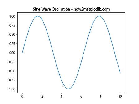
ax.set_title("Sine Wave Oscillation - how2matplotlib.com")
plt.show()
Output: