How to Master plt.subplots and figsize in Matplotlib
plt.subplots figsize are essential components in Matplotlib for creating and customizing plots. This comprehensive guide will explore the ins and outs of using plt.subplots and figsize to create stunning visualizations. We’ll cover everything from basic usage to advanced techniques, providing you with the knowledge and skills to take your data visualization game to the next level.
Understanding plt.subplots and figsize
plt.subplots is a function in Matplotlib that allows you to create a figure and a set of subplots in a single call. The figsize parameter, on the other hand, is used to specify the size of the figure. Together, these two elements give you precise control over the layout and dimensions of your plots.
Let’s start with a simple example to illustrate the basic usage of plt.subplots and figsize:
import matplotlib.pyplot as plt
import numpy as np

# Create a figure and a subplot
fig, ax = plt.subplots(figsize=(8, 6))

# Generate some data
x = np.linspace(0, 10, 100)
y = np.sin(x)

# Plot the data
ax.plot(x, y)

# Add labels and title
ax.set_xlabel('X-axis')
ax.set_ylabel('Y-axis')
ax.set_title('Simple plot using plt.subplots and figsize - how2matplotlib.com')

plt.show()
Output:
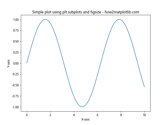
In this example, we use plt.subplots() to create a figure and a single subplot. The figsize parameter is set to (8, 6), which creates a figure that is 8 inches wide and 6 inches tall. We then plot a simple sine wave on the subplot.
Exploring the plt.subplots Function
The plt.subplots function is incredibly versatile and offers many options for customizing your plots. Let’s dive deeper into its parameters and usage.
Basic Syntax
The basic syntax for plt.subplots is as follows:
fig, ax = plt.subplots(nrows=1, ncols=1, figsize=(width, height))
nrows: The number of rows of subplots (default is 1)ncols: The number of columns of subplots (default is 1)figsize: A tuple specifying the width and height of the figure in inches
Creating Multiple Subplots
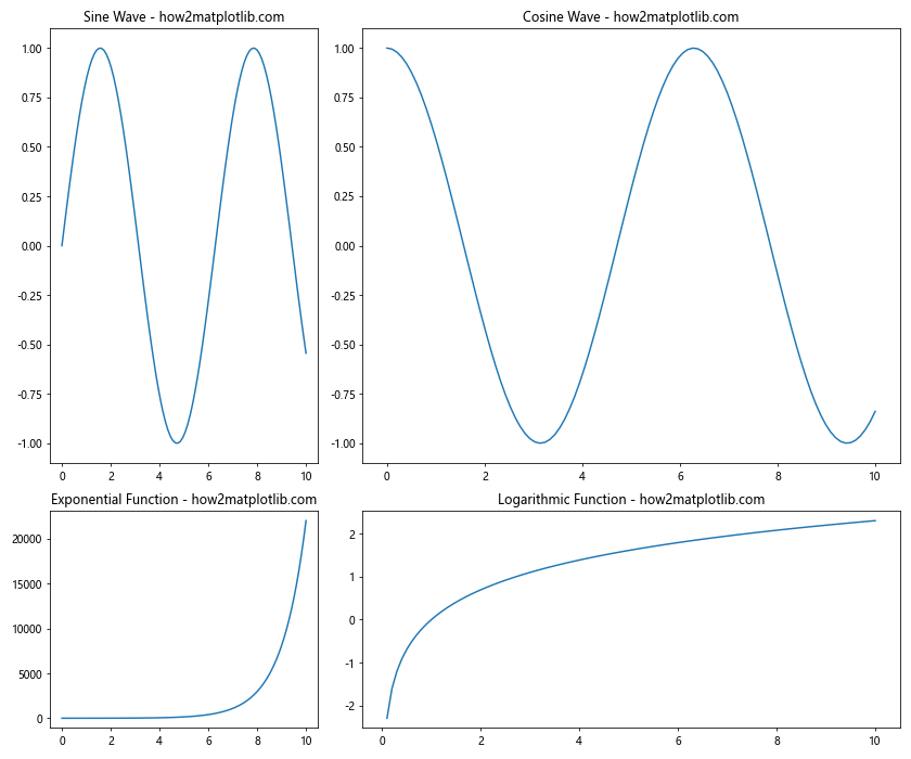
One of the most powerful features of plt.subplots is the ability to create multiple subplots in a single figure. Here’s an example that creates a 2×2 grid of subplots:
import matplotlib.pyplot as plt
import numpy as np

# Create a 2x2 grid of subplots
fig, axs = plt.subplots(2, 2, figsize=(12, 10))

# Generate some data
x = np.linspace(0, 10, 100)

# Plot different functions on each subplot
axs[0, 0].plot(x, np.sin(x))
axs[0, 0].set_title('Sine Wave - how2matplotlib.com')

axs[0, 1].plot(x, np.cos(x))
axs[0, 1].set_title('Cosine Wave - how2matplotlib.com')

axs[1, 0].plot(x, np.exp(x))
axs[1, 0].set_title('Exponential Function - how2matplotlib.com')

axs[1, 1].plot(x, np.log(x))
axs[1, 1].set_title('Logarithmic Function - how2matplotlib.com')

# Adjust the layout and display the plot
plt.tight_layout()
plt.show()
Output:
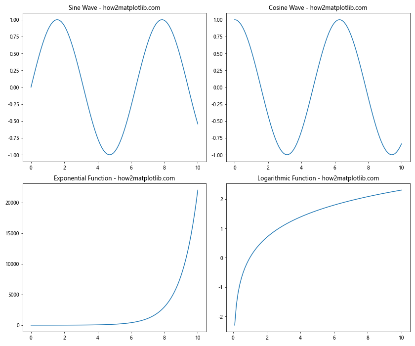
In this example, we create a 2×2 grid of subplots using plt.subplots(2, 2). The figsize is set to (12, 10) to accommodate the multiple plots. We then plot different functions on each subplot using the axs array.
Mastering figsize for Perfect Plot Dimensions
The figsize parameter is crucial for controlling the size and aspect ratio of your plots. Let’s explore how to use figsize effectively.
Understanding figsize Units
The figsize parameter takes a tuple of two values: (width, height). These values are in inches by default. For example:
import matplotlib.pyplot as plt
import numpy as np

# Create a figure with custom size
fig, ax = plt.subplots(figsize=(10, 4))

# Generate some data
x = np.linspace(0, 10, 100)
y = np.sin(x)

# Plot the data
ax.plot(x, y)

# Add labels and title
ax.set_xlabel('X-axis')
ax.set_ylabel('Y-axis')
ax.set_title('Custom figsize example - how2matplotlib.com')

plt.show()
Output:
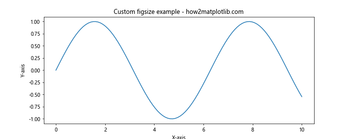
In this example, we create a figure that is 10 inches wide and 4 inches tall, resulting in a wide, rectangular plot.
Calculating figsize Based on Screen Resolution
If you want your plots to have specific pixel dimensions, you can calculate the appropriate figsize based on your screen’s DPI (dots per inch). Here’s an example:
import matplotlib.pyplot as plt
import numpy as np

# Get the screen DPI
dpi = plt.rcParams['figure.dpi']

# Calculate figsize for a 800x600 pixel plot
width_inches = 800 / dpi
height_inches = 600 / dpi

# Create the figure and subplot
fig, ax = plt.subplots(figsize=(width_inches, height_inches))

# Generate some data
x = np.linspace(0, 10, 100)
y = np.sin(x)

# Plot the data
ax.plot(x, y)

# Add labels and title
ax.set_xlabel('X-axis')
ax.set_ylabel('Y-axis')
ax.set_title('800x600 pixel plot - how2matplotlib.com')

plt.show()
Output:
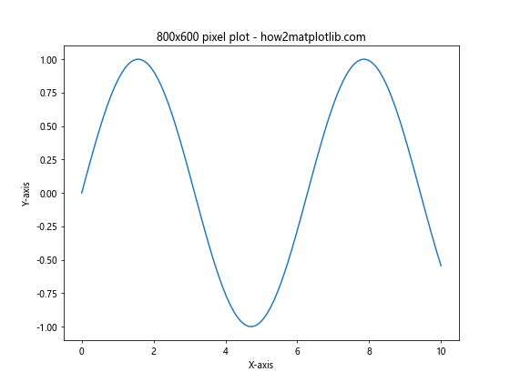
This code calculates the appropriate figsize to create a plot that is exactly 800×600 pixels, regardless of the screen’s DPI.
Advanced Techniques with plt.subplots and figsize
Now that we’ve covered the basics, let’s explore some advanced techniques for using plt.subplots and figsize.
Creating Subplots with Different Sizes
You can create subplots with different sizes using the gridspec_kw parameter in plt.subplots. Here’s an example:
import matplotlib.pyplot as plt
import numpy as np

# Create subplots with different sizes
fig, axs = plt.subplots(2, 2, figsize=(12, 10),
                        gridspec_kw={'height_ratios': [2, 1],
                                     'width_ratios': [1, 2]})

# Generate some data
x = np.linspace(0, 10, 100)

# Plot different functions on each subplot
axs[0, 0].plot(x, np.sin(x))
axs[0, 0].set_title('Sine Wave - how2matplotlib.com')

axs[0, 1].plot(x, np.cos(x))
axs[0, 1].set_title('Cosine Wave - how2matplotlib.com')

axs[1, 0].plot(x, np.exp(x))
axs[1, 0].set_title('Exponential Function - how2matplotlib.com')

axs[1, 1].plot(x, np.log(x))
axs[1, 1].set_title('Logarithmic Function - how2matplotlib.com')

# Adjust the layout and display the plot
plt.tight_layout()
plt.show()
Output:
In this example, we use the gridspec_kw parameter to create subplots with different sizes. The top row is twice as tall as the bottom row, and the right column is twice as wide as the left column.
Creating Subplots with Shared Axes
plt.subplots allows you to create subplots with shared axes, which can be useful for comparing data across multiple plots. Here’s an example:
import matplotlib.pyplot as plt
import numpy as np

# Create subplots with shared axes
fig, (ax1, ax2) = plt.subplots(2, 1, figsize=(10, 8), sharex=True)

# Generate some data
x = np.linspace(0, 10, 100)
y1 = np.sin(x)
y2 = np.cos(x)

# Plot data on the subplots
ax1.plot(x, y1)
ax1.set_title('Sine Wave - how2matplotlib.com')

ax2.plot(x, y2)
ax2.set_title('Cosine Wave - how2matplotlib.com')

# Add labels
ax2.set_xlabel('X-axis')
ax1.set_ylabel('Y-axis')
ax2.set_ylabel('Y-axis')

plt.tight_layout()
plt.show()
Output:
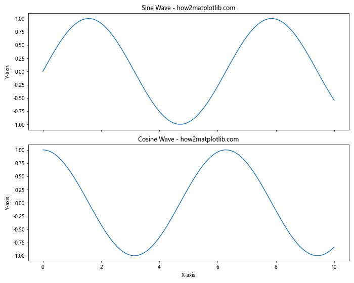
In this example, we create two subplots with a shared x-axis using the sharex=True parameter. This ensures that the x-axis limits and ticks are the same for both plots.
Optimizing figsize for Different Plot Types
Different types of plots may require different aspect ratios to look their best. Let’s explore how to optimize figsize for various plot types.
Bar Plots
Bar plots often look best with a wider aspect ratio. Here’s an example:
import matplotlib.pyplot as plt
import numpy as np

# Create a figure with a wide aspect ratio
fig, ax = plt.subplots(figsize=(12, 6))

# Generate some data
categories = ['A', 'B', 'C', 'D', 'E']
values = np.random.randint(1, 100, 5)

# Create the bar plot
ax.bar(categories, values)

# Add labels and title
ax.set_xlabel('Categories')
ax.set_ylabel('Values')
ax.set_title('Bar Plot with Optimized figsize - how2matplotlib.com')

plt.show()
Output:
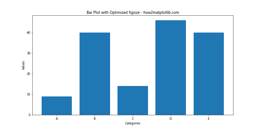
In this example, we use a figsize of (12, 6) to create a wide aspect ratio that works well for bar plots.
Scatter Plots
Scatter plots often look best with a square aspect ratio. Here’s an example:
import matplotlib.pyplot as plt
import numpy as np

# Create a figure with a square aspect ratio
fig, ax = plt.subplots(figsize=(8, 8))

# Generate some random data
x = np.random.randn(100)
y = np.random.randn(100)

# Create the scatter plot
ax.scatter(x, y)

# Add labels and title
ax.set_xlabel('X-axis')
ax.set_ylabel('Y-axis')
ax.set_title('Scatter Plot with Square figsize - how2matplotlib.com')

plt.show()
Output:
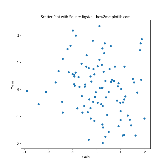
In this example, we use a figsize of (8, 8) to create a square aspect ratio that works well for scatter plots.
Combining plt.subplots with Other Matplotlib Features
plt.subplots can be combined with other Matplotlib features to create more complex and informative visualizations. Let’s explore some examples.
Adding a Colorbar to Subplots
You can add a colorbar to your subplots to provide additional information. Here’s an example:
import matplotlib.pyplot as plt
import numpy as np

# Create a figure with subplots
fig, (ax1, ax2) = plt.subplots(1, 2, figsize=(12, 5))

# Generate some data
x = np.linspace(-5, 5, 100)
y = np.linspace(-5, 5, 100)
X, Y = np.meshgrid(x, y)
Z1 = np.sin(np.sqrt(X**2 + Y**2))
Z2 = np.cos(np.sqrt(X**2 + Y**2))

# Create contour plots
im1 = ax1.contourf(X, Y, Z1, cmap='viridis')
im2 = ax2.contourf(X, Y, Z2, cmap='plasma')

# Add colorbars
fig.colorbar(im1, ax=ax1, label='Values')
fig.colorbar(im2, ax=ax2, label='Values')

# Add titles
ax1.set_title('Sine Function - how2matplotlib.com')
ax2.set_title('Cosine Function - how2matplotlib.com')

plt.tight_layout()
plt.show()
Output:
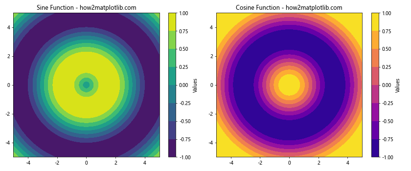
In this example, we create two contour plots and add a colorbar to each subplot using fig.colorbar().
Creating Subplots with Different Projections
plt.subplots allows you to create subplots with different projections, such as polar or 3D plots. Here’s an example:
import matplotlib.pyplot as plt
import numpy as np

# Create a figure with different subplot projections
fig = plt.figure(figsize=(12, 5))
ax1 = fig.add_subplot(121)
ax2 = fig.add_subplot(122, projection='polar')

# Generate some data
x = np.linspace(0, 10, 100)
y = np.sin(x)
theta = np.linspace(0, 2*np.pi, 100)
r = np.abs(np.sin(4*theta))

# Create plots
ax1.plot(x, y)
ax1.set_title('Regular Plot - how2matplotlib.com')

ax2.plot(theta, r)
ax2.set_title('Polar Plot - how2matplotlib.com')

plt.tight_layout()
plt.show()
Output:
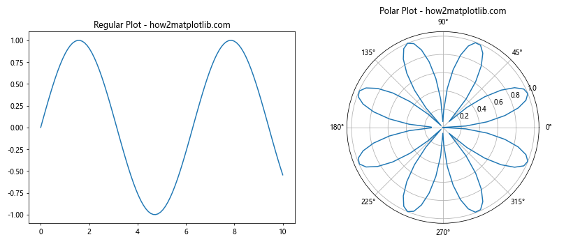
In this example, we create a figure with two subplots: a regular plot and a polar plot. We use fig.add_subplot() to create subplots with different projections.
Best Practices for Using plt.subplots and figsize
To make the most of plt.subplots and figsize, consider the following best practices:
- Choose appropriate figsize values based on the content and intended display medium (e.g., screen, print, presentation).
- Use plt.tight_layout() to automatically adjust subplot parameters for optimal spacing.
- Consider the aspect ratio of your data when selecting figsize values.
- Use sharex and sharey parameters to create subplots with shared axes when appropriate.
- Experiment with different layouts and sizes to find the most effective presentation for your data.
Here’s an example that demonstrates some of these best practices:
import matplotlib.pyplot as plt
import numpy as np

# Create a figure with subplots
fig, axs = plt.subplots(2, 2, figsize=(12, 10), sharex='col', sharey='row')

# Generate some data
x = np.linspace(0, 10, 100)
y1 = np.sin(x)
y2 = np.cos(x)
y3 = np.exp(-x/10) * np.sin(x)
y4 = np.exp(-x/10) * np.cos(x)

# Plot data on the subplots
axs[0, 0].plot(x, y1)
axs[0, 0].set_title('Sine Wave - how2matplotlib.com')

axs[0, 1].plot(x, y2)
axs[0, 1].set_title('Cosine Wave - how2matplotlib.com')

axs[1, 0].plot(x, y3)
axs[1, 0].set_title('Damped Sine Wave - how2matplotlib.com')

axs[1, 1].plot(x, y4)
axs[1, 1].set_title('Damped Cosine Wave - how2matplotlib.com')

# Add labels to the outer subplots
for ax in axs[-1, :]:
    ax.set_xlabel('X-axis')
for ax in axs[:, 0]:
    ax.set_ylabel('Y-axis')

# Adjust the layout
plt.tight_layout()
plt.show()
Output:
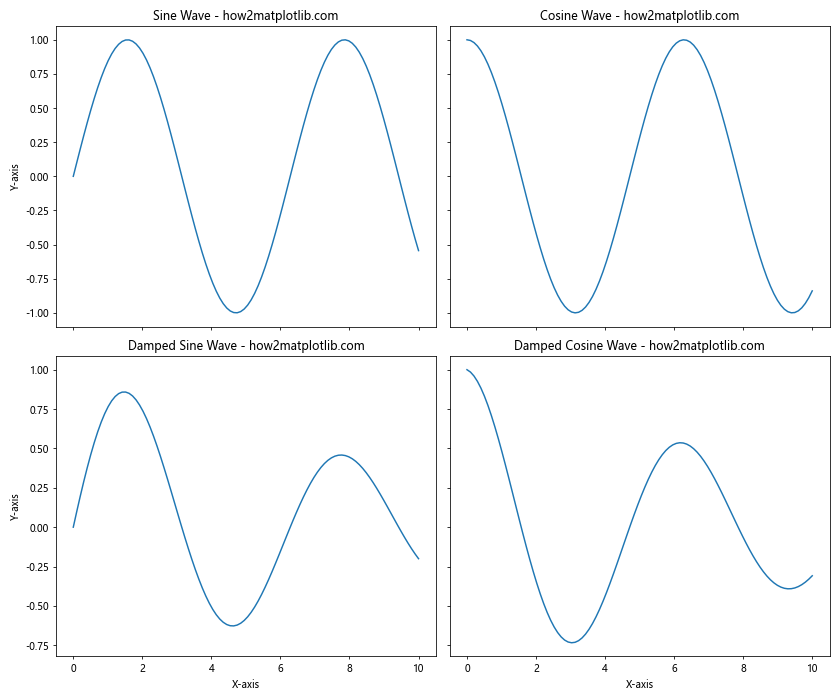
This example demonstrates the use of shared axes, appropriate figsize, and tight_layout() to create a well-organized and visually appealing set of subplots.
Troubleshooting Common Issues with plt.subplots and figsize
When working with plt.subplotsand figsize, you may encounter some common issues. Here are some problems you might face and how to solve them:
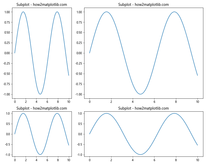
Issue 1: Overlapping Subplots
If your subplots are overlapping, you can use plt.tight_layout() or adjust the figsize. Here’s an example of how to fix overlapping subplots:
import matplotlib.pyplot as plt
import numpy as np

# Create a figure with potentially overlapping subplots
fig, axs = plt.subplots(2, 2, figsize=(8, 6))

# Generate some data
x = np.linspace(0, 10, 100)
y = np.sin(x)

# Plot the same data on all subplots
for ax in axs.flat:
    ax.plot(x, y)
    ax.set_title('Subplot - how2matplotlib.com')

# Fix overlapping by using tight_layout
plt.tight_layout()

plt.show()
Output:
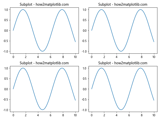
In this example, we use plt.tight_layout() to automatically adjust the spacing between subplots and prevent overlapping.
Issue 2: Inconsistent Subplot Sizes
If your subplots have inconsistent sizes, you can use gridspec_kw to set specific height and width ratios. Here’s an example:
import matplotlib.pyplot as plt
import numpy as np

# Create a figure with subplots of different sizes
fig, axs = plt.subplots(2, 2, figsize=(10, 8),
                        gridspec_kw={'height_ratios': [2, 1],
                                     'width_ratios': [1, 2]})

# Generate some data
x = np.linspace(0, 10, 100)
y = np.sin(x)

# Plot the same data on all subplots
for ax in axs.flat:
    ax.plot(x, y)
    ax.set_title('Subplot - how2matplotlib.com')

plt.tight_layout()
plt.show()
Output:
This example creates subplots with different sizes using the gridspec_kw parameter.
Issue 3: Incorrect Aspect Ratio
If your plots have an incorrect aspect ratio, you can adjust the figsize or use set_aspect(). Here’s an example:
import matplotlib.pyplot as plt
import numpy as np

# Create a figure with subplots
fig, (ax1, ax2) = plt.subplots(1, 2, figsize=(12, 4))

# Generate some data
x = np.linspace(0, 10, 100)
y = np.sin(x)

# Plot with default aspect ratio
ax1.plot(x, y)
ax1.set_title('Default Aspect Ratio - how2matplotlib.com')

# Plot with adjusted aspect ratio
ax2.plot(x, y)
ax2.set_aspect('equal')
ax2.set_title('Equal Aspect Ratio - how2matplotlib.com')

plt.tight_layout()
plt.show()
Output:
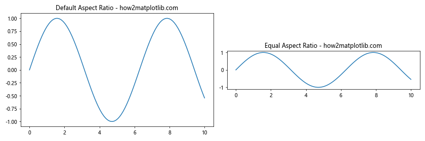
In this example, we use ax.set_aspect(‘equal’) to set an equal aspect ratio for the second subplot.
Advanced Applications of plt.subplots and figsize
Let’s explore some advanced applications of plt.subplots and figsize to create more complex and informative visualizations.
Creating a Dashboard-style Layout
You can use plt.subplots to create a dashboard-style layout with multiple plots of different sizes and types. Here’s an example:
import matplotlib.pyplot as plt
import numpy as np

# Create a figure with a complex layout
fig = plt.figure(figsize=(16, 10))
gs = fig.add_gridspec(3, 3)

# Create subplots of different sizes
ax1 = fig.add_subplot(gs[0, :])
ax2 = fig.add_subplot(gs[1, :-1])
ax3 = fig.add_subplot(gs[1:, -1])
ax4 = fig.add_subplot(gs[-1, 0])
ax5 = fig.add_subplot(gs[-1, -2])

# Generate some data
x = np.linspace(0, 10, 100)
y1 = np.sin(x)
y2 = np.cos(x)
y3 = np.exp(-x/10)

# Create different types of plots
ax1.plot(x, y1)
ax1.set_title('Line Plot - how2matplotlib.com')

ax2.scatter(x, y2)
ax2.set_title('Scatter Plot - how2matplotlib.com')

ax3.bar(x[::10], y3[::10])
ax3.set_title('Bar Plot - how2matplotlib.com')

ax4.hist(np.random.randn(1000))
ax4.set_title('Histogram - how2matplotlib.com')

ax5.boxplot([np.random.randn(100) for _ in range(5)])
ax5.set_title('Box Plot - how2matplotlib.com')

plt.tight_layout()
plt.show()
Output:
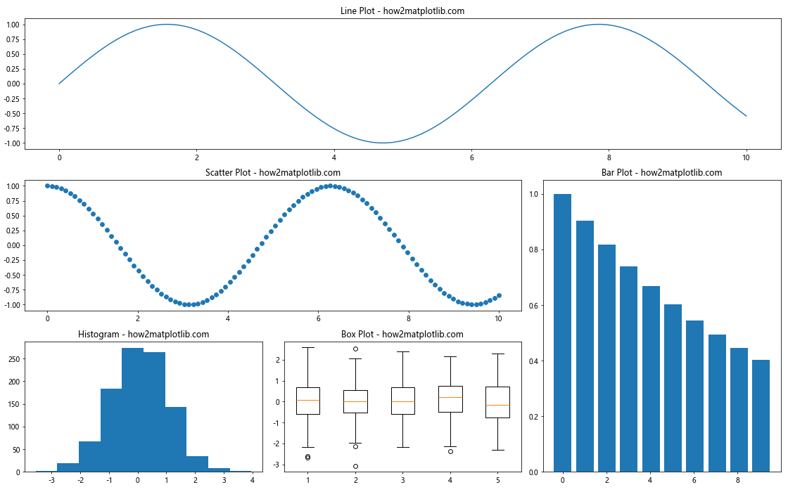
This example creates a complex dashboard-style layout with different types of plots using plt.subplots and gridspec.
Creating Inset Axes
You can use plt.subplots in combination with inset_axes to create plots within plots. Here’s an example:
import matplotlib.pyplot as plt
from mpl_toolkits.axes_grid1.inset_locator import inset_axes
import numpy as np

# Create a figure and subplot
fig, ax = plt.subplots(figsize=(10, 6))

# Generate some data
x = np.linspace(0, 10, 1000)
y = np.sin(x) * np.exp(-x/10)

# Create the main plot
ax.plot(x, y)
ax.set_title('Main Plot with Inset - how2matplotlib.com')

# Create an inset plot
axins = inset_axes(ax, width="40%", height="30%", loc=1)
axins.plot(x, y)
axins.set_xlim(2, 4)
axins.set_ylim(0.4, 0.8)
axins.set_xticklabels([])
axins.set_yticklabels([])

# Add a box to show the zoomed region
ax.indicate_inset_zoom(axins, edgecolor="black")

plt.show()
Output:
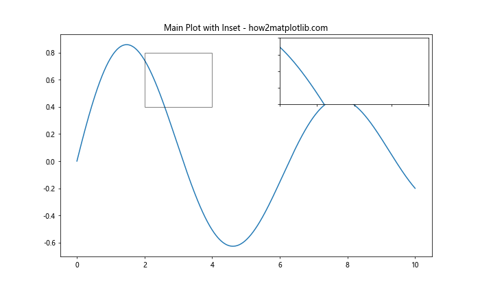
This example creates a main plot with an inset plot that shows a zoomed-in view of a specific region.
Customizing plt.subplots and figsize for Publication-Quality Figures
When preparing figures for publication, you may need to adhere to specific size and formatting requirements. Here’s an example of how to create a publication-quality figure using plt.subplots and figsize:
import matplotlib.pyplot as plt
import numpy as np

# Set the figure size to match journal requirements (e.g., 7 inches wide)
fig_width = 7
golden_ratio = (5**0.5 - 1) / 2
fig_height = fig_width * golden_ratio

# Create a figure with subplots
fig, (ax1, ax2) = plt.subplots(2, 1, figsize=(fig_width, fig_height))

# Generate some data
x = np.linspace(0, 10, 100)
y1 = np.sin(x)
y2 = np.cos(x)

# Create plots
ax1.plot(x, y1, label='Sine')
ax1.set_ylabel('Amplitude')
ax1.legend()
ax1.set_title('Sine Wave - how2matplotlib.com')

ax2.plot(x, y2, label='Cosine')
ax2.set_xlabel('Time')
ax2.set_ylabel('Amplitude')
ax2.legend()
ax2.set_title('Cosine Wave - how2matplotlib.com')

# Adjust the layout
plt.tight_layout()

# Save the figure as a high-resolution PDF
plt.savefig('publication_figure.pdf', dpi=300, bbox_inches='tight')

plt.show()
Output:
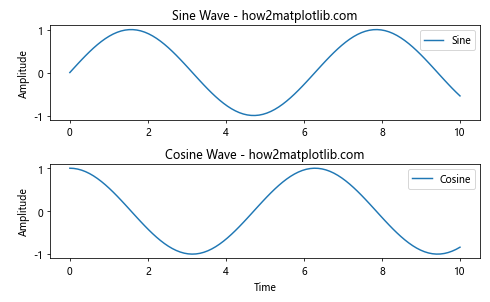
This example creates a figure with dimensions suitable for publication, uses a golden ratio for aesthetically pleasing proportions, and saves the figure as a high-resolution PDF.
plt.subplots figsize Conclusion
Mastering plt.subplots and figsize is essential for creating professional-looking visualizations with Matplotlib. These powerful tools allow you to control the layout, size, and arrangement of your plots with precision. By understanding the various parameters and techniques we’ve covered in this guide, you’ll be able to create complex, informative, and visually appealing plots for a wide range of applications.
Remember to experiment with different layouts, sizes, and configurations to find the best way to present your data. Whether you’re creating simple plots for personal use or preparing publication-quality figures, the combination of plt.subplots and figsize gives you the flexibility and control you need to achieve your visualization goals.