How to Master Plotting a Wide DataFrame with Custom Colors and Linestyles in Matplotlib
Plotting a Wide DataFrame with Custom Colors and Linestyles is an essential skill for data visualization using Matplotlib. This comprehensive guide will walk you through the process of creating stunning visualizations from wide DataFrames, utilizing custom colors and linestyles to enhance your plots. Whether you’re a beginner or an experienced data scientist, this article will provide you with the knowledge and techniques to create professional-looking charts and graphs.
Understanding Wide DataFrames and Their Importance in Data Visualization
Before diving into the specifics of plotting a wide DataFrame with custom colors and linestyles, it’s crucial to understand what a wide DataFrame is and why it’s important in data visualization. A wide DataFrame is a tabular data structure where each row represents a single observation, and each column represents a different variable or feature. Wide DataFrames are common in many data analysis scenarios, especially when dealing with time series data or multiple variables for each observation.
When plotting a wide DataFrame, you’re essentially visualizing multiple variables or features simultaneously, which can provide valuable insights into relationships, trends, and patterns within your data. By using custom colors and linestyles, you can further enhance the visual appeal and clarity of your plots, making it easier for your audience to interpret the information presented.
Let’s start with a simple example of creating a wide DataFrame and plotting it using Matplotlib:
import pandas as pd
import matplotlib.pyplot as plt

# Create a sample wide DataFrame
data = {
    'Date': pd.date_range(start='2023-01-01', periods=10),
    'A': [1, 2, 3, 4, 5, 6, 7, 8, 9, 10],
    'B': [10, 9, 8, 7, 6, 5, 4, 3, 2, 1],
    'C': [5, 6, 7, 8, 9, 10, 9, 8, 7, 6]
}
df = pd.DataFrame(data)
df.set_index('Date', inplace=True)

# Plot the wide DataFrame
plt.figure(figsize=(10, 6))
for column in df.columns:
    plt.plot(df.index, df[column], label=column)

plt.title('Plotting a Wide DataFrame - how2matplotlib.com')
plt.xlabel('Date')
plt.ylabel('Value')
plt.legend()
plt.grid(True)
plt.show()
Output:
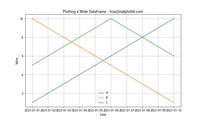
In this example, we created a simple wide DataFrame with three columns (A, B, and C) and a date index. We then plotted each column as a separate line on the same graph. However, this basic plot lacks custom colors and linestyles, which we’ll explore in the following sections.
Customizing Colors in Wide DataFrame Plots
When plotting a wide DataFrame with custom colors, you have the flexibility to assign specific colors to each column or variable. This can greatly enhance the visual appeal of your plot and make it easier for viewers to distinguish between different data series. Matplotlib offers a wide range of color options, including named colors, RGB values, and hex codes.
Here’s an example of plotting a wide DataFrame with custom colors:
import pandas as pd
import matplotlib.pyplot as plt

# Create a sample wide DataFrame
data = {
    'Date': pd.date_range(start='2023-01-01', periods=12),
    'Sales': [100, 120, 140, 160, 180, 200, 220, 240, 260, 280, 300, 320],
    'Expenses': [80, 90, 100, 110, 120, 130, 140, 150, 160, 170, 180, 190],
    'Profit': [20, 30, 40, 50, 60, 70, 80, 90, 100, 110, 120, 130]
}
df = pd.DataFrame(data)
df.set_index('Date', inplace=True)

# Define custom colors
colors = {'Sales': '#FF5733', 'Expenses': '#33FF57', 'Profit': '#3357FF'}

# Plot the wide DataFrame with custom colors
plt.figure(figsize=(12, 6))
for column in df.columns:
    plt.plot(df.index, df[column], color=colors[column], label=column)

plt.title('Financial Performance - how2matplotlib.com')
plt.xlabel('Date')
plt.ylabel('Amount ($)')
plt.legend()
plt.grid(True)
plt.show()
Output:
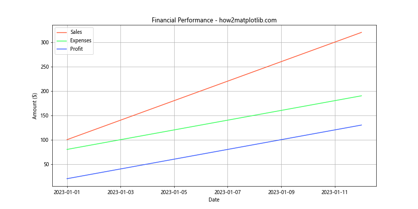
In this example, we’ve created a DataFrame representing financial data and assigned custom colors to each column using a dictionary. The colors dictionary maps each column name to a specific hex color code. When plotting, we use the color parameter in the plt.plot() function to apply these custom colors.
Implementing Custom Linestyles in Wide DataFrame Plots
In addition to custom colors, implementing custom linestyles can further enhance the visual distinction between different data series in your plot. Matplotlib provides various linestyle options, including solid lines, dashed lines, dotted lines, and dash-dot lines. By combining custom colors and linestyles, you can create highly informative and visually appealing plots.
Let’s modify our previous example to include custom linestyles:
import pandas as pd
import matplotlib.pyplot as plt

# Create a sample wide DataFrame
data = {
    'Date': pd.date_range(start='2023-01-01', periods=12),
    'Temperature': [20, 22, 25, 28, 30, 32, 33, 32, 30, 28, 25, 22],
    'Humidity': [60, 58, 55, 52, 50, 48, 47, 49, 52, 55, 58, 60],
    'Wind Speed': [10, 12, 15, 18, 20, 22, 23, 21, 19, 16, 13, 11]
}
df = pd.DataFrame(data)
df.set_index('Date', inplace=True)

# Define custom colors and linestyles
styles = {
    'Temperature': {'color': '#FF5733', 'linestyle': '-'},
    'Humidity': {'color': '#33FF57', 'linestyle': '--'},
    'Wind Speed': {'color': '#3357FF', 'linestyle': ':'}
}

# Plot the wide DataFrame with custom colors and linestyles
plt.figure(figsize=(12, 6))
for column in df.columns:
    plt.plot(df.index, df[column], color=styles[column]['color'],
             linestyle=styles[column]['linestyle'], label=column)

plt.title('Weather Data - how2matplotlib.com')
plt.xlabel('Date')
plt.ylabel('Value')
plt.legend()
plt.grid(True)
plt.show()
Output:
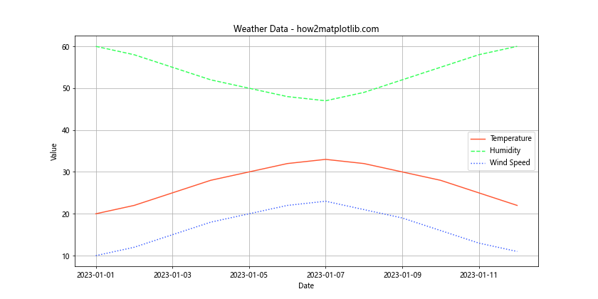
In this example, we’ve created a DataFrame with weather data and defined a styles dictionary that includes both color and linestyle information for each column. When plotting, we use both the color and linestyle parameters in the plt.plot() function to apply these custom styles.
Advanced Techniques for Plotting Wide DataFrames
Now that we’ve covered the basics of plotting a wide DataFrame with custom colors and linestyles, let’s explore some advanced techniques to further enhance your visualizations.
Using ColorMaps for Automatic Color Assignment
When dealing with a wide DataFrame that has many columns, manually assigning colors to each column can be time-consuming. Matplotlib’s colormaps can be used to automatically generate a range of colors for your plot. Here’s an example:
import pandas as pd
import matplotlib.pyplot as plt
import numpy as np

# Create a sample wide DataFrame with many columns
num_columns = 10
data = {'Date': pd.date_range(start='2023-01-01', periods=30)}
for i in range(num_columns):
    data[f'Series_{i+1}'] = np.random.rand(30) * 100

df = pd.DataFrame(data)
df.set_index('Date', inplace=True)

# Use a colormap to automatically assign colors
cmap = plt.get_cmap('tab10')
colors = cmap(np.linspace(0, 1, num_columns))

# Plot the wide DataFrame with colormap-generated colors
plt.figure(figsize=(12, 6))
for i, column in enumerate(df.columns):
    plt.plot(df.index, df[column], color=colors[i], label=column)

plt.title('Multiple Data Series - how2matplotlib.com')
plt.xlabel('Date')
plt.ylabel('Value')
plt.legend(bbox_to_anchor=(1.05, 1), loc='upper left')
plt.tight_layout()
plt.show()
Output:
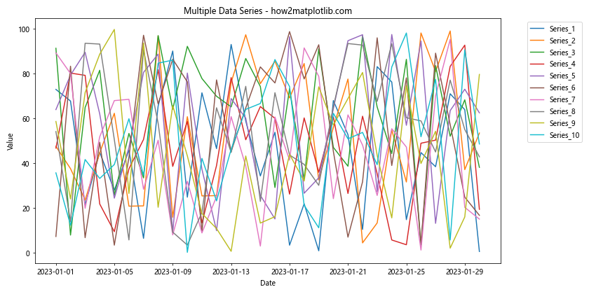
In this example, we’ve created a DataFrame with 10 columns of random data. We then use the ‘tab10’ colormap to automatically generate a range of colors for our plot. This technique is particularly useful when dealing with DataFrames that have a large number of columns.
Implementing Dual Y-Axes for Different Scales
When plotting a wide DataFrame with variables that have significantly different scales, using dual Y-axes can help visualize the data more effectively. Here’s an example:
import pandas as pd
import matplotlib.pyplot as plt

# Create a sample wide DataFrame with different scales
data = {
    'Date': pd.date_range(start='2023-01-01', periods=12),
    'Stock Price': [100, 102, 105, 103, 107, 110, 112, 115, 118, 120, 122, 125],
    'Trading Volume': [1000000, 1200000, 1500000, 1100000, 1300000, 1600000,
                       1400000, 1700000, 1900000, 2000000, 2200000, 2500000]
}
df = pd.DataFrame(data)
df.set_index('Date', inplace=True)

# Create a figure with two Y-axes
fig, ax1 = plt.subplots(figsize=(12, 6))
ax2 = ax1.twinx()

# Plot stock price on the left Y-axis
ax1.plot(df.index, df['Stock Price'], color='#FF5733', label='Stock Price')
ax1.set_xlabel('Date')
ax1.set_ylabel('Stock Price ($)', color='#FF5733')
ax1.tick_params(axis='y', labelcolor='#FF5733')

# Plot trading volume on the right Y-axis
ax2.plot(df.index, df['Trading Volume'], color='#3357FF', label='Trading Volume')
ax2.set_ylabel('Trading Volume', color='#3357FF')
ax2.tick_params(axis='y', labelcolor='#3357FF')

# Combine legends
lines1, labels1 = ax1.get_legend_handles_labels()
lines2, labels2 = ax2.get_legend_handles_labels()
ax1.legend(lines1 + lines2, labels1 + labels2, loc='upper left')

plt.title('Stock Price and Trading Volume - how2matplotlib.com')
plt.tight_layout()
plt.show()
Output:
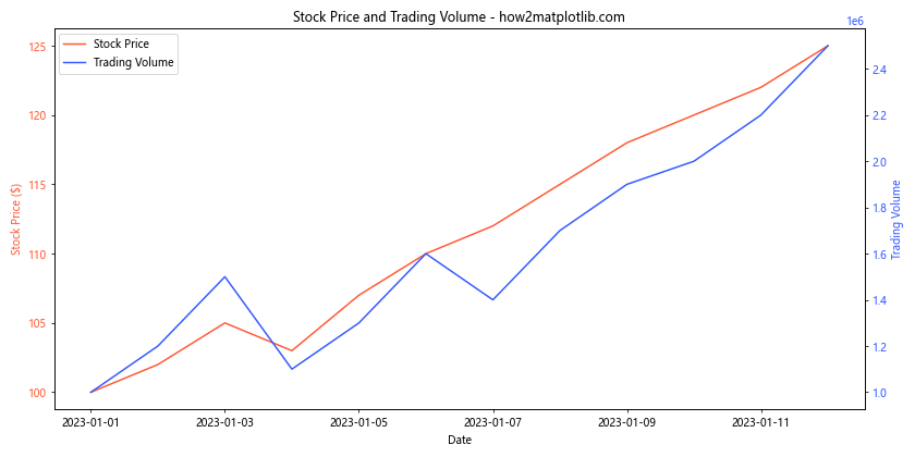
In this example, we’ve created a DataFrame with stock price and trading volume data. Since these two variables have very different scales, we use dual Y-axes to plot them effectively. The stock price is plotted on the left Y-axis, while the trading volume is plotted on the right Y-axis.
Creating Stacked Area Plots
Stacked area plots can be an effective way to visualize cumulative data in a wide DataFrame. Here’s an example of how to create a stacked area plot:
import pandas as pd
import matplotlib.pyplot as plt

# Create a sample wide DataFrame for stacked area plot
data = {
    'Date': pd.date_range(start='2023-01-01', periods=12),
    'Product A': [100, 120, 140, 130, 150, 160, 170, 180, 190, 200, 210, 220],
    'Product B': [80, 90, 100, 110, 120, 130, 140, 150, 160, 170, 180, 190],
    'Product C': [50, 60, 70, 80, 90, 100, 110, 120, 130, 140, 150, 160]
}
df = pd.DataFrame(data)
df.set_index('Date', inplace=True)

# Create a stacked area plot
plt.figure(figsize=(12, 6))
plt.stackplot(df.index, df['Product A'], df['Product B'], df['Product C'],
              labels=['Product A', 'Product B', 'Product C'],
              colors=['#FF5733', '#33FF57', '#3357FF'])

plt.title('Product Sales Stacked Area Plot - how2matplotlib.com')
plt.xlabel('Date')
plt.ylabel('Sales')
plt.legend(loc='upper left')
plt.tight_layout()
plt.show()
Output:
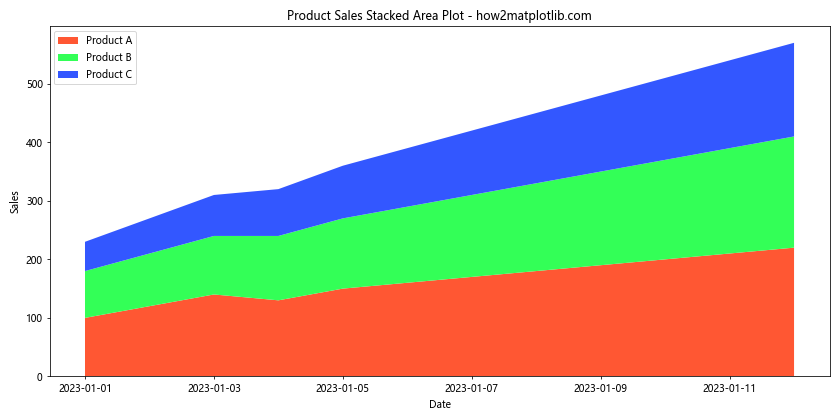
In this example, we’ve created a DataFrame with sales data for three products. We then use plt.stackplot() to create a stacked area plot, which shows the cumulative sales of all products over time.
Enhancing Plot Readability and Aesthetics
When plotting a wide DataFrame with custom colors and linestyles, it’s important to consider the overall readability and aesthetics of your visualization. Here are some techniques to enhance your plots:
Adding Data Labels
Adding data labels to your plot can provide more detailed information about specific data points. Here’s an example:
import pandas as pd
import matplotlib.pyplot as plt

# Create a sample wide DataFrame
data = {
    'Month': ['Jan', 'Feb', 'Mar', 'Apr', 'May', 'Jun'],
    'Revenue': [100, 120, 140, 160, 180, 200],
    'Expenses': [80, 90, 100, 110, 120, 130],
    'Profit': [20, 30, 40, 50, 60, 70]
}
df = pd.DataFrame(data)
df.set_index('Month', inplace=True)

# Plot the wide DataFrame with data labels
plt.figure(figsize=(12, 6))
for column in df.columns:
    plt.plot(df.index, df[column], marker='o', label=column)
    for i, value in enumerate(df[column]):
        plt.text(i, value, f'{value}', ha='center', va='bottom')

plt.title('Financial Performance with Data Labels - how2matplotlib.com')
plt.xlabel('Month')
plt.ylabel('Amount ($)')
plt.legend()
plt.grid(True)
plt.tight_layout()
plt.show()
Output:
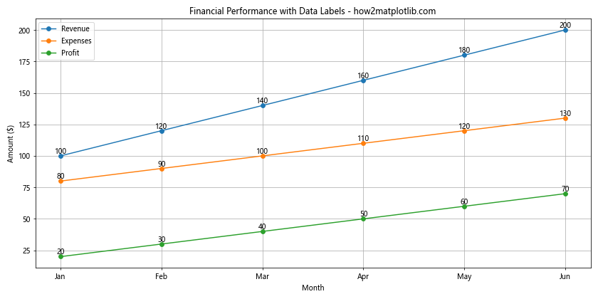
In this example, we’ve added data labels to each point on the plot using plt.text(). This provides a clear view of the exact values for each data point.
Customizing Markers
Adding custom markers to your plot can help distinguish between different data series and highlight specific data points. Here’s an example:
import pandas as pd
import matplotlib.pyplot as plt

# Create a sample wide DataFrame
data = {
    'Year': [2018, 2019, 2020, 2021, 2022],
    'Company A': [100, 120, 140, 160, 180],
    'Company B': [90, 110, 130, 150, 170],
    'Company C': [80, 100, 120, 140, 160]
}
df = pd.DataFrame(data)
df.set_index('Year', inplace=True)

# Define custom colors, linestyles, and markers
styles = {
    'Company A': {'color': '#FF5733', 'linestyle': '-', 'marker': 'o'},
    'Company B': {'color': '#33FF57', 'linestyle': '--', 'marker': 's'},
    'Company C': {'color': '#3357FF', 'linestyle': ':', 'marker': '^'}
}

# Plot the wide DataFrame with custom styles and markers
plt.figure(figsize=(12, 6))
for column in df.columns:
    plt.plot(df.index, df[column], color=styles[column]['color'],
             linestyle=styles[column]['linestyle'],
             marker=styles[column]['marker'],
             markersize=10,
             label=column)

plt.title('CompanyPerformance Comparison - how2matplotlib.com')
plt.xlabel('Year')
plt.ylabel('Performance Score')
plt.legend()
plt.grid(True)
plt.tight_layout()
plt.show()
Output:
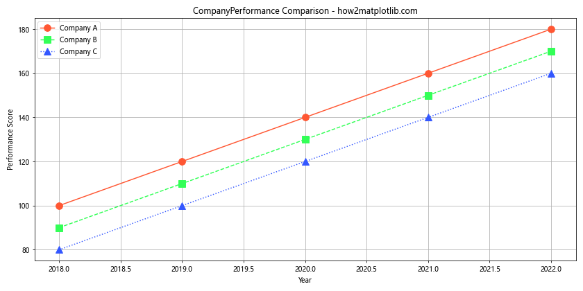
In this example, we’ve added custom markers to each data series using the marker parameter in the plt.plot() function. This helps to distinguish between different companies and highlight individual data points.
Implementing Shaded Regions
Adding shaded regions to your plot can help highlight specific time periods or ranges of values. Here’s an example:
import pandas as pd
import matplotlib.pyplot as plt
import numpy as np

# Create a sample wide DataFrame
data = {
    'Date': pd.date_range(start='2023-01-01', periods=365),
    'Temperature': np.random.normal(20, 5, 365),
    'Humidity': np.random.normal(60, 10, 365)
}
df = pd.DataFrame(data)
df.set_index('Date', inplace=True)

# Plot the wide DataFrame with shaded regions
plt.figure(figsize=(12, 6))
plt.plot(df.index, df['Temperature'], color='#FF5733', label='Temperature')
plt.plot(df.index, df['Humidity'], color='#3357FF', label='Humidity')

# Add shaded regions for seasons
seasons = [('2023-03-20', '2023-06-20', 'Spring'),
           ('2023-06-21', '2023-09-22', 'Summer'),
           ('2023-09-23', '2023-12-20', 'Autumn'),
           ('2023-12-21', '2024-03-19', 'Winter')]

colors = ['#FFFF99', '#FFCC99', '#FF9999', '#99CCFF']

for i, (start, end, season) in enumerate(seasons):
    plt.axvspan(pd.to_datetime(start), pd.to_datetime(end),
                alpha=0.2, color=colors[i], label=season)

plt.title('Temperature and Humidity with Seasonal Shading - how2matplotlib.com')
plt.xlabel('Date')
plt.ylabel('Value')
plt.legend(loc='upper left', bbox_to_anchor=(1, 1))
plt.tight_layout()
plt.show()
Output:
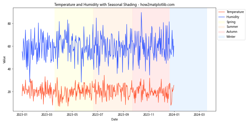
In this example, we’ve added shaded regions to represent different seasons using plt.axvspan(). This helps to visually separate different time periods in the data.
Handling Large Datasets in Wide DataFrame Plots
When plotting a wide DataFrame with a large number of data points, you may encounter performance issues or overcrowded plots. Here are some techniques to handle large datasets effectively:
Data Resampling
Resampling your data can help reduce the number of data points while still maintaining the overall trend. Here’s an example:
import pandas as pd
import matplotlib.pyplot as plt
import numpy as np

# Create a sample wide DataFrame with many data points
dates = pd.date_range(start='2023-01-01', periods=1000, freq='H')
data = {
    'Date': dates,
    'Series A': np.cumsum(np.random.randn(1000)),
    'Series B': np.cumsum(np.random.randn(1000)),
    'Series C': np.cumsum(np.random.randn(1000))
}
df = pd.DataFrame(data)
df.set_index('Date', inplace=True)

# Resample the data to daily frequency
df_resampled = df.resample('D').mean()

# Plot the resampled data
plt.figure(figsize=(12, 6))
for column in df_resampled.columns:
    plt.plot(df_resampled.index, df_resampled[column], label=column)

plt.title('Resampled Time Series Data - how2matplotlib.com')
plt.xlabel('Date')
plt.ylabel('Value')
plt.legend()
plt.grid(True)
plt.tight_layout()
plt.show()
Output:
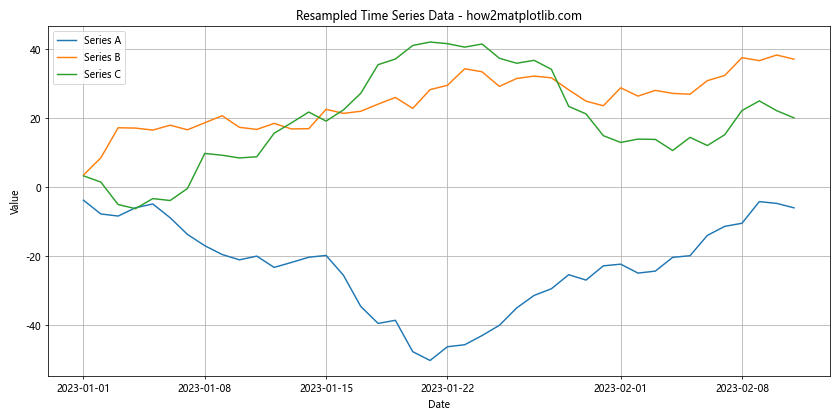
In this example, we’ve created a DataFrame with hourly data and then resampled it to daily frequency using df.resample('D').mean(). This reduces the number of data points while still preserving the overall trends in the data.
Using Subplots for Multiple Series
When dealing with a wide DataFrame that has many columns, using subplots can help organize the visualization and prevent overcrowding. Here’s an example:
import pandas as pd
import matplotlib.pyplot as plt
import numpy as np

# Create a sample wide DataFrame with many columns
num_columns = 9
data = {'Date': pd.date_range(start='2023-01-01', periods=100)}
for i in range(num_columns):
    data[f'Series_{i+1}'] = np.cumsum(np.random.randn(100))

df = pd.DataFrame(data)
df.set_index('Date', inplace=True)

# Create subplots
fig, axes = plt.subplots(3, 3, figsize=(15, 15))
fig.suptitle('Multiple Time Series in Subplots - how2matplotlib.com', fontsize=16)

for i, column in enumerate(df.columns):
    row = i // 3
    col = i % 3
    axes[row, col].plot(df.index, df[column])
    axes[row, col].set_title(column)
    axes[row, col].set_xlabel('Date')
    axes[row, col].set_ylabel('Value')
    axes[row, col].grid(True)

plt.tight_layout()
plt.show()
Output:
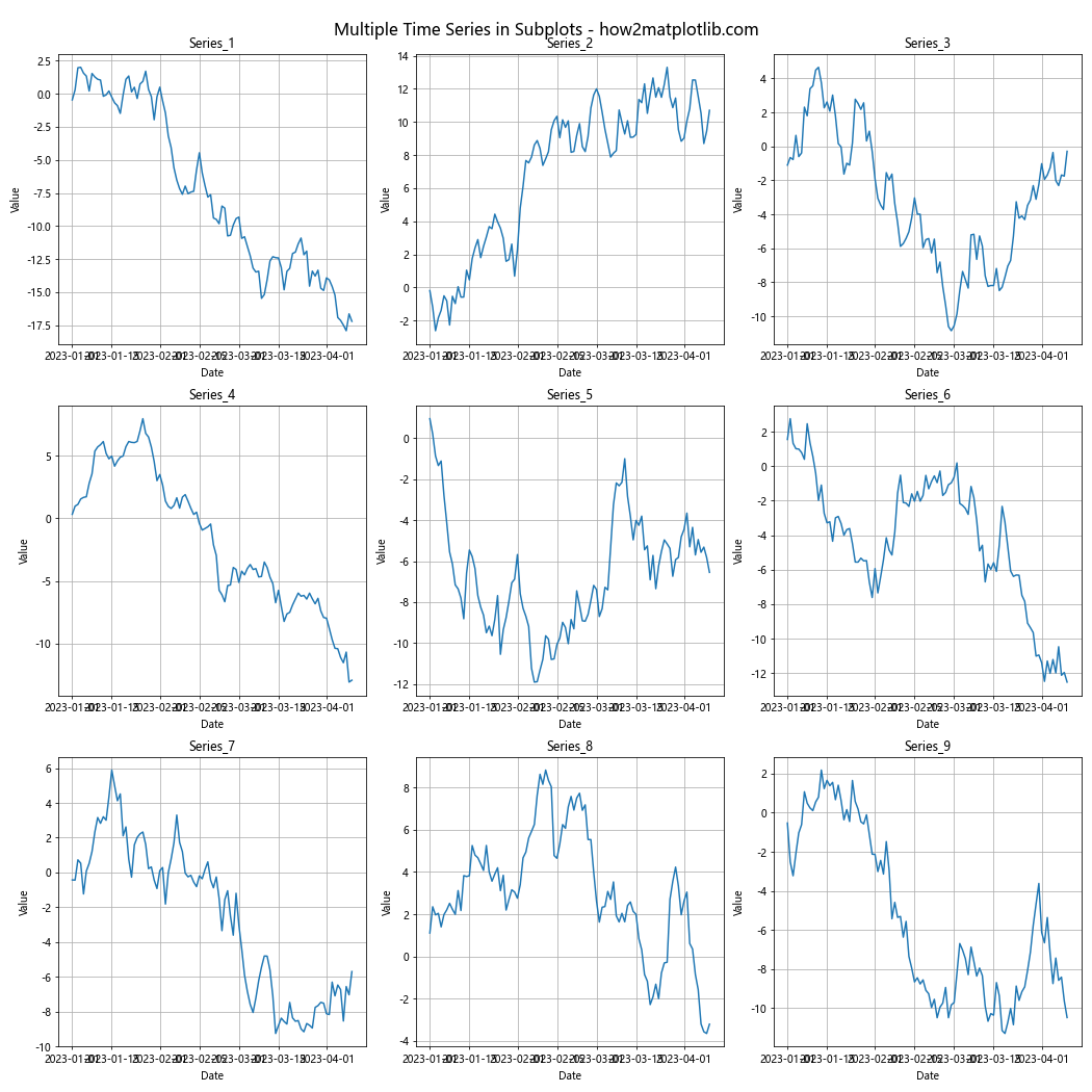
In this example, we’ve created a 3×3 grid of subplots, with each subplot displaying a different column from the wide DataFrame. This approach allows for a clear visualization of multiple time series without overcrowding a single plot.
Advanced Customization Techniques
To further enhance your plots of wide DataFrames with custom colors and linestyles, consider these advanced customization techniques:
Adding Annotations
Annotations can be used to highlight specific points or regions of interest in your plot. Here’s an example:
import pandas as pd
import matplotlib.pyplot as plt
import numpy as np

# Create a sample wide DataFrame
data = {
    'Date': pd.date_range(start='2023-01-01', periods=100),
    'Series A': np.cumsum(np.random.randn(100)),
    'Series B': np.cumsum(np.random.randn(100))
}
df = pd.DataFrame(data)
df.set_index('Date', inplace=True)

# Plot the wide DataFrame with annotations
plt.figure(figsize=(12, 6))
for column in df.columns:
    plt.plot(df.index, df[column], label=column)

plt.title('Time Series with Annotations - how2matplotlib.com')
plt.xlabel('Date')
plt.ylabel('Value')
plt.legend()

# Add annotations
max_point = df['Series A'].idxmax()
plt.annotate(f'Peak: {df["Series A"][max_point]:.2f}',
             xy=(max_point, df['Series A'][max_point]),
             xytext=(10, 10), textcoords='offset points',
             arrowprops=dict(arrowstyle='->'))

min_point = df['Series B'].idxmin()
plt.annotate(f'Trough: {df["Series B"][min_point]:.2f}',
             xy=(min_point, df['Series B'][min_point]),
             xytext=(10, -10), textcoords='offset points',
             arrowprops=dict(arrowstyle='->'))

plt.tight_layout()
plt.show()
Output:
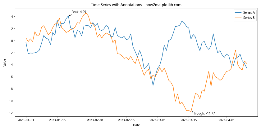
In this example, we’ve added annotations to highlight the peak of Series A and the trough of Series B. These annotations help draw attention to important features in the data.
Best Practices for Plotting Wide DataFrames
When plotting a wide DataFrame with custom colors and linestyles, keep these best practices in mind:
- Choose colors wisely: Use a color palette that is visually appealing and easy to distinguish. Consider color-blind friendly palettes for accessibility.
Be consistent with linestyles: Use different linestyles to distinguish between data series, but maintain consistency throughout your plot.
Provide clear labels: Always include a title, axis labels, and a legend to make your plot easy to understand.
Use appropriate scales: Consider using dual y-axes or log scales when dealing with data of different magnitudes.
Avoid clutter: If your DataFrame has too many columns, consider using subplots or focusing on the most important series.
Highlight important information: Use annotations, markers, or shaded regions to draw attention to key data points or trends.
Consider your audience: Tailor your plot’s complexity and design to your intended audience.
Test for readability: Ensure your plot is easily readable when printed or viewed on different devices.
Conclusion
Plotting a Wide DataFrame with Custom Colors and Linestyles is a powerful technique for visualizing complex datasets in Matplotlib. By mastering these techniques, you can create informative, visually appealing, and professional-looking plots that effectively communicate your data insights. Remember to experiment with different color schemes, linestyles, and plot types to find the best representation for your specific dataset. With practice and attention to detail, you’ll be able to create stunning visualizations that bring your data to life.