Matplotlib Scatter Plot Example: A Comprehensive Guide
Matplotlib scatter plot example is a powerful visualization technique used to display individual data points on a two-dimensional graph. This article will provide an in-depth exploration of scatter plots in Matplotlib, covering various aspects from basic usage to advanced customization options.
Understanding the Basics of Matplotlib Scatter Plot Example
A scatter plot is an excellent way to visualize the relationship between two variables. In Matplotlib, the scatter() function is used to create scatter plots. Let’s start with a simple example to illustrate the basic usage:
import matplotlib.pyplot as plt
import numpy as np

# Generate random data
np.random.seed(42)
x = np.random.rand(50)
y = np.random.rand(50)

# Create scatter plot
plt.figure(figsize=(10, 6))
plt.scatter(x, y)
plt.title("Basic Matplotlib Scatter Plot Example")
plt.xlabel("X-axis")
plt.ylabel("Y-axis")
plt.text(0.5, 0.95, "how2matplotlib.com", transform=plt.gca().transAxes, ha='center')
plt.show()

print("Scatter plot created successfully!")
Output:
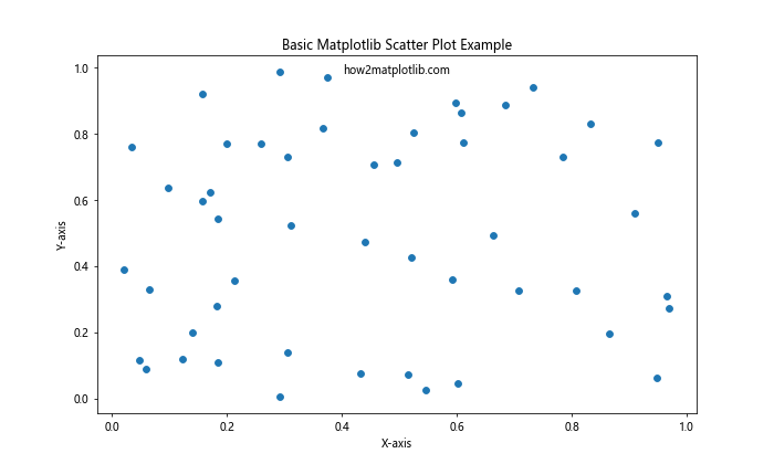
In this example, we first import the necessary libraries: Matplotlib’s pyplot module and NumPy. We then generate random data for x and y coordinates using NumPy’s random.rand() function. The scatter() function is called with these x and y values to create the scatter plot. We also set a title, x-label, and y-label to provide context for the plot.
Customizing Marker Appearance in Matplotlib Scatter Plot Example
One of the key features of scatter plots is the ability to customize the appearance of the markers. Let’s explore various options:
import matplotlib.pyplot as plt
import numpy as np

# Generate data
np.random.seed(42)
x = np.random.rand(50)
y = np.random.rand(50)

# Create scatter plot with custom markers
plt.figure(figsize=(12, 8))
plt.scatter(x, y, c='red', marker='*', s=100, alpha=0.7, edgecolors='black', linewidth=1)
plt.title("Customized Matplotlib Scatter Plot Example")
plt.xlabel("X-axis")
plt.ylabel("Y-axis")
plt.text(0.5, 0.95, "how2matplotlib.com", transform=plt.gca().transAxes, ha='center')
plt.show()

print("Customized scatter plot created successfully!")
Output:
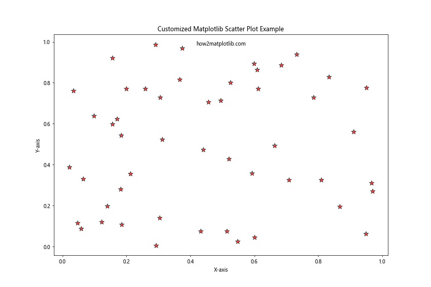
In this example, we’ve customized several aspects of the markers:
c='red': Sets the color of the markers to red.marker='*': Changes the marker shape to a star.s=100: Increases the size of the markers.alpha=0.7: Sets the transparency of the markers.edgecolors='black': Adds a black edge to each marker.linewidth=1: Sets the width of the marker edges.
These customizations allow for greater visual distinction and can help highlight specific aspects of your data.
Adding a Color Dimension to Matplotlib Scatter Plot Example
Scatter plots can represent three dimensions of data by using color as the third dimension. This is particularly useful for visualizing relationships between three variables:
import matplotlib.pyplot as plt
import numpy as np

# Generate data
np.random.seed(42)
x = np.random.rand(100)
y = np.random.rand(100)
colors = np.random.rand(100)

# Create scatter plot with color dimension
plt.figure(figsize=(10, 8))
scatter = plt.scatter(x, y, c=colors, cmap='viridis', s=50)
plt.colorbar(scatter)
plt.title("Matplotlib Scatter Plot Example with Color Dimension")
plt.xlabel("X-axis")
plt.ylabel("Y-axis")
plt.text(0.5, 0.95, "how2matplotlib.com", transform=plt.gca().transAxes, ha='center')
plt.show()

print("Scatter plot with color dimension created successfully!")
Output:
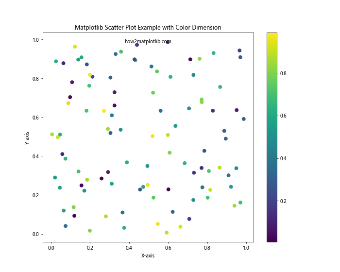
In this example, we’ve added a third dimension to our data represented by the colors array. The scatter() function uses this array to color each point according to its value. We’ve also specified a colormap (cmap='viridis') and added a colorbar to show the mapping between colors and values.
Creating Bubble Charts with Matplotlib Scatter Plot Example
Bubble charts are a variation of scatter plots where the size of each point represents a third variable. Here’s how to create a bubble chart:
import matplotlib.pyplot as plt
import numpy as np

# Generate data
np.random.seed(42)
x = np.random.rand(50)
y = np.random.rand(50)
sizes = np.random.rand(50) * 1000

# Create bubble chart
plt.figure(figsize=(12, 8))
plt.scatter(x, y, s=sizes, alpha=0.5)
plt.title("Matplotlib Scatter Plot Example: Bubble Chart")
plt.xlabel("X-axis")
plt.ylabel("Y-axis")
plt.text(0.5, 0.95, "how2matplotlib.com", transform=plt.gca().transAxes, ha='center')
plt.show()

print("Bubble chart created successfully!")
Output:
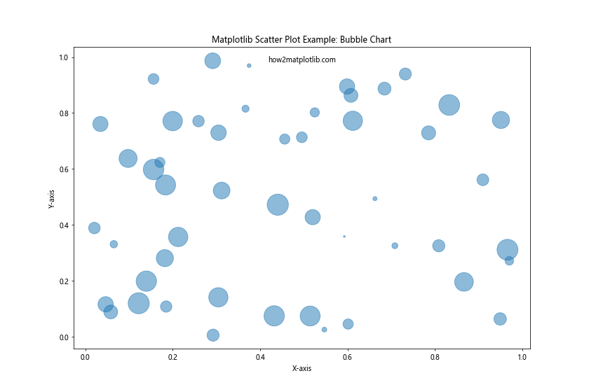
In this bubble chart, the size of each bubble is determined by the sizes array. The alpha parameter is set to 0.5 to make the bubbles semi-transparent, which helps when bubbles overlap.
Matplotlib Scatter Plot Example with Multiple Datasets
Often, you may want to compare multiple datasets on the same scatter plot. Here’s how to do that:
import matplotlib.pyplot as plt
import numpy as np

# Generate data for two datasets
np.random.seed(42)
x1 = np.random.rand(50)
y1 = np.random.rand(50)
x2 = np.random.rand(50) + 0.5
y2 = np.random.rand(50) + 0.5

# Create scatter plot with multiple datasets
plt.figure(figsize=(12, 8))
plt.scatter(x1, y1, c='blue', label='Dataset 1')
plt.scatter(x2, y2, c='red', label='Dataset 2')
plt.title("Matplotlib Scatter Plot Example with Multiple Datasets")
plt.xlabel("X-axis")
plt.ylabel("Y-axis")
plt.legend()
plt.text(0.5, 0.95, "how2matplotlib.com", transform=plt.gca().transAxes, ha='center')
plt.show()

print("Scatter plot with multiple datasets created successfully!")
Output:
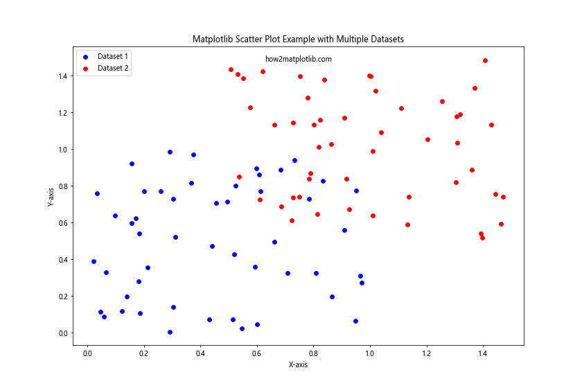
In this example, we create two separate scatter plots on the same axes. We use different colors and labels for each dataset, and add a legend to distinguish between them.
Adding Error Bars to Matplotlib Scatter Plot Example
Error bars can be added to scatter plots to show the uncertainty or variability in the data points:
import matplotlib.pyplot as plt
import numpy as np

# Generate data
np.random.seed(42)
x = np.random.rand(20)
y = np.random.rand(20)
xerr = np.random.rand(20) * 0.1
yerr = np.random.rand(20) * 0.1

# Create scatter plot with error bars
plt.figure(figsize=(12, 8))
plt.errorbar(x, y, xerr=xerr, yerr=yerr, fmt='o', capsize=5)
plt.title("Matplotlib Scatter Plot Example with Error Bars")
plt.xlabel("X-axis")
plt.ylabel("Y-axis")
plt.text(0.5, 0.95, "how2matplotlib.com", transform=plt.gca().transAxes, ha='center')
plt.show()

print("Scatter plot with error bars created successfully!")
Output:
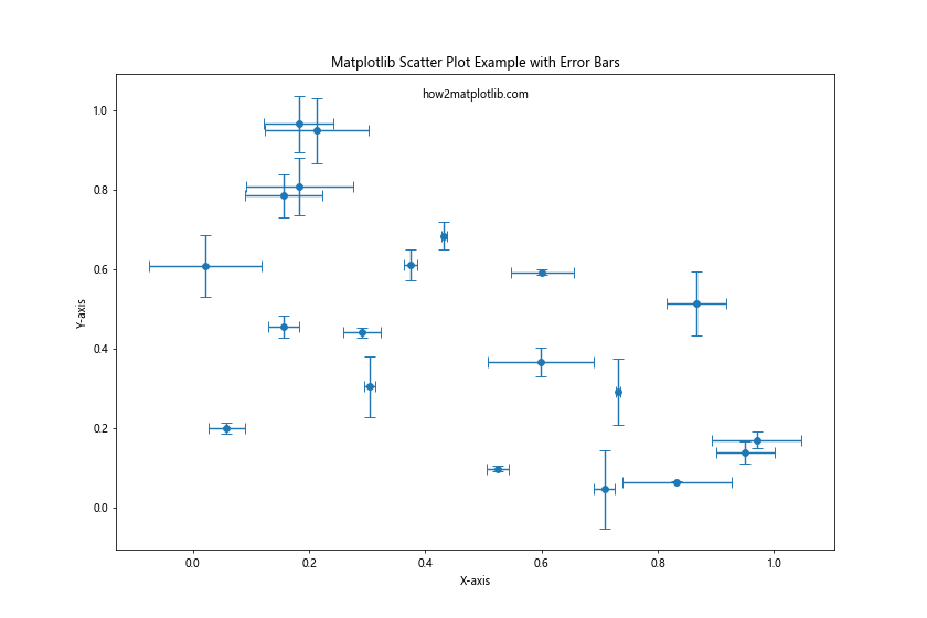
In this example, we use plt.errorbar() instead of plt.scatter(). The xerr and yerr parameters specify the size of the error bars in the x and y directions, respectively. The fmt='o' parameter tells Matplotlib to use circular markers, and capsize=5 adds caps to the ends of the error bars.
Matplotlib Scatter Plot Example with Categorical Data
Scatter plots can also be used with categorical data on one or both axes:
import matplotlib.pyplot as plt
import numpy as np

# Generate data
np.random.seed(42)
categories = ['A', 'B', 'C', 'D', 'E']
x = np.random.choice(categories, 100)
y = np.random.rand(100)

# Create scatter plot with categorical data
plt.figure(figsize=(12, 8))
plt.scatter(x, y)
plt.title("Matplotlib Scatter Plot Example with Categorical Data")
plt.xlabel("Categories")
plt.ylabel("Values")
plt.text(0.5, 0.95, "how2matplotlib.com", transform=plt.gca().transAxes, ha='center')
plt.show()

print("Scatter plot with categorical data created successfully!")
Output:
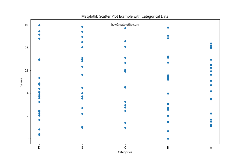
In this example, we use categorical data for the x-axis. Matplotlib automatically handles the conversion of categories to numeric values for plotting.
Adding Text Labels to Matplotlib Scatter Plot Example
Sometimes it’s useful to add text labels to specific points in a scatter plot:
import matplotlib.pyplot as plt
import numpy as np

# Generate data
np.random.seed(42)
x = np.random.rand(10)
y = np.random.rand(10)
labels = [f'Point {i+1}' for i in range(10)]

# Create scatter plot with text labels
plt.figure(figsize=(12, 8))
plt.scatter(x, y)
for i, label in enumerate(labels):
    plt.annotate(label, (x[i], y[i]), xytext=(5, 5), textcoords='offset points')
plt.title("Matplotlib Scatter Plot Example with Text Labels")
plt.xlabel("X-axis")
plt.ylabel("Y-axis")
plt.text(0.5, 0.95, "how2matplotlib.com", transform=plt.gca().transAxes, ha='center')
plt.show()

print("Scatter plot with text labels created successfully!")
Output:
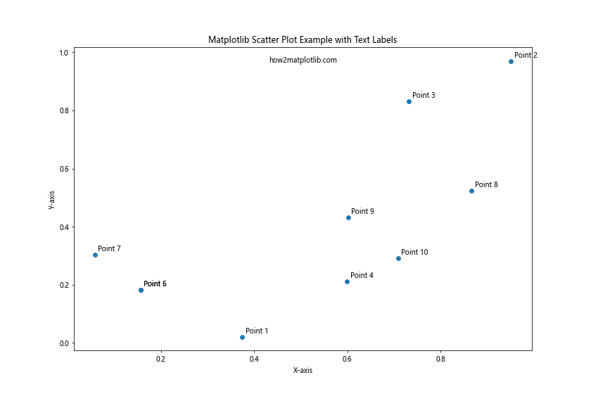
In this example, we use plt.annotate() to add text labels to each point. The xytext parameter specifies the offset of the label from the point.
Matplotlib Scatter Plot Example with Logarithmic Scales
For data that spans multiple orders of magnitude, it can be useful to use logarithmic scales:
import matplotlib.pyplot as plt
import numpy as np

# Generate data
np.random.seed(42)
x = np.random.rand(100) * 1000
y = np.random.rand(100) * 1000000

# Create scatter plot with logarithmic scales
plt.figure(figsize=(12, 8))
plt.scatter(x, y)
plt.xscale('log')
plt.yscale('log')
plt.title("Matplotlib Scatter Plot Example with Logarithmic Scales")
plt.xlabel("X-axis (log scale)")
plt.ylabel("Y-axis (log scale)")
plt.text(0.5, 0.95, "how2matplotlib.com", transform=plt.gca().transAxes, ha='center')
plt.show()

print("Scatter plot with logarithmic scales created successfully!")
Output:
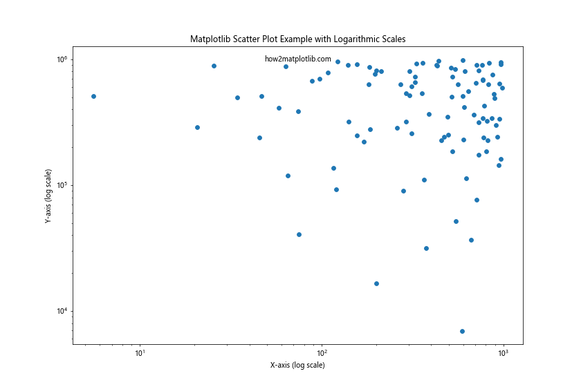
In this example, we use plt.xscale('log') and plt.yscale('log') to set both axes to a logarithmic scale. This is particularly useful when dealing with data that spans several orders of magnitude.
Creating a Scatter Plot with a Trend Line
Adding a trend line to a scatter plot can help visualize the overall relationship between variables:
import matplotlib.pyplot as plt
import numpy as np
from scipy import stats

# Generate data
np.random.seed(42)
x = np.random.rand(100)
y = 2 * x + 1 + np.random.normal(0, 0.1, 100)

# Calculate trend line
slope, intercept, r_value, p_value, std_err = stats.linregress(x, y)
line = slope * x + intercept

# Create scatter plot with trend line
plt.figure(figsize=(12, 8))
plt.scatter(x, y, label='Data')
plt.plot(x, line, color='red', label=f'Trend line (R² = {r_value**2:.2f})')
plt.title("Matplotlib Scatter Plot Example with Trend Line")
plt.xlabel("X-axis")
plt.ylabel("Y-axis")
plt.legend()
plt.text(0.5, 0.95, "how2matplotlib.com", transform=plt.gca().transAxes, ha='center')
plt.show()

print("Scatter plot with trend line created successfully!")
Output:
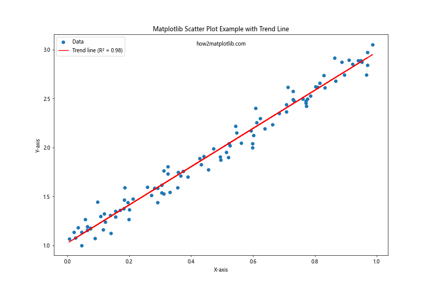
In this example, we use SciPy’s stats.linregress() function to calculate the parameters of the trend line. We then plot this line along with the scatter plot. The R² value is included in the legend to indicate the goodness of fit.
Matplotlib Scatter Plot Example with Subplots
Sometimes it’s useful to create multiple scatter plots side by side for comparison:
import matplotlib.pyplot as plt
import numpy as np

# Generate data
np.random.seed(42)
x1 = np.random.rand(50)
y1 = np.random.rand(50)
x2 = np.random.rand(50)
y2 = np.random.rand(50)

# Create scatter plots with subplots
fig, (ax1, ax2) = plt.subplots(1, 2, figsize=(16, 6))

ax1.scatter(x1, y1, c='blue')
ax1.set_title("Subplot 1")
ax1.set_xlabel("X-axis")
ax1.set_ylabel("Y-axis")

ax2.scatter(x2, y2, c='red')
ax2.set_title("Subplot 2")
ax2.set_xlabel("X-axis")
ax2.set_ylabel("Y-axis")

plt.suptitle("Matplotlib Scatter Plot Example with Subplots")
plt.text(0.5, 0.98, "how2matplotlib.com", transform=plt.gcf().transFigure, ha='center')
plt.tight_layout()
plt.show()

print("Scatter plots with subplots created successfully!")
Output:
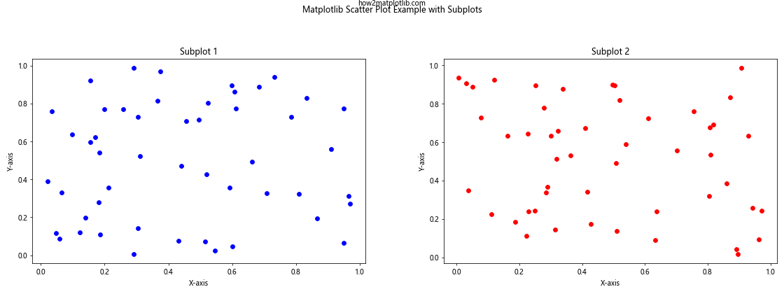
In this example, we create two scatter plots side by side using plt.subplots(). This allows for easy comparison between two datasets or different views of the same data.
Creating a Scatter Plot with a Colorbar and Custom Colormap
You can use a custom colormap and add a colorbar to your scatter plot for more informative visualizations:
import matplotlib.pyplot as plt
import numpy as np

# Generate data
np.random.seed(42)
x = np.random.rand(100)
y = np.random.rand(100)
colors = np.random.rand(100)

# Create scatter plot with custom colormap and colorbar
plt.figure(figsize=(12, 8))
scatter = plt.scatter(x, y, c=colors, cmap='coolwarm', s=100)
plt.colorbar(scatter)
plt.title("Matplotlib Scatter Plot Example with Custom Colormap and Colorbar")
plt.xlabel("X-axis")
plt.ylabel("Y-axis")
plt.text(0.5, 0.95, "how2matplotlib.com", transform=plt.gca().transAxes, ha='center')
plt.show()

print("Scatter plot with custom colormap and colorbar created successfully!")
Output:
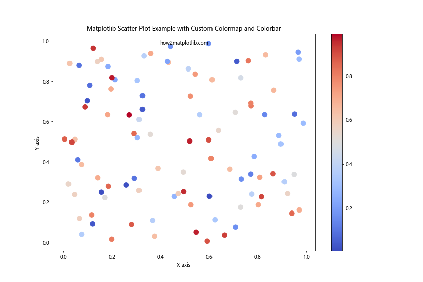
In this example, we use the ‘coolwarm’ colormap and add a colorbar to show the mapping between colors and values. The s parameter is used to set the size of the markers.
Matplotlib Scatter Plot Example with Varying Marker Sizes and Colors
You can create more complex scatter plots by varying both the size and color of markers based on different variables:
import matplotlib.pyplot as plt
import numpy as np

# Generate data
np.random.seed(42)
x = np.random.rand(50)
y = np.random.rand(50)
colors = np.random.rand(50)
sizes = 1000 * np.random.rand(50)

# Create scatter plot with varying marker sizes and colors
plt.figure(figsize=(12, 8))
scatter = plt.scatter(x, y, c=colors, s=sizes, alpha=0.6, cmap='viridis')
plt.colorbar(scatter)
plt.title("Matplotlib Scatter Plot Example with Varying Marker Sizes and Colors")
plt.xlabel("X-axis")
plt.ylabel("Y-axis")
plt.text(0.5, 0.95, "how2matplotlib.com", transform=plt.gca().transAxes, ha='center')
plt.show()

print("Scatter plot with varying marker sizes and colors created successfully!")
Output:
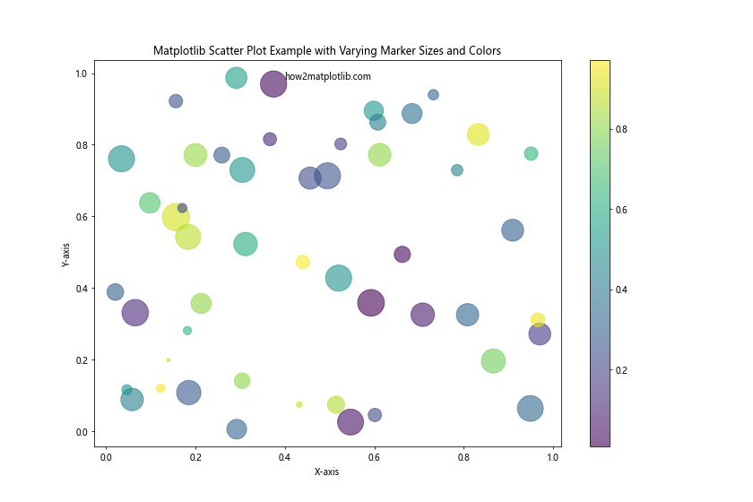
In this example, both the color and size of each point vary based on different variables. The alpha parameter is set to 0.6 to make the markers semi-transparent, which helps when markers overlap.
Creating a Scatter Plot with Custom Markers
Matplotlib allows you to use custom markers in your scatter plots:
import matplotlib.pyplot as plt
import numpy as np

# Generate data
np.random.seed(42)
x = np.random.rand(50)
y = np.random.rand(50)

# Define custom markers
markers = ['o', 's', '^', 'D', 'v']

# Create scatter plot with custom markers
plt.figure(figsize=(12, 8))
for i in range(5):
    plt.scatter(x[i::5], y[i::5], marker=markers[i], label=f'Group {i+1}')
plt.title("Matplotlib Scatter Plot Example with Custom Markers")
plt.xlabel("X-axis")
plt.ylabel("Y-axis")
plt.legend()
plt.text(0.5, 0.95, "how2matplotlib.com", transform=plt.gca().transAxes, ha='center')
plt.show()

print("Scatter plot with custom markers created successfully!")
Output:
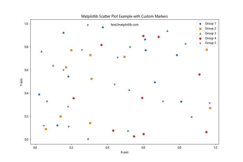
In this example, we use different marker shapes for different groups of data points. This can be useful when you want to distinguish between different categories in your data.
Matplotlib Scatter Plot Example with Marginal Distributions
Adding marginal distributions to a scatter plot can provide additional insights into the distribution of each variable:
import matplotlib.pyplot as plt
import numpy as np

# Generate data
np.random.seed(42)
x = np.random.randn(1000)
y = x + np.random.randn(1000) * 0.5

# Create scatter plot with marginal distributions
fig = plt.figure(figsize=(12, 12))
gs = fig.add_gridspec(3, 3)

ax_main = fig.add_subplot(gs[1:, :-1])
ax_right = fig.add_subplot(gs[1:, -1], sharey=ax_main)
ax_top = fig.add_subplot(gs[0, :-1], sharex=ax_main)

# Main scatter plot
ax_main.scatter(x, y, alpha=0.5)
ax_main.set_xlabel("X-axis")
ax_main.set_ylabel("Y-axis")

# Top histogram
ax_top.hist(x, bins=50)
ax_top.set_yticks([])

# Right histogram
ax_right.hist(y, bins=50, orientation='horizontal')
ax_right.set_xticks([])

plt.suptitle("Matplotlib Scatter Plot Example with Marginal Distributions")
plt.text(0.5, 0.98, "how2matplotlib.com", transform=plt.gcf().transFigure, ha='center')
plt.tight_layout()
plt.show()

print("Scatter plot with marginal distributions created successfully!")
Output:
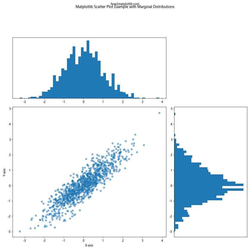
This example creates a scatter plot with histograms on the top and right sides, showing the distributions of the x and y variables respectively. This type of plot is sometimes called a “scatter plot with marginal histograms” or a “joint plot”.
Creating a Scatter Plot with Confidence Ellipses
Adding confidence ellipses to a scatter plot can help visualize the uncertainty in your data:
import matplotlib.pyplot as plt
import numpy as np
from matplotlib.patches import Ellipse
import matplotlib.transforms as transforms

def confidence_ellipse(x, y, ax, n_std=3.0, facecolor='none', **kwargs):
    """
    Create a plot of the covariance confidence ellipse of *x* and *y*.
    """
    if x.size != y.size:
        raise ValueError("x and y must be the same size")

    cov = np.cov(x, y)
    pearson = cov[0, 1]/np.sqrt(cov[0, 0] * cov[1, 1])

    ell_radius_x = np.sqrt(1 + pearson)
    ell_radius_y = np.sqrt(1 - pearson)
    ellipse = Ellipse((0, 0), width=ell_radius_x * 2, height=ell_radius_y * 2,
                      facecolor=facecolor, **kwargs)

    scale_x = np.sqrt(cov[0, 0]) * n_std
    mean_x = np.mean(x)

    scale_y = np.sqrt(cov[1, 1]) * n_std
    mean_y = np.mean(y)

    transf = transforms.Affine2D() \
        .rotate_deg(45) \
        .scale(scale_x, scale_y) \
        .translate(mean_x, mean_y)

    ellipse.set_transform(transf + ax.transData)
    return ax.add_patch(ellipse)

# Generate data
np.random.seed(42)
x = np.random.randn(100)
y = 0.8 * x + np.random.randn(100) * 0.5

# Create scatter plot with confidence ellipse
fig, ax = plt.subplots(figsize=(12, 8))
ax.scatter(x, y, s=5)
confidence_ellipse(x, y, ax, edgecolor='red')

ax.set_title("Matplotlib Scatter Plot Example with Confidence Ellipse")
ax.set_xlabel("X-axis")
ax.set_ylabel("Y-axis")
plt.text(0.5, 0.95, "how2matplotlib.com", transform=plt.gca().transAxes, ha='center')
plt.show()

print("Scatter plot with confidence ellipse created successfully!")
Output:
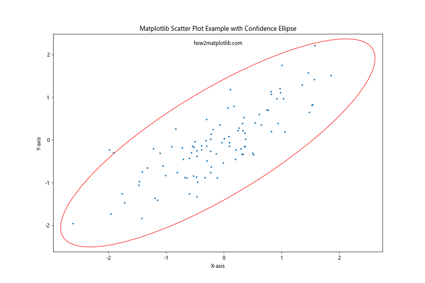
This example defines a function to create a confidence ellipse based on the covariance of the data, then adds this ellipse to the scatter plot. The ellipse provides a visual representation of the spread and correlation of the data.
Matplotlib scatter plot example Conclusion
Matplotlib scatter plot examples offer a versatile and powerful way to visualize relationships between variables in your data. From basic plots to advanced customizations, scatter plots can be adapted to suit a wide range of data visualization needs. By mastering these techniques, you can create informative and visually appealing scatter plots that effectively communicate your data insights.
Remember to always consider your audience and the story you want to tell with your data when creating scatter plots. Choose appropriate colors, markers, and additional elements like trend lines or confidence ellipses to enhance the clarity and impact of your visualizations.
As you continue to work with Matplotlib scatter plots, don’t hesitate to experiment with different combinations of these techniques to find the best way to represent your specific data and research questions. Happy plotting!