How to Master Matplotlib Grid Spacing: A Comprehensive Guide
Matplotlib grid spacing is a crucial aspect of data visualization that allows you to control the layout and appearance of your plots. By adjusting the grid spacing in Matplotlib, you can create more organized and visually appealing charts and graphs. This comprehensive guide will explore various techniques and methods to manipulate Matplotlib grid spacing, providing you with the tools to enhance your data visualization skills.
Understanding Matplotlib Grid Spacing Basics
Matplotlib grid spacing refers to the arrangement and spacing of gridlines in a plot. These gridlines help viewers interpret data points more accurately and provide a visual reference for the plot’s scale. By default, Matplotlib adds gridlines to plots, but you can customize their appearance and spacing to suit your specific needs.
Let’s start with a basic example of how to add a grid to a Matplotlib plot:
import matplotlib.pyplot as plt
import numpy as np

x = np.linspace(0, 10, 100)
y = np.sin(x)

plt.figure(figsize=(10, 6))
plt.plot(x, y)
plt.title('Sine Wave - how2matplotlib.com')
plt.xlabel('X-axis')
plt.ylabel('Y-axis')
plt.grid(True)
plt.show()
Output:
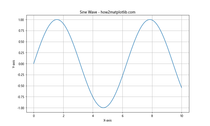
In this example, we’ve created a simple sine wave plot and added a grid using plt.grid(True). This adds default gridlines to both the x and y axes.
Customizing Matplotlib Grid Spacing
While the default grid is useful, you may want to customize the Matplotlib grid spacing to better suit your data or visual preferences. Matplotlib provides several options to adjust grid spacing and appearance.
Adjusting Grid Line Style
You can modify the style of grid lines using the linestyle parameter:
import matplotlib.pyplot as plt
import numpy as np

x = np.linspace(0, 10, 100)
y = np.sin(x)

plt.figure(figsize=(10, 6))
plt.plot(x, y)
plt.title('Sine Wave with Custom Grid - how2matplotlib.com')
plt.xlabel('X-axis')
plt.ylabel('Y-axis')
plt.grid(True, linestyle='--', linewidth=0.5)
plt.show()
Output:
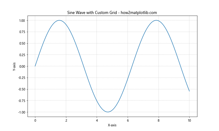
In this example, we’ve set the grid lines to be dashed (linestyle='--') and reduced their width (linewidth=0.5).
Controlling Grid Spacing
To adjust the Matplotlib grid spacing, you can use the xticks and yticks functions:
import matplotlib.pyplot as plt
import numpy as np

x = np.linspace(0, 10, 100)
y = np.sin(x)

plt.figure(figsize=(10, 6))
plt.plot(x, y)
plt.title('Sine Wave with Custom Grid Spacing - how2matplotlib.com')
plt.xlabel('X-axis')
plt.ylabel('Y-axis')
plt.xticks(np.arange(0, 11, 2))
plt.yticks(np.arange(-1, 1.1, 0.5))
plt.grid(True)
plt.show()
Output:
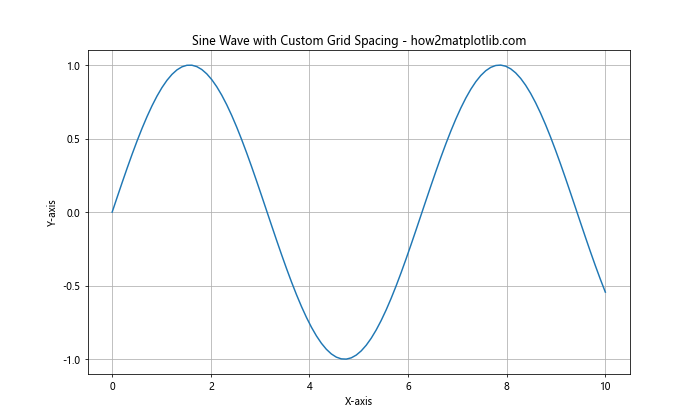
This code sets the x-axis ticks to appear every 2 units and the y-axis ticks to appear every 0.5 units, effectively controlling the Matplotlib grid spacing.
Advanced Matplotlib Grid Spacing Techniques
As you become more comfortable with basic Matplotlib grid spacing, you can explore more advanced techniques to fine-tune your plots.
Using GridSpec for Complex Layouts
GridSpec is a powerful tool in Matplotlib that allows you to create complex grid layouts:
import matplotlib.pyplot as plt
import matplotlib.gridspec as gridspec
import numpy as np

fig = plt.figure(figsize=(12, 8))
gs = gridspec.GridSpec(2, 2, width_ratios=[1, 2], height_ratios=[2, 1])

ax1 = plt.subplot(gs[0, 0])
ax2 = plt.subplot(gs[0, 1])
ax3 = plt.subplot(gs[1, :])

x = np.linspace(0, 10, 100)
y1 = np.sin(x)
y2 = np.cos(x)
y3 = np.tan(x)

ax1.plot(x, y1)
ax1.set_title('Sine - how2matplotlib.com')
ax1.grid(True)

ax2.plot(x, y2)
ax2.set_title('Cosine - how2matplotlib.com')
ax2.grid(True)

ax3.plot(x, y3)
ax3.set_title('Tangent - how2matplotlib.com')
ax3.grid(True)

plt.tight_layout()
plt.show()
Output:
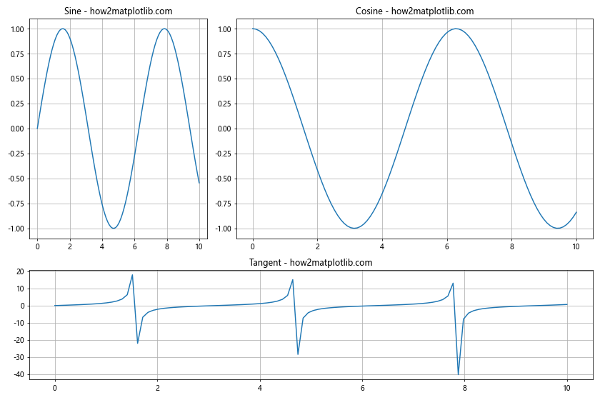
This example creates a layout with three subplots of different sizes, demonstrating how GridSpec can be used to create complex arrangements while maintaining control over Matplotlib grid spacing.
Adjusting Subplot Spacing
You can fine-tune the spacing between subplots using the subplots_adjust function:
import matplotlib.pyplot as plt
import numpy as np

fig, (ax1, ax2) = plt.subplots(2, 1, figsize=(10, 8))

x = np.linspace(0, 10, 100)
y1 = np.sin(x)
y2 = np.cos(x)

ax1.plot(x, y1)
ax1.set_title('Sine Wave - how2matplotlib.com')
ax1.grid(True)

ax2.plot(x, y2)
ax2.set_title('Cosine Wave - how2matplotlib.com')
ax2.grid(True)

plt.subplots_adjust(hspace=0.4)  # Adjust vertical spacing between subplots
plt.show()
Output:
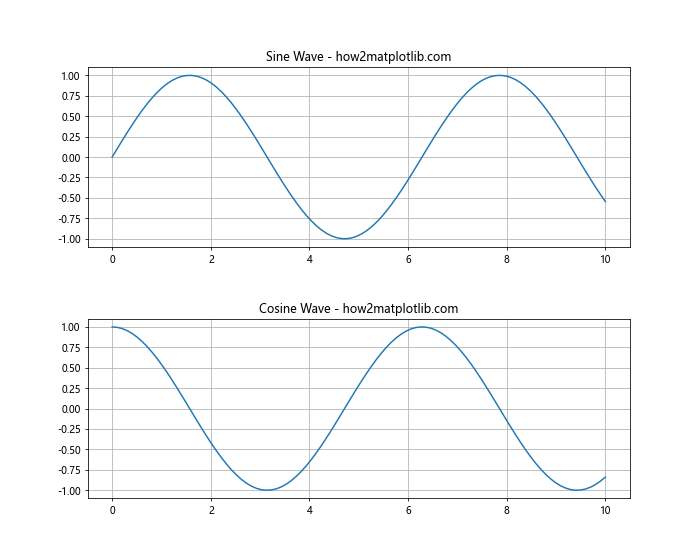
This code creates two subplots and adjusts the vertical spacing between them using plt.subplots_adjust(hspace=0.4).
Matplotlib Grid Spacing for Different Plot Types
Different types of plots may require different approaches to Matplotlib grid spacing. Let’s explore how to adjust grid spacing for various plot types.
Histogram Grid Spacing
When creating histograms, you might want to adjust the bin spacing and grid lines:
import matplotlib.pyplot as plt
import numpy as np

data = np.random.normal(0, 1, 1000)

plt.figure(figsize=(10, 6))
plt.hist(data, bins=20, edgecolor='black')
plt.title('Histogram with Custom Grid - how2matplotlib.com')
plt.xlabel('Value')
plt.ylabel('Frequency')
plt.grid(axis='y', linestyle='--', alpha=0.7)
plt.show()
Output:
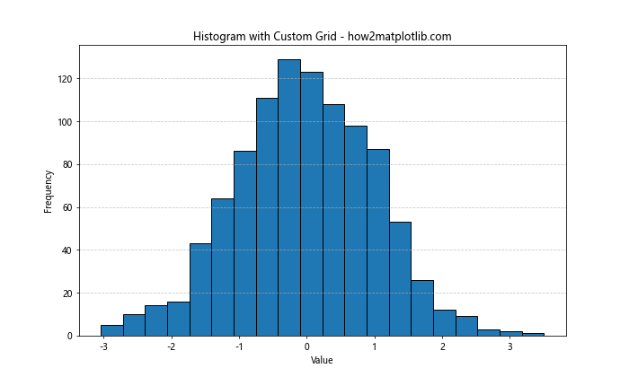
In this example, we’ve added a grid only to the y-axis and made it semi-transparent for better visibility of the histogram bars.
Scatter Plot Grid Spacing
For scatter plots, you might want to adjust the Matplotlib grid spacing to highlight specific regions:
import matplotlib.pyplot as plt
import numpy as np

x = np.random.rand(50)
y = np.random.rand(50)

plt.figure(figsize=(10, 6))
plt.scatter(x, y, alpha=0.5)
plt.title('Scatter Plot with Custom Grid - how2matplotlib.com')
plt.xlabel('X-axis')
plt.ylabel('Y-axis')
plt.grid(True, which='both', linestyle=':', linewidth=0.5)
plt.minorticks_on()
plt.show()
Output:
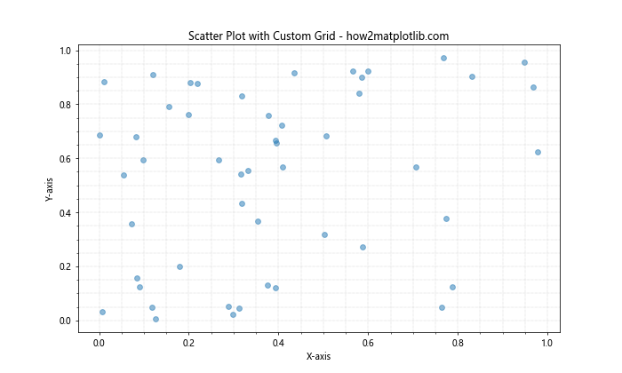
This code adds both major and minor gridlines to the scatter plot, providing more detailed reference points for the data.
Matplotlib Grid Spacing in 3D Plots
3D plots present unique challenges and opportunities for Matplotlib grid spacing. Let’s explore how to adjust grid spacing in 3D plots.
3D Surface Plot Grid Spacing
When creating 3D surface plots, you can adjust the grid spacing on all three axes:
import matplotlib.pyplot as plt
import numpy as np
from mpl_toolkits.mplot3d import Axes3D

fig = plt.figure(figsize=(12, 8))
ax = fig.add_subplot(111, projection='3d')

x = np.arange(-5, 5, 0.25)
y = np.arange(-5, 5, 0.25)
X, Y = np.meshgrid(x, y)
Z = np.sin(np.sqrt(X**2 + Y**2))

surf = ax.plot_surface(X, Y, Z, cmap='viridis')
ax.set_title('3D Surface Plot - how2matplotlib.com')
ax.set_xlabel('X-axis')
ax.set_ylabel('Y-axis')
ax.set_zlabel('Z-axis')

ax.xaxis.set_major_locator(plt.MultipleLocator(2))
ax.yaxis.set_major_locator(plt.MultipleLocator(2))
ax.zaxis.set_major_locator(plt.MultipleLocator(0.5))

plt.show()
Output:
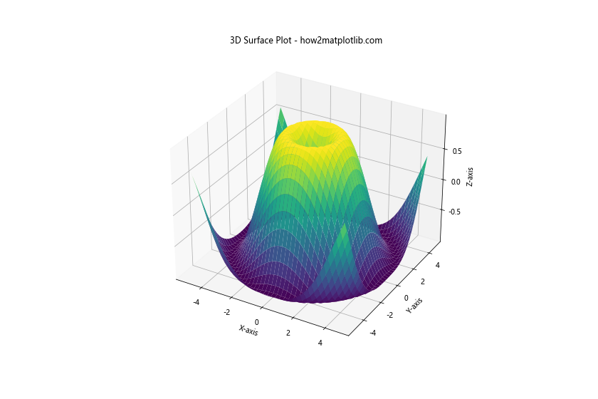
This example creates a 3D surface plot and adjusts the grid spacing on all three axes using MultipleLocator.
Customizing Matplotlib Grid Spacing Colors
The color of your grid can significantly impact the readability of your plot. Let’s explore how to customize grid colors in Matplotlib.
Using Different Colors for Major and Minor Grids
You can set different colors for major and minor gridlines to improve visual hierarchy:
import matplotlib.pyplot as plt
import numpy as np

x = np.linspace(0, 10, 100)
y = np.sin(x)

plt.figure(figsize=(10, 6))
plt.plot(x, y)
plt.title('Sine Wave with Colored Grids - how2matplotlib.com')
plt.xlabel('X-axis')
plt.ylabel('Y-axis')

plt.grid(which='major', color='#666666', linestyle='-')
plt.grid(which='minor', color='#999999', linestyle=':')
plt.minorticks_on()

plt.show()
Output:
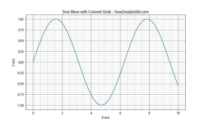
This example sets dark gray for major gridlines and light gray for minor gridlines, creating a clear visual distinction.
Matplotlib Grid Spacing in Polar Plots
Polar plots require a different approach to Matplotlib grid spacing. Let’s see how to adjust grid spacing in polar coordinates.
Customizing Radial and Angular Grid Spacing
In polar plots, you can adjust both the radial and angular grid spacing:
import matplotlib.pyplot as plt
import numpy as np

r = np.arange(0, 2, 0.01)
theta = 2 * np.pi * r

fig, ax = plt.subplots(subplot_kw=dict(projection='polar'), figsize=(8, 8))
ax.plot(theta, r)
ax.set_title('Polar Plot with Custom Grid - how2matplotlib.com')

ax.set_rticks([0.5, 1, 1.5])  # Set radial ticks
ax.set_rlabel_position(45)  # Move radial labels away from plot line
ax.grid(True)

plt.show()
Output:
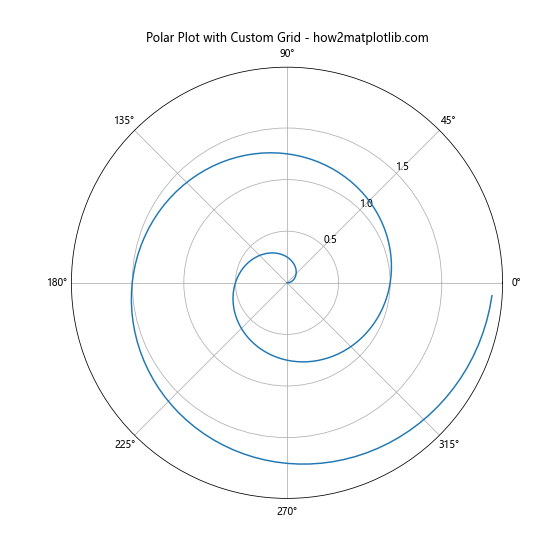
This code creates a polar plot with custom radial ticks and adjusts the position of radial labels for better readability.
Matplotlib Grid Spacing in Subplots with Shared Axes
When creating multiple subplots with shared axes, you need to consider how Matplotlib grid spacing affects the overall layout.
Adjusting Grid Spacing in Shared Axis Subplots
Here’s an example of how to adjust grid spacing in subplots with shared axes:
import matplotlib.pyplot as plt
import numpy as np

x = np.linspace(0, 10, 100)
y1 = np.sin(x)
y2 = np.cos(x)

fig, (ax1, ax2) = plt.subplots(2, 1, figsize=(10, 8), sharex=True)

ax1.plot(x, y1)
ax1.set_title('Sine Wave - how2matplotlib.com')
ax1.grid(True, linestyle='--', alpha=0.7)

ax2.plot(x, y2)
ax2.set_title('Cosine Wave - how2matplotlib.com')
ax2.grid(True, linestyle='--', alpha=0.7)

plt.xlabel('X-axis')
plt.tight_layout()
plt.show()
Output:
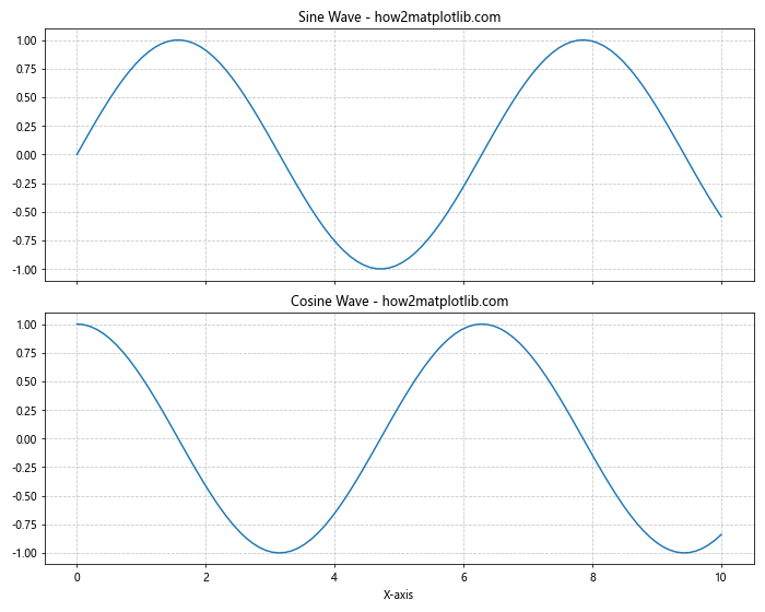
This example creates two subplots with a shared x-axis and applies consistent grid spacing to both.
Advanced Matplotlib Grid Spacing Techniques
As you become more proficient with Matplotlib grid spacing, you can explore more advanced techniques to create highly customized and informative plots.
Using Inset Axes with Custom Grid Spacing
Inset axes allow you to create a plot within a plot, each with its own grid spacing:
import matplotlib.pyplot as plt
import numpy as np
from mpl_toolkits.axes_grid1.inset_locator import inset_axes

x = np.linspace(0, 10, 100)
y = np.sin(x)

fig, ax = plt.subplots(figsize=(10, 6))
ax.plot(x, y)
ax.set_title('Sine Wave with Inset - how2matplotlib.com')
ax.set_xlabel('X-axis')
ax.set_ylabel('Y-axis')
ax.grid(True, linestyle='--', alpha=0.7)

# Create inset axes
axins = inset_axes(ax, width="40%", height="30%", loc=1)
axins.plot(x, y)
axins.set_xlim(4, 6)
axins.set_ylim(-1, 1)
axins.grid(True, linestyle=':', linewidth=0.5)

plt.show()
Output:
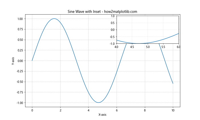
This example creates a main plot with an inset that zooms in on a specific region, each with its own grid spacing settings.
Matplotlib Grid Spacing for Logarithmic Scales
When working with logarithmic scales, Matplotlib grid spacing needs special consideration to ensure readability.
Adjusting Grid Spacing in Log-Log Plots
Here’s how to adjust grid spacing in a log-log plot:
import matplotlib.pyplot as plt
import numpy as np

x = np.logspace(0, 3, 50)
y = x**2

plt.figure(figsize=(10, 6))
plt.loglog(x, y, 'b-')
plt.title('Log-Log Plot with Custom Grid - how2matplotlib.com')
plt.xlabel('X-axis (log scale)')
plt.ylabel('Y-axis (log scale)')

plt.grid(True, which="both", ls="-", alpha=0.5)
plt.gca().xaxis.set_minor_locator(plt.LogLocator(subs=[2, 3, 4, 5, 6, 7, 8, 9]))
plt.gca().yaxis.set_minor_locator(plt.LogLocator(subs=[2, 3, 4, 5, 6, 7, 8, 9]))

plt.show()
Output:
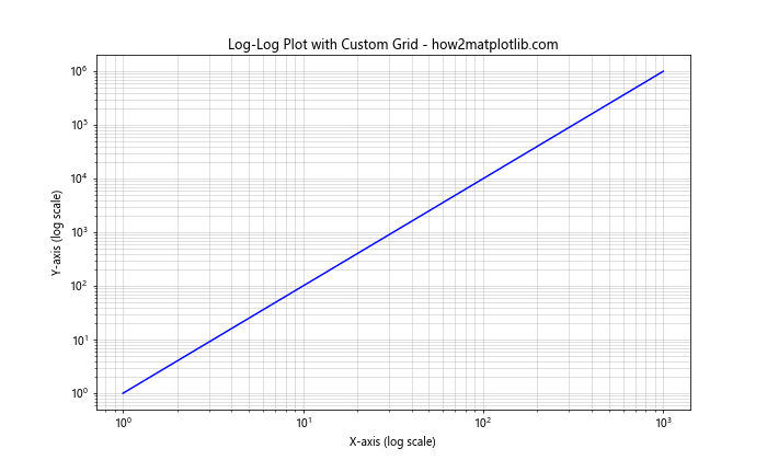
This example creates a log-log plot with custom grid spacing for both major and minor gridlines, enhancing readability across multiple orders of magnitude.
Matplotlib Grid Spacing in Heatmaps
Heatmaps present unique challenges for Matplotlib grid spacing. Let’s explore how to adjust grid spacing in heatmaps to improve data visualization.
Customizing Grid Spacing in Heatmaps
Here’s an example of how to create a heatmap with custom grid spacing:
import matplotlib.pyplot as plt
import numpy as np

data = np.random.rand(10, 10)

fig, ax = plt.subplots(figsize=(10, 8))
im = ax.imshow(data, cmap='viridis')

# Add colorbar
cbar = ax.figure.colorbar(im, ax=ax)
cbar.ax.set_ylabel('Value', rotation=-90, va="bottom")

# Customize grid
ax.set_xticks(np.arange(-.5, 10, 1), minor=True)
ax.set_yticks(np.arange(-.5, 10, 1), minor=True)
ax.grid(which="minor", color="w", linestyle='-', linewidth=2)
ax.tick_params(which="minor", bottom=False, left=False)

plt.title('Heatmap with Custom Grid - how2matplotlib.com')
plt.show()
Output:
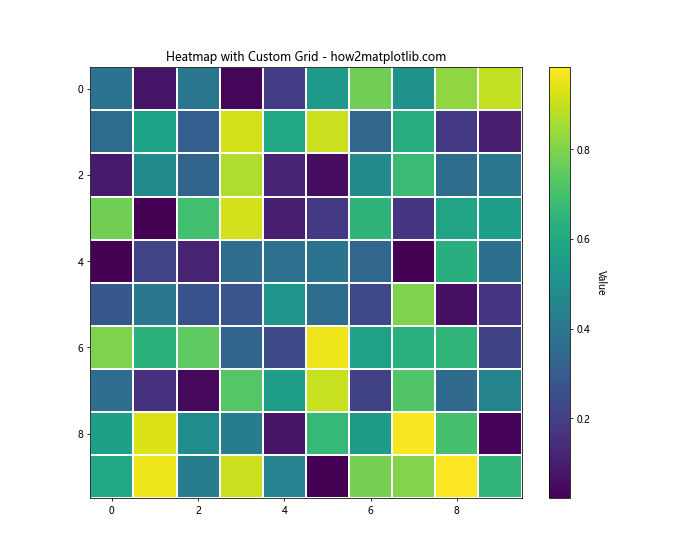
This code creates a heatmap with a grid that outlines each cell, improving the readability of the data.
Matplotlib Grid Spacing in Stacked Plots
Stacked plots, such as stacked bar charts or area plots, require careful consideration of Matplotlib grid spacing to ensure clarity.
Adjusting Grid Spacing in Stacked Area Plots
Here’s an example of how to create a stacked area plot with custom grid spacing:
import matplotlib.pyplot as plt
import numpy as np

x = np.arange(0, 10, 0.1)
y1 = np.sin(x)
y2 = np.cos(x)
y3 = np.tan(x)

plt.figure(figsize=(12, 6))
plt.stackplot(x, y1, y2, y3, labels=['Sin', 'Cos', 'Tan'])
plt.title('Stacked Area Plot with Custom Grid - how2matplotlib.com')
plt.xlabel('X-axis')
plt.ylabel('Y-axis')

plt.grid(True, linestyle='--', alpha=0.7)
plt.legend(loc='upper left')

plt.show()
Output:
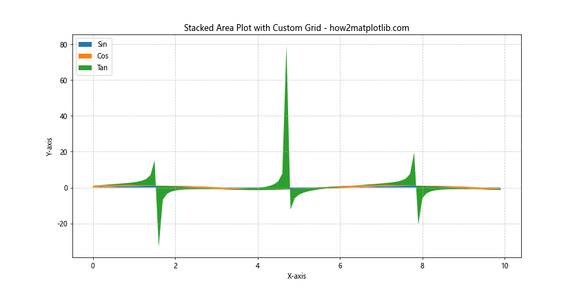
This example creates a stacked area plot with a custom grid that helps viewers distinguish between different layers of data.
Matplotlib Grid Spacing in Violin Plots
Violin plots are useful for visualizing the distribution of data across different categories. Let’s see how to adjust Matplotlib grid spacing in violin plots.
Customizing Grid Spacing in Violin Plots
Here’s an example of creating a violin plot with custom grid spacing:
import matplotlib.pyplot as plt
import numpy as np

np.random.seed(10)
data = [np.random.normal(0, std, 100) for std in range(1, 5)]

fig, ax = plt.subplots(figsize=(10, 6))
ax.violinplot(data, showmeans=True, showextrema=True, showmedians=True)

ax.set_title('Violin Plot with Custom Grid - how2matplotlib.com')
ax.set_xlabel('Category')
ax.set_ylabel('Value')

ax.set_xticks([1, 2, 3, 4])
ax.set_xticklabels(['A', 'B', 'C', 'D'])

ax.grid(True, axis='y', linestyle='--', alpha=0.7)

plt.show()
Output:
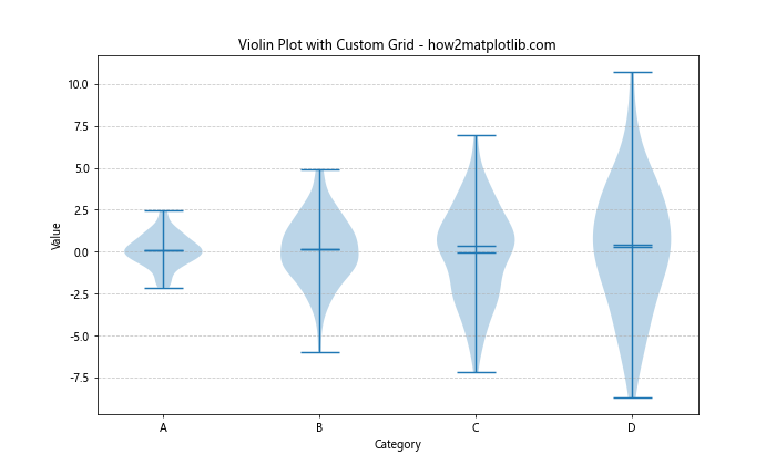
This code creates a violin plot with a custom y-axis grid that helps in comparing distributions across categories.
Matplotlib Grid Spacing in Radar Charts
Radar charts, also known as spider charts, require a unique approach to Matplotlib grid spacing. Let’s explore how to customize grid spacing in radar charts.
Adjusting Grid Spacing in Radar Charts
Here’s an example of creating a radar chart with custom grid spacing:
import matplotlib.pyplot as plt
import numpy as np

categories = ['A', 'B', 'C', 'D', 'E', 'F']
values = [4, 3, 5, 2, 4, 5]

angles = np.linspace(0, 2*np.pi, len(categories), endpoint=False)
values = np.concatenate((values, [values[0]]))  # Repeat the first value to close the polygon
angles = np.concatenate((angles, [angles[0]]))  # Repeat the first angle to close the polygon

fig, ax = plt.subplots(figsize=(8, 8), subplot_kw=dict(projection='polar'))
ax.plot(angles, values)
ax.fill(angles, values, alpha=0.25)

ax.set_xticks(angles[:-1])
ax.set_xticklabels(categories)

ax.set_yticks([1, 2, 3, 4, 5])
ax.set_yticklabels(['1', '2', '3', '4', '5'])
ax.set_ylim(0, 5)

ax.grid(True)

plt.title('Radar Chart with Custom Grid - how2matplotlib.com')
plt.show()
Output:
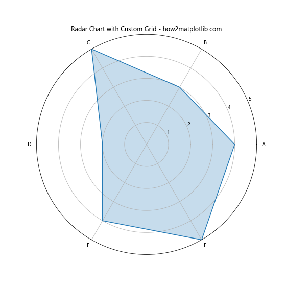
This example creates a radar chart with customized angular and radial grid spacing, enhancing the readability of the chart.
Conclusion: Mastering Matplotlib Grid Spacing
Matplotlib grid spacing is a powerful tool for enhancing the clarity and effectiveness of your data visualizations. By mastering the techniques covered in this comprehensive guide, you’ll be able to create more professional and informative plots that effectively communicate your data insights.
Remember that the key to effective Matplotlib grid spacing is finding the right balance between providing helpful reference points and avoiding visual clutter. Experiment with different settings and approaches to find what works best for your specific data and audience.