Matplotlib Errorbar Color Comprehensive Guide
Matplotlib errorbar color is a crucial aspect of data visualization that allows you to effectively communicate uncertainty in your data. This article will provide an in-depth exploration of how to use and customize errorbar colors in Matplotlib, offering practical examples and explanations to help you create visually appealing and informative plots.
Understanding Matplotlib Errorbar Color Basics
Matplotlib errorbar color refers to the color of the error bars in a plot created using Matplotlib’s errorbar() function. Error bars are graphical representations of the variability of data and are often used to indicate the error or uncertainty in a measurement. The color of these error bars can be customized to enhance the visual appeal and clarity of your plots.
Let’s start with a basic example of how to create a plot with error bars and set their color:
import matplotlib.pyplot as plt
import numpy as np

x = np.linspace(0, 10, 50)
y = np.sin(x)
yerr = 0.1 + 0.2 * np.random.rand(len(x))

plt.figure(figsize=(10, 6))
plt.errorbar(x, y, yerr=yerr, color='red', ecolor='blue', label='how2matplotlib.com')
plt.title('Basic Matplotlib Errorbar Color Example')
plt.xlabel('X-axis')
plt.ylabel('Y-axis')
plt.legend()
plt.show()
Output:
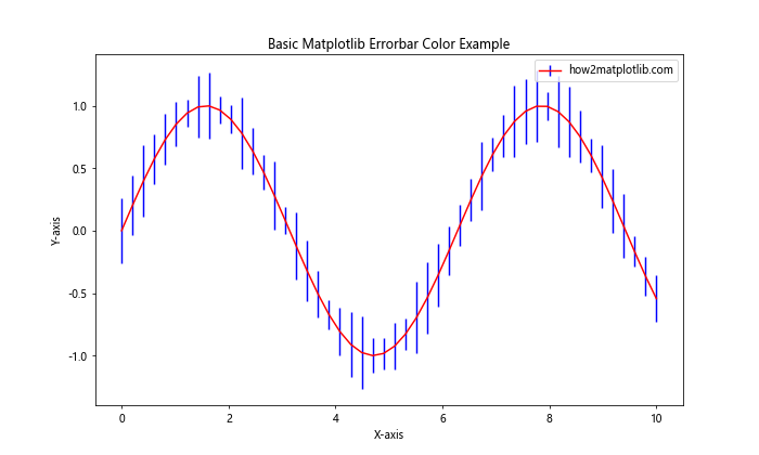
In this example, we create a simple sine wave plot with error bars. The color parameter sets the color of the main line, while ecolor sets the color of the error bars. The result is a red line with blue error bars.
Customizing Matplotlib Errorbar Color
Matplotlib offers various ways to customize the color of error bars. You can use named colors, RGB values, or even color maps to create visually striking plots.
Using Named Colors for Matplotlib Errorbar Color
Matplotlib provides a wide range of named colors that you can use for your error bars. Here’s an example using different named colors:
import matplotlib.pyplot as plt
import numpy as np

x = np.arange(0, 10, 1)
y = np.random.rand(10)
yerr = 0.1 + 0.1 * np.random.rand(len(x))

plt.figure(figsize=(10, 6))
plt.errorbar(x, y, yerr=yerr, color='forestgreen', ecolor='crimson',
             capsize=5, capthick=2, label='how2matplotlib.com')
plt.title('Matplotlib Errorbar Color with Named Colors')
plt.xlabel('X-axis')
plt.ylabel('Y-axis')
plt.legend()
plt.show()
Output:
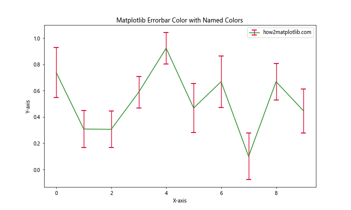
In this example, we use ‘forestgreen’ for the main line color and ‘crimson’ for the error bar color. The capsize and capthick parameters are used to customize the appearance of the error bar caps.
Using RGB Values for Matplotlib Errorbar Color
For more precise color control, you can use RGB values to define your matplotlib errorbar color:
import matplotlib.pyplot as plt
import numpy as np

x = np.linspace(0, 5, 20)
y = np.exp(-x)
yerr = 0.1 * np.random.rand(len(x))

plt.figure(figsize=(10, 6))
plt.errorbar(x, y, yerr=yerr, color=(0.2, 0.7, 0.3), ecolor=(0.8, 0.2, 0.1),
             capsize=3, label='how2matplotlib.com')
plt.title('Matplotlib Errorbar Color with RGB Values')
plt.xlabel('X-axis')
plt.ylabel('Y-axis')
plt.legend()
plt.show()
Output:
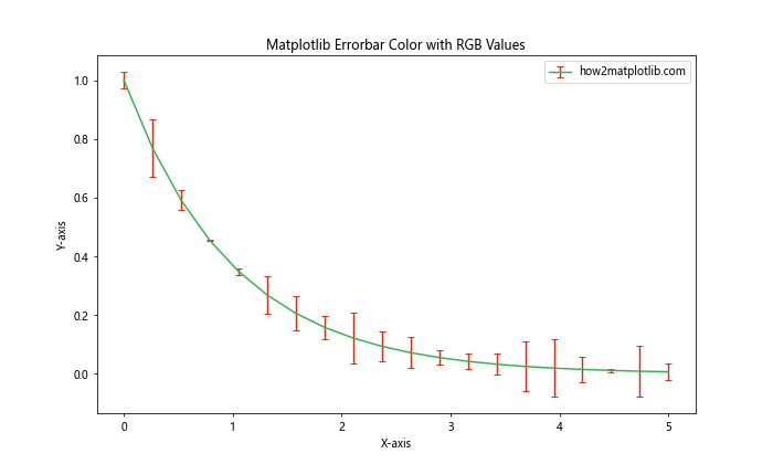
In this example, we use RGB tuples to define the colors. The main line is a shade of green (0.2, 0.7, 0.3), while the error bars are a shade of red (0.8, 0.2, 0.1).
Advanced Matplotlib Errorbar Color Techniques
Now that we’ve covered the basics, let’s explore some more advanced techniques for customizing matplotlib errorbar color.
Using Color Maps for Matplotlib Errorbar Color
Color maps can be a powerful tool for visualizing data trends through color. Here’s an example of how to use a color map for your error bars:
import matplotlib.pyplot as plt
import numpy as np

x = np.linspace(0, 10, 50)
y = np.sin(x) + np.random.normal(0, 0.1, 50)
yerr = np.random.uniform(0.05, 0.2, 50)

plt.figure(figsize=(12, 6))
cm = plt.cm.get_cmap('viridis')
sc = plt.scatter(x, y, c=yerr, cmap=cm, s=50, label='how2matplotlib.com')
plt.colorbar(sc, label='Error Magnitude')
plt.errorbar(x, y, yerr=yerr, fmt='none', ecolor=cm(yerr/max(yerr)))
plt.title('Matplotlib Errorbar Color with Color Map')
plt.xlabel('X-axis')
plt.ylabel('Y-axis')
plt.legend()
plt.show()
Output:
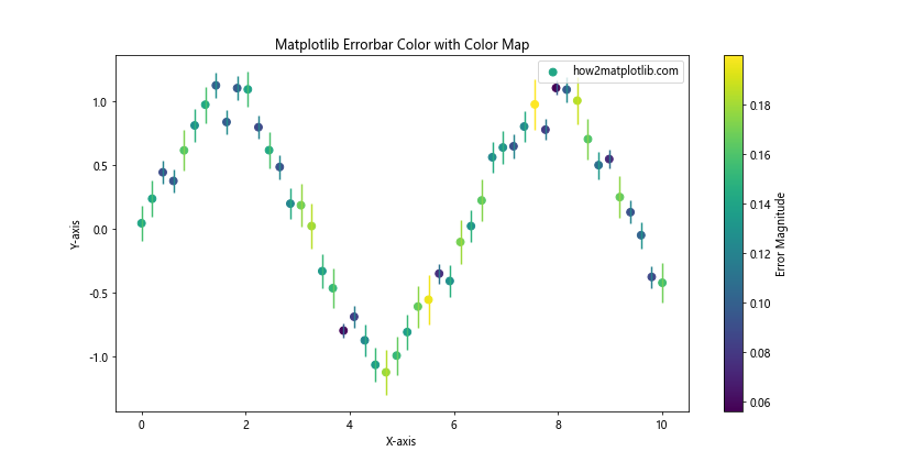
In this example, we use the ‘viridis’ color map to color both the scatter points and the error bars based on the magnitude of the error. The error bar color is determined by normalizing the error values and mapping them to the color map.
Matplotlib Errorbar Color for Multiple Datasets
When plotting multiple datasets, you might want to use different colors for each set of error bars. Here’s how you can achieve this:
import matplotlib.pyplot as plt
import numpy as np

x = np.linspace(0, 10, 20)
y1 = np.sin(x)
y2 = np.cos(x)
yerr1 = 0.1 + 0.1 * np.random.rand(len(x))
yerr2 = 0.1 + 0.1 * np.random.rand(len(x))

plt.figure(figsize=(12, 6))
plt.errorbar(x, y1, yerr=yerr1, color='blue', ecolor='lightblue',
             capsize=5, label='Sin - how2matplotlib.com')
plt.errorbar(x, y2, yerr=yerr2, color='red', ecolor='lightcoral',
             capsize=5, label='Cos - how2matplotlib.com')
plt.title('Matplotlib Errorbar Color for Multiple Datasets')
plt.xlabel('X-axis')
plt.ylabel('Y-axis')
plt.legend()
plt.show()
Output:
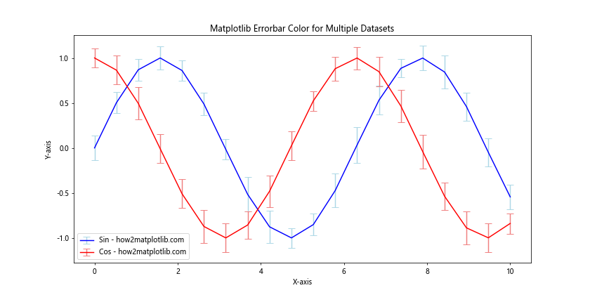
In this example, we plot two datasets (sine and cosine) with different colors for both the main lines and the error bars. This helps to distinguish between the two datasets easily.
Customizing Matplotlib Errorbar Color Properties
Beyond just setting the color, Matplotlib allows you to customize various properties of error bars to enhance your visualizations.
Adjusting Matplotlib Errorbar Color Transparency
You can adjust the transparency of your error bars using the alpha parameter:
import matplotlib.pyplot as plt
import numpy as np

x = np.linspace(0, 10, 30)
y = np.exp(-x/3.0)
yerr = 0.1 * np.random.rand(len(x))

plt.figure(figsize=(10, 6))
plt.errorbar(x, y, yerr=yerr, color='purple', ecolor='purple',
             alpha=0.5, elinewidth=3, capsize=0, label='how2matplotlib.com')
plt.title('Matplotlib Errorbar Color with Transparency')
plt.xlabel('X-axis')
plt.ylabel('Y-axis')
plt.legend()
plt.show()
Output:
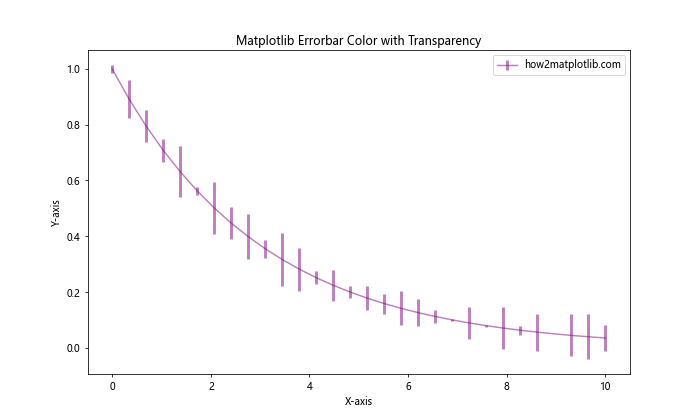
In this example, we set the alpha parameter to 0.5, making both the main line and error bars semi-transparent. We also increased the elinewidth to make the error bars more visible.
Advanced Matplotlib Errorbar Color Techniques
Let’s explore some more advanced techniques for working with matplotlib errorbar color.
Using Gradients for Matplotlib Errorbar Color
You can create a gradient effect for your error bars to represent changing uncertainty:
import matplotlib.pyplot as plt
import numpy as np
from matplotlib.collections import LineCollection

x = np.linspace(0, 10, 50)
y = np.sin(x)
yerr = 0.1 + 0.2 * np.abs(np.sin(x))

plt.figure(figsize=(12, 6))

# Plot the main line
plt.plot(x, y, color='black', label='how2matplotlib.com')

# Create gradient error bars
for i in range(len(x)):
    plt.plot([x[i], x[i]], [y[i]-yerr[i], y[i]+yerr[i]],
             color=plt.cm.viridis(yerr[i]/max(yerr)), alpha=0.7)

plt.title('Matplotlib Errorbar Color with Gradient')
plt.xlabel('X-axis')
plt.ylabel('Y-axis')
plt.legend()
plt.show()
Output:
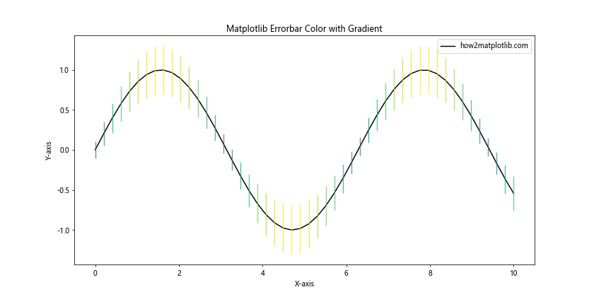
In this example, we create individual error bars for each point and color them based on their magnitude using the ‘viridis’ color map.
Matplotlib Errorbar Color in 3D Plots
You can also use error bars with custom colors in 3D plots:
import matplotlib.pyplot as plt
import numpy as np
from mpl_toolkits.mplot3d import Axes3D

fig = plt.figure(figsize=(12, 8))
ax = fig.add_subplot(111, projection='3d')

x = np.linspace(0, 10, 20)
y = np.sin(x)
z = np.cos(x)
zerr = 0.1 + 0.1 * np.random.rand(len(x))

ax.errorbar(x, y, z, zerr=zerr, color='purple', ecolor='orange',
            capsize=3, label='how2matplotlib.com')

ax.set_title('3D Matplotlib Errorbar Color')
ax.set_xlabel('X-axis')
ax.set_ylabel('Y-axis')
ax.set_zlabel('Z-axis')
ax.legend()
plt.show()
Output:
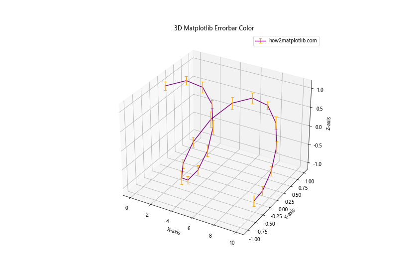
This example demonstrates how to create a 3D plot with error bars, using different colors for the main line and the error bars.
Best Practices for Matplotlib Errorbar Color
When working with matplotlib errorbar color, it’s important to follow some best practices to ensure your visualizations are effective and easy to interpret.
Choosing Appropriate Colors
The choice of colors for your error bars can significantly impact the readability of your plot. Here are some tips:
- Use contrasting colors for the main line and error bars to make them easily distinguishable.
- Consider color-blind friendly palettes to ensure your plots are accessible to all viewers.
- Use color to convey meaning, such as using warmer colors for larger errors and cooler colors for smaller errors.
Here’s an example implementing these practices:
import matplotlib.pyplot as plt
import numpy as np

x = np.linspace(0, 10, 30)
y = np.sin(x)
yerr = 0.1 + 0.2 * np.random.rand(len(x))

plt.figure(figsize=(12, 6))
cm = plt.cm.get_cmap('viridis')
sc = plt.scatter(x, y, c=yerr, cmap=cm, s=50, label='Data Points')
plt.colorbar(sc, label='Error Magnitude')
plt.errorbar(x, y, yerr=yerr, fmt='none', ecolor=cm(yerr/max(yerr)),
             alpha=0.7, label='how2matplotlib.com')
plt.title('Best Practices for Matplotlib Errorbar Color')
plt.xlabel('X-axis')
plt.ylabel('Y-axis')
plt.legend()
plt.show()
Output:
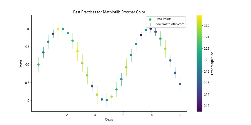
In this example, we use a color map to represent the magnitude of errors, making it easy to identify areas of higher uncertainty at a glance.
Balancing Visibility and Aesthetics
While it’s important to make your error bars visible, they shouldn’t overpower the main data. Here’s an example of how to balance visibility and aesthetics:
import matplotlib.pyplot as plt
import numpy as np

x = np.linspace(0, 10, 40)
y = np.exp(-x/5.0)
yerr = 0.1 + 0.1 * np.random.rand(len(x))

plt.figure(figsize=(12, 6))
plt.errorbar(x, y, yerr=yerr, color='navy', ecolor='skyblue',
             elinewidth=1, capsize=3, capthick=1, alpha=0.7,
             label='how2matplotlib.com')
plt.fill_between(x, y-yerr, y+yerr, color='lightblue', alpha=0.3)
plt.title('Balanced Matplotlib Errorbar Color')
plt.xlabel('X-axis')
plt.ylabel('Y-axis')
plt.legend()
plt.show()
Output:
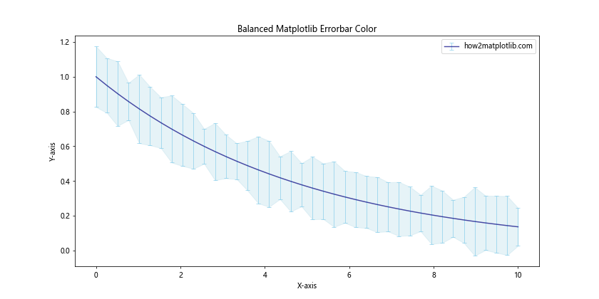
In this example, we use a darker color for the main line and a lighter color for the error bars. We also add a shaded region to represent the error range, which provides a clear visual representation of uncertainty without overwhelming the plot.
Troubleshooting Common Matplotlib Errorbar Color Issues
When working with matplotlib errorbar color, you might encounter some common issues. Let’s address a few of these and how to resolve them.
Issue 1: Error Bars Not Visible
Sometimes, your error bars might not be visible due to color choices or plot scaling. Here’s how to address this:
import matplotlib.pyplot as plt
import numpy as np

x = np.linspace(0, 10, 20)
y = np.sin(x)
yerr = 0.05 + 0.05 * np.random.rand(len(x))

plt.figure(figsize=(12, 6))
plt.errorbar(x, y, yerr=yerr, color='black', ecolor='red',
             elinewidth=2, capsize=5, capthick=2,
             label='how2matplotlib.com')
plt.title('Ensuring Visible Matplotlib Errorbar Color')
plt.xlabel('X-axis')
plt.ylabel('Y-axis')
plt.legend()
plt.show()
Output:
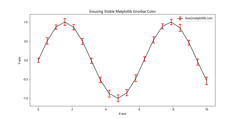
In this example, we use a contrasting color for the error bars (red) against the main line color (black). We also increase the elinewidth, capsize, and capthick to make the error bars more prominent.
Issue 2: Color Inconsistency
Sometimes, the color of your error bars might not match your expectations. This can often be resolved by ensuring you’re setting the color correctly:
import matplotlib.pyplot as plt
import numpy as np

x = np.linspace(0, 10, 20)
y = np.cos(x)
yerr = 0.1 + 0.1 * np.random.rand(len(x))

plt.figure(figsize=(12, 6))
plt.errorbar(x, y, yerr=yerr, color='green', ecolor='green',
             label='Consistent Color - how2matplotlib.com')
plt.title('Ensuring Color Consistency in Matplotlib Errorbar')
plt.xlabel('X-axis')
plt.ylabel('Y-axis')
plt.legend()
plt.show()
Output:
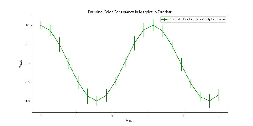
In this example, we explicitly set both color and ecolor to ‘green’ to ensure consistency between the main line and error bars.
Advanced Matplotlib Errorbar Color Techniques
Let’s explore some more advanced techniques for working with matplotlib errorbar color.
Using Custom Line Styles with Matplotlib Errorbar Color
You can combine custom line styles with your color choices to create more distinctive error bars:
import matplotlib.pyplot as plt
import numpy as np

x = np.linspace(0, 10, 15)
y = np.sin(x) * np.exp(-x/10)
yerr = 0.1 + 0.1 * np.random.rand(len(x))

plt.figure(figsize=(12, 6))
plt.errorbar(x, y, yerr=yerr, color='purple', ecolor='orange',
             linestyle='--', elinewidth=2, capsize=5,
             label='how2matplotlib.com')
plt.title('Custom Line Styles with Matplotlib Errorbar Color')
plt.xlabel('X-axis')
plt.ylabel('Y-axis')
plt.legend()
plt.show()
Output:
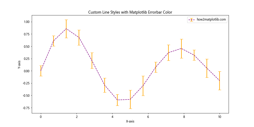
In this example, we use a dashed line style for the main line and solid error bars with contrasting colors.
Matplotlib Errorbar Color in Subplots
When working with subplots, you might want to use different color schemes for each subplot:
import matplotlib.pyplot as plt
import numpy as np

x = np.linspace(0, 10, 20)
y1 = np.sin(x)
y2 = np.cos(x)
yerr1 = 0.1 + 0.1 * np.random.rand(len(x))
yerr2 = 0.1 + 0.1 * np.random.rand(len(x))

fig, (ax1, ax2) = plt.subplots(1, 2, figsize=(15, 6))

ax1.errorbar(x, y1, yerr=yerr1, color='blue', ecolor='lightblue',
             capsize=3, label='Sin - how2matplotlib.com')
ax1.set_title('Subplot 1: Sin Function')
ax1.set_xlabel('X-axis')
ax1.set_ylabel('Y-axis')
ax1.legend()

ax2.errorbar(x, y2, yerr=yerr2, color='red', ecolor='lightcoral',
             capsize=3, label='Cos - how2matplotlib.com')
ax2.set_title('Subplot 2: Cos Function')
ax2.set_xlabel('X-axis')
ax2.set_ylabel('Y-axis')
ax2.legend()

plt.tight_layout()
plt.show()
Output:
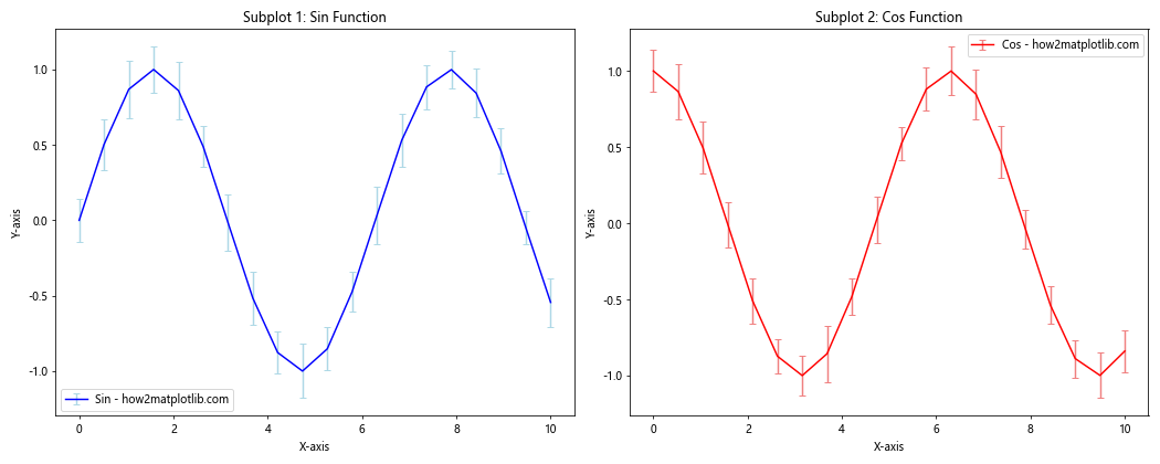
This example demonstrates how to create two subplots with different color schemes for the error bars.
Matplotlib Errorbar Color in Different Plot Types
Matplotlib errorbar color can be applied to various types of plots. Let’s explore a few examples.
Matplotlib Errorbar Color in Bar Plots
You can add error bars with custom colors to bar plots:
import matplotlib.pyplot as plt
import numpy as np

categories = ['A', 'B', 'C', 'D', 'E']
values = np.random.rand(5)
errors = 0.1 + 0.1 * np.random.rand(5)

plt.figure(figsize=(10, 6))
plt.bar(categories, values, yerr=errors, color='skyblue',
        ecolor='navy', capsize=5, label='how2matplotlib.com')
plt.title('Matplotlib Errorbar Color in Bar Plot')
plt.xlabel('Categories')
plt.ylabel('Values')
plt.legend()
plt.show()
Output:
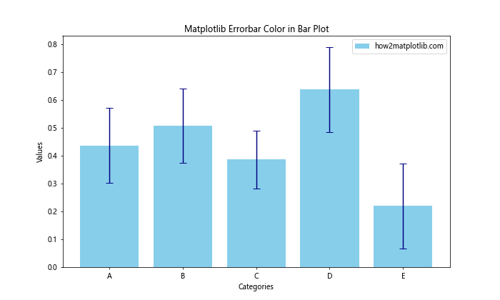
In this example, we create a bar plot with error bars, using different colors for the bars and the error bars.
Matplotlib Errorbar Color in Polar Plots
You can also apply custom errorbar colors to polar plots:
import matplotlib.pyplot as plt
import numpy as np

theta = np.linspace(0, 2*np.pi, 8, endpoint=False)
radii = 10 * np.random.rand(8)
width = np.pi/4 * np.random.rand(8)
errors = np.random.rand(8)

plt.figure(figsize=(10, 10))
ax = plt.subplot(111, projection='polar')
bars = ax.bar(theta, radii, width=width, bottom=0.0, yerr=errors,
               color='lightgreen', ecolor='darkgreen', capsize=5)
ax.set_title('Matplotlib Errorbar Color in Polar Plot')
plt.text(0, 0, 'how2matplotlib.com', ha='center', va='center')
plt.show()
Output:
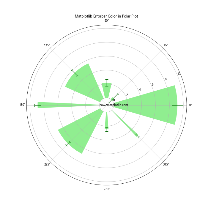
This example demonstrates how to add error bars with custom colors to a polar plot.
Optimizing Matplotlib Errorbar Color for Different Backgrounds
The choice of matplotlib errorbar color can be influenced by the background color of your plot. Let’s explore how to optimize your color choices for different backgrounds.
Light Background
For light backgrounds, you typically want to use darker colors for your error bars:
import matplotlib.pyplot as plt
import numpy as np

x = np.linspace(0, 10, 20)
y = np.sin(x)
yerr = 0.1 + 0.1 * np.random.rand(len(x))

plt.figure(figsize=(12, 6))
plt.errorbar(x, y, yerr=yerr, color='navy', ecolor='darkred',
             capsize=5, label='how2matplotlib.com')
plt.title('Matplotlib Errorbar Color on Light Background')
plt.xlabel('X-axis')
plt.ylabel('Y-axis')
plt.legend()
plt.show()
Output:
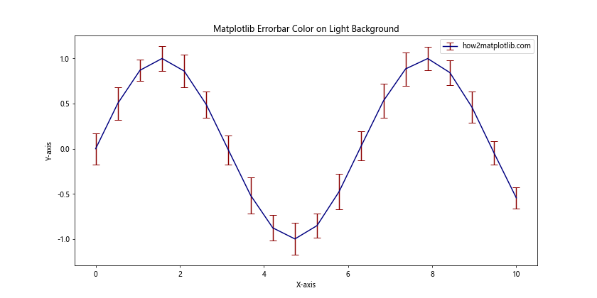
In this example, we use dark colors that stand out well against a light background.
Dark Background
For dark backgrounds, lighter colors often work better:
import matplotlib.pyplot as plt
import numpy as np

x = np.linspace(0, 10, 20)
y = np.cos(x)
yerr = 0.1 + 0.1 * np.random.rand(len(x))

plt.figure(figsize=(12, 6), facecolor='black')
plt.errorbar(x, y, yerr=yerr, color='cyan', ecolor='yellow',
             capsize=5, label='how2matplotlib.com')
plt.title('Matplotlib Errorbar Color on Dark Background', color='white')
plt.xlabel('X-axis', color='white')
plt.ylabel('Y-axis', color='white')
plt.legend()
plt.gca().set_facecolor('black')
plt.tick_params(colors='white')
plt.show()
Output:
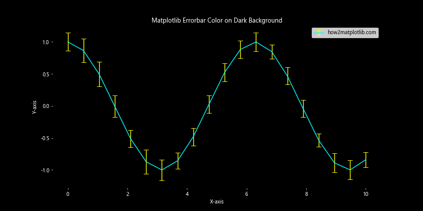
In this example, we use bright colors for the error bars and text to contrast with the dark background.
Matplotlib errorbar color Conclusion
Mastering matplotlib errorbar color is an essential skill for creating informative and visually appealing data visualizations. By understanding how to customize colors, adjust transparency, and apply different techniques for various plot types and backgrounds, you can effectively communicate the uncertainty in your data.
Remember to consider the overall aesthetic of your plot, the readability of your error bars, and the accessibility of your color choices. With practice and experimentation, you’ll be able to create stunning visualizations that effectively convey your data and its associated uncertainties.
Whether you’re working on scientific research, data analysis, or any field that requires the visualization of data with error margins, the techniques covered in this article will help you create professional-quality plots using matplotlib errorbar color.
Keep exploring and experimenting with different color combinations and techniques to find what works best for your specific data and audience.