How to Create and Customize Matplotlib Contour Plot Legends: A Comprehensive Guide
Matplotlib contour legend is an essential feature for creating informative and visually appealing contour plots. In this comprehensive guide, we’ll explore various aspects of matplotlib contour legends, including how to create them, customize their appearance, and integrate them effectively into your plots. We’ll cover everything from basic usage to advanced techniques, providing you with the knowledge and tools to master matplotlib contour legends in your data visualization projects.
Understanding Matplotlib Contour Plots and Legends
Before diving into the specifics of matplotlib contour legends, it’s important to understand what contour plots are and why legends are crucial for their interpretation. Contour plots are two-dimensional representations of three-dimensional data, where lines or filled areas represent points of equal value. Matplotlib contour legends provide a key to understanding these values, making them an indispensable part of any contour plot.
Let’s start with a basic example of creating a contour plot with a legend using matplotlib:
import numpy as np
import matplotlib.pyplot as plt

# Generate sample data
x = np.linspace(-5, 5, 100)
y = np.linspace(-5, 5, 100)
X, Y = np.meshgrid(x, y)
Z = np.sin(np.sqrt(X**2 + Y**2))

# Create the contour plot
fig, ax = plt.subplots(figsize=(10, 8))
cs = ax.contourf(X, Y, Z, levels=20, cmap='viridis')

# Add a colorbar legend
cbar = fig.colorbar(cs)
cbar.set_label('Value')

plt.title('Matplotlib Contour Plot with Legend - how2matplotlib.com')
plt.xlabel('X-axis')
plt.ylabel('Y-axis')
plt.show()
Output:
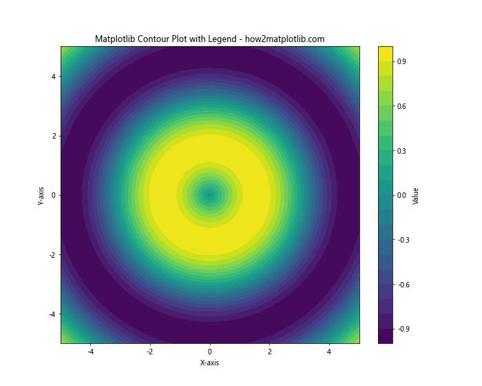
In this example, we create a simple contour plot using contourf() and add a colorbar legend using fig.colorbar(). The colorbar serves as a legend, showing the mapping between colors and values in the plot.
Creating Basic Matplotlib Contour Legends
When working with matplotlib contour plots, there are several ways to create legends. The most common approach is to use a colorbar, as shown in the previous example. However, you can also create discrete legends for contour lines. Let’s explore both methods:
Colorbar Legends
Colorbar legends are ideal for continuous data represented by filled contours. Here’s an example of creating a contour plot with a colorbar legend:
import numpy as np
import matplotlib.pyplot as plt

# Generate sample data
x = np.linspace(-3, 3, 100)
y = np.linspace(-3, 3, 100)
X, Y = np.meshgrid(x, y)
Z = np.exp(-(X**2 + Y**2))

# Create the contour plot
fig, ax = plt.subplots(figsize=(10, 8))
cs = ax.contourf(X, Y, Z, levels=15, cmap='plasma')

# Add a colorbar legend
cbar = fig.colorbar(cs)
cbar.set_label('Intensity - how2matplotlib.com')

plt.title('Matplotlib Contour Plot with Colorbar Legend')
plt.xlabel('X-axis')
plt.ylabel('Y-axis')
plt.show()
Output:
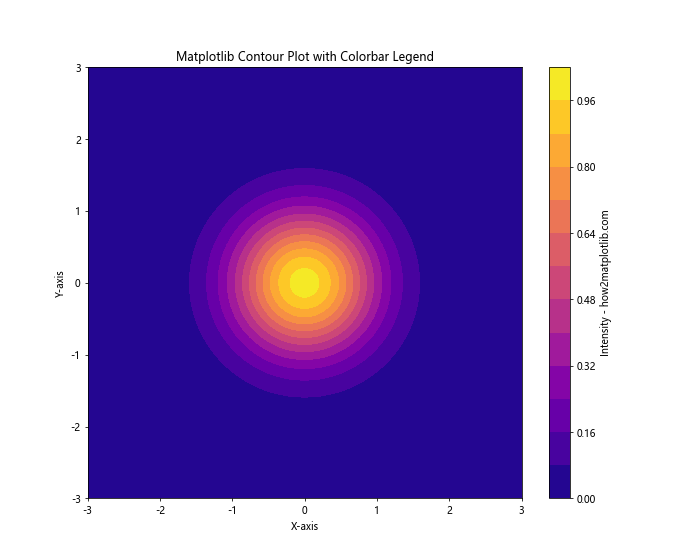
In this example, we use fig.colorbar() to add a colorbar legend to the contour plot. The colorbar shows the mapping between colors and intensity values.
Discrete Legends for Contour Lines
For contour lines, you might want to create a discrete legend that shows specific contour levels. Here’s how to do that:
import numpy as np
import matplotlib.pyplot as plt

# Generate sample data
x = np.linspace(-4, 4, 100)
y = np.linspace(-4, 4, 100)
X, Y = np.meshgrid(x, y)
Z = X*np.exp(-X**2 - Y**2)

# Create the contour plot
fig, ax = plt.subplots(figsize=(10, 8))
levels = [-0.5, -0.25, 0, 0.25, 0.5]
cs = ax.contour(X, Y, Z, levels=levels, colors='k')

# Add labels to the contour lines
ax.clabel(cs, inline=True, fontsize=10)

# Create a legend
legend_elements = [plt.Line2D([0], [0], color='k', lw=2, label=f'Level {level}')
                   for level in levels]
ax.legend(handles=legend_elements, title='Contour Levels - how2matplotlib.com')

plt.title('Matplotlib Contour Plot with Discrete Legend')
plt.xlabel('X-axis')
plt.ylabel('Y-axis')
plt.show()
Output:
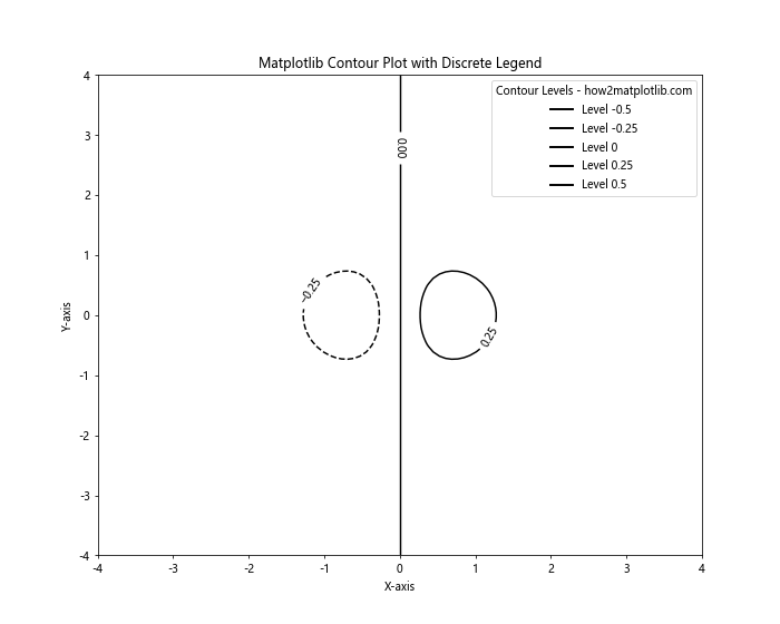
In this example, we create a discrete legend for contour lines using plt.Line2D objects and the ax.legend() method.
Customizing Matplotlib Contour Legends
Customizing matplotlib contour legends allows you to enhance the visual appeal and clarity of your plots. Let’s explore various ways to customize both colorbar and discrete legends.
Customizing Colorbar Legends
You can customize colorbar legends in several ways, including changing the colormap, adjusting the number of ticks, and modifying the label format. Here’s an example:
import numpy as np
import matplotlib.pyplot as plt
from matplotlib.colors import LogNorm

# Generate sample data
x = np.linspace(0, 5, 100)
y = np.linspace(0, 5, 100)
X, Y = np.meshgrid(x, y)
Z = np.exp(X) * np.sin(Y)

# Create the contour plot
fig, ax = plt.subplots(figsize=(10, 8))
cs = ax.contourf(X, Y, Z, levels=20, norm=LogNorm(), cmap='coolwarm')

# Add a customized colorbar legend
cbar = fig.colorbar(cs, extend='both')
cbar.set_label('Value (log scale) - how2matplotlib.com', rotation=270, labelpad=15)
cbar.set_ticks([1e0, 1e1, 1e2])
cbar.set_ticklabels(['Low', 'Medium', 'High'])

plt.title('Matplotlib Contour Plot with Customized Colorbar Legend')
plt.xlabel('X-axis')
plt.ylabel('Y-axis')
plt.show()
Output:
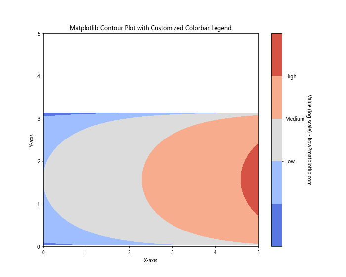
In this example, we use a logarithmic scale for the colorbar, customize the tick locations and labels, and adjust the colorbar label orientation.
Customizing Discrete Legends
For discrete legends, you can customize the appearance of legend elements, adjust their positioning, and add a title. Here’s an example:
import numpy as np
import matplotlib.pyplot as plt

# Generate sample data
x = np.linspace(-5, 5, 100)
y = np.linspace(-5, 5, 100)
X, Y = np.meshgrid(x, y)
Z = np.sin(X) * np.cos(Y)

# Create the contour plot
fig, ax = plt.subplots(figsize=(10, 8))
levels = [-0.75, -0.5, -0.25, 0, 0.25, 0.5, 0.75]
cs = ax.contour(X, Y, Z, levels=levels, cmap='RdYlBu_r')

# Add labels to the contour lines
ax.clabel(cs, inline=True, fontsize=8)

# Create a customized legend
legend_elements = [plt.Line2D([0], [0], color=cs.cmap(cs.norm(level)), lw=2,
                              label=f'Level {level:.2f}') for level in levels]
ax.legend(handles=legend_elements, title='Contour Levels - how2matplotlib.com',
          loc='center left', bbox_to_anchor=(1, 0.5), fontsize=8)

plt.title('Matplotlib Contour Plot with Customized Discrete Legend')
plt.xlabel('X-axis')
plt.ylabel('Y-axis')
plt.tight_layout()
plt.show()
Output:
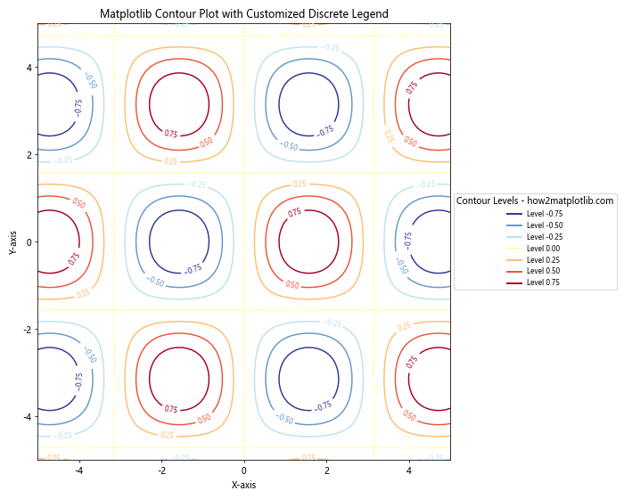
In this example, we create a customized discrete legend with colored lines matching the contour levels, position it outside the plot, and adjust its appearance.
Advanced Techniques for Matplotlib Contour Legends
As you become more proficient with matplotlib contour legends, you can explore advanced techniques to create more sophisticated and informative visualizations. Let’s look at some advanced approaches:
Combining Filled Contours and Line Contours
You can create a plot that combines filled contours with line contours, each with its own legend. This approach can provide both a continuous color representation and discrete level information:
import numpy as np
import matplotlib.pyplot as plt

# Generate sample data
x = np.linspace(-3, 3, 100)
y = np.linspace(-3, 3, 100)
X, Y = np.meshgrid(x, y)
Z = np.sin(X**2 + Y**2)

# Create the plot
fig, ax = plt.subplots(figsize=(12, 9))

# Filled contours
cf = ax.contourf(X, Y, Z, levels=20, cmap='viridis', alpha=0.7)
cbar = fig.colorbar(cf, label='Filled Contour Values - how2matplotlib.com')

# Line contours
levels = [-0.5, 0, 0.5]
cl = ax.contour(X, Y, Z, levels=levels, colors='k', linewidths=2)
ax.clabel(cl, inline=True, fontsize=10)

# Create a legend for line contours
legend_elements = [plt.Line2D([0], [0], color='k', lw=2, label=f'Level {level}')
                   for level in levels]
ax.legend(handles=legend_elements, title='Line Contour Levels', loc='upper right')

plt.title('Matplotlib Contour Plot with Combined Legends')
plt.xlabel('X-axis')
plt.ylabel('Y-axis')
plt.show()
Output:
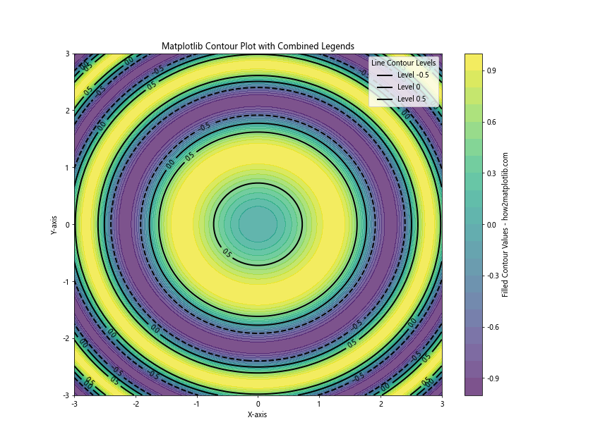
This example demonstrates how to create a plot with both filled contours (using a colorbar legend) and line contours (using a discrete legend).
Creating a Custom Colorbar
Sometimes, you may want to create a custom colorbar that doesn’t directly correspond to the contour plot. This can be useful for showing additional information or creating a more complex legend:
import numpy as np
import matplotlib.pyplot as plt
from matplotlib.colors import LinearSegmentedColormap

# Generate sample data
x = np.linspace(-4, 4, 100)
y = np.linspace(-4, 4, 100)
X, Y = np.meshgrid(x, y)
Z = np.sin(np.sqrt(X**2 + Y**2))

# Create a custom colormap
colors = ['#1a9850', '#91cf60', '#d9ef8b', '#fee08b', '#fc8d59', '#d73027']
n_bins = len(colors)
cmap = LinearSegmentedColormap.from_list('custom', colors, N=n_bins)

# Create the contour plot
fig, ax = plt.subplots(figsize=(12, 9))
cs = ax.contourf(X, Y, Z, levels=20, cmap=cmap)

# Create a custom colorbar
sm = plt.cm.ScalarMappable(cmap=cmap, norm=plt.Normalize(vmin=-1, vmax=1))
sm.set_array([])
cbar = fig.colorbar(sm, label='Custom Scale - how2matplotlib.com',
                    ticks=np.linspace(-1, 1, n_bins))
cbar.set_ticklabels(['Very Low', 'Low', 'Medium Low', 'Medium High', 'High', 'Very High'])

plt.title('Matplotlib Contour Plot with Custom Colorbar Legend')
plt.xlabel('X-axis')
plt.ylabel('Y-axis')
plt.show()
In this example, we create a custom colormap and use it to generate a colorbar with custom labels, providing a more descriptive legend for the contour plot.
Handling Multiple Contour Plots
When working with multiple contour plots in a single figure, managing legends becomes more complex. Let’s explore some techniques for handling legends in these scenarios:
Subplots with Individual Legends
You can create multiple subplots, each with its own contour plot and legend:
import numpy as np
import matplotlib.pyplot as plt

# Generate sample data
x = np.linspace(-5, 5, 100)
y = np.linspace(-5, 5, 100)
X, Y = np.meshgrid(x, y)
Z1 = np.sin(np.sqrt(X**2 + Y**2))
Z2 = np.cos(np.sqrt(X**2 + Y**2))

# Create subplots
fig, (ax1, ax2) = plt.subplots(1, 2, figsize=(16, 8))

# First contour plot
cs1 = ax1.contourf(X, Y, Z1, levels=20, cmap='viridis')
cbar1 = fig.colorbar(cs1, ax=ax1)
cbar1.set_label('Values (sin) - how2matplotlib.com')
ax1.set_title('Contour Plot 1')
ax1.set_xlabel('X-axis')
ax1.set_ylabel('Y-axis')

# Second contour plot
cs2 = ax2.contourf(X, Y, Z2, levels=20, cmap='plasma')
cbar2 = fig.colorbar(cs2, ax=ax2)
cbar2.set_label('Values (cos) - how2matplotlib.com')
ax2.set_title('Contour Plot 2')
ax2.set_xlabel('X-axis')
ax2.set_ylabel('Y-axis')

plt.tight_layout()
plt.show()
Output:
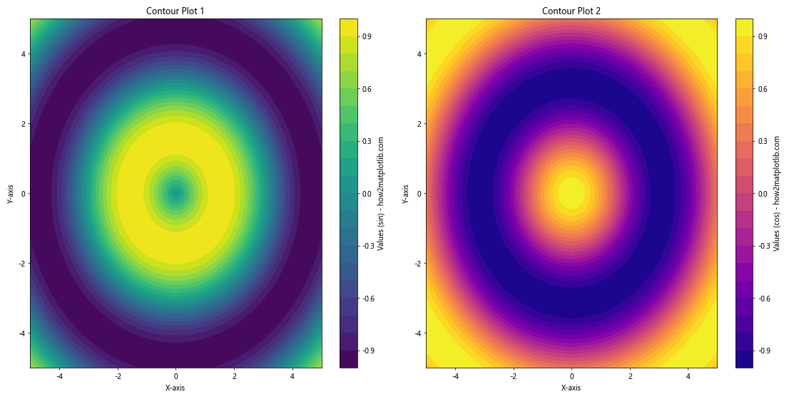
This example creates two contour plots side by side, each with its own colorbar legend.
Shared Colorbar for Multiple Plots
In some cases, you might want to use a single colorbar for multiple contour plots:
import numpy as np
import matplotlib.pyplot as plt

# Generate sample data
x = np.linspace(-5, 5, 100)
y = np.linspace(-5, 5, 100)
X, Y = np.meshgrid(x, y)
Z1 = np.sin(np.sqrt(X**2 + Y**2))
Z2 = np.cos(np.sqrt(X**2 + Y**2))

# Create subplots
fig, (ax1, ax2) = plt.subplots(1, 2, figsize=(16, 8))

# First contour plot
cs1 = ax1.contourf(X, Y, Z1, levels=20, cmap='viridis', vmin=-1, vmax=1)
ax1.set_title('Contour Plot 1')
ax1.set_xlabel('X-axis')
ax1.set_ylabel('Y-axis')

# Second contour plot
cs2 = ax2.contourf(X, Y, Z2, levels=20, cmap='viridis', vmin=-1, vmax=1)
ax2.set_title('Contour Plot 2')
ax2.set_xlabel('X-axis')
ax2.set_ylabel('Y-axis')

# Add a shared colorbar
cbar_ax = fig.add_axes([0.92, 0.15, 0.02, 0.7])
cbar = fig.colorbar(cs2, cax=cbar_ax)
cbar.set_label('Shared Values - how2matplotlib.com')

plt.tight_layout(rect=[0, 0, 0.9, 1])
plt.show()
Output:
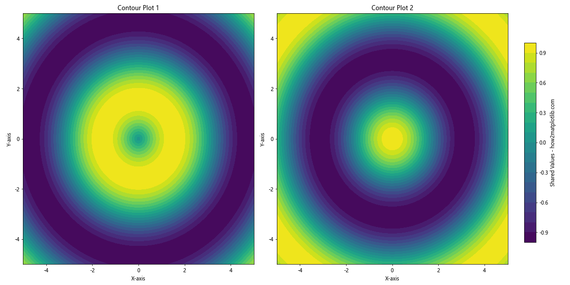
This example demonstrates how to create two contour plots with a shared colorbar legend.## Integrating Matplotlib Contour Legends with Other Plot Elements
Matplotlib contour legends can be effectively integrated with other plot elements to create more informative and visually appealing visualizations. Let’s explore some techniques for combining contour plots and their legends with other plot types:
Overlaying Contour Plots on Scatter Plots
You can overlay a contour plot with its legend on a scatter plot to show the relationship between discrete data points and the underlying continuous distribution:
import numpy as np
import matplotlib.pyplot as plt

# Generate sample data
np.random.seed(42)
x = np.random.randn(100)
y = np.random.randn(100)
z = x * np.exp(-x**2 - y**2)

# Create the plot
fig, ax = plt.subplots(figsize=(12, 9))

# Scatter plot
scatter = ax.scatter(x, y, c=z, cmap='viridis', s=50, edgecolor='k')

# Contour plot
xi = yi = np.linspace(-3, 3, 100)
Xi, Yi = np.meshgrid(xi, yi)
Zi = (Xi * np.exp(-Xi**2 - Yi**2)).reshape(Xi.shape)

cs = ax.contour(Xi, Yi, Zi, levels=10, cmap='viridis', alpha=0.5)
ax.clabel(cs, inline=True, fontsize=8)

# Add colorbar legend
cbar = fig.colorbar(scatter)
cbar.set_label('Z Value - how2matplotlib.com')

plt.title('Matplotlib Contour Plot with Scatter Overlay')
plt.xlabel('X-axis')
plt.ylabel('Y-axis')
plt.show()
Output:
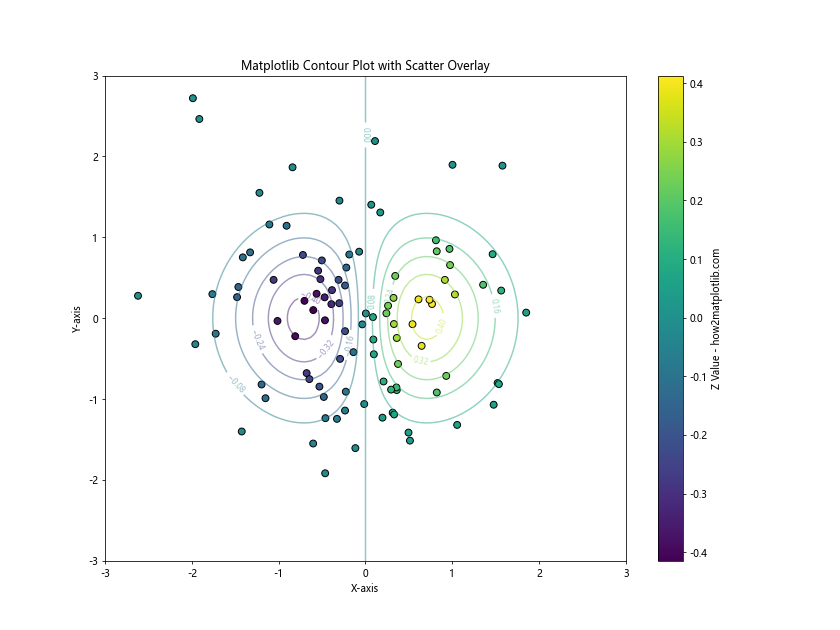
This example demonstrates how to create a scatter plot with an overlaid contour plot, using a shared colorbar legend for both elements.
Combining Contour Plots with Vector Fields
Contour plots can be combined with vector fields to show both scalar and vector data in the same visualization:
import numpy as np
import matplotlib.pyplot as plt

# Generate sample data
x = np.linspace(-5, 5, 20)
y = np.linspace(-5, 5, 20)
X, Y = np.meshgrid(x, y)
Z = np.sin(X) * np.cos(Y)
U = -np.sin(Y)
V = np.cos(X)

# Create the plot
fig, ax = plt.subplots(figsize=(12, 9))

# Contour plot
cs = ax.contourf(X, Y, Z, levels=20, cmap='coolwarm', alpha=0.7)
cbar = fig.colorbar(cs)
cbar.set_label('Scalar Field - how2matplotlib.com')

# Vector field
q = ax.quiver(X, Y, U, V, scale=50, color='k', alpha=0.7)

# Add legend for vector field
ax.quiverkey(q, X=0.9, Y=1.05, U=1, label='Vector Field', labelpos='E')

plt.title('Matplotlib Contour Plot with Vector Field')
plt.xlabel('X-axis')
plt.ylabel('Y-axis')
plt.show()
Output:
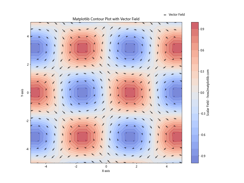
This example shows how to create a contour plot with a colorbar legend for the scalar field and add a vector field with its own legend.
Handling Special Cases in Matplotlib Contour Legends
There are some special cases and challenges you might encounter when working with matplotlib contour legends. Let’s address a few of these scenarios:
Dealing with Irregular Data
When working with irregular or non-uniform data, you may need to use specialized contouring techniques:
import numpy as np
import matplotlib.pyplot as plt
from scipy.interpolate import griddata

# Generate irregular sample data
np.random.seed(42)
x = np.random.rand(100) * 4 - 2
y = np.random.rand(100) * 4 - 2
z = x * np.exp(-x**2 - y**2)

# Create a regular grid for interpolation
xi = yi = np.linspace(-2, 2, 100)
Xi, Yi = np.meshgrid(xi, yi)

# Interpolate the irregular data onto the regular grid
Zi = griddata((x, y), z, (Xi, Yi), method='cubic')

# Create the plot
fig, ax = plt.subplots(figsize=(12, 9))

# Contour plot of interpolated data
cs = ax.contourf(Xi, Yi, Zi, levels=20, cmap='viridis')
cbar = fig.colorbar(cs)
cbar.set_label('Interpolated Values - how2matplotlib.com')

# Scatter plot of original data points
scatter = ax.scatter(x, y, c=z, s=50, edgecolor='k', cmap='viridis')

plt.title('Matplotlib Contour Plot with Irregular Data')
plt.xlabel('X-axis')
plt.ylabel('Y-axis')
plt.show()
Output:
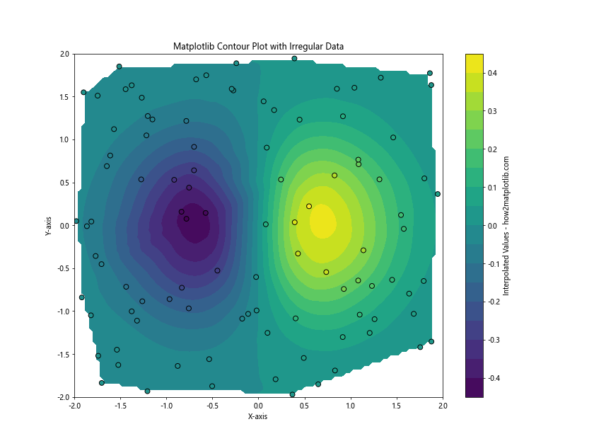
This example demonstrates how to create a contour plot from irregular data using interpolation, and how to add a legend that represents both the interpolated contours and the original data points.
Handling Missing Data
When dealing with datasets that contain missing values, you need to take special care in creating contour plots and their legends:
import numpy as np
import matplotlib.pyplot as plt

# Generate sample data with missing values
x = np.linspace(-5, 5, 100)
y = np.linspace(-5, 5, 100)
X, Y = np.meshgrid(x, y)
Z = np.sin(np.sqrt(X**2 + Y**2))

# Introduce missing values
mask = np.random.random(Z.shape) < 0.2
Z_masked = np.ma.masked_where(mask, Z)

# Create the plot
fig, ax = plt.subplots(figsize=(12, 9))

# Contour plot with masked data
cs = ax.contourf(X, Y, Z_masked, levels=20, cmap='viridis', extend='both')
cbar = fig.colorbar(cs)
cbar.set_label('Values (with missing data) - how2matplotlib.com')

plt.title('Matplotlib Contour Plot with Missing Data')
plt.xlabel('X-axis')
plt.ylabel('Y-axis')
plt.show()
Output:
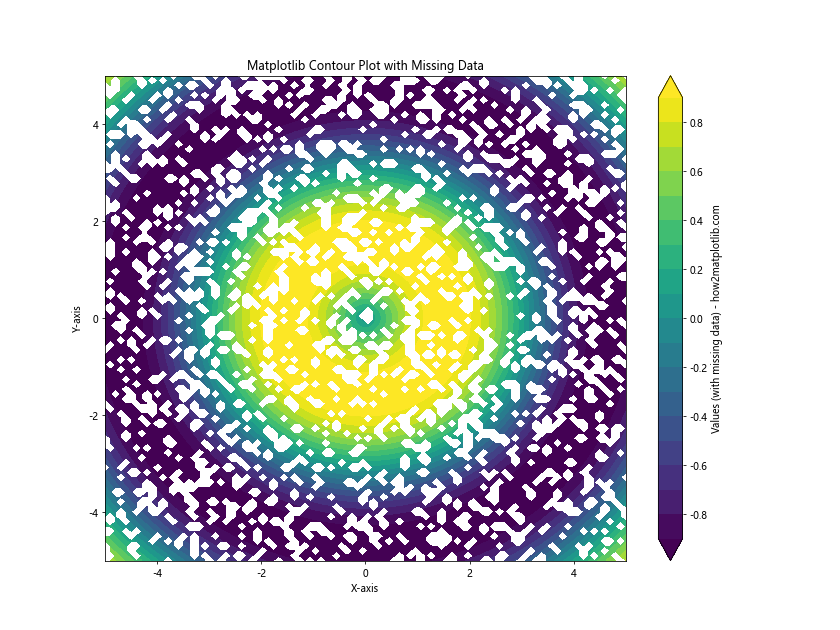
This example shows how to create a contour plot with missing data using masked arrays, and how to adjust the legend to account for these missing values.
Best Practices for Matplotlib Contour Legends
To create effective and informative matplotlib contour legends, consider the following best practices:
- Choose appropriate color schemes: Use color maps that are perceptually uniform and colorblind-friendly, such as 'viridis', 'plasma', or 'cividis'.
Adjust the number of levels: Choose a number of contour levels that balances detail with readability. Too few levels may oversimplify the data, while too many can make the plot cluttered.
Use clear and concise labels: Ensure that your legend labels are easy to understand and provide relevant information about the data being visualized.
Position legends carefully: Place legends where they don't obscure important parts of the plot. Consider using
bbox_to_anchorto position legends outside the plot area if necessary.Use consistent scales: When comparing multiple contour plots, use consistent color scales and contour levels to facilitate accurate comparisons.
Add context with additional plot elements: Combine contour plots with other visualizations like scatter plots or vector fields to provide more context and information.
Handle special cases appropriately: Be prepared to deal with irregular data, missing values, and other special cases that may require additional processing or visualization techniques.
Troubleshooting Common Issues with Matplotlib Contour Legends
When working with matplotlib contour legends, you may encounter some common issues. Here are some problems and their solutions: