How to Create Filled Contour Plots with Matplotlib: A Comprehensive Guide
Matplotlib contour filled plots are powerful tools for visualizing three-dimensional data on a two-dimensional plane. This article will explore the intricacies of creating filled contour plots using Matplotlib, providing detailed explanations and numerous examples to help you master this visualization technique.
Introduction to Matplotlib Contour Filled Plots
Matplotlib contour filled plots, also known as filled contour plots, are a type of visualization that represents three-dimensional data on a two-dimensional plane using color-filled regions. These plots are particularly useful for displaying continuous data distributions, such as temperature maps, elevation data, or pressure fields.
In a matplotlib contour filled plot, the data is represented by different color-filled areas, where each area corresponds to a specific range of values. The boundaries between these areas are called contour lines, which connect points of equal value.
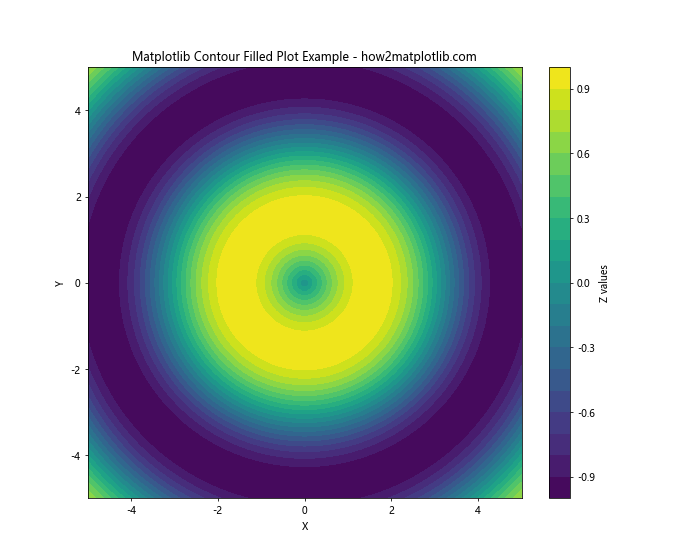
Let’s start with a simple example to illustrate the concept of a matplotlib contour filled plot:
import numpy as np
import matplotlib.pyplot as plt

# Generate sample data
x = np.linspace(-5, 5, 100)
y = np.linspace(-5, 5, 100)
X, Y = np.meshgrid(x, y)
Z = np.sin(np.sqrt(X**2 + Y**2))

# Create the matplotlib contour filled plot
plt.figure(figsize=(10, 8))
plt.contourf(X, Y, Z, levels=20, cmap='viridis')
plt.colorbar(label='Z values')
plt.title('Matplotlib Contour Filled Plot Example - how2matplotlib.com')
plt.xlabel('X')
plt.ylabel('Y')
plt.show()
Output:

In this example, we create a simple matplotlib contour filled plot of a two-dimensional sinc function. The contourf function is used to generate the filled contour plot, with 20 levels and the ‘viridis’ colormap.
Understanding the Basics of Matplotlib Contour Filled Plots
Before diving deeper into matplotlib contour filled plots, it’s essential to understand the key components and concepts involved:
- Data: The input data for a matplotlib contour filled plot typically consists of three arrays: X, Y, and Z. X and Y represent the coordinates of the data points, while Z represents the values at those coordinates.
Levels: Levels define the boundaries between different color-filled regions in the plot. You can specify the number of levels or provide explicit level values.
Colormap: The colormap determines the colors used to represent different ranges of values in the plot.
Contour lines: These are the lines that separate different color-filled regions and represent points of equal value.
Let’s create a more detailed example to illustrate these concepts: