How to Create Grouped Boxplots in Matplotlib: A Comprehensive Guide
Matplotlib boxplot by group is a powerful visualization technique that allows you to compare distributions across multiple categories or groups. This article will provide an in-depth exploration of creating grouped boxplots using Matplotlib, one of the most popular data visualization libraries in Python. We’ll cover various aspects of matplotlib boxplot by group, including basic syntax, customization options, and advanced techniques.
Understanding Matplotlib Boxplot by Group
Matplotlib boxplot by group is an essential tool for data scientists and analysts who need to visualize and compare distributions across different categories. A boxplot, also known as a box-and-whisker plot, provides a concise summary of a dataset’s distribution, including the median, quartiles, and potential outliers. When we create a matplotlib boxplot by group, we’re essentially creating multiple boxplots side by side, each representing a different group or category within our data.
Let’s start with a basic example of how to create a matplotlib boxplot by group:
import matplotlib.pyplot as plt
import numpy as np

# Generate sample data
np.random.seed(42)
group1 = np.random.normal(100, 10, 200)
group2 = np.random.normal(80, 20, 200)
group3 = np.random.normal(90, 15, 200)

# Create the boxplot
fig, ax = plt.subplots(figsize=(10, 6))
ax.boxplot([group1, group2, group3], labels=['Group 1', 'Group 2', 'Group 3'])

ax.set_title('Matplotlib Boxplot by Group - how2matplotlib.com')
ax.set_ylabel('Values')
plt.show()
Output:
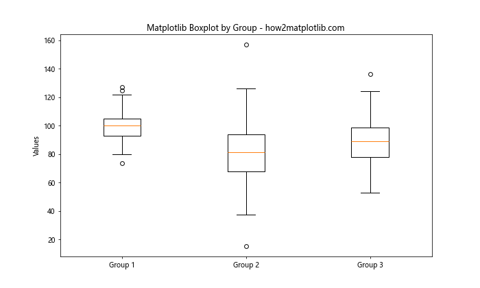
In this example, we’ve created three groups of data and used matplotlib boxplot by group to visualize their distributions side by side. This allows us to quickly compare the central tendencies, spread, and potential outliers across the groups.
Customizing Matplotlib Boxplot by Group
One of the strengths of matplotlib boxplot by group is its high degree of customizability. Let’s explore some ways to enhance our grouped boxplots.
Changing Colors and Styles
We can customize the appearance of our matplotlib boxplot by group by changing colors, line styles, and other visual properties:
import matplotlib.pyplot as plt
import numpy as np

np.random.seed(42)
data = [np.random.normal(0, std, 100) for std in range(1, 4)]

fig, ax = plt.subplots(figsize=(10, 6))
bplot = ax.boxplot(data, patch_artist=True)

colors = ['pink', 'lightblue', 'lightgreen']
for patch, color in zip(bplot['boxes'], colors):
    patch.set_facecolor(color)

ax.set_title('Customized Matplotlib Boxplot by Group - how2matplotlib.com')
ax.set_xticklabels(['Group 1', 'Group 2', 'Group 3'])
plt.show()
Output:
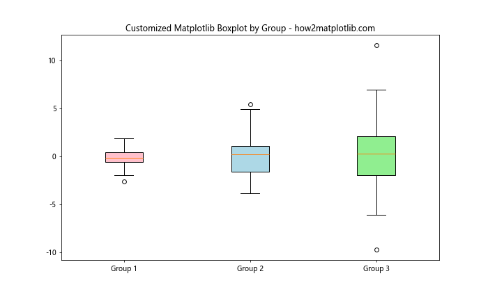
In this example, we’ve used different colors for each box in our matplotlib boxplot by group, making it easier to distinguish between groups.
Adding Notches
Notches can be added to our matplotlib boxplot by group to provide a rough guide to significance of difference of medians:
import matplotlib.pyplot as plt
import numpy as np

np.random.seed(42)
data = [np.random.normal(0, std, 100) for std in range(1, 4)]

fig, ax = plt.subplots(figsize=(10, 6))
ax.boxplot(data, notch=True, patch_artist=True)

ax.set_title('Matplotlib Boxplot by Group with Notches - how2matplotlib.com')
ax.set_xticklabels(['Group 1', 'Group 2', 'Group 3'])
plt.show()
Output:
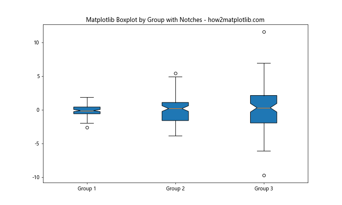
The notches in this matplotlib boxplot by group represent the 95% confidence interval around the median.
Advanced Techniques for Matplotlib Boxplot by Group
Now that we’ve covered the basics, let’s explore some more advanced techniques for creating matplotlib boxplot by group visualizations.
Horizontal Boxplots
While vertical boxplots are more common, horizontal matplotlib boxplot by group can be useful in certain situations, especially when dealing with long category names:
import matplotlib.pyplot as plt
import numpy as np

np.random.seed(42)
data = [np.random.normal(0, std, 100) for std in range(1, 6)]

fig, ax = plt.subplots(figsize=(10, 6))
ax.boxplot(data, vert=False)

ax.set_title('Horizontal Matplotlib Boxplot by Group - how2matplotlib.com')
ax.set_yticklabels(['Group 1', 'Group 2', 'Group 3', 'Group 4', 'Group 5'])
plt.show()
Output:
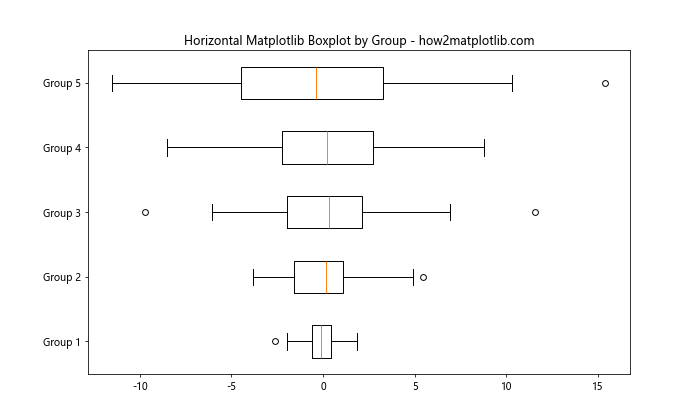
This horizontal matplotlib boxplot by group can be particularly useful when you have many groups or long group names.
Multiple Boxplots in Subplots
When dealing with multiple sets of grouped data, we can create separate subplots for each set:
import matplotlib.pyplot as plt
import numpy as np

np.random.seed(42)
data1 = [np.random.normal(0, std, 100) for std in range(1, 4)]
data2 = [np.random.normal(0, std, 100) for std in range(2, 5)]

fig, (ax1, ax2) = plt.subplots(1, 2, figsize=(15, 6))

ax1.boxplot(data1)
ax1.set_title('Set 1 - how2matplotlib.com')
ax1.set_xticklabels(['Group 1', 'Group 2', 'Group 3'])

ax2.boxplot(data2)
ax2.set_title('Set 2 - how2matplotlib.com')
ax2.set_xticklabels(['Group 1', 'Group 2', 'Group 3'])

plt.suptitle('Multiple Matplotlib Boxplot by Group')
plt.show()
Output:
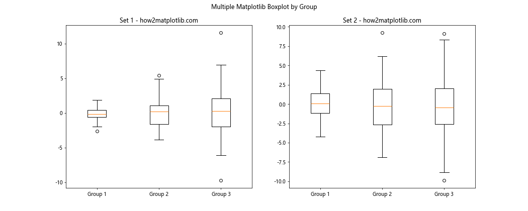
This approach allows us to compare multiple sets of grouped data side by side.
Handling Outliers in Matplotlib Boxplot by Group
Outliers are an important consideration when creating a matplotlib boxplot by group. By default, Matplotlib represents outliers as individual points beyond the whiskers. However, we can customize how outliers are displayed or even remove them entirely.
Customizing Outlier Appearance
Let’s modify the appearance of outliers in our matplotlib boxplot by group:
import matplotlib.pyplot as plt
import numpy as np

np.random.seed(42)
data = [np.random.normal(0, std, 100) for std in range(1, 4)]

fig, ax = plt.subplots(figsize=(10, 6))
ax.boxplot(data, flierprops={'marker': 'o', 'markerfacecolor': 'red', 'markersize': 8})

ax.set_title('Matplotlib Boxplot by Group with Custom Outliers - how2matplotlib.com')
ax.set_xticklabels(['Group 1', 'Group 2', 'Group 3'])
plt.show()
Output:
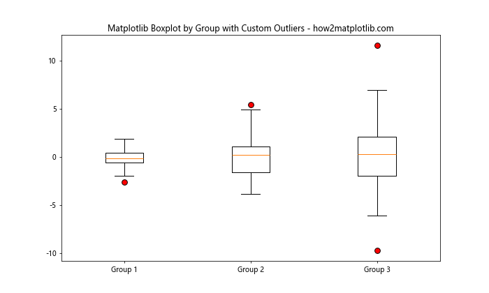
In this example, we’ve customized the outliers in our matplotlib boxplot by group to be red circles, making them more prominent.
Removing Outliers
In some cases, you might want to remove outliers from your matplotlib boxplot by group:
import matplotlib.pyplot as plt
import numpy as np

np.random.seed(42)
data = [np.random.normal(0, std, 100) for std in range(1, 4)]

fig, ax = plt.subplots(figsize=(10, 6))
ax.boxplot(data, showfliers=False)

ax.set_title('Matplotlib Boxplot by Group without Outliers - how2matplotlib.com')
ax.set_xticklabels(['Group 1', 'Group 2', 'Group 3'])
plt.show()
Output:
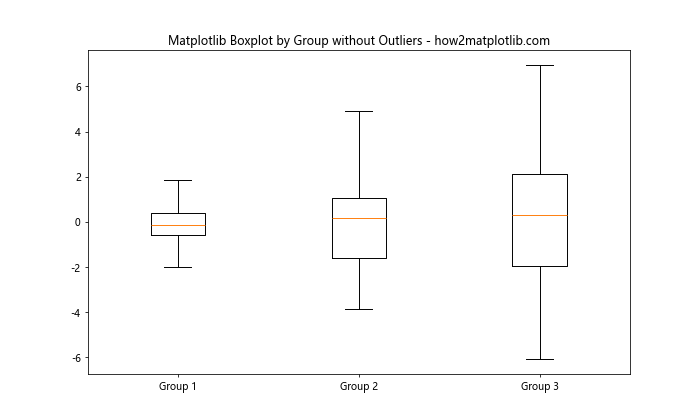
By setting showfliers=False, we’ve removed the outliers from our matplotlib boxplot by group visualization.
Adding Statistical Annotations to Matplotlib Boxplot by Group
To make our matplotlib boxplot by group more informative, we can add statistical annotations such as mean values or significance indicators.
Adding Mean Values
Let’s add mean values to our matplotlib boxplot by group:
import matplotlib.pyplot as plt
import numpy as np

np.random.seed(42)
data = [np.random.normal(0, std, 100) for std in range(1, 4)]

fig, ax = plt.subplots(figsize=(10, 6))
bplot = ax.boxplot(data)

for i, d in enumerate(data):
    y = np.mean(d)
    ax.text(i+1, y, f'Mean: {y:.2f}', ha='center', va='bottom')

ax.set_title('Matplotlib Boxplot by Group with Mean Values - how2matplotlib.com')
ax.set_xticklabels(['Group 1', 'Group 2', 'Group 3'])
plt.show()
Output:
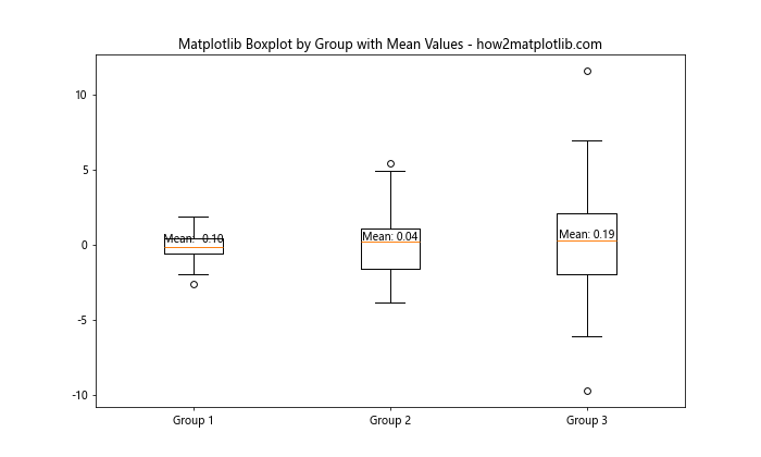
This matplotlib boxplot by group now includes the mean value for each group, providing additional context to the visualization.
Combining Matplotlib Boxplot by Group with Other Plot Types
Matplotlib’s flexibility allows us to combine boxplots with other types of plots for more comprehensive visualizations.
Boxplot with Scatter Plot
Let’s create a matplotlib boxplot by group and overlay it with a scatter plot of the raw data:
import matplotlib.pyplot as plt
import numpy as np

np.random.seed(42)
data = [np.random.normal(0, std, 100) for std in range(1, 4)]

fig, ax = plt.subplots(figsize=(10, 6))
ax.boxplot(data)

for i, d in enumerate(data):
    y = d
    x = np.random.normal(i+1, 0.04, len(y))
    ax.plot(x, y, 'r.', alpha=0.2)

ax.set_title('Matplotlib Boxplot by Group with Scatter Plot - how2matplotlib.com')
ax.set_xticklabels(['Group 1', 'Group 2', 'Group 3'])
plt.show()
Output:
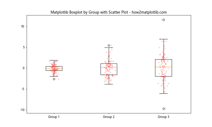
This combination of matplotlib boxplot by group and scatter plot provides a comprehensive view of both the distribution and individual data points.
Handling Large Datasets with Matplotlib Boxplot by Group
When dealing with large datasets, creating a matplotlib boxplot by group can help summarize the data effectively. However, we need to be mindful of performance and visual clarity.
Using Random Sampling
For very large datasets, we can use random sampling to create our matplotlib boxplot by group:
import matplotlib.pyplot as plt
import numpy as np

np.random.seed(42)
large_data = [np.random.normal(0, std, 10000) for std in range(1, 4)]

# Sample 1000 points from each group
sampled_data = [np.random.choice(d, 1000, replace=False) for d in large_data]

fig, ax = plt.subplots(figsize=(10, 6))
ax.boxplot(sampled_data)

ax.set_title('Matplotlib Boxplot by Group with Sampled Data - how2matplotlib.com')
ax.set_xticklabels(['Group 1', 'Group 2', 'Group 3'])
plt.show()
Output:
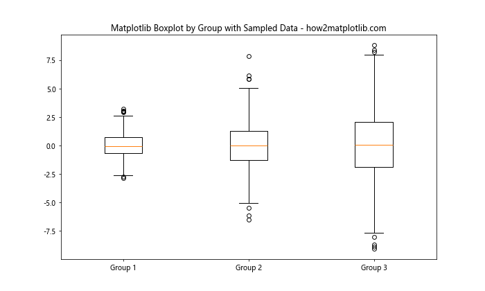
This approach allows us to create a representative matplotlib boxplot by group without the computational overhead of processing the entire dataset.
Creating Interactive Matplotlib Boxplot by Group
While static matplotlib boxplot by group visualizations are useful, interactive plots can provide even more insights. We can use libraries like Plotly, which is built on top of Matplotlib, to create interactive boxplots.
Here’s an example of how to create an interactive matplotlib boxplot by group using Plotly:
import plotly.graph_objects as go
import numpy as np

np.random.seed(42)
data = [np.random.normal(0, std, 100) for std in range(1, 4)]

fig = go.Figure()
for i, d in enumerate(data):
    fig.add_trace(go.Box(y=d, name=f'Group {i+1}'))

fig.update_layout(title='Interactive Matplotlib Boxplot by Group - how2matplotlib.com')
fig.show()
This interactive matplotlib boxplot by group allows users to hover over elements to see exact values, zoom in and out, and more.
Best Practices for Matplotlib Boxplot by Group
When creating a matplotlib boxplot by group, it’s important to follow some best practices to ensure your visualization is effective and informative:
- Choose appropriate group sizes: Ensure that each group in your matplotlib boxplot by group has a sufficient number of data points to make meaningful comparisons.
Order groups logically: Arrange the groups in your matplotlib boxplot by group in a logical order, such as alphabetical or by median value, to facilitate easier comparison.
Use clear labels: Provide clear, descriptive labels for each group in your matplotlib boxplot by group to avoid confusion.
Consider color-coding: Use colors effectively in your matplotlib boxplot by group to distinguish between groups or highlight important features.
Include a legend: If using colors or patterns, include a legend in your matplotlib boxplot by group to explain what each represents.
Add context: Include titles, axis labels, and any necessary annotations to provide context for your matplotlib boxplot by group.
Here’s an example that incorporates these best practices: