Matplotlib Box Plots
Box plots, also known as box-and-whisker plots, are a graphical representation of statistical data based on the minimum, first quartile, median, third quartile, and maximum. They are useful for highlighting the central tendency, dispersion, and skewness of the data, as well as identifying outliers. In this article, we will explore how to create box plots using Matplotlib, a comprehensive library for creating static, animated, and interactive visualizations in Python.
Introduction to Box Plots
A box plot displays the five-number summary of a set of data: the minimum, first quartile (Q1), median (Q2), third quartile (Q3), and maximum. These components are crucial for understanding the distribution of data. The box represents the interquartile range (IQR), which is the distance between the first and third quartiles. The line inside the box shows the median of the data. Whiskers extend from the box to show the range of the data, and points outside of the whiskers are considered outliers.
Creating a Basic Box Plot
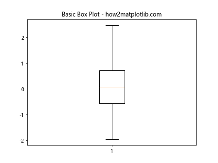
Let’s start with a basic example of a box plot. This example will show you how to create a simple box plot using Matplotlib.
import matplotlib.pyplot as plt
import numpy as np

data = np.random.normal(loc=0, scale=1, size=100)
plt.boxplot(data)
plt.title("Basic Box Plot - how2matplotlib.com")
plt.show()
Output:
Customizing Box Plots
Matplotlib allows for extensive customization of box plots. You can change the properties of the boxes, whiskers, caps, medians, and fliers (outliers).
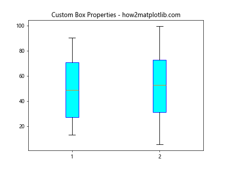
Changing Box Properties
import matplotlib.pyplot as plt
import numpy as np

data = np.random.rand(10, 2) * 100
plt.boxplot(data, patch_artist=True, boxprops=dict(facecolor="cyan", color="blue"))
plt.title("Custom Box Properties - how2matplotlib.com")
plt.show()
Output:
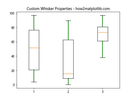
Modifying Whisker Properties
import matplotlib.pyplot as plt
import numpy as np

data = np.random.rand(10, 3) * 100
plt.boxplot(data, whiskerprops=dict(color="green", linewidth=2))
plt.title("Custom Whisker Properties - how2matplotlib.com")
plt.show()
Output:
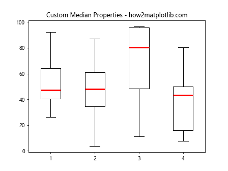
Adjusting Median Properties
import matplotlib.pyplot as plt
import numpy as np

data = np.random.rand(10, 4) * 100
plt.boxplot(data, medianprops=dict(color="red", linewidth=3))
plt.title("Custom Median Properties - how2matplotlib.com")
plt.show()
Output:
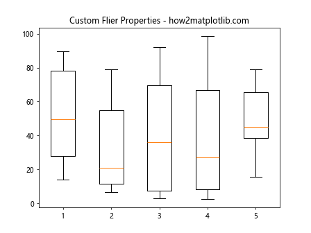
Customizing Flier (Outlier) Properties
import matplotlib.pyplot as plt
import numpy as np

data = np.random.rand(10, 5) * 100
plt.boxplot(data, flierprops=dict(marker='o', color='yellow', markersize=12))
plt.title("Custom Flier Properties - how2matplotlib.com")
plt.show()
Output:
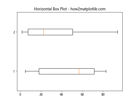
Horizontal Box Plots
Box plots can be oriented horizontally by setting the vert parameter to False.
import matplotlib.pyplot as plt
import numpy as np

data = np.random.rand(10, 2) * 100
plt.boxplot(data, vert=False)
plt.title("Horizontal Box Plot - how2matplotlib.com")
plt.show()
Output:
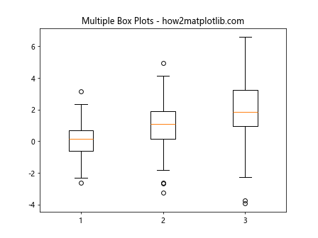
Multiple Box Plots
You can display multiple box plots side-by-side to compare different datasets.
import matplotlib.pyplot as plt
import numpy as np

data1 = np.random.normal(0, 1, 100)
data2 = np.random.normal(1, 1.5, 100)
data3 = np.random.normal(2, 2, 100)
data = [data1, data2, data3]

plt.boxplot(data)
plt.title("Multiple Box Plots - how2matplotlib.com")
plt.show()
Output:
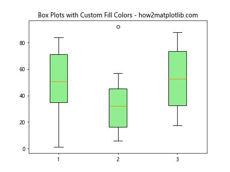
Box Plots with Custom Fill Colors
You can customize the fill colors of box plots to enhance their visual appeal.
import matplotlib.pyplot as plt
import numpy as np

data = np.random.rand(10, 3) * 100
plt.boxplot(data, patch_artist=True, boxprops=dict(facecolor="lightgreen"))
plt.title("Box Plots with Custom Fill Colors - how2matplotlib.com")
plt.show()
Output:
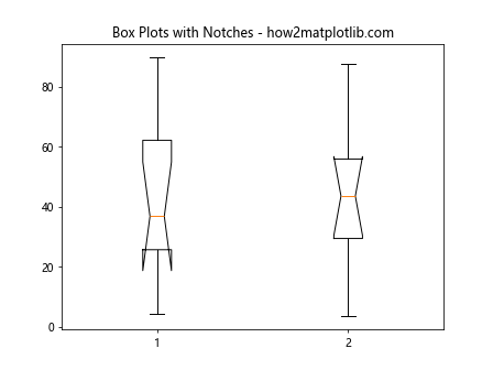
Box Plots with Notches
Adding notches to a box plot can provide a visual indication of the confidence interval around the median.
import matplotlib.pyplot as plt
import numpy as np

data = np.random.rand(10, 2) * 100
plt.boxplot(data, notch=True)
plt.title("Box Plots with Notches - how2matplotlib.com")
plt.show()
Output:
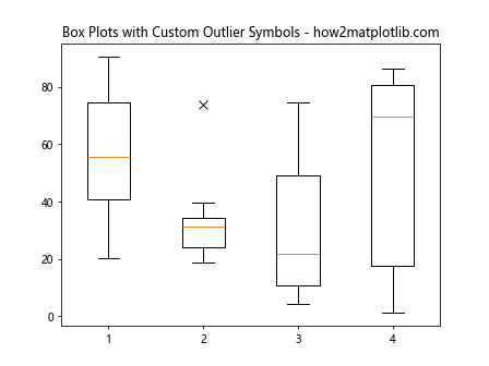
Box Plots with Custom Outlier Symbols
You can customize the appearance of outliers using the flierprops parameter.
import matplotlib.pyplot as plt
import numpy as np

data = np.random.rand(10, 4) * 100
plt.boxplot(data, flierprops=dict(marker='x', color='purple', markersize=8))
plt.title("Box Plots with Custom Outlier Symbols - how2matplotlib.com")
plt.show()
Output:
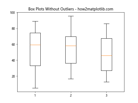
Box Plots Without Outliers
It’s possible to create box plots that do not display outliers by setting the showfliers parameter to False.
import matplotlib.pyplot as plt
import numpy as np

data = np.random.rand(10, 3) * 100
plt.boxplot(data, showfliers=False)
plt.title("Box Plots Without Outliers - how2matplotlib.com")
plt.show()
Output:
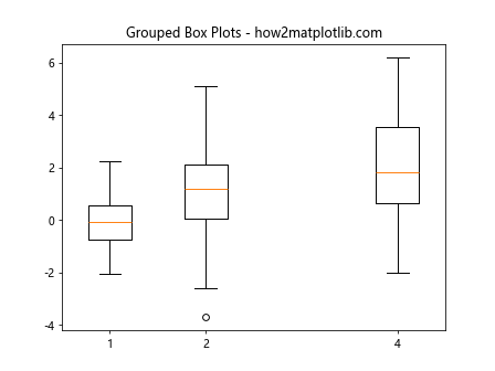
Grouped Box Plots
Grouped box plots can be created to compare distributions across different categories.
import matplotlib.pyplot as plt
import numpy as np

data1 = np.random.normal(0, 1, 100)
data2 = np.random.normal(1, 1.5, 100)
data3 = np.random.normal(2, 2, 100)
data = [data1, data2, data3]

positions = [1, 2, 4]
plt.boxplot(data, positions=positions)
plt.title("Grouped Box Plots - how2matplotlib.com")
plt.show()
Output:
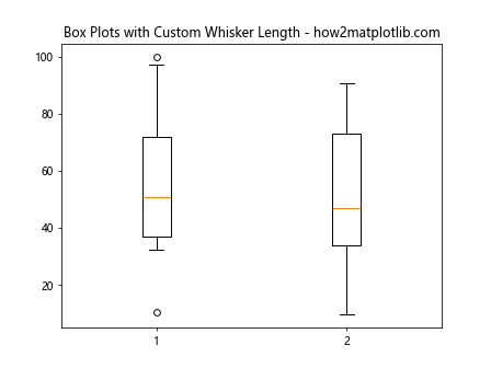
Box Plots with Custom Whisker Length
The length of the whiskers can be customized by setting the whis parameter.
import matplotlib.pyplot as plt
import numpy as np

data = np.random.rand(10, 2) * 100
plt.boxplot(data, whis=0.75)
plt.title("Box Plots with Custom Whisker Length - how2matplotlib.com")
plt.show()
Output:
Conclusion
Box plots are a powerful tool for statistical analysis, providing a compact representation of data distributions. With Matplotlib, you can create, customize, and compare box plots with ease. By adjusting properties such as color, width, orientation, and outlier symbols, you can tailor your plots to your specific needs, making your data analysis both effective and visually appealing. Whether you’re exploring a single dataset or comparing multiple groups, box plots can provide valuable insights into your data’s structure and outliers.