How to Create Matplotlib Bar Charts with Error Bars: A Comprehensive Guide
Matplotlib bar charts with error bars are powerful tools for visualizing data with uncertainty or variability. This article will provide a detailed exploration of how to create and customize bar charts with error bars using Matplotlib, a popular plotting library in Python. We’ll cover various aspects of creating these charts, from basic implementations to advanced customization techniques.
Introduction to Matplotlib Bar Charts with Error Bars
Matplotlib bar charts with error bars are essential for presenting data that includes measures of uncertainty or variability. These charts combine the simplicity of bar charts with the added information provided by error bars, making them ideal for scientific, statistical, and data analysis presentations.
Let’s start with a basic example of a Matplotlib bar chart with error bars:
import matplotlib.pyplot as plt
import numpy as np

categories = ['A', 'B', 'C', 'D']
values = [3, 7, 5, 9]
errors = [0.5, 1, 0.8, 1.2]

plt.figure(figsize=(8, 6))
plt.bar(categories, values, yerr=errors, capsize=5)
plt.title('Basic Matplotlib Bar Chart with Error Bars - how2matplotlib.com')
plt.xlabel('Categories')
plt.ylabel('Values')
plt.show()
Output:
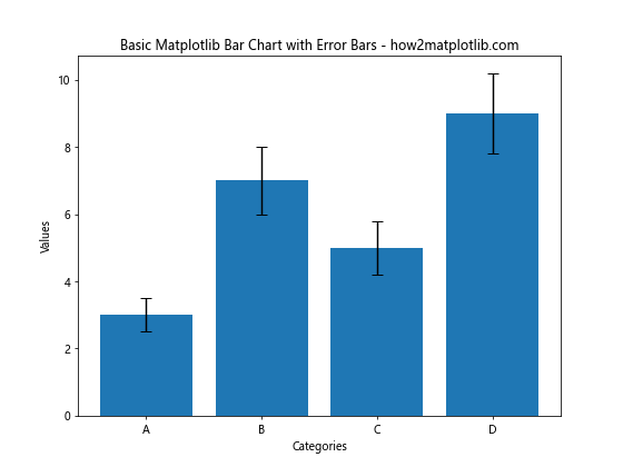
In this example, we create a simple bar chart with error bars using plt.bar(). The yerr parameter is used to specify the error values, and capsize determines the width of the error bar caps.
Understanding the Components of Matplotlib Bar Charts with Error Bars
To effectively create and customize Matplotlib bar charts with error bars, it’s crucial to understand their key components:
- Bars: The main visual elements representing data values.
- Error bars: Vertical lines indicating the range of uncertainty or variability.
- Caps: Horizontal lines at the ends of error bars.
- X-axis: Typically represents categories or groups.
- Y-axis: Represents the measured values.
- Labels and titles: Provide context and information about the data.
Let’s create a more detailed example to illustrate these components:
import matplotlib.pyplot as plt
import numpy as np

categories = ['Group A', 'Group B', 'Group C', 'Group D']
values = [4.2, 6.7, 5.3, 8.1]
errors = [0.3, 0.6, 0.4, 0.7]

fig, ax = plt.subplots(figsize=(10, 7))
bars = ax.bar(categories, values, yerr=errors, capsize=7, color='skyblue', edgecolor='navy')

ax.set_title('Detailed Matplotlib Bar Chart with Error Bars - how2matplotlib.com', fontsize=16)
ax.set_xlabel('Categories', fontsize=12)
ax.set_ylabel('Values', fontsize=12)

for bar in bars:
    height = bar.get_height()
    ax.text(bar.get_x() + bar.get_width()/2, height, f'{height:.1f}',
            ha='center', va='bottom')

plt.show()
Output:
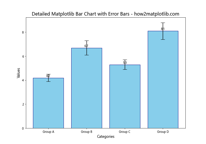
This example demonstrates how to create a more detailed bar chart with error bars, including custom colors, bar value labels, and adjusted font sizes for better readability.
Creating Grouped Bar Charts with Error Bars
Grouped bar charts with error bars are useful for comparing multiple sets of data across categories. Here’s how to create a grouped bar chart with error bars using Matplotlib:
import matplotlib.pyplot as plt
import numpy as np

categories = ['Category A', 'Category B', 'Category C', 'Category D']
group1_values = [4, 7, 5, 9]
group2_values = [3, 6, 4, 8]
group1_errors = [0.5, 0.8, 0.6, 1]
group2_errors = [0.4, 0.7, 0.5, 0.9]

x = np.arange(len(categories))
width = 0.35

fig, ax = plt.subplots(figsize=(12, 7))
rects1 = ax.bar(x - width/2, group1_values, width, yerr=group1_errors, label='Group 1', capsize=5)
rects2 = ax.bar(x + width/2, group2_values, width, yerr=group2_errors, label='Group 2', capsize=5)

ax.set_title('Grouped Matplotlib Bar Chart with Error Bars - how2matplotlib.com', fontsize=16)
ax.set_xlabel('Categories', fontsize=12)
ax.set_ylabel('Values', fontsize=12)
ax.set_xticks(x)
ax.set_xticklabels(categories)
ax.legend()

plt.tight_layout()
plt.show()
Output:
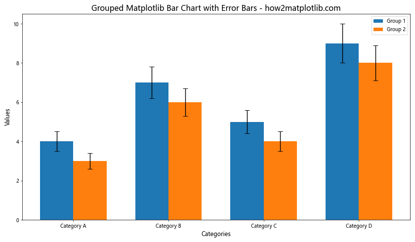
This example shows how to create a grouped bar chart with error bars for two different groups across multiple categories. The width parameter is used to control the width of the bars, and the positioning is adjusted to create the grouped effect.
Customizing Error Bar Appearance
Matplotlib offers various options to customize the appearance of error bars. Let’s explore some of these customization techniques:
import matplotlib.pyplot as plt
import numpy as np

categories = ['A', 'B', 'C', 'D']
values = [5, 8, 6, 9]
errors = [1, 1.5, 0.8, 1.2]

fig, ax = plt.subplots(figsize=(10, 7))
ax.bar(categories, values, yerr=errors, capsize=10,
       ecolor='red', color='lightblue', edgecolor='navy', linewidth=2,
       error_kw={'elinewidth': 2, 'capthick': 2})

ax.set_title('Customized Error Bars in Matplotlib - how2matplotlib.com', fontsize=16)
ax.set_xlabel('Categories', fontsize=12)
ax.set_ylabel('Values', fontsize=12)

plt.show()
Output:
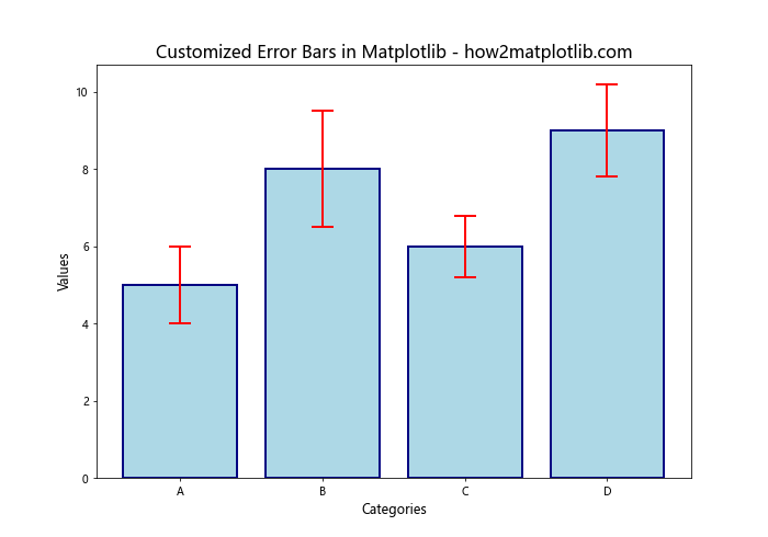
In this example, we customize the error bars by:
- Setting a larger
capsize - Changing the error bar color with
ecolor - Adjusting the line width of the bars and error bars
- Modifying the error bar line width and cap thickness using
error_kw
Adding Error Bars to Horizontal Bar Charts
While vertical bar charts are common, horizontal bar charts can be useful in certain scenarios, especially when dealing with long category names. Here’s how to create a horizontal bar chart with error bars:
import matplotlib.pyplot as plt
import numpy as np

categories = ['Long Category Name A', 'Long Category Name B', 'Long Category Name C', 'Long Category Name D']
values = [4, 7, 5, 8]
errors = [0.5, 0.8, 0.6, 0.9]

fig, ax = plt.subplots(figsize=(10, 8))
ax.barh(categories, values, xerr=errors, capsize=5, color='lightgreen', edgecolor='darkgreen')

ax.set_title('Horizontal Matplotlib Bar Chart with Error Bars - how2matplotlib.com', fontsize=16)
ax.set_xlabel('Values', fontsize=12)
ax.set_ylabel('Categories', fontsize=12)

ax.invert_yaxis()  # To display categories from top to bottom

plt.tight_layout()
plt.show()
Output:
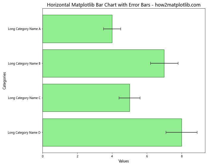
In this example, we use ax.barh() to create horizontal bars. The xerr parameter is used instead of yerr for horizontal error bars. We also invert the y-axis to display categories from top to bottom, which is a common convention for horizontal bar charts.
Handling Asymmetric Error Bars
Sometimes, error bars may not be symmetric. Matplotlib allows you to specify different values for the upper and lower parts of the error bars. Here’s how to create a bar chart with asymmetric error bars:
import matplotlib.pyplot as plt
import numpy as np

categories = ['A', 'B', 'C', 'D']
values = [5, 7, 4, 8]
lower_errors = [0.5, 0.8, 0.3, 0.7]
upper_errors = [1, 1.5, 0.6, 1.2]

fig, ax = plt.subplots(figsize=(10, 7))
ax.bar(categories, values, yerr=[lower_errors, upper_errors], capsize=7,
       color='lightsalmon', edgecolor='red')

ax.set_title('Matplotlib Bar Chart with Asymmetric Error Bars - how2matplotlib.com', fontsize=16)
ax.set_xlabel('Categories', fontsize=12)
ax.set_ylabel('Values', fontsize=12)

plt.show()
Output:
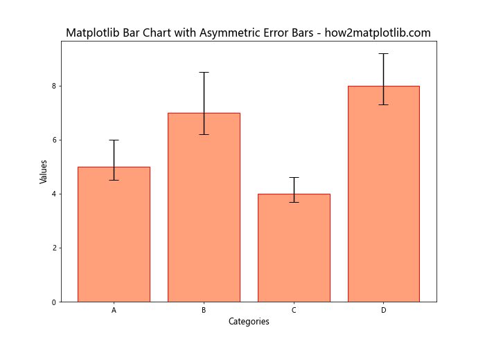
In this example, we pass a list of two arrays to the yerr parameter: [lower_errors, upper_errors]. This allows us to specify different values for the lower and upper parts of each error bar.
Creating Stacked Bar Charts with Error Bars
Stacked bar charts can be useful for showing the composition of each category while also displaying error bars. Here’s an example of how to create a stacked bar chart with error bars:
import matplotlib.pyplot as plt
import numpy as np

categories = ['A', 'B', 'C', 'D']
values1 = [3, 4, 2, 5]
values2 = [2, 3, 3, 4]
errors1 = [0.5, 0.7, 0.4, 0.8]
errors2 = [0.3, 0.5, 0.6, 0.7]

fig, ax = plt.subplots(figsize=(10, 7))
ax.bar(categories, values1, yerr=errors1, capsize=5, label='Group 1', color='lightblue')
ax.bar(categories, values2, yerr=errors2, capsize=5, label='Group 2', color='lightgreen', bottom=values1)

ax.set_title('Stacked Matplotlib Bar Chart with Error Bars - how2matplotlib.com', fontsize=16)
ax.set_xlabel('Categories', fontsize=12)
ax.set_ylabel('Values', fontsize=12)
ax.legend()

plt.show()
Output:
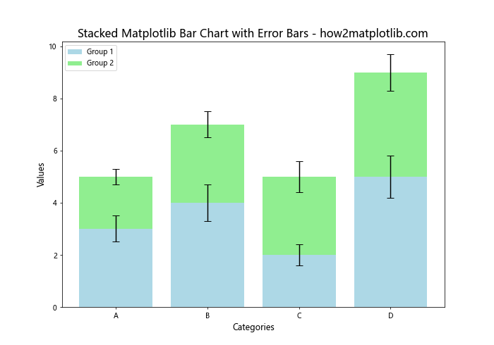
In this example, we create two sets of bars using ax.bar(). The second set of bars is stacked on top of the first by using the bottom parameter. Error bars are added to both sets of bars.
Adding Data Labels to Bar Charts with Error Bars
Adding data labels to your bar charts can make them more informative. Here’s how to add labels to a bar chart with error bars:
import matplotlib.pyplot as plt
import numpy as np

categories = ['A', 'B', 'C', 'D']
values = [4.2, 6.7, 5.3, 8.1]
errors = [0.5, 0.8, 0.6, 1]

fig, ax = plt.subplots(figsize=(10, 7))
bars = ax.bar(categories, values, yerr=errors, capsize=7, color='lightcoral', edgecolor='red')

ax.set_title('Matplotlib Bar Chart with Error Bars and Labels - how2matplotlib.com', fontsize=16)
ax.set_xlabel('Categories', fontsize=12)
ax.set_ylabel('Values', fontsize=12)

for bar in bars:
    height = bar.get_height()
    ax.text(bar.get_x() + bar.get_width()/2, height, f'{height:.1f}',
            ha='center', va='bottom')

plt.show()
Output:
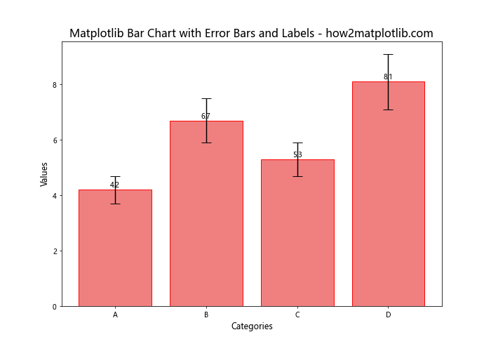
In this example, we iterate through the bars and add text labels above each bar showing the value. The ha and va parameters control the horizontal and vertical alignment of the text.
Customizing Bar Width and Spacing
Adjusting the width and spacing of bars can improve the visual appeal of your chart. Here’s how to customize these aspects:
import matplotlib.pyplot as plt
import numpy as np

categories = ['A', 'B', 'C', 'D', 'E']
values = [4, 7, 5, 8, 6]
errors = [0.5, 0.8, 0.6, 1, 0.7]

fig, ax = plt.subplots(figsize=(12, 7))
x = np.arange(len(categories))
width = 0.6

bars = ax.bar(x, values, width, yerr=errors, capsize=7, color='skyblue', edgecolor='navy')

ax.set_title('Matplotlib Bar Chart with Custom Width and Spacing - how2matplotlib.com', fontsize=16)
ax.set_xlabel('Categories', fontsize=12)
ax.set_ylabel('Values', fontsize=12)
ax.set_xticks(x)
ax.set_xticklabels(categories)

plt.tight_layout()
plt.show()
Output:
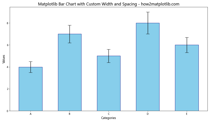
In this example, we use np.arange() to create evenly spaced x-coordinates for the bars. The width parameter controls the width of the bars. By adjusting these values, you can control the spacing between bars.
Creating Bar Charts with Confidence Intervals
Error bars can also represent confidence intervals. Here’s an example of how to create a bar chart with confidence intervals:
import matplotlib.pyplot as plt
import numpy as np
from scipy import stats

categories = ['A', 'B', 'C', 'D']
values = [5, 7, 4, 8]
sample_sizes = [50, 60, 45, 55]

confidence_level = 0.95
confidence_intervals = []

for value, n in zip(values, sample_sizes):
    sem = stats.sem([value] * n)
    ci = stats.t.interval(confidence_level, n-1, loc=value, scale=sem)
    confidence_intervals.append((value - ci[0], ci[1] - value))

fig, ax = plt.subplots(figsize=(10, 7))
ax.bar(categories, values, yerr=np.array(confidence_intervals).T, capsize=7,
       color='lightgreen', edgecolor='darkgreen')

ax.set_title(f'Matplotlib Bar Chart with {confidence_level*100}% Confidence Intervals - how2matplotlib.com', fontsize=16)
ax.set_xlabel('Categories', fontsize=12)
ax.set_ylabel('Values', fontsize=12)

plt.show()
Output:
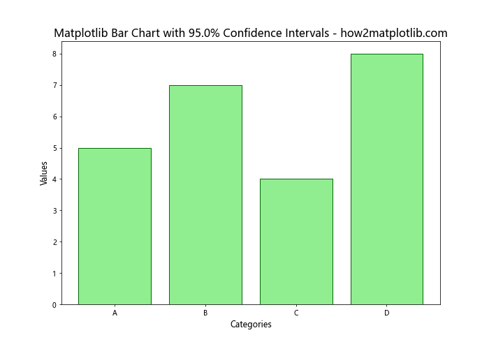
In this example, we calculate confidence intervals using the t-distribution from scipy.stats. The error bars represent the lower and upper bounds of the confidence intervals.
Handling Negative Values in Bar Charts with Error Bars
When dealing with data that includes negative values, it’s important to adjust your bar chart accordingly. Here’s how to create a bar chart with error bars that includes negative values:
import matplotlib.pyplot as plt
import numpy as np

categories = ['A', 'B', 'C', 'D', 'E']
values = [3, -2, 5, -1, 4]
errors = [0.5, 0.3, 0.7, 0.2, 0.6]

fig, ax = plt.subplots(figsize=(10, 7))
bars = ax.bar(categories, values, yerr=errors, capsize=7, color='lightblue', edgecolor='navy')

ax.set_title('Matplotlib Bar Chart with Error Bars and Negative Values - how2matplotlib.com', fontsize=16)
ax.set_xlabel('Categories', fontsize=12)
ax.set_ylabel('Values', fontsize=12)

ax.axhline(y=0, color='k', linestyle='-', linewidth=0.5)

for bar in bars:
    height = bar.get_height()
    ax.text(bar.get_x() + bar.get_width()/2, height, f'{height:.1f}',
            ha='center', va='bottom' if height >= 0 else 'top')

plt.show()
Output:
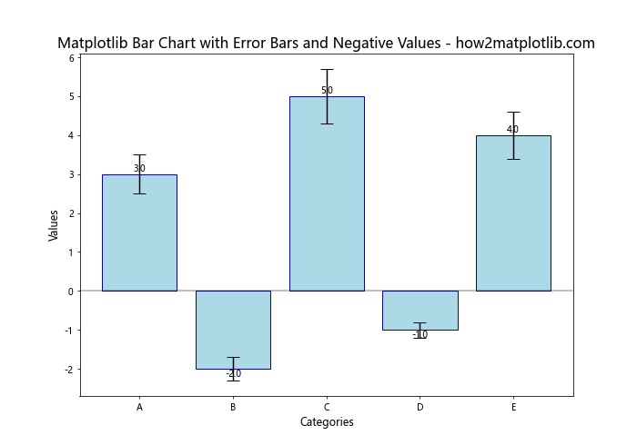
In this example, we add a horizontal line at y=0 using ax.axhline() to clearly show the zero baseline. We also adjust the vertical alignment of the data labels based on whether the value is positive or negative.
Creating Logarithmic Scale Bar Charts with Error Bars
For data with a wide range of values, a logarithmic scale can be useful. Here’s how to create a bar chart with error bars using a logarithmic y-axis:
import matplotlib.pyplot as plt
import numpy as np

categories = ['A', 'B', 'C', 'D']
values = [100, 1000, 500, 5000]
errors = [20, 200, 100, 1000]

fig, ax = plt.subplots(figsize=(10, 7))
ax.bar(categories, values, yerr=errors, capsize=7, color='lightsalmon', edgecolor='red')

ax.set_yscale('log')
ax.set_title('Logarithmic Matplotlib Bar Chart with Error Bars - how2matplotlib.com', fontsize=16)
ax.set_xlabel('Categories', fontsize=12)
ax.set_ylabel('Values (log scale)', fontsize=12)

for i, v in enumerate(values):
    ax.text(i, v, f'{v}', ha='center', va='bottom')

plt.show()
Output:
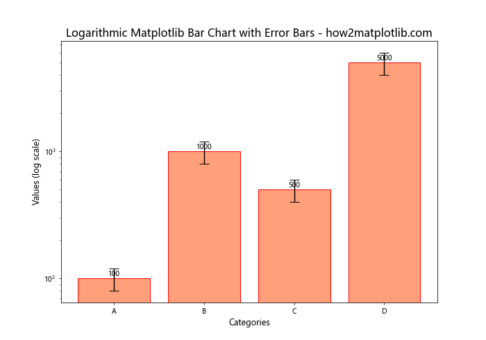
In this example, we use ax.set_yscale('log') to set the y-axis to a logarithmic scale. This is particularly useful when dealing with data that spans several orders of magnitude.
Customizing Error Bar Colors and Styles
You can further customize the appearance of error bars by changing their colors and styles. Here’s an example:
import matplotlib.pyplot as plt
import numpy as np

categories = ['A', 'B', 'C', 'D']
values = [4, 7, 5, 8]
errors = [0.5, 0.8, 0.6, 1]

fig, ax = plt.subplots(figsize=(10, 7))
ax.bar(categories, values, yerr=errors, capsize=7, color='lightblue', edgecolor='navy',
       error_kw={'ecolor': 'red', 'capthick': 2, 'elinewidth': 2, 'linestyle': '--'})

ax.set_title('Matplotlib Bar Chart with Customized Error Bars - how2matplotlib.com', fontsize=16)
ax.set_xlabel('Categories', fontsize=12)
ax.set_ylabel('Values', fontsize=12)

plt.show()
Output:
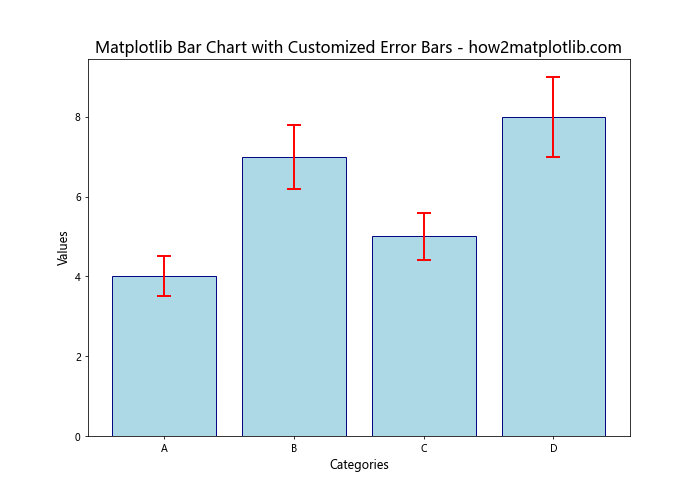
In this example, we use the error_kw parameter to customize the error bars. We set a different color for the error bars, increase the thickness of the caps and lines, and change the line style to dashed.
Creating Multi-Series Bar Charts with Error Bars
When dealing with multiple series of data, you can create a more complex bar chart with error bars for each series. Here’s an example:
import matplotlib.pyplot as plt
import numpy as np

categories = ['A', 'B', 'C', 'D']
series1 = [4, 7, 5, 8]
series2 = [3, 6, 4, 7]
series3 = [5, 8, 6, 9]
errors1 = [0.5, 0.8, 0.6, 1]
errors2 = [0.4, 0.7, 0.5, 0.9]
errors3 = [0.6, 0.9, 0.7, 1.1]

x = np.arange(len(categories))
width = 0.25

fig, ax = plt.subplots(figsize=(12, 7))
rects1 = ax.bar(x - width, series1, width, yerr=errors1, label='Series 1', capsize=5, color='lightblue')
rects2 = ax.bar(x, series2, width, yerr=errors2, label='Series 2', capsize=5, color='lightgreen')
rects3 = ax.bar(x + width, series3, width, yerr=errors3, label='Series 3', capsize=5, color='lightsalmon')

ax.set_title('Multi-Series Matplotlib Bar Chart with Error Bars - how2matplotlib.com', fontsize=16)
ax.set_xlabel('Categories', fontsize=12)
ax.set_ylabel('Values', fontsize=12)
ax.set_xticks(x)
ax.set_xticklabels(categories)
ax.legend()

plt.tight_layout()
plt.show()
Output:
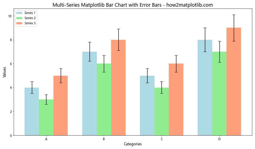
This example demonstrates how to create a bar chart with three different series, each with its own error bars. The bars are positioned side by side for easy comparison across categories.
Adding a Secondary Y-Axis with Error Bars
In some cases, you might want to display two different scales on the same chart. Here’s how to create a bar chart with error bars and a secondary y-axis:
import matplotlib.pyplot as plt
import numpy as np

categories = ['A', 'B', 'C', 'D']
values1 = [4, 7, 5, 8]
values2 = [40, 70, 50, 80]
errors1 = [0.5, 0.8, 0.6, 1]
errors2 = [5, 8, 6, 10]

fig, ax1 = plt.subplots(figsize=(10, 7))

ax1.bar(categories, values1, yerr=errors1, capsize=7, color='lightblue', edgecolor='navy', label='Series 1')
ax1.set_xlabel('Categories', fontsize=12)
ax1.set_ylabel('Values (Series 1)', fontsize=12, color='navy')
ax1.tick_params(axis='y', labelcolor='navy')

ax2 = ax1.twinx()
ax2.bar(categories, values2, yerr=errors2, capsize=7, color='lightgreen', edgecolor='darkgreen', alpha=0.5, label='Series 2')
ax2.set_ylabel('Values (Series 2)', fontsize=12, color='darkgreen')
ax2.tick_params(axis='y', labelcolor='darkgreen')

plt.title('Matplotlib Bar Chart with Error Bars and Secondary Y-Axis - how2matplotlib.com', fontsize=16)

fig.legend(loc='upper right', bbox_to_anchor=(1, 1), bbox_transform=ax1.transAxes)

plt.tight_layout()
plt.show()
Output:
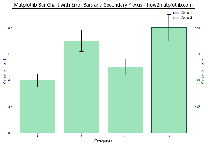
In this example, we create two y-axes using ax1.twinx(). This allows us to plot two series with different scales on the same chart, each with its own error bars.
Animating Bar Charts with Error Bars
Creating animated bar charts with error bars can be useful for showing changes over time. Here’s a simple example using Matplotlib’s animation functionality:
import matplotlib.pyplot as plt
import matplotlib.animation as animation
import numpy as np

categories = ['A', 'B', 'C', 'D']
frames = 50

fig, ax = plt.subplots(figsize=(10, 7))

def animate(i):
    ax.clear()
    values = np.random.randint(1, 10, size=4)
    errors = np.random.rand(4)

    ax.bar(categories, values, yerr=errors, capsize=7, color='lightblue', edgecolor='navy')
    ax.set_title(f'Animated Matplotlib Bar Chart with Error Bars - Frame {i+1} - how2matplotlib.com', fontsize=16)
    ax.set_xlabel('Categories', fontsize=12)
    ax.set_ylabel('Values', fontsize=12)
    ax.set_ylim(0, 12)

ani = animation.FuncAnimation(fig, animate, frames=frames, interval=200, repeat=False)

plt.tight_layout()
plt.show()
Output:
This example creates an animation where the bar heights and error bar values change randomly in each frame. Note that to save this animation, you would need to use a writer like FFMpegWriter or PillowWriter.
Matplotlib bar charts with error bars Conclusion
Matplotlib bar charts with error bars are versatile tools for data visualization, offering numerous customization options to effectively communicate your data and its associated uncertainty. Throughout this article, we’ve explored various techniques for creating, customizing, and enhancing these charts, from basic implementations to more advanced features.
Key points to remember when working with Matplotlib bar charts with error bars include:
- Use
plt.bar()orax.bar()to create bar charts, and specify error bars with theyerrparameter. - Customize the appearance of bars and error bars using parameters like
color,edgecolor,capsize, anderror_kw. - Create grouped, stacked, and multi-series bar charts to compare different categories or groups of data.
- Adjust scales, add secondary axes, and implement animations to enhance the information conveyed by your charts.
- Always provide clear labels, titles, and legends to ensure your charts are easily interpretable.
By mastering these techniques, you can create informative and visually appealing bar charts with error bars that effectively communicate your data and its associated uncertainty. Whether you’re working in scientific research, data analysis, or any field that requires the presentation of data with error margins, Matplotlib provides the tools you need to create professional-quality visualizations.