How to Create and Customize Matplotlib Bar Charts with Rotated X-axis Labels
Matplotlib bar chart rotate x labels is a common technique used in data visualization to improve the readability of bar charts with long or numerous x-axis labels. This article will explore various aspects of creating and customizing bar charts in Matplotlib, with a focus on rotating x-axis labels. We’ll cover everything from basic bar chart creation to advanced customization techniques, providing numerous examples along the way.
Introduction to Matplotlib Bar Charts and Label Rotation
Matplotlib is a powerful plotting library for Python that allows users to create a wide variety of charts and graphs. Bar charts are one of the most commonly used types of visualizations, especially when dealing with categorical data. However, when working with bar charts that have long or numerous x-axis labels, it’s often necessary to rotate these labels to prevent overlapping and improve readability. This is where the concept of matplotlib bar chart rotate x labels comes into play.
Let’s start with a basic example of creating a bar chart with rotated x-axis labels:
import matplotlib.pyplot as plt

categories = ['Category A', 'Category B', 'Category C', 'Category D', 'Category E']
values = [23, 45, 56, 78, 32]

plt.figure(figsize=(10, 6))
plt.bar(categories, values)
plt.xlabel('Categories')
plt.ylabel('Values')
plt.title('Basic Bar Chart with Rotated X Labels - how2matplotlib.com')
plt.xticks(rotation=45, ha='right')
plt.tight_layout()
plt.show()
Output:

In this example, we create a simple bar chart using plt.bar(). The key part for rotating the x-axis labels is the plt.xticks(rotation=45, ha='right') line. This rotates the labels by 45 degrees and aligns them to the right for better readability.
Understanding the Importance of Rotating X-axis Labels
Rotating x-axis labels in a matplotlib bar chart is crucial when dealing with:
- Long label names
- A large number of categories
- Limited horizontal space
By implementing matplotlib bar chart rotate x labels, we can:
- Prevent label overlap
- Improve readability
- Maximize space utilization
- Enhance the overall aesthetics of the chart
Let’s look at an example that demonstrates the difference between non-rotated and rotated labels:
import matplotlib.pyplot as plt

long_categories = ['Very Long Category A', 'Extremely Long Category B',
                   'Incredibly Long Category C', 'Unbelievably Long Category D']
values = [10, 20, 15, 25]

fig, (ax1, ax2) = plt.subplots(2, 1, figsize=(12, 10))

# Non-rotated labels
ax1.bar(long_categories, values)
ax1.set_title('Bar Chart with Non-Rotated Labels - how2matplotlib.com')
ax1.set_xlabel('Categories')
ax1.set_ylabel('Values')

# Rotated labels
ax2.bar(long_categories, values)
ax2.set_title('Bar Chart with Rotated Labels - how2matplotlib.com')
ax2.set_xlabel('Categories')
ax2.set_ylabel('Values')
ax2.set_xticklabels(long_categories, rotation=45, ha='right')

plt.tight_layout()
plt.show()
Output:
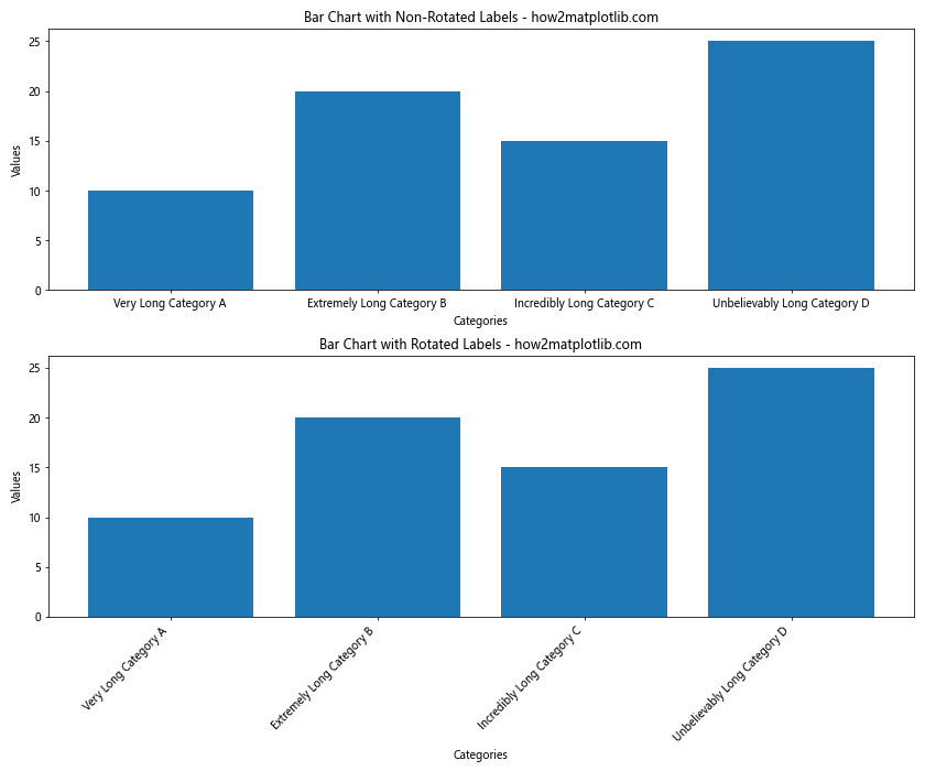
This example creates two subplots: one with non-rotated labels and another with rotated labels. The difference in readability is immediately apparent.
Basic Techniques for Rotating X-axis Labels in Matplotlib Bar Charts
There are several ways to rotate x-axis labels in a matplotlib bar chart. Let’s explore some basic techniques:
Using plt.xticks()
The simplest method to rotate x-axis labels is using the plt.xticks() function:
import matplotlib.pyplot as plt

categories = ['A', 'B', 'C', 'D', 'E']
values = [10, 20, 15, 25, 30]

plt.figure(figsize=(8, 6))
plt.bar(categories, values)
plt.title('Bar Chart with Rotated Labels using plt.xticks() - how2matplotlib.com')
plt.xlabel('Categories')
plt.ylabel('Values')
plt.xticks(rotation=45)
plt.tight_layout()
plt.show()
Output:
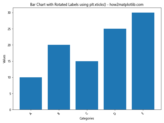
In this example, plt.xticks(rotation=45) rotates all x-axis labels by 45 degrees.
Using ax.set_xticklabels()
When working with Axes objects, you can use the set_xticklabels() method:
import matplotlib.pyplot as plt

categories = ['Category 1', 'Category 2', 'Category 3', 'Category 4', 'Category 5']
values = [15, 25, 20, 35, 30]

fig, ax = plt.subplots(figsize=(8, 6))
ax.bar(categories, values)
ax.set_title('Bar Chart with Rotated Labels using set_xticklabels() - how2matplotlib.com')
ax.set_xlabel('Categories')
ax.set_ylabel('Values')
ax.set_xticklabels(categories, rotation=60, ha='right')
plt.tight_layout()
plt.show()
Output:
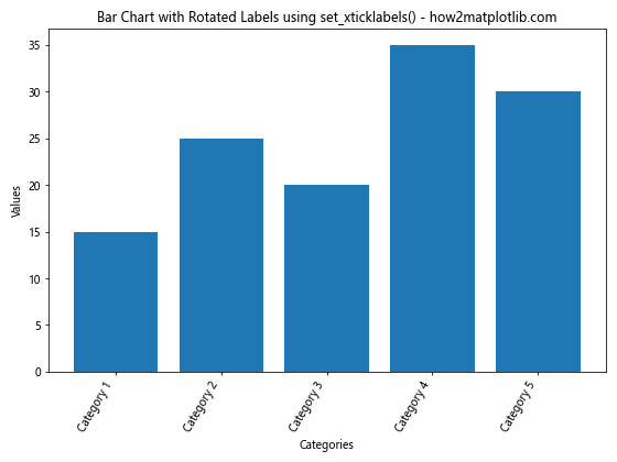
Here, ax.set_xticklabels(categories, rotation=60, ha='right') rotates the labels by 60 degrees and aligns them to the right.
Advanced Techniques for Matplotlib Bar Chart Rotate X Labels
Now that we’ve covered the basics, let’s explore some more advanced techniques for rotating x-axis labels in matplotlib bar charts.
Adjusting Label Alignment
When rotating labels, it’s often necessary to adjust their alignment for better positioning:
import matplotlib.pyplot as plt

categories = ['Long Category A', 'Long Category B', 'Long Category C', 'Long Category D']
values = [30, 45, 25, 60]

fig, ax = plt.subplots(figsize=(10, 6))
ax.bar(categories, values)
ax.set_title('Bar Chart with Rotated and Aligned Labels - how2matplotlib.com')
ax.set_xlabel('Categories')
ax.set_ylabel('Values')
ax.set_xticklabels(categories, rotation=45, ha='right', va='top')
ax.tick_params(axis='x', pad=5)
plt.tight_layout()
plt.show()
Output:
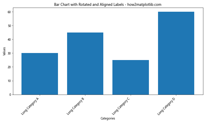
In this example, we use ha='right' and va='top' to align the labels. The tick_params() method is used to add some padding between the labels and the x-axis.
Using Seaborn for Enhanced Aesthetics
Seaborn, a statistical data visualization library built on top of matplotlib, can be used to create visually appealing bar charts with rotated labels:
import matplotlib.pyplot as plt
import seaborn as sns

categories = ['A', 'B', 'C', 'D', 'E', 'F']
values = [20, 35, 30, 45, 25, 40]

plt.figure(figsize=(10, 6))
sns.barplot(x=categories, y=values)
plt.title('Seaborn Bar Chart with Rotated Labels - how2matplotlib.com')
plt.xlabel('Categories')
plt.ylabel('Values')
plt.xticks(rotation=45)
plt.tight_layout()
plt.show()
Output:
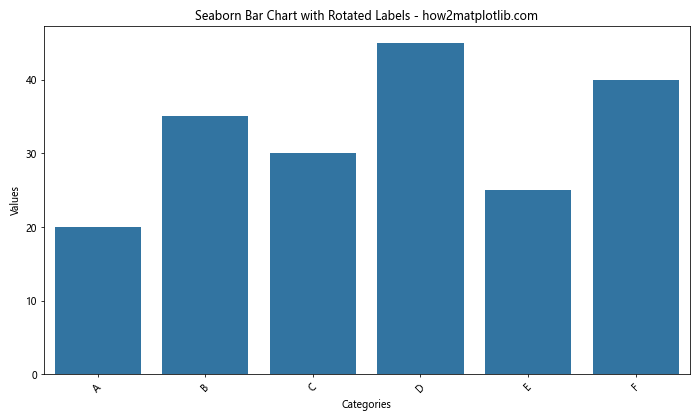
Seaborn’s barplot() function creates a bar chart with enhanced aesthetics, and we can still use matplotlib’s plt.xticks() to rotate the labels.
Handling Long Labels in Matplotlib Bar Charts
When dealing with particularly long labels, rotating them might not be enough. Here are some additional techniques to handle long labels in matplotlib bar charts:
Wrapping Long Labels
You can use the textwrap module to wrap long labels:
import matplotlib.pyplot as plt
import textwrap

categories = ['Very Long Category Name A', 'Extremely Long Category Name B',
              'Incredibly Long Category Name C', 'Unbelievably Long Category Name D']
values = [10, 20, 15, 25]

def wrap_labels(labels, max_width=10):
    return [textwrap.fill(label, max_width) for label in labels]

wrapped_categories = wrap_labels(categories)

plt.figure(figsize=(12, 6))
plt.bar(wrapped_categories, values)
plt.title('Bar Chart with Wrapped Labels - how2matplotlib.com')
plt.xlabel('Categories')
plt.ylabel('Values')
plt.xticks(rotation=45, ha='right')
plt.tight_layout()
plt.show()
Output:
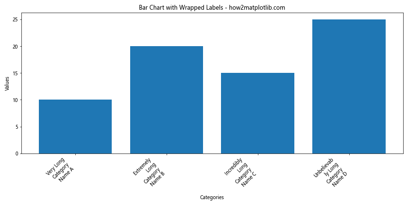
This example uses textwrap.fill() to wrap long labels, making them more compact.
Using Abbreviations
For very long labels, you might consider using abbreviations and providing a legend:
import matplotlib.pyplot as plt

full_categories = ['Very Long Category A', 'Extremely Long Category B',
                   'Incredibly Long Category C', 'Unbelievably Long Category D']
abbr_categories = ['VLCA', 'ELCB', 'ILCC', 'ULCD']
values = [10, 20, 15, 25]

plt.figure(figsize=(10, 6))
bars = plt.bar(abbr_categories, values)
plt.title('Bar Chart with Abbreviated Labels - how2matplotlib.com')
plt.xlabel('Categories')
plt.ylabel('Values')

# Add a legend
plt.legend(bars, full_categories, title="Full Category Names", loc='upper left', bbox_to_anchor=(1, 1))

plt.tight_layout()
plt.show()
Output:
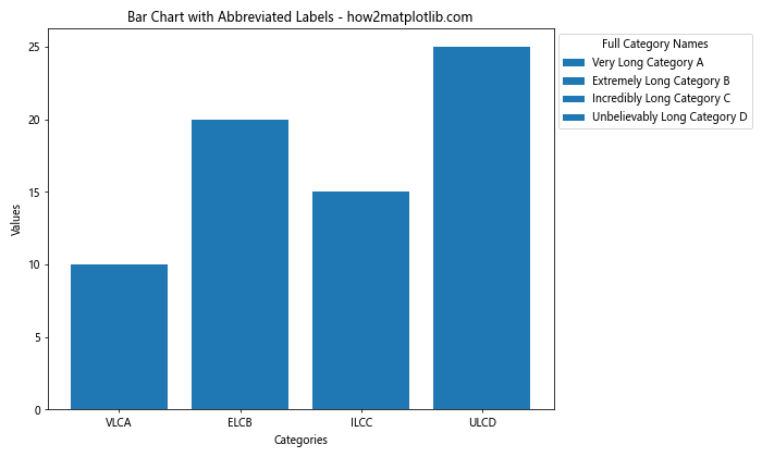
This approach uses abbreviated labels on the x-axis and provides the full names in a legend.
Customizing Bar Colors and Styles
When creating a matplotlib bar chart with rotated x labels, you can also customize the appearance of the bars themselves. Let’s explore some techniques:
Using Custom Colors
You can assign custom colors to each bar:
import matplotlib.pyplot as plt

categories = ['A', 'B', 'C', 'D', 'E']
values = [23, 45, 56, 78, 32]
colors = ['red', 'green', 'blue', 'yellow', 'purple']

plt.figure(figsize=(10, 6))
plt.bar(categories, values, color=colors)
plt.title('Bar Chart with Custom Colors - how2matplotlib.com')
plt.xlabel('Categories')
plt.ylabel('Values')
plt.xticks(rotation=45, ha='right')
plt.tight_layout()
plt.show()
Output:
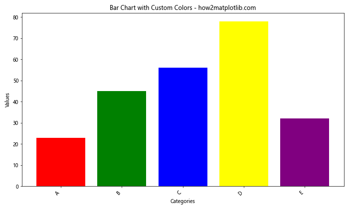
This example assigns a different color to each bar using the color parameter in plt.bar().
Adding Patterns to Bars
You can add patterns to bars for additional visual distinction:
import matplotlib.pyplot as plt
import numpy as np

categories = ['A', 'B', 'C', 'D', 'E']
values = [23, 45, 56, 78, 32]
patterns = ['/', '\\', '|', '-', '+']

fig, ax = plt.subplots(figsize=(10, 6))
bars = ax.bar(categories, values)

for bar, pattern in zip(bars, patterns):
    bar.set_hatch(pattern)

ax.set_title('Bar Chart with Patterns - how2matplotlib.com')
ax.set_xlabel('Categories')
ax.set_ylabel('Values')
plt.xticks(rotation=45, ha='right')
plt.tight_layout()
plt.show()
Output:
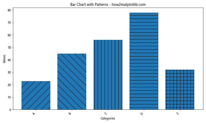
This example uses the set_hatch() method to add different patterns to each bar.
Adding Data Labels to Bars
Adding data labels to bars can enhance the information conveyed by your matplotlib bar chart with rotated x labels:
import matplotlib.pyplot as plt

categories = ['Category A', 'Category B', 'Category C', 'Category D', 'Category E']
values = [23, 45, 56, 78, 32]

fig, ax = plt.subplots(figsize=(10, 6))
bars = ax.bar(categories, values)

ax.set_title('Bar Chart with Data Labels - how2matplotlib.com')
ax.set_xlabel('Categories')
ax.set_ylabel('Values')

# Add data labels
for bar in bars:
    height = bar.get_height()
    ax.text(bar.get_x() + bar.get_width()/2., height,
            f'{height}',
            ha='center', va='bottom')

plt.xticks(rotation=45, ha='right')
plt.tight_layout()
plt.show()
Output:
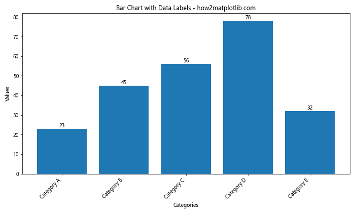
This example adds the value of each bar as a text label above the bar.
Creating Grouped Bar Charts with Rotated Labels
Grouped bar charts are useful for comparing multiple sets of data across categories. Here’s how to create a grouped bar chart with rotated x-axis labels:
import matplotlib.pyplot as plt
import numpy as np

categories = ['A', 'B', 'C', 'D', 'E']
values1 = [23, 45, 56, 78, 32]
values2 = [15, 30, 45, 20, 35]

x = np.arange(len(categories))
width = 0.35

fig, ax = plt.subplots(figsize=(12, 6))
rects1 = ax.bar(x - width/2, values1, width, label='Group 1')
rects2 = ax.bar(x + width/2, values2, width, label='Group 2')

ax.set_title('Grouped Bar Chart with Rotated Labels - how2matplotlib.com')
ax.set_xlabel('Categories')
ax.set_ylabel('Values')
ax.set_xticks(x)
ax.set_xticklabels(categories, rotation=45, ha='right')
ax.legend()

plt.tight_layout()
plt.show()
Output:
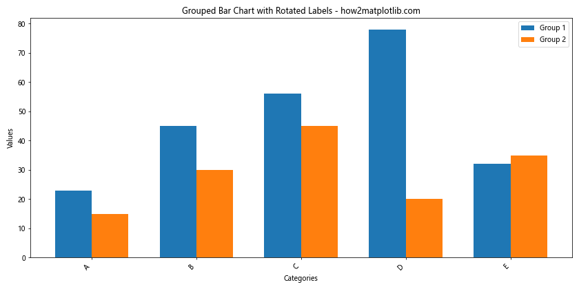
This example creates two sets of bars side by side for each category, allowing for easy comparison between groups.
Handling Date-based X-axis Labels
When dealing with date-based x-axis labels in a matplotlib bar chart, rotation becomes even more important for readability:
import matplotlib.pyplot as plt
import pandas as pd

# Create sample data
dates = pd.date_range(start='2023-01-01', end='2023-12-31', freq='M')
values = [10, 15, 20, 25, 30, 35, 40, 45, 50, 55, 60, 65]

fig, ax = plt.subplots(figsize=(12, 6))
ax.bar(dates, values)

ax.set_title('Bar Chart with Date-based X-axis Labels - how2matplotlib.com')
ax.set_xlabel('Dates')
ax.set_ylabel('Values')

# Format x-axis ticks
plt.xticks(rotation=45, ha='right')
ax.xaxis.set_major_formatter(plt.DateFormatter('%Y-%m-%d'))

plt.tight_layout()
plt.show()
This example uses pandas to create a date range and formats the x-axis labels as dates.
Creating Horizontal Bar Charts with Rotated Labels
While we’ve focused on vertical bar charts, horizontal bar charts can be useful when dealing with many categories or long labels:
import matplotlib.pyplot as plt

categories = ['Very Long Category A', 'Extremely Long Category B',
              'Incredibly Long Category C', 'Unbelievably Long Category D']
values = [23, 45, 56, 78]

plt.figure(figsize=(10, 6))
plt.barh(categories, values)
plt.title('Horizontal Bar Chart - how2matplotlib.com')
plt.xlabel('Values')
plt.ylabel('Categories')
plt.tight_layout()
plt.show()
Output:
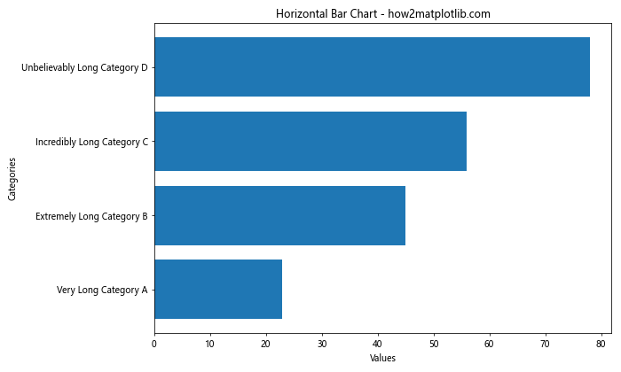
In this case, we don’t need to rotate the labels as they are naturally displayed horizontally.
Adjusting Figure Size and Layout
When working with rotated labels in a matplotlib bar chart, it’s often necessary to adjust the figure size and layout to accommodate the rotated text:
import matplotlib.pyplot as plt

categories = ['Category A', 'Category B', 'Category C', 'Category D', 'Category E', 'Category F', 'Category G']
values = [23, 45, 56, 78, 32, 65, 41]

plt.figure(figsize=(12, 8))
plt.bar(categories, values)
plt.title('Bar Chart with Adjusted Figure Size - how2matplotlib.com')
plt.xlabel('Categories')
plt.ylabel('Values')
plt.xticks(rotation=45, ha='right')

# Adjust layout
plt.subplots_adjust(bottom=0.2)

plt.show()
Output:
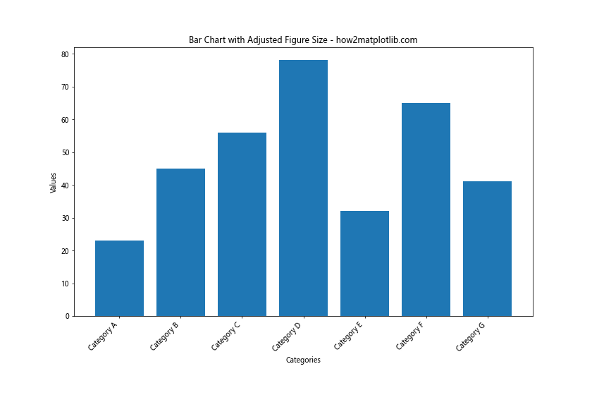
In this example, we use a larger figure size (figsize=(12, 8)) and adjust the bottom margin (plt.subplots_adjust(bottom=0.2)) to accommodate the rotated labels.
Using GridSpec for Complex Layouts
For more complex layouts involving multiple subplots and rotated labels, you can use GridSpec:
import matplotlib.pyplot as plt
import matplotlib.gridspec as gridspec

categories = ['A', 'B', 'C', 'D', 'E']
values1 = [23, 45, 56, 78, 32]
values2 = [15, 30, 45, 20, 35]

fig = plt.figure(figsize=(12, 8))
gs = gridspec.GridSpec(2, 2, height_ratios=[3, 1])

ax1 = fig.add_subplot(gs[0, :])
ax1.bar(categories, values1)
ax1.set_title('Bar Chart 1 - how2matplotlib.com')
ax1.set_xticklabels(categories, rotation=45, ha='right')

ax2 = fig.add_subplot(gs[1, 0])
ax2.bar(categories, values2)
ax2.set_title('Bar Chart 2')
ax2.set_xticklabels(categories, rotation=45, ha='right')

ax3 = fig.add_subplot(gs[1, 1])
ax3.pie(values2, labels=categories, autopct='%1.1f%%')
ax3.set_title('Pie Chart')

plt.tight_layout()
plt.show()
Output:
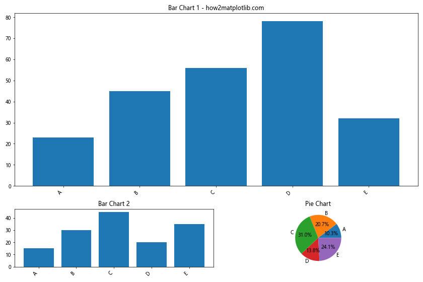
This example creates a complex layout with two bar charts (both with rotated labels) and a pie chart.
Handling Overlapping Labels
When you have many categories, even rotated labels might overlap. Here’s a technique to handle this:
import matplotlib.pyplot as plt

categories = [f'Category {i}' for i in range(20)]
values = [i * 5 for i in range(20)]

fig, ax = plt.subplots(figsize=(12, 6))
bars = ax.bar(categories, values)

ax.set_title('Bar Chart with Many Categories - how2matplotlib.com')
ax.set_xlabel('Categories')
ax.set_ylabel('Values')

# Rotate and align the tick labels so they look better
plt.setp(ax.xaxis.get_majorticklabels(), rotation=45, ha='right')

# Use a logarithmic scale on y-axis
ax.set_yscale('log')

# Add some space between the axis and the labels
ax.tick_params(axis='x', which='major', pad=8)

# Use fewer ticks to prevent overlapping
ax.set_xticks(ax.get_xticks()[::2])

plt.tight_layout()
plt.show()
Output:
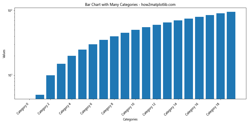
This example uses several techniques to handle many categories: rotating labels, using a logarithmic scale, adding padding, and showing fewer ticks.
Customizing Tick Marks and Grid Lines
You can further customize your matplotlib bar chart with rotated x labels by adjusting tick marks and grid lines:
import matplotlib.pyplot as plt

categories = ['A', 'B', 'C', 'D', 'E']
values = [23, 45, 56, 78, 32]

fig, ax = plt.subplots(figsize=(10, 6))
ax.bar(categories, values)

ax.set_title('Bar Chart with Custom Ticks and Grid - how2matplotlib.com')
ax.set_xlabel('Categories')
ax.set_ylabel('Values')

# Customize x-axis
ax.set_xticklabels(categories, rotation=45, ha='right')
ax.tick_params(axis='x', which='major', labelsize=10, pad=8, length=6, width=2, color='red')

# Customize y-axis
ax.tick_params(axis='y', which='major', labelsize=10, pad=8, length=6, width=2, color='blue')

# Add grid lines
ax.grid(True, axis='y', linestyle='--', alpha=0.7)

plt.tight_layout()
plt.show()
Output:

This example customizes the appearance of tick marks and adds grid lines to the chart.
Adding Annotations to Bar Charts
Annotations can provide additional context to your matplotlib bar chart with rotated x labels:
import matplotlib.pyplot as plt

categories = ['A', 'B', 'C', 'D', 'E']
values = [23, 45, 56, 78, 32]

fig, ax = plt.subplots(figsize=(10, 6))
bars = ax.bar(categories, values)

ax.set_title('Bar Chart with Annotations - how2matplotlib.com')
ax.set_xlabel('Categories')
ax.set_ylabel('Values')

# Rotate x-axis labels
plt.xticks(rotation=45, ha='right')

# Add annotations
ax.annotate('Highest Value', xy=(3, 78), xytext=(3.5, 85),
            arrowprops=dict(facecolor='black', shrink=0.05))

ax.annotate('Lowest Value', xy=(0, 23), xytext=(-0.5, 30),
            arrowprops=dict(facecolor='black', shrink=0.05))

plt.tight_layout()
plt.show()
Output:
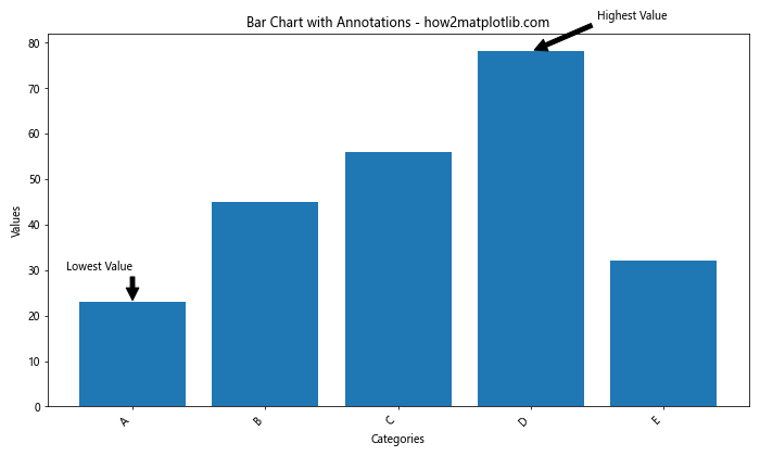
This example adds annotations to highlight the highest and lowest values in the chart.
Saving Bar Charts with Rotated Labels
When saving a matplotlib bar chart with rotated x labels, it’s important to ensure that all elements are visible:
import matplotlib.pyplot as plt

categories = ['Category A', 'Category B', 'Category C', 'Category D', 'Category E']
values = [23, 45, 56, 78, 32]

plt.figure(figsize=(10, 6))
plt.bar(categories, values)
plt.title('Bar Chart Saved with Rotated Labels - how2matplotlib.com')
plt.xlabel('Categories')
plt.ylabel('Values')
plt.xticks(rotation=45, ha='right')

# Adjust layout before saving
plt.tight_layout()

# Save the figure
plt.savefig('bar_chart_rotated_labels.png', dpi=300, bbox_inches='tight')

plt.show()
Output:

The bbox_inches='tight' parameter ensures that all elements, including rotated labels, are included in the saved image.
Matplotlib bar chart rotate x labels Conclusion
Mastering the technique of rotating x-axis labels in matplotlib bar charts is crucial for creating clear and readable visualizations, especially when dealing with long or numerous category names. Throughout this article, we’ve explored various aspects of creating and customizing bar charts with rotated labels, from basic techniques to advanced customization options.
Key takeaways include:
- Use
plt.xticks(rotation=45)orax.set_xticklabels(labels, rotation=45)to rotate labels. - Adjust alignment with
ha='right'andva='top'for better positioning. - Consider wrapping or abbreviating long labels for improved readability.
- Customize colors, patterns, and add data labels to enhance your charts.
- Use grouped bar charts for comparing multiple data sets.
- Adjust figure size and layout to accommodate rotated labels.
- Utilize GridSpec for complex layouts with multiple subplots.
- Handle overlapping labels by adjusting tick frequency and using logarithmic scales when appropriate.
- Add annotations to provide additional context to your charts.
- Ensure proper saving of charts with rotated labels using
bbox_inches='tight'.
By applying these techniques, you can create professional-looking, informative bar charts that effectively communicate your data, even when dealing with challenging x-axis labels. Remember that the key to a good visualization is clarity and readability, and rotating x-axis labels is often an essential step in achieving this goal.