Matplotlib 3D Surface Plots
Creating 3D surface plots with Matplotlib is an engaging way to visualize three-dimensional data. With the help of Matplotlib’s mplot3d toolkit, it is possible to create stunning 3D surface plots that can enhance the understanding of complex data sets. This article will guide you through the process of creating 3D surface plots using Matplotlib, providing detailed examples to illustrate various features and customization options.
Introduction to 3D Surface Plots
3D surface plots represent three-dimensional data on a two-dimensional plane, where the x and y axes represent the input variables, and the z-axis represents the output or the function of the input variables. These plots are particularly useful in visualizing landscapes, potential fields, or any phenomena where you want to see how a response variable changes over a two-dimensional space.
To start creating 3D surface plots, you need to have Matplotlib installed. If you haven’t installed it yet, you can do so by running pip install matplotlib in your terminal or command prompt.
Basic 3D Surface Plot
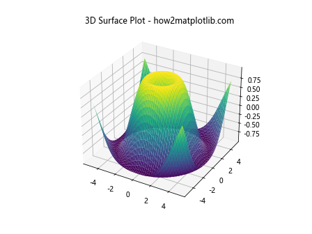
Let’s start with a basic example of a 3D surface plot. The following code demonstrates how to create a simple 3D surface plot using Matplotlib.
import matplotlib.pyplot as plt
from mpl_toolkits.mplot3d import Axes3D
import numpy as np

x = np.linspace(-5, 5, 100)
y = np.linspace(-5, 5, 100)
x, y = np.meshgrid(x, y)
z = np.sin(np.sqrt(x**2 + y**2))

fig = plt.figure()
ax = fig.add_subplot(111, projection='3d')
ax.plot_surface(x, y, z, cmap='viridis')

ax.set_title('3D Surface Plot - how2matplotlib.com')
plt.show()
Output:
Customizing the Color Map
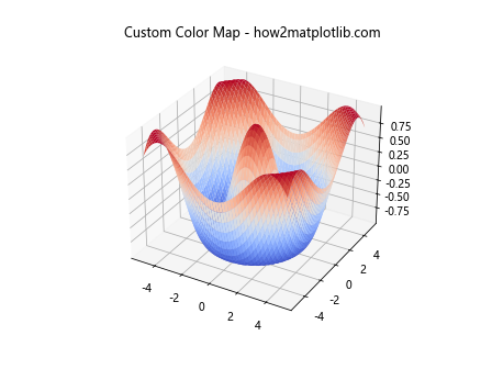
Changing the color map of the surface plot can significantly affect the visual appeal and readability of the plot. Here’s how you can customize the color map.
import matplotlib.pyplot as plt
from mpl_toolkits.mplot3d import Axes3D
import numpy as np

x = np.linspace(-5, 5, 100)
y = np.linspace(-5, 5, 100)
x, y = np.meshgrid(x, y)
z = np.cos(np.sqrt(x**2 + y**2))

fig = plt.figure()
ax = fig.add_subplot(111, projection='3d')
ax.plot_surface(x, y, z, cmap='coolwarm')

ax.set_title('Custom Color Map - how2matplotlib.com')
plt.show()
Output:
Adding Color Bar
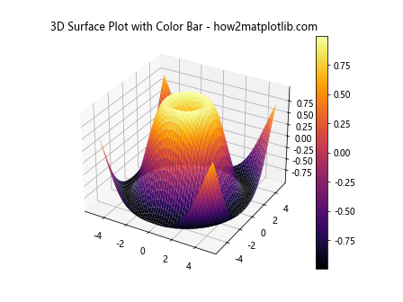
A color bar can be added to the plot to indicate the scale of values. This is particularly useful for interpreting the colors in terms of the z-values.
import matplotlib.pyplot as plt
from mpl_toolkits.mplot3d import Axes3D
import numpy as np

x = np.linspace(-5, 5, 100)
y = np.linspace(-5, 5, 100)
x, y = np.meshgrid(x, y)
z = np.sin(np.sqrt(x**2 + y**2))

fig = plt.figure()
ax = fig.add_subplot(111, projection='3d')
surf = ax.plot_surface(x, y, z, cmap='inferno')
fig.colorbar(surf)

ax.set_title('3D Surface Plot with Color Bar - how2matplotlib.com')
plt.show()
Output:
Wireframe Plot
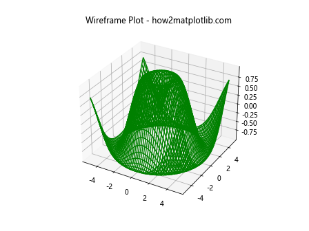
Instead of a surface plot, you can create a wireframe plot which only outlines the surface without filling it with color.
import matplotlib.pyplot as plt
from mpl_toolkits.mplot3d import Axes3D
import numpy as np

x = np.linspace(-5, 5, 100)
y = np.linspace(-5, 5, 100)
x, y = np.meshgrid(x, y)
z = np.sin(np.sqrt(x**2 + y**2))

fig = plt.figure()
ax = fig.add_subplot(111, projection='3d')
ax.plot_wireframe(x, y, z, color='green')

ax.set_title('Wireframe Plot - how2matplotlib.com')
plt.show()
Output:
Contour Plot Under Surface
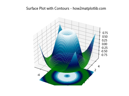
Adding contour plots under the surface plot can help in understanding the variations along the z-axis in more detail.
import matplotlib.pyplot as plt
from mpl_toolkits.mplot3d import Axes3D
import numpy as np

x = np.linspace(-5, 5, 100)
y = np.linspace(-5, 5, 100)
x, y = np.meshgrid(x, y)
z = np.sin(np.sqrt(x**2 + y**2))

fig = plt.figure()
ax = fig.add_subplot(111, projection='3d')
ax.plot_surface(x, y, z, cmap='ocean')
ax.contourf(x, y, z, zdir='z', offset=-2, cmap='ocean')

ax.set_title('Surface Plot with Contours - how2matplotlib.com')
plt.show()
Output:
Changing the View Angle
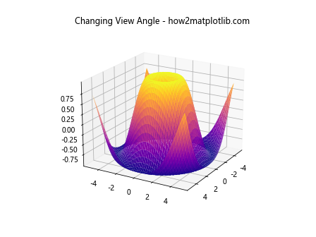
You can change the view angle of the plot to get a better perspective of the data.
import matplotlib.pyplot as plt
from mpl_toolkits.mplot3d import Axes3D
import numpy as np

x = np.linspace(-5, 5, 100)
y = np.linspace(-5, 5, 100)
x, y = np.meshgrid(x, y)
z = np.sin(np.sqrt(x**2 + y**2))

fig = plt.figure()
ax = fig.add_subplot(111, projection='3d')
ax.plot_surface(x, y, z, cmap='plasma')
ax.view_init(elev=20, azim=30)

ax.set_title('Changing View Angle - how2matplotlib.com')
plt.show()
Output:
Adding Labels and Title
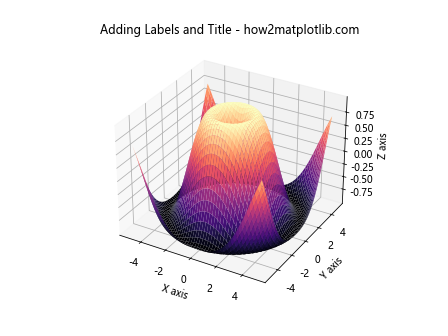
Adding labels to the axes and a title to the plot makes it more informative.
import matplotlib.pyplot as plt
from mpl_toolkits.mplot3d import Axes3D
import numpy as np

x = np.linspace(-5, 5, 100)
y = np.linspace(-5, 5, 100)
x, y = np.meshgrid(x, y)
z = np.sin(np.sqrt(x**2 + y**2))

fig = plt.figure()
ax = fig.add_subplot(111, projection='3d')
ax.plot_surface(x, y, z, cmap='magma')
ax.set_xlabel('X axis')
ax.set_ylabel('Y axis')
ax.set_zlabel('Z axis')
ax.set_title('Adding Labels and Title - how2matplotlib.com')

plt.show()
Output:
Transparent Surface
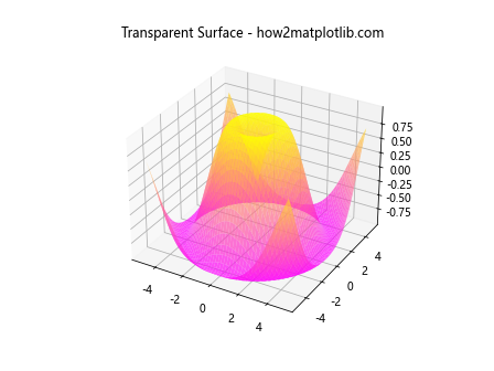
You can make the surface plot semi-transparent by adjusting the alpha parameter, which can be useful for seeing structures beneath the surface.
import matplotlib.pyplot as plt
from mpl_toolkits.mplot3d import Axes3D
import numpy as np

x = np.linspace(-5, 5, 100)
y = np.linspace(-5, 5, 100)
x, y = np.meshgrid(x, y)
z = np.sin(np.sqrt(x**2 + y**2))

fig = plt.figure()
ax = fig.add_subplot(111, projection='3d')
ax.plot_surface(x, y, z, cmap='spring', alpha=0.7)

ax.set_title('Transparent Surface - how2matplotlib.com')
plt.show()
Output:
Conclusion
This article has introduced you to creating 3D surface plots using Matplotlib, along with various customization options to enhance the visualization. By adjusting colors, adding labels, changing the view angle, and experimenting with transparency, you can create visually appealing plots that effectively communicate the underlying data. Remember, visualization is not just about presenting data; it’s about telling a story. With these examples and techniques, you’re well-equipped to tell compelling stories with your data using Matplotlib’s 3D plotting capabilities.