Line Fill Histogram in Matplotlib
Matplotlib is a powerful data visualization library in Python that offers a wide range of plotting capabilities. One of the most useful and versatile plot types is the histogram, which allows us to visualize the distribution of data. In this comprehensive guide, we’ll explore how to create line fill histograms using Matplotlib, covering various aspects and techniques to enhance your data visualization skills.
Introduction to Histograms
A histogram is a graphical representation of the distribution of numerical data. It consists of bars where the height of each bar represents the frequency or count of data points falling within a specific range or bin. Histograms are particularly useful for understanding the shape, central tendency, and spread of a dataset.
In Matplotlib, we can create histograms using the hist() function. However, to create a line fill histogram, we’ll need to combine the histogram data with line and fill plotting techniques.
Let’s start with a basic example of creating a histogram and then move on to more advanced techniques for line fill histograms.
import matplotlib.pyplot as plt
import numpy as np

# Generate sample data
data = np.random.normal(0, 1, 1000)

# Create a histogram
plt.figure(figsize=(10, 6))
plt.hist(data, bins=30, edgecolor='black')
plt.title('Basic Histogram - how2matplotlib.com')
plt.xlabel('Value')
plt.ylabel('Frequency')
plt.grid(True, alpha=0.3)
plt.show()

# Print histogram data
counts, bins, _ = plt.hist(data, bins=30)
print("Bin edges:", bins)
print("Counts:", counts)
Output:
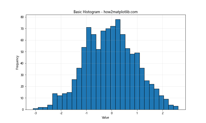
In this example, we generate random data from a normal distribution and create a basic histogram using plt.hist(). The edgecolor parameter is set to ‘black’ to give each bar a distinct outline. We also add a title, labels, and a grid for better readability.
Creating a Line Fill Histogram
To create a line fill histogram, we’ll first compute the histogram data using np.histogram(), and then use plt.plot() to draw the outline and plt.fill_between() to fill the area under the curve.
import matplotlib.pyplot as plt
import numpy as np

# Generate sample data
data = np.random.normal(0, 1, 1000)

# Compute histogram data
counts, bins = np.histogram(data, bins=30)

# Create a line fill histogram
plt.figure(figsize=(10, 6))
plt.plot(bins[:-1], counts, 'b-', linewidth=2, label='Line')
plt.fill_between(bins[:-1], counts, alpha=0.5, label='Fill')
plt.title('Line Fill Histogram - how2matplotlib.com')
plt.xlabel('Value')
plt.ylabel('Frequency')
plt.legend()
plt.grid(True, alpha=0.3)
plt.show()

print("Bin edges:", bins)
print("Counts:", counts)
Output:
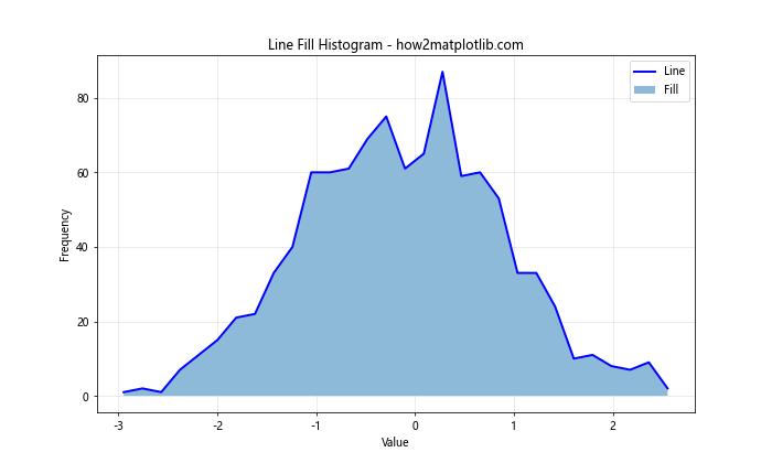
In this example, we first compute the histogram data using np.histogram(). Then, we use plt.plot() to draw the outline of the histogram and plt.fill_between() to fill the area under the curve. The alpha parameter in fill_between() controls the transparency of the fill.
Customizing Line Fill Histograms
Now that we have the basic structure of a line fill histogram, let’s explore various ways to customize and enhance it.
Color Schemes
You can change the colors of the line and fill to make your histogram more visually appealing or to match a specific color scheme.
import matplotlib.pyplot as plt
import numpy as np

# Generate sample data
data = np.random.gamma(2, 2, 1000)

# Compute histogram data
counts, bins = np.histogram(data, bins=30)

# Create a line fill histogram with custom colors
plt.figure(figsize=(10, 6))
plt.plot(bins[:-1], counts, color='#FF5733', linewidth=2, label='Line')
plt.fill_between(bins[:-1], counts, color='#FFC300', alpha=0.7, label='Fill')
plt.title('Custom Color Line Fill Histogram - how2matplotlib.com')
plt.xlabel('Value')
plt.ylabel('Frequency')
plt.legend()
plt.grid(True, alpha=0.3)
plt.show()

print("Bin edges:", bins)
print("Counts:", counts)
Output:
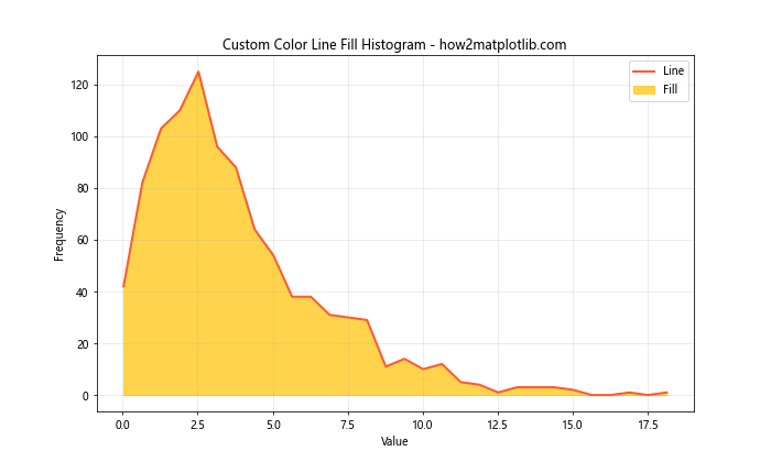
In this example, we use custom hex color codes for both the line and fill. The line color is set to a shade of red (#FF5733), and the fill color is set to a shade of yellow (#FFC300). The alpha value for the fill is increased to 0.7 to make it more opaque.
Multiple Datasets
You can plot multiple datasets on the same histogram to compare their distributions.
import matplotlib.pyplot as plt
import numpy as np

# Generate sample data
data1 = np.random.normal(0, 1, 1000)
data2 = np.random.normal(2, 1.5, 1000)

# Compute histogram data
counts1, bins1 = np.histogram(data1, bins=30)
counts2, bins2 = np.histogram(data2, bins=30)

# Create a line fill histogram with multiple datasets
plt.figure(figsize=(12, 6))
plt.plot(bins1[:-1], counts1, 'b-', linewidth=2, label='Dataset 1')
plt.fill_between(bins1[:-1], counts1, alpha=0.3)
plt.plot(bins2[:-1], counts2, 'r-', linewidth=2, label='Dataset 2')
plt.fill_between(bins2[:-1], counts2, alpha=0.3)
plt.title('Multiple Datasets Line Fill Histogram - how2matplotlib.com')
plt.xlabel('Value')
plt.ylabel('Frequency')
plt.legend()
plt.grid(True, alpha=0.3)
plt.show()

print("Dataset 1 - Bin edges:", bins1)
print("Dataset 1 - Counts:", counts1)
print("Dataset 2 - Bin edges:", bins2)
print("Dataset 2 - Counts:", counts2)
Output:
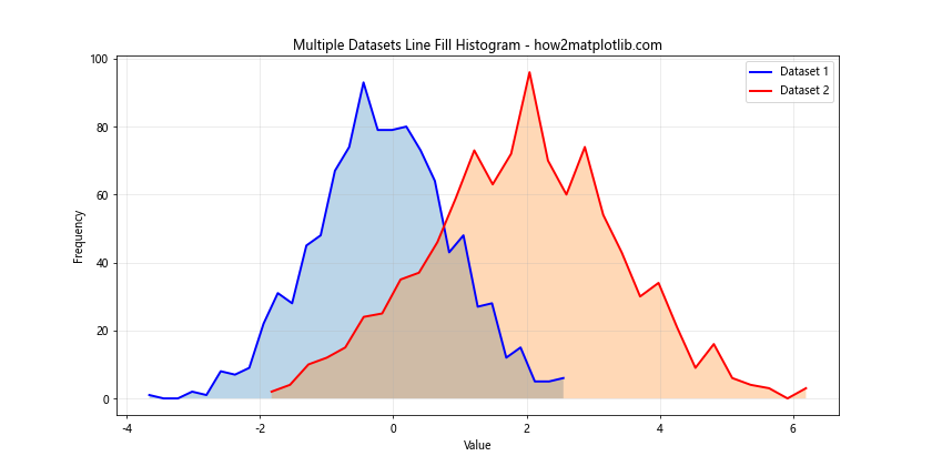
In this example, we create two datasets with different normal distributions. We then plot both datasets on the same histogram using different colors for the lines and fills. This allows for easy comparison of the two distributions.
Stacked Histograms
Stacked histograms are useful when you want to show the composition of data within each bin.
import matplotlib.pyplot as plt
import numpy as np

# Generate sample data
data1 = np.random.normal(0, 1, 1000)
data2 = np.random.normal(2, 1, 1000)

# Compute histogram data
counts1, bins = np.histogram(data1, bins=30)
counts2, _ = np.histogram(data2, bins=bins)

# Create a stacked line fill histogram
plt.figure(figsize=(12, 6))
plt.plot(bins[:-1], counts1, 'b-', linewidth=2)
plt.fill_between(bins[:-1], counts1, alpha=0.5, label='Dataset 1')
plt.plot(bins[:-1], counts1 + counts2, 'r-', linewidth=2)
plt.fill_between(bins[:-1], counts1, counts1 + counts2, alpha=0.5, label='Dataset 2')
plt.title('Stacked Line Fill Histogram - how2matplotlib.com')
plt.xlabel('Value')
plt.ylabel('Frequency')
plt.legend()
plt.grid(True, alpha=0.3)
plt.show()

print("Bin edges:", bins)
print("Dataset 1 - Counts:", counts1)
print("Dataset 2 - Counts:", counts2)
Output:
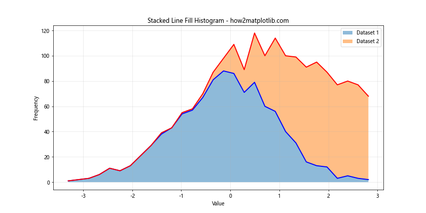
In this stacked histogram example, we plot two datasets on top of each other. The first dataset is plotted normally, and the second dataset is plotted on top of the first one. This allows us to see both the total frequency and the composition of each bin.
Normalized Histograms
Normalized histograms are useful when you want to compare datasets of different sizes or when you’re interested in the probability density rather than raw counts.
import matplotlib.pyplot as plt
import numpy as np

# Generate sample data
data = np.random.normal(0, 1, 1000)

# Compute normalized histogram data
counts, bins = np.histogram(data, bins=30, density=True)

# Create a normalized line fill histogram
plt.figure(figsize=(10, 6))
plt.plot(bins[:-1], counts, 'g-', linewidth=2, label='Density')
plt.fill_between(bins[:-1], counts, alpha=0.5)
plt.title('Normalized Line Fill Histogram - how2matplotlib.com')
plt.xlabel('Value')
plt.ylabel('Probability Density')
plt.legend()
plt.grid(True, alpha=0.3)
plt.show()

print("Bin edges:", bins)
print("Normalized counts:", counts)
Output:
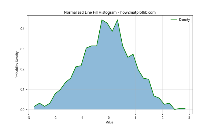
In this example, we use the density=True parameter in np.histogram() to compute a normalized histogram. The y-axis now represents probability density instead of raw counts.
Cumulative Histograms
Cumulative histograms show the cumulative frequency or probability up to each bin.
import matplotlib.pyplot as plt
import numpy as np

# Generate sample data
data = np.random.normal(0, 1, 1000)

# Compute cumulative histogram data
counts, bins = np.histogram(data, bins=30)
cumulative = np.cumsum(counts)

# Create a cumulative line fill histogram
plt.figure(figsize=(10, 6))
plt.plot(bins[:-1], cumulative, 'purple', linewidth=2, label='Cumulative')
plt.fill_between(bins[:-1], cumulative, alpha=0.5)
plt.title('Cumulative Line Fill Histogram - how2matplotlib.com')
plt.xlabel('Value')
plt.ylabel('Cumulative Frequency')
plt.legend()
plt.grid(True, alpha=0.3)
plt.show()

print("Bin edges:", bins)
print("Cumulative counts:", cumulative)
Output:
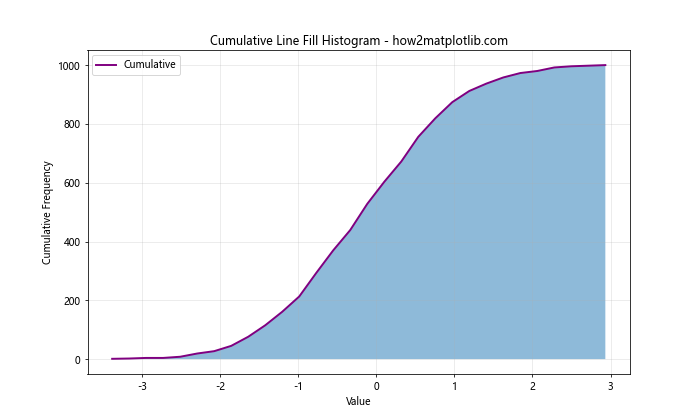
In this example, we use np.cumsum() to compute the cumulative sum of the histogram counts. This gives us a cumulative histogram, which shows the total number of data points up to and including each bin.
Log Scale Histograms
Log scale histograms are useful when dealing with data that spans several orders of magnitude.
import matplotlib.pyplot as plt
import numpy as np

# Generate sample data with a wide range
data = np.random.lognormal(0, 1, 1000)

# Compute histogram data
counts, bins = np.histogram(data, bins=30)

# Create a log scale line fill histogram
plt.figure(figsize=(10, 6))
plt.plot(bins[:-1], counts, 'c-', linewidth=2, label='Frequency')
plt.fill_between(bins[:-1], counts, alpha=0.5)
plt.title('Log Scale Line Fill Histogram - how2matplotlib.com')
plt.xlabel('Value (log scale)')
plt.ylabel('Frequency')
plt.xscale('log')
plt.legend()
plt.grid(True, alpha=0.3)
plt.show()

print("Bin edges:", bins)
print("Counts:", counts)
Output:
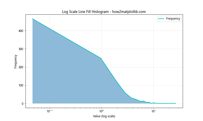
In this example, we use plt.xscale('log') to set the x-axis to a logarithmic scale. This is particularly useful for data that follows a log-normal distribution or spans several orders of magnitude.
2D Histograms
While not strictly a line fill histogram, 2D histograms can be useful for visualizing the relationship between two variables.
import matplotlib.pyplot as plt
import numpy as np

# Generate sample 2D data
x = np.random.normal(0, 1, 1000)
y = x + np.random.normal(0, 0.5, 1000)

# Create a 2D histogram
plt.figure(figsize=(10, 8))
plt.hist2d(x, y, bins=30, cmap='viridis')
plt.colorbar(label='Frequency')
plt.title('2D Histogram - how2matplotlib.com')
plt.xlabel('X Value')
plt.ylabel('Y Value')
plt.show()

# Print histogram data
H, xedges, yedges = np.histogram2d(x, y, bins=30)
print("X bin edges:", xedges)
print("Y bin edges:", yedges)
print("2D histogram counts:")
print(H)
Output:
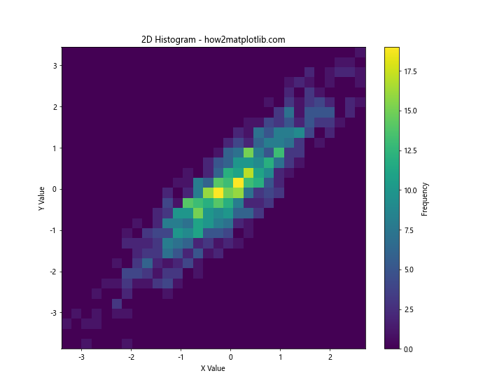
In this example, we use plt.hist2d() to create a 2D histogram. The color of each bin represents the frequency of data points falling into that bin. We also add a colorbar to show the frequency scale.
Kernel Density Estimation (KDE)
Kernel Density Estimation is a non-parametric way to estimate the probability density function of a random variable. It can be used to create a smooth line fill histogram.
import matplotlib.pyplot as plt
import numpy as np
from scipy.stats import gaussian_kde

# Generate sample data
data = np.random.normal(0, 1, 1000)

# Compute KDE
kde = gaussian_kde(data)
x_range = np.linspace(data.min(), data.max(), 100)
y_kde = kde(x_range)

# Create a KDE line fill histogram
plt.figure(figsize=(10, 6))
plt.plot(x_range, y_kde, 'm-', linewidth=2, label='KDE')
plt.fill_between(x_range, y_kde, alpha=0.5)
plt.title('Kernel Density Estimation Line Fill Histogram - how2matplotlib.com')
plt.xlabel('Value')
plt.ylabel('Density')
plt.legend()
plt.grid(True, alpha=0.3)
plt.show()

print("X range:", x_range)
print("KDE values:", y_kde)
Output:
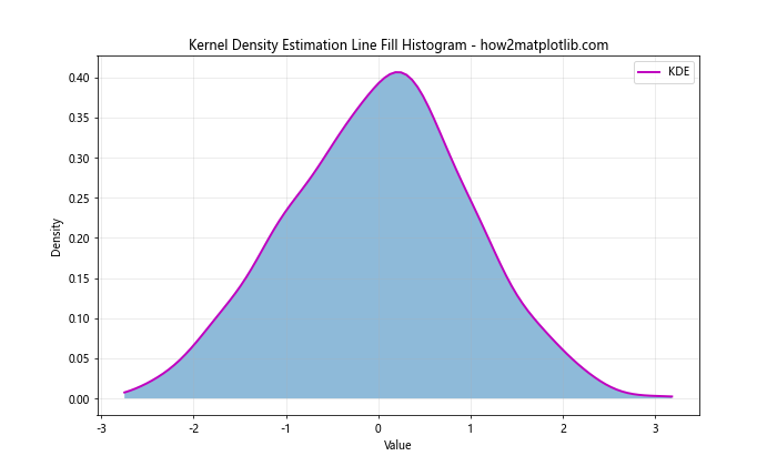
In this example, we use scipy.stats.gaussian_kde to compute the kernel density estimation. This results in a smooth curve that estimates the probability density function of the data.
Histogram with Confidence Intervals
You can add confidence intervals to your histogram to show the uncertainty in each bin’s count.
import matplotlib.pyplot as plt
import numpy as np
from scipy import stats

# Generate sample data
data = np.random.normal(0, 1, 1000)

# Compute histogram data
counts, bins = np.histogram(data, bins=30)

# Compute confidence intervals (using normal approximation)
confidence = 0.95
n = len(data)
stderr = np.sqrt(counts * (1 - counts/n)) / np.sqrt(n)
margin = stderr * stats.norm.ppf((1 + confidence) / 2)

# Create a histogram with confidence intervals
plt.figure(figsize=(12, 6))
plt.bar(bins[:-1], counts, width=np.diff(bins), alpha=0.5, label='Frequency')
plt.errorbar(bins[:-1] + np.diff(bins)/2, counts, yerr=margin, fmt='none', capsize=5, color='black', label='95% CI')
plt.title('Histogram with Confidence Intervals - how2matplotlib.com')
plt.xlabel('Value')
plt.ylabel('Frequency')
plt.legend()
plt.grid(True, alpha=0.3)
plt.show()

print("Bin edges:", bins)
print("Counts:", counts)
print("Confidence intervals:", margin)
Output:
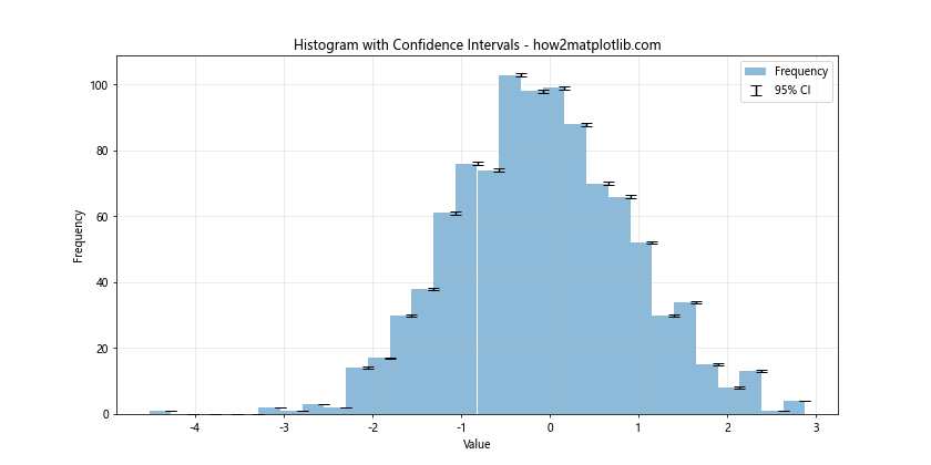
In this example, we compute confidence intervals for each bin using a normal approximation. We then use plt.errorbar() to add error bars representing these confidence intervals to the histogram.
Histogram with Fitted Distribution
You can overlay a fitted probability distribution on your histogram to compare the empirical distribution with a theoretical one.
import matplotlib.pyplot as plt
import numpy as np
from scipy import stats

# Generate sample data
data = np.random.normal(0, 1, 1000)

# Compute histogram data
counts, bins = np.histogram(data, bins=30, density=True)

# Fit a normal distribution to the data
mu, std = stats.norm.fit(data)
x = np.linspace(data.min(), data.max(), 100)
p = stats.norm.pdf(x, mu, std)

# Create a histogram with fitted distribution
plt.figure(figsize=(12, 6))
plt.plot(bins[:-1], counts, 'b-', linewidth=2, label='Empirical')
plt.fill_between(bins[:-1], counts, alpha=0.5)
plt.plot(x, p, 'r-', linewidth=2, label='Fitted Normal')
plt.title('Histogram with Fitted Distribution - how2matplotlib.com')
plt.xlabel('Value')
plt.ylabel('Probability Density')
plt.legend()
plt.grid(True, alpha=0.3)
plt.show()

print("Bin edges:", bins)
print("Counts:", counts)
print("Fitted parameters - Mean:", mu, "Std Dev:", std)
Output:
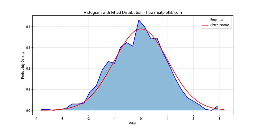
In this example, we fit a normal distribution to the data using stats.norm.fit(). We then overlay this fitted distribution on the histogram, allowing for easy comparison between the empirical and theoretical distributions.
Histogram with Multiple Y-axes
Sometimes, you might want to display different aspects of your data on the same plot using multiple y-axes.
import matplotlib.pyplot as plt
import numpy as np

# Generate sample data
data = np.random.gamma(2, 2, 1000)

# Compute histogram data
counts, bins = np.histogram(data, bins=30)
cumulative = np.cumsum(counts)

# Create a histogram with multiple y-axes
fig, ax1 = plt.subplots(figsize=(12, 6))

# Plot histogram on primary y-axis
ax1.plot(bins[:-1], counts, 'b-', linewidth=2)
ax1.fill_between(bins[:-1], counts, alpha=0.5, label='Frequency')
ax1.set_xlabel('Value')
ax1.set_ylabel('Frequency', color='b')
ax1.tick_params(axis='y', labelcolor='b')

# Create secondary y-axis and plot cumulative histogram
ax2 = ax1.twinx()
ax2.plot(bins[:-1], cumulative, 'r-', linewidth=2, label='Cumulative')
ax2.set_ylabel('Cumulative Frequency', color='r')
ax2.tick_params(axis='y', labelcolor='r')

plt.title('Histogram with Multiple Y-axes - how2matplotlib.com')
fig.legend(loc='upper right', bbox_to_anchor=(1, 0.85))
plt.grid(True, alpha=0.3)
plt.show()

print("Bin edges:", bins)
print("Counts:", counts)
print("Cumulative counts:", cumulative)
Output:
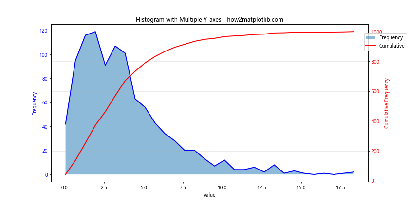
In this example, we use ax1.twinx() to create a secondary y-axis. We plot the regular histogram on the primary axis and the cumulative histogram on the secondary axis. This allows us to display both the frequency and cumulative frequency on the same plot.
Histogram with Subplots
You can create multiple histograms as subplots to compare different aspects of your data or different datasets.
import matplotlib.pyplot as plt
import numpy as np

# Generate sample data
data1 = np.random.normal(0, 1, 1000)
data2 = np.random.gamma(2, 2, 1000)
data3 = np.random.exponential(2, 1000)

# Create histograms with subplots
fig, (ax1, ax2, ax3) = plt.subplots(1, 3, figsize=(18, 6))

# Subplot 1: Normal distribution
counts1, bins1, _ = ax1.hist(data1, bins=30, alpha=0.7)
ax1.plot(bins1[:-1], counts1, 'r-', linewidth=2)
ax1.set_title('Normal Distribution - how2matplotlib.com')
ax1.set_xlabel('Value')
ax1.set_ylabel('Frequency')

# Subplot 2: Gamma distribution
counts2, bins2, _ = ax2.hist(data2, bins=30, alpha=0.7)
ax2.plot(bins2[:-1], counts2, 'g-', linewidth=2)
ax2.set_title('Gamma Distribution - how2matplotlib.com')
ax2.set_xlabel('Value')
ax2.set_ylabel('Frequency')

# Subplot 3: Exponential distribution
counts3, bins3, _ = ax3.hist(data3, bins=30, alpha=0.7)
ax3.plot(bins3[:-1], counts3, 'b-', linewidth=2)
ax3.set_title('Exponential Distribution - how2matplotlib.com')
ax3.set_xlabel('Value')
ax3.set_ylabel('Frequency')

plt.tight_layout()
plt.show()

print("Normal distribution - Bin edges:", bins1)
print("Normal distribution - Counts:", counts1)
print("Gamma distribution - Bin edges:", bins2)
print("Gamma distribution - Counts:", counts2)
print("Exponential distribution - Bin edges:", bins3)
print("Exponential distribution - Counts:", counts3)
Output:
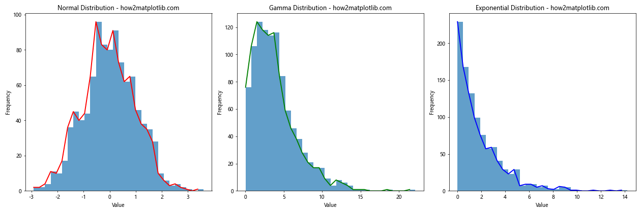
In this example, we create three subplots, each showing a histogram for a different distribution. This allows for easy comparison between different types of data or different aspects of the same dataset.
Histogram with Custom Bin Edges
Sometimes, you might want to specify custom bin edges for your histogram, especially when dealing with categorical data or when you want to focus on specific ranges of your data.
import matplotlib.pyplot as plt
import numpy as np

# Generate sample data
data = np.random.normal(0, 1, 1000)

# Define custom bin edges
custom_bins = [-3, -2, -1, -0.5, 0, 0.5, 1, 2, 3]

# Compute histogram data
counts, bins = np.histogram(data, bins=custom_bins)

# Create a histogram with custom bin edges
plt.figure(figsize=(12, 6))
plt.plot(bins[:-1], counts, 'b-', linewidth=2)
plt.fill_between(bins[:-1], counts, alpha=0.5, label='Frequency')
plt.title('Histogram with Custom Bin Edges - how2matplotlib.com')
plt.xlabel('Value')
plt.ylabel('Frequency')
plt.xticks(custom_bins)
plt.legend()
plt.grid(True, alpha=0.3)
plt.show()

print("Custom bin edges:", custom_bins)
print("Counts:", counts)
Output:
In this example, we define custom bin edges using the custom_bins list. This allows us to have uneven bin widths and focus on specific ranges of the data. We use these custom bins when computing the histogram data and plotting.
Histogram with Annotations
Adding annotations to your histogram can help highlight important features or provide additional information about specific bins.
import matplotlib.pyplot as plt
import numpy as np

# Generate sample data
data = np.random.normal(0, 1, 1000)

# Compute histogram data
counts, bins = np.histogram(data, bins=30)

# Create a histogram with annotations
plt.figure(figsize=(12, 6))
plt.plot(bins[:-1], counts, 'b-', linewidth=2)
plt.fill_between(bins[:-1], counts, alpha=0.5, label='Frequency')
plt.title('Histogram with Annotations - how2matplotlib.com')
plt.xlabel('Value')
plt.ylabel('Frequency')

# Add annotations
max_bin = np.argmax(counts)
plt.annotate(f'Max: {counts[max_bin]}',
             xy=(bins[max_bin], counts[max_bin]),
             xytext=(bins[max_bin]+0.5, counts[max_bin]+10),
             arrowprops=dict(facecolor='black', shrink=0.05))

mean = np.mean(data)
plt.axvline(mean, color='r', linestyle='dashed', linewidth=2)
plt.text(mean+0.1, plt.ylim()[1]*0.9, f'Mean: {mean:.2f}', rotation=90, va='top')

plt.legend()
plt.grid(True, alpha=0.3)
plt.show()

print("Bin edges:", bins)
print("Counts:", counts)
print("Mean:", mean)
Output:
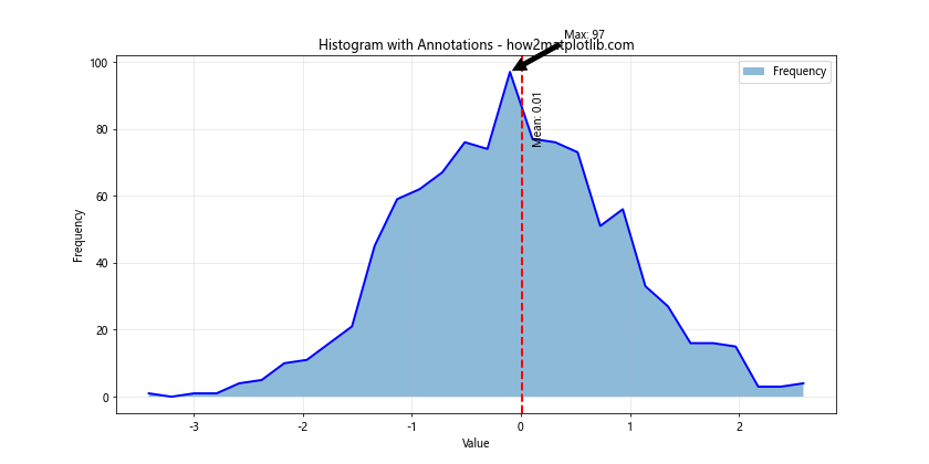
In this example, we add two types of annotations:
- An arrow pointing to the bin with the highest frequency, along with its count.
- A vertical line indicating the mean of the data, with a text label.
These annotations help to highlight important features of the distribution.
Advanced Techniques
Histogram with Moving Average
Adding a moving average line to your histogram can help smooth out noise and highlight trends in the data.
import matplotlib.pyplot as plt
import numpy as np
from scipy.ndimage import gaussian_filter1d

# Generate sample data
data = np.random.normal(0, 1, 1000)

# Compute histogram data
counts, bins = np.histogram(data, bins=50)

# Compute moving average
window = 5
moving_avg = gaussian_filter1d(counts, sigma=window)

# Create a histogram with moving average
plt.figure(figsize=(12, 6))
plt.plot(bins[:-1], counts, 'b-', linewidth=1, alpha=0.7, label='Frequency')
plt.fill_between(bins[:-1], counts, alpha=0.3)
plt.plot(bins[:-1], moving_avg, 'r-', linewidth=2, label=f'Moving Avg (window={window})')
plt.title('Histogram with Moving Average - how2matplotlib.com')
plt.xlabel('Value')
plt.ylabel('Frequency')
plt.legend()
plt.grid(True, alpha=0.3)
plt.show()

print("Bin edges:", bins)
print("Counts:", counts)
print("Moving average:", moving_avg)
Output:
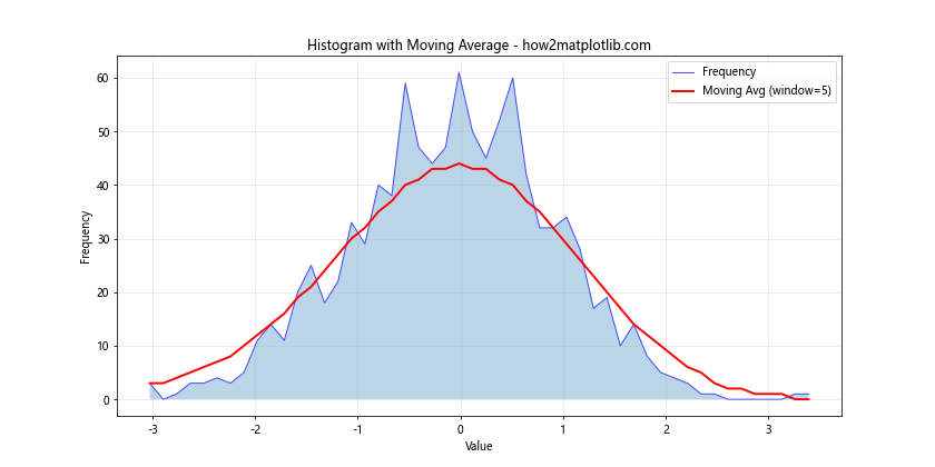
In this example, we use gaussian_filter1d from SciPy to compute a moving average of the histogram counts. This smoothed line helps to highlight the overall trend of the data distribution.
Histogram with Outlier Detection
You can use histograms to help identify and visualize outliers in your data.
import matplotlib.pyplot as plt
import numpy as np
from scipy import stats

# Generate sample data with outliers
data = np.concatenate([np.random.normal(0, 1, 980), np.random.normal(10, 1, 20)])

# Compute histogram data
counts, bins = np.histogram(data, bins=50)

# Identify outliers using z-score
z_scores = np.abs(stats.zscore(data))
outliers = data[z_scores > 3]

# Create a histogram with outlier detection
plt.figure(figsize=(12, 6))
plt.hist(data, bins=50, alpha=0.7, label='All Data')
plt.hist(outliers, bins=50, alpha=0.7, color='r', label='Outliers')
plt.title('Histogram with Outlier Detection - how2matplotlib.com')
plt.xlabel('Value')
plt.ylabel('Frequency')
plt.legend()
plt.grid(True, alpha=0.3)
plt.show()

print("Bin edges:", bins)
print("Counts:", counts)
print("Number of outliers:", len(outliers))
print("Outlier values:", outliers)
Output:
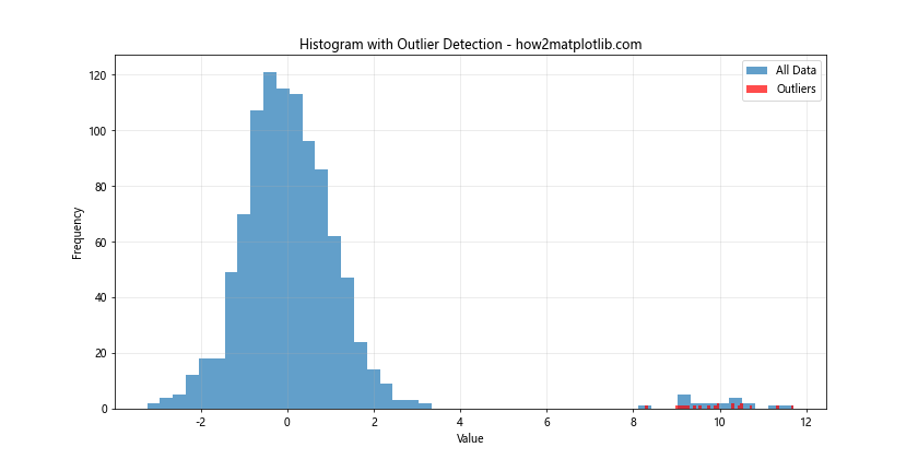
In this example, we use the z-score method to identify outliers (data points more than 3 standard deviations from the mean). We then highlight these outliers in red on the histogram.
Line Fill Histogram in Matplotlib Conclusion
Line fill histograms are a powerful tool for visualizing the distribution of data. By combining the techniques of histograms with line plots and area fills, we can create informative and visually appealing representations of our data.
In this comprehensive guide, we’ve explored various aspects of creating and customizing line fill histograms using Matplotlib. We’ve covered basic histograms, customization techniques, multiple datasets, stacked histograms, normalized and cumulative histograms, log scales, 2D histograms, kernel density estimation, confidence intervals, fitted distributions, multiple y-axes, subplots, custom bin edges, annotations, moving averages, and outlier detection.
Each of these techniques offers unique insights into your data and can be combined in various ways to create the most informative visualization for your specific needs. Remember to always consider your audience and the story you want to tell with your data when choosing which techniques to apply.
As you continue to work with Matplotlib and data visualization, experiment with these techniques and don’t be afraid to combine them in creative ways. The flexibility of Matplotlib allows for endless possibilities in data visualization, and mastering these techniques will greatly enhance your ability to communicate insights from your data effectively.