How to Set X-Axis Values in Matplotlib in Python
How to Set X-Axis Values in Matplotlib in Python is an essential skill for data visualization in Python. Matplotlib is a powerful library that allows you to create a wide variety of plots and charts. One of the most common tasks when working with Matplotlib is customizing the x-axis values to better represent your data. In this comprehensive guide, we’ll explore various techniques and methods to set x-axis values in Matplotlib, providing you with the knowledge and tools to create informative and visually appealing plots.
Understanding the Basics of X-Axis Values in Matplotlib
Before diving into the specifics of how to set x-axis values in Matplotlib, it’s important to understand the basics of how Matplotlib handles x-axis values. By default, Matplotlib automatically sets the x-axis values based on the data you provide. However, there are many situations where you might want to customize these values to better suit your needs.
Let’s start with a simple example to illustrate how Matplotlib handles x-axis values by default:
import matplotlib.pyplot as plt

# Data for plotting
y = [1, 4, 9, 16, 25]

# Create the plot
plt.figure(figsize=(10, 6))
plt.plot(y)
plt.title('Default X-Axis Values in Matplotlib - how2matplotlib.com')
plt.xlabel('X-axis')
plt.ylabel('Y-axis')
plt.show()
Output:
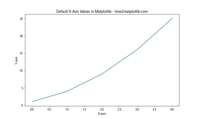
In this example, we’re plotting a simple line graph without explicitly specifying x-axis values. Matplotlib automatically assigns integer values starting from 0 for the x-axis. While this default behavior is suitable for many cases, you’ll often need more control over the x-axis values to accurately represent your data.
Setting X-Axis Values Using Explicit Data
One of the most straightforward ways to set x-axis values in Matplotlib is by providing explicit data for both the x and y axes. This method gives you complete control over the x-axis values and is particularly useful when you have specific x-coordinates for your data points.
Here’s an example of how to set x-axis values using explicit data:
import matplotlib.pyplot as plt

# Explicit x and y data
x = [0, 2, 4, 6, 8]
y = [1, 4, 9, 16, 25]

# Create the plot
plt.figure(figsize=(10, 6))
plt.plot(x, y)
plt.title('Setting X-Axis Values with Explicit Data - how2matplotlib.com')
plt.xlabel('Custom X-axis')
plt.ylabel('Y-axis')
plt.show()
Output:
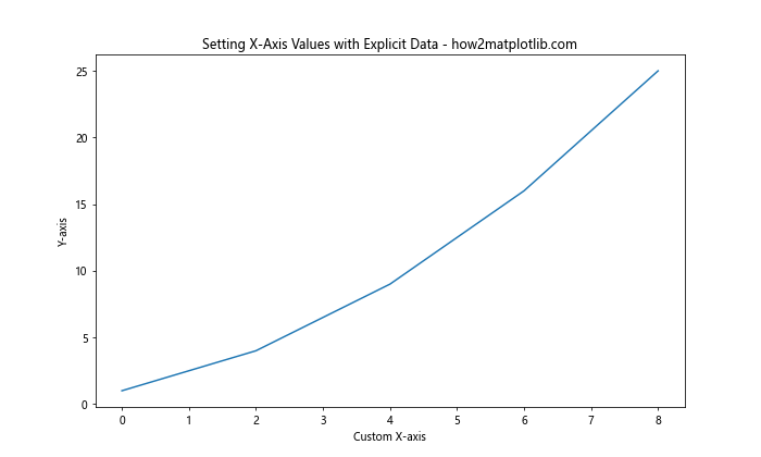
In this example, we’ve explicitly defined both x and y values. Matplotlib uses these x values to set the x-axis, giving us precise control over the positioning of our data points.
Using NumPy to Generate X-Axis Values
When working with large datasets or when you need to generate x-axis values programmatically, using NumPy can be incredibly helpful. NumPy provides efficient functions for creating arrays of values, which can be used to set x-axis values in Matplotlib.
Here’s an example of how to use NumPy to generate x-axis values:
import numpy as np
import matplotlib.pyplot as plt

# Generate x values using NumPy
x = np.linspace(0, 10, 100)
y = np.sin(x)

# Create the plot
plt.figure(figsize=(10, 6))
plt.plot(x, y)
plt.title('X-Axis Values Generated with NumPy - how2matplotlib.com')
plt.xlabel('X-axis')
plt.ylabel('Y-axis')
plt.show()
Output:
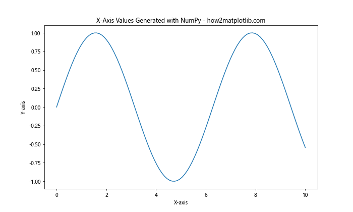
In this example, we use NumPy’s linspace function to generate 100 evenly spaced points between 0 and 10 for our x-axis. This approach is particularly useful when you need to create smooth curves or when working with mathematical functions.
Customizing X-Axis Ticks and Labels
Setting x-axis values goes beyond just specifying the data points. Matplotlib provides various methods to customize the appearance of x-axis ticks and labels, allowing you to create more informative and visually appealing plots.
Setting Custom Tick Locations
You can use the plt.xticks() function to set custom tick locations on the x-axis. This is useful when you want to highlight specific points or intervals on your plot.
Here’s an example:
import matplotlib.pyplot as plt

# Data for plotting
x = range(0, 11)
y = [i**2 for i in x]

# Create the plot
plt.figure(figsize=(10, 6))
plt.plot(x, y)
plt.title('Custom X-Axis Tick Locations - how2matplotlib.com')
plt.xlabel('X-axis')
plt.ylabel('Y-axis')

# Set custom tick locations
plt.xticks([0, 2, 4, 6, 8, 10])

plt.show()
Output:
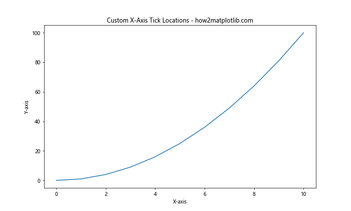
In this example, we’ve set custom tick locations at 0, 2, 4, 6, 8, and 10 on the x-axis, providing a clearer view of specific data points.
Adding Custom Tick Labels
In addition to setting tick locations, you can also customize the labels for these ticks. This is particularly useful when you want to display categorical data or add more context to your x-axis values.
Here’s how you can add custom tick labels:
import matplotlib.pyplot as plt

# Data for plotting
x = range(5)
y = [2, 4, 6, 8, 10]

# Create the plot
plt.figure(figsize=(10, 6))
plt.plot(x, y)
plt.title('Custom X-Axis Tick Labels - how2matplotlib.com')
plt.xlabel('Categories')
plt.ylabel('Values')

# Set custom tick locations and labels
plt.xticks(x, ['A', 'B', 'C', 'D', 'E'])

plt.show()
Output:
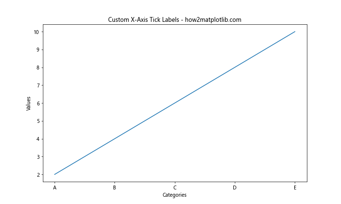
In this example, we’ve replaced the numeric x-axis labels with custom categorical labels A, B, C, D, and E.
Rotating X-Axis Labels
When dealing with long x-axis labels or dates, you might encounter overlapping text that makes your plot difficult to read. Matplotlib allows you to rotate x-axis labels to improve readability.
Here’s an example of how to rotate x-axis labels:
import matplotlib.pyplot as plt

# Data for plotting
x = ['Long Label 1', 'Long Label 2', 'Long Label 3', 'Long Label 4', 'Long Label 5']
y = [1, 4, 9, 16, 25]

# Create the plot
plt.figure(figsize=(10, 6))
plt.plot(x, y)
plt.title('Rotated X-Axis Labels - how2matplotlib.com')
plt.xlabel('Categories')
plt.ylabel('Values')

# Rotate x-axis labels
plt.xticks(rotation=45, ha='right')

plt.tight_layout()
plt.show()
Output:
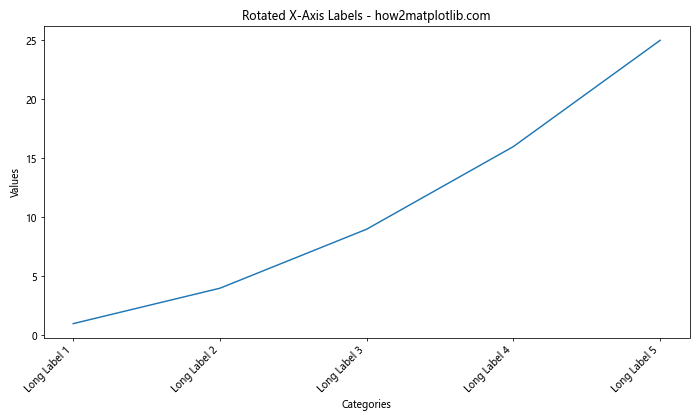
In this example, we’ve rotated the x-axis labels by 45 degrees and aligned them to the right for better readability.
Setting X-Axis Limits
Sometimes you may want to focus on a specific range of x-axis values or extend the axis beyond your data points. Matplotlib allows you to set custom limits for the x-axis using the plt.xlim() function.
Here’s an example of how to set x-axis limits:
import matplotlib.pyplot as plt

# Data for plotting
x = range(10)
y = [i**2 for i in x]

# Create the plot
plt.figure(figsize=(10, 6))
plt.plot(x, y)
plt.title('Custom X-Axis Limits - how2matplotlib.com')
plt.xlabel('X-axis')
plt.ylabel('Y-axis')

# Set custom x-axis limits
plt.xlim(-2, 12)

plt.show()
Output:
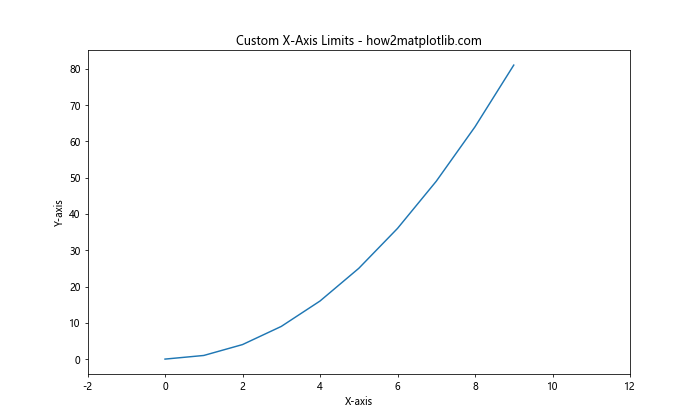
In this example, we’ve extended the x-axis range from -2 to 12, even though our data only spans from 0 to 9.
Working with Date and Time X-Axis Values
When dealing with time series data, you’ll often need to set x-axis values as dates or times. Matplotlib provides specialized tools for handling date and time data on the x-axis.
Here’s an example of how to set x-axis values using dates:
import matplotlib.pyplot as plt
import matplotlib.dates as mdates
from datetime import datetime, timedelta

# Generate date range
start_date = datetime(2023, 1, 1)
dates = [start_date + timedelta(days=i) for i in range(10)]
y = [i**2 for i in range(10)]

# Create the plot
plt.figure(figsize=(10, 6))
plt.plot(dates, y)
plt.title('Date X-Axis Values - how2matplotlib.com')
plt.xlabel('Date')
plt.ylabel('Value')

# Format x-axis ticks as dates
plt.gca().xaxis.set_major_formatter(mdates.DateFormatter('%Y-%m-%d'))
plt.gcf().autofmt_xdate()  # Rotate and align the tick labels

plt.show()
Output:
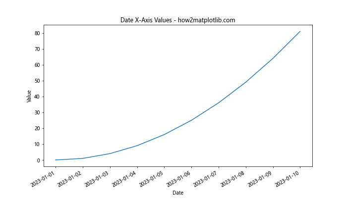
In this example, we’ve used Python’s datetime module to generate a range of dates and plotted them on the x-axis. We’ve also used Matplotlib’s date formatting capabilities to display the dates in a readable format.
Using Logarithmic X-Axis Scale
For data that spans several orders of magnitude, a logarithmic scale on the x-axis can be more appropriate. Matplotlib allows you to easily set a logarithmic scale for the x-axis.
Here’s an example of how to use a logarithmic x-axis scale:
import numpy as np
import matplotlib.pyplot as plt

# Generate data
x = np.logspace(0, 5, 100)
y = x**2

# Create the plot
plt.figure(figsize=(10, 6))
plt.semilogx(x, y)
plt.title('Logarithmic X-Axis Scale - how2matplotlib.com')
plt.xlabel('X-axis (log scale)')
plt.ylabel('Y-axis')

plt.grid(True)
plt.show()
Output:
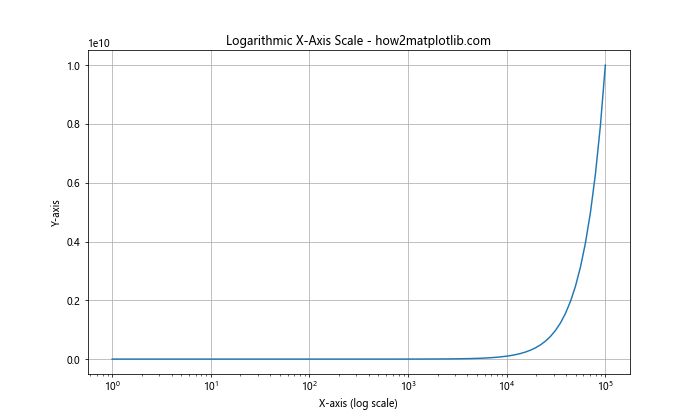
In this example, we’ve used plt.semilogx() to create a plot with a logarithmic x-axis scale. This is particularly useful for visualizing data that grows exponentially.
Setting X-Axis Values in Subplots
When creating multiple plots in a single figure using subplots, you can set x-axis values independently for each subplot. This allows you to compare different datasets or visualize related information side by side.
Here’s an example of how to set x-axis values in subplots:
import matplotlib.pyplot as plt

# Data for plotting
x1 = range(0, 10)
y1 = [i**2 for i in x1]
x2 = range(0, 20, 2)
y2 = [i**3 for i in range(10)]

# Create the subplots
fig, (ax1, ax2) = plt.subplots(1, 2, figsize=(15, 6))

# Plot data on the first subplot
ax1.plot(x1, y1)
ax1.set_title('Subplot 1 - how2matplotlib.com')
ax1.set_xlabel('X-axis')
ax1.set_ylabel('Y-axis')

# Plot data on the second subplot
ax2.plot(x2, y2)
ax2.set_title('Subplot 2 - how2matplotlib.com')
ax2.set_xlabel('X-axis')
ax2.set_ylabel('Y-axis')

plt.tight_layout()
plt.show()
Output:
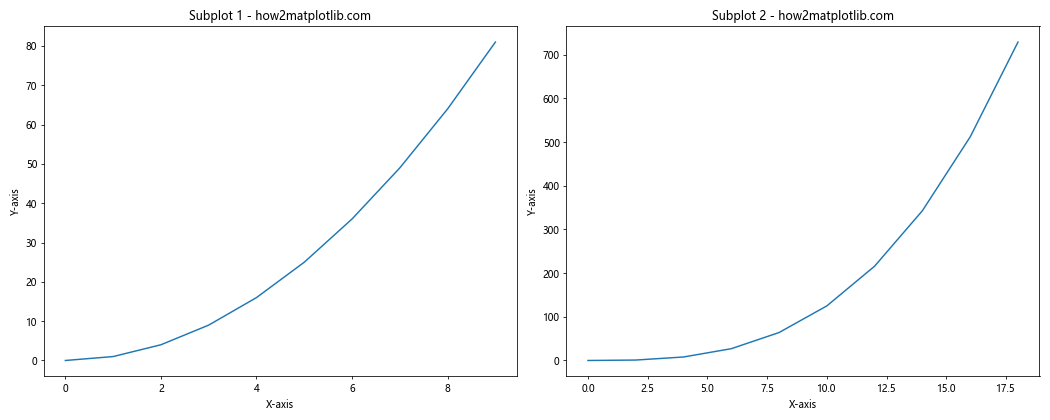
In this example, we’ve created two subplots with different x-axis values. This approach allows you to customize the x-axis for each subplot independently.
Using Twin Axes for Different X-Axis Scales
Sometimes you may need to plot data with different scales on the same graph. Matplotlib allows you to create twin axes, where you can have two different x-axes with different scales.
Here’s an example of how to use twin axes for different x-axis scales:
import numpy as np
import matplotlib.pyplot as plt

# Generate data
x1 = np.linspace(0, 10, 100)
y1 = np.sin(x1)
x2 = np.linspace(0, 1, 100)
y2 = np.cos(2 * np.pi * x2)

# Create the plot
fig, ax1 = plt.subplots(figsize=(10, 6))

# Plot the first dataset
ax1.plot(x1, y1, 'b-', label='sin(x)')
ax1.set_xlabel('X-axis 1')
ax1.set_ylabel('Y-axis', color='b')
ax1.tick_params(axis='y', labelcolor='b')

# Create a twin axis
ax2 = ax1.twiny()
ax2.plot(x2, y2, 'r-', label='cos(2πx)')
ax2.set_xlabel('X-axis 2', color='r')
ax2.tick_params(axis='x', labelcolor='r')

plt.title('Twin X-Axes with Different Scales - how2matplotlib.com')
plt.legend()
plt.show()
Output:
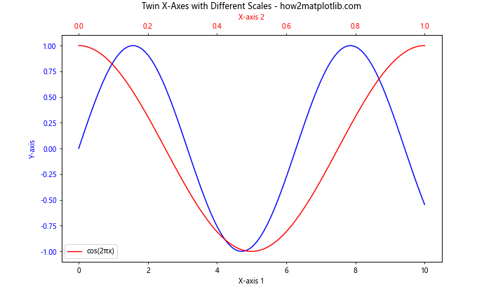
In this example, we’ve created two x-axes with different scales. The bottom x-axis goes from 0 to 10, while the top x-axis goes from 0 to 1. This is useful when you want to show relationships between datasets with different x-axis scales.
Customizing X-Axis Grid Lines
Grid lines can help improve the readability of your plots. Matplotlib allows you to customize the appearance of grid lines on the x-axis.
Here’s an example of how to customize x-axis grid lines:
import matplotlib.pyplot as plt

# Data for plotting
x = range(10)
y = [i**2 for i in x]

# Create the plot
plt.figure(figsize=(10, 6))
plt.plot(x, y)
plt.title('Customized X-Axis Grid Lines - how2matplotlib.com')
plt.xlabel('X-axis')
plt.ylabel('Y-axis')

# Customize grid lines
plt.grid(axis='x', color='red', linestyle='--', linewidth=0.5)

plt.show()
Output:
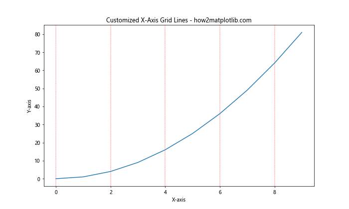
In this example, we’ve added red, dashed grid lines to the x-axis, making it easier to read values from the plot.
Using Categorical Data on the X-Axis
When working with categorical data, you may want to use these categories as x-axis values. Matplotlib provides tools to handle categorical data effectively.
Here’s an example of how to use categorical data on the x-axis:
import matplotlib.pyplot as plt

# Categorical data
categories = ['Category A', 'Category B', 'Category C', 'Category D', 'Category E']
values = [23, 45, 56, 78, 32]

# Create the plot
plt.figure(figsize=(10, 6))
plt.bar(categories, values)
plt.title('Categorical Data on X-Axis - how2matplotlib.com')
plt.xlabel('Categories')
plt.ylabel('Values')

# Rotate x-axis labels for better readability
plt.xticks(rotation=45, ha='right')

plt.tight_layout()
plt.show()
Output:
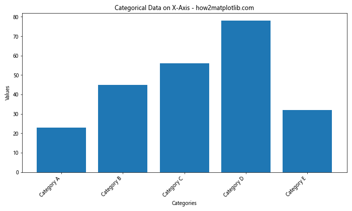
In this example, we’ve created a bar plot using categorical data for the x-axis. This approach is particularly useful when dealing with non-numeric, discrete categories.
Handling Missing or Irregular X-Axis Data
When dealing with real-world data, you may encounter missing or irregular x-axis values. Matplotlib provides ways to handle these situations gracefully.
Here’s an example of how to plot data with missing x-axis values:
import matplotlib.pyplot as plt
import numpy as np

# Data with missing values
x = [0, 1, 2, 3, 5, 7, 8, 9]
y = [1, 4, 9, 16, 36, 64, 81, 100]

# Create the plot
plt.figure(figsize=(10, 6))
plt.plot(x, y, 'bo-')
plt.title('Handling Missing X-Axis Values - how2matplotlib.com')
plt.xlabel('X-axis')
plt.ylabel('Y-axis')

# Set x-axis ticks to show all integer values
plt.xticks(range(min(x), max(x)+1))

plt.grid(True)
plt.show()
Output:
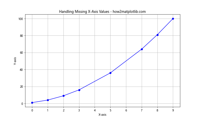
In this example, we’ve plotted data with missing x-axis values (4 and 6 are missing). Matplotlib automatically handles the gaps in the data, and we’ve used plt.xticks() to show all integer values on the x-axis, highlighting the missing data points.
Using Date Locators for Time Series Data
When working with time series data, you may want to customize how dates are displayed on the x-axis. Matplotlib’s date locators can help you achieve this.
Here’s an example of using date locators:
import matplotlib.pyplot as plt
import matplotlib.dates as mdates
from datetime import datetime, timedelta

# Generate date range
start_date = datetime(2023, 1, 1)
dates = [start_date + timedelta(days=i) for i in range(365)]
values = [i**2 for i in range(365)]

# Create the plot
plt.figure(figsize=(12, 6))
plt.plot(dates, values)
plt.title('Using Date Locators for X-Axis - how2matplotlib.com')
plt.xlabel('Date')
plt.ylabel('Value')

# Set date locators and formatters
plt.gca().xaxis.set_major_locator(mdates.MonthLocator())
plt.gca().xaxis.set_major_formatter(mdates.DateFormatter('%b %Y'))
plt.gca().xaxis.set_minor_locator(mdates.WeekdayLocator())

plt.gcf().autofmt_xdate()  # Rotate and align the tick labels
plt.grid(True)
plt.show()
Output:
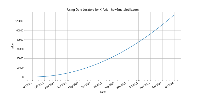
In this example, we’ve used MonthLocator for major ticks and WeekdayLocator for minor ticks, providing a clear view of the time series data over a year.
Customizing X-Axis Tick Marks
Customizing x-axis tick marks can help improve the readability and aesthetics of your plots. Matplotlib offers various options to modify the appearance of tick marks.
Here’s an example of how to customize x-axis tick marks:
import matplotlib.pyplot as plt
import numpy as np

# Generate data
x = np.linspace(0, 10, 100)
y = np.sin(x)

# Create the plot
fig, ax = plt.subplots(figsize=(10, 6))
ax.plot(x, y)
ax.set_title('Customized X-Axis Tick Marks - how2matplotlib.com')
ax.set_xlabel('X-axis')
ax.set_ylabel('Y-axis')

# Customize major ticks
ax.xaxis.set_major_locator(plt.MultipleLocator(2))
ax.xaxis.set_major_formatter(plt.FormatStrFormatter('%d'))

# Customize minor ticks
ax.xaxis.set_minor_locator(plt.MultipleLocator(0.5))

# Customize tick appearance
ax.tick_params(axis='x', which='major', length=10, width=2, color='red')
ax.tick_params(axis='x', which='minor', length=5, width=1, color='blue')

plt.grid(True)
plt.show()
Output:
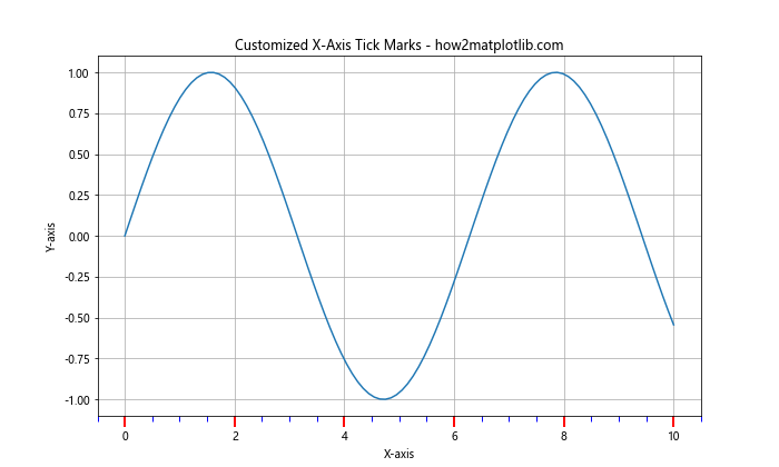
In this example, we’ve customized both major and minor tick marks on the x-axis, adjusting their position, format, length, width, and color.
Setting X-Axis Values in Polar Plots
Polar plots are useful for visualizing cyclic data or directional information. When creating polar plots, you can set x-axis values to represent angles.
Here’s an example of how to set x-axis values in a polar plot:
import matplotlib.pyplot as plt
import numpy as np

# Generate data
theta = np.linspace(0, 2*np.pi, 100)
r = np.sin(4*theta)

# Create the polar plot
fig, ax = plt.subplots(figsize=(8, 8), subplot_kw=dict(projection='polar'))
ax.plot(theta, r)
ax.set_title('Polar Plot with Custom X-Axis Values - how2matplotlib.com')

# Set x-axis (theta) ticks
ax.set_xticks(np.linspace(0, 2*np.pi, 8, endpoint=False))
ax.set_xticklabels(['0°', '45°', '90°', '135°', '180°', '225°', '270°', '315°'])

plt.show()
Output:
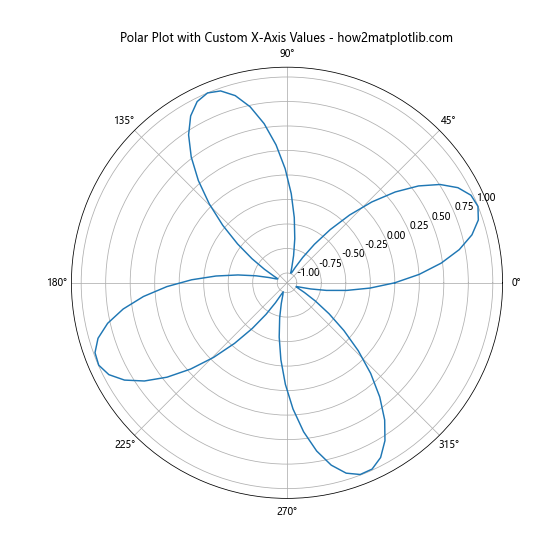
In this example, we’ve created a polar plot and set custom x-axis (theta) values representing angles from 0° to 315°.
Conclusion: Mastering X-Axis Value Setting in Matplotlib
Throughout this comprehensive guide, we’ve explored various techniques and methods for setting x-axis values in Matplotlib. From basic plotting to advanced customization, we’ve covered a wide range of scenarios you might encounter when working with data visualization in Python.
Remember, the key to effective data visualization is choosing the right approach for your specific data and audience. Whether you’re working with numerical data, time series, categorical information, or complex 3D plots, Matplotlib provides the tools you need to set x-axis values accurately and create informative, visually appealing charts and graphs.
By mastering these techniques for setting x-axis values, you’ll be well-equipped to handle a variety of data visualization challenges. Practice with different datasets and experiment with the various methods we’ve discussed to become proficient in customizing x-axis values in Matplotlib.