How to Adjust the Number of Ticks in Seaborn Plots
In data visualization, controlling the appearance of axis ticks can greatly enhance the readability and aesthetics of a plot. Seaborn, a powerful Python visualization library based on Matplotlib, offers various ways to manipulate the ticks of a plot’s axes. This article will explore how to adjust the number of ticks in Seaborn plots, providing a comprehensive guide with multiple examples.
Introduction to Seaborn and Ticks
Seaborn is a statistical data visualization library that simplifies the process of creating beautiful and informative plots. One common requirement in data visualization is the adjustment of axis ticks — the markers denoting data points on axes. Proper tick adjustment can help in making plots easier to interpret, especially when dealing with large datasets or datasets with unusual scales.
Setting Up Your Environment
Before diving into the examples, ensure you have the necessary tools installed. You will need Python, Matplotlib, and Seaborn. You can install these packages using pip if they are not already installed:
pip install matplotlib seaborn
Basic Plot with Default Ticks
Let’s start by creating a basic plot using Seaborn to understand the default settings.
import seaborn as sns
import matplotlib.pyplot as plt

# Load an example dataset
data = sns.load_dataset('tips')

# Create a basic plot
sns.scatterplot(x='total_bill', y='tip', data=data)
plt.title('Basic Scatter Plot - how2matplotlib.com')
plt.show()
Output:

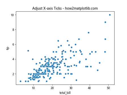
Example 1: Adjusting Tick Frequency Using Matplotlib
Seaborn is built on top of Matplotlib, which means you can use Matplotlib’s functionality to manipulate ticks. Here’s how you can adjust the number of ticks on the x-axis.
import seaborn as sns
import matplotlib.pyplot as plt
import matplotlib.ticker as ticker

# Load an example dataset
data = sns.load_dataset('tips')

# Create a plot
sns.scatterplot(x='total_bill', y='tip', data=data)

# Adjust x-axis ticks
ax = plt.gca()
ax.xaxis.set_major_locator(ticker.MultipleLocator(10))
plt.title('Adjust X-axis Ticks - how2matplotlib.com')
plt.show()
Output:
Example 2: Setting Tick Frequency on Y-axis
Similarly, you can adjust the ticks on the y-axis.
import seaborn as sns
import matplotlib.pyplot as plt
import matplotlib.ticker as ticker

# Load an example dataset
data = sns.load_dataset('tips')

# Create a plot
sns.scatterplot(x='total_bill', y='tip', data=data)

# Adjust y-axis ticks
ax = plt.gca()
ax.yaxis.set_major_locator(ticker.MultipleLocator(1))
plt.title('Adjust Y-axis Ticks - how2matplotlib.com')
plt.show()
Output:

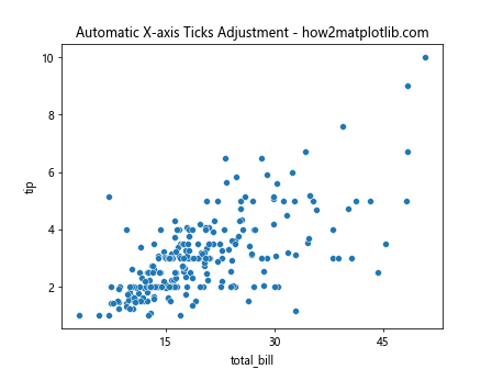
Example 3: Using MaxNLocator for Automatic Tick Adjustment
MaxNLocator is a useful tool from Matplotlib that automatically adjusts ticks based on the maximum number of ticks you want.
import seaborn as sns
import matplotlib.pyplot as plt
from matplotlib.ticker import MaxNLocator

# Load an example dataset
data = sns.load_dataset('tips')

# Create a plot
sns.scatterplot(x='total_bill', y='tip', data=data)

# Automatically adjust x-axis ticks
ax = plt.gca()
ax.xaxis.set_major_locator(MaxNLocator(5))
plt.title('Automatic X-axis Ticks Adjustment - how2matplotlib.com')
plt.show()
Output:
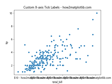
Example 4: Customizing Tick Labels
Adjusting the number of ticks often goes hand-in-hand with customizing their labels for better readability.
import seaborn as sns
import matplotlib.pyplot as plt
import matplotlib.ticker as ticker

# Load an example dataset
data = sns.load_dataset('tips')

# Create a plot
sns.scatterplot(x='total_bill', y='tip', data=data)

# Customize x-axis tick labels
ax = plt.gca()
ax.xaxis.set_major_locator(ticker.MultipleLocator(10))
ax.xaxis.set_major_formatter(ticker.FuncFormatter(lambda x, pos: f'${x:.0f} - how2matplotlib.com'))
plt.title('Custom X-axis Tick Labels - how2matplotlib.com')
plt.show()
Output:
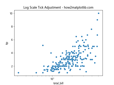
Example 5: Log Scale Tick Adjustment
When dealing with data across several orders of magnitude, using a logarithmic scale can be very helpful. Here’s how to adjust ticks on a log scale.
import seaborn as sns
import matplotlib.pyplot as plt
import matplotlib.ticker as ticker

# Load an example dataset
data = sns.load_dataset('tips')

# Create a plot with a log scale
sns.scatterplot(x='total_bill', y='tip', data=data)
plt.xscale('log')

# Adjust x-axis ticks for log scale
ax = plt.gca()
ax.xaxis.set_major_locator(ticker.LogLocator(base=10))
plt.title('Log Scale Tick Adjustment - how2matplotlib.com')
plt.show()
Output:
Conclusion
Adjusting the number of ticks and their appearance is a crucial aspect of creating plots that are not only informative but also visually appealing. By leveraging the combined power of Seaborn and Matplotlib, you can fine-tune your plots to better suit your data visualization needs. The examples provided in this article should serve as a starting point for customizing ticks in your own plots, enhancing both their functionality and their aesthetic appeal.
Remember, the key to effective data visualization lies in experimentation and iteration. Keep adjusting the parameters until you find the perfect balance for your specific dataset and visualization goals.