How to Add Markers to a Graph Plot in Matplotlib with Python
Matplotlib is a comprehensive library for creating static, animated, and interactive visualizations in Python. It is one of the most popular tools for data visualization and is capable of producing a wide variety of plots and charts. In this article, we will focus on how to add markers to graph plots using Matplotlib. Markers can be used to highlight specific points on a graph, making it easier to identify them visually. We will explore various types of markers, how to customize their properties, and how to apply them to different types of plots.
Introduction to Markers in Matplotlib
Markers are symbols that can be placed at certain points in a graph to highlight them. They are particularly useful in scatter plots and line plots where distinguishing individual data points is necessary. Matplotlib provides a wide range of marker styles, including circles, triangles, squares, and many more.
Example 1: Basic Scatter Plot with Markers
import matplotlib.pyplot as plt

x = [1, 2, 3, 4, 5]
y = [2, 3, 5, 7, 11]

plt.scatter(x, y, marker='o', label='Data Points')
plt.title("Basic Scatter Plot with Markers - how2matplotlib.com")
plt.xlabel("X-axis")
plt.ylabel("Y-axis")
plt.legend()
plt.show()
Output:

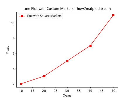
Example 2: Line Plot with Custom Markers
import matplotlib.pyplot as plt

x = [1, 2, 3, 4, 5]
y = [2, 3, 5, 7, 11]

plt.plot(x, y, marker='s', linestyle='-', color='r', label='Line with Square Markers')
plt.title("Line Plot with Custom Markers - how2matplotlib.com")
plt.xlabel("X-axis")
plt.ylabel("Y-axis")
plt.legend()
plt.show()
Output:
Different Types of Markers
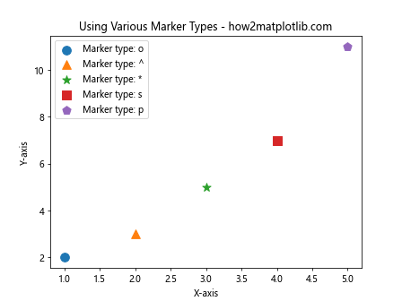
Matplotlib supports a variety of markers, each of which can be customized in terms of size, color, and other properties. Here are some examples of different marker types and how to use them.
Example 3: Using Various Marker Types
import matplotlib.pyplot as plt

x = range(1, 6)
y = [2, 3, 5, 7, 11]
markers = ['o', '^', '*', 's', 'p']

for i, marker in enumerate(markers):
    plt.scatter([x[i]], [y[i]], marker=marker, s=100, label=f'Marker type: {marker}')

plt.title("Using Various Marker Types - how2matplotlib.com")
plt.xlabel("X-axis")
plt.ylabel("Y-axis")
plt.legend()
plt.show()
Output:
Customizing Marker Properties
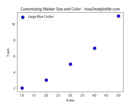
Markers can be customized to change their size, edge color, face color, and more. This allows for more detailed customization of plots.
Example 4: Customizing Marker Size and Color
import matplotlib.pyplot as plt

x = [1, 2, 3, 4, 5]
y = [2, 3, 5, 7, 11]

plt.scatter(x, y, marker='o', s=100, facecolor='blue', edgecolor='black', label='Large Blue Circles')
plt.title("Customizing Marker Size and Color - how2matplotlib.com")
plt.xlabel("X-axis")
plt.ylabel("Y-axis")
plt.legend()
plt.show()
Output:
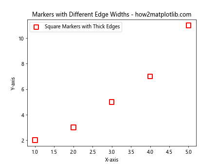
Example 5: Markers with Different Edge Widths
import matplotlib.pyplot as plt

x = [1, 2, 3, 4, 5]
y = [2, 3, 5, 7, 11]

plt.scatter(x, y, marker='s', s=100, linewidths=2, edgecolor='red', facecolor='none', label='Square Markers with Thick Edges')
plt.title("Markers with Different Edge Widths - how2matplotlib.com")
plt.xlabel("X-axis")
plt.ylabel("Y-axis")
plt.legend()
plt.show()
Output:
Applying Markers to Different Plot Types
Markers are not limited to scatter plots. They can also be used in line plots, bar charts, and other types of visualizations.
Example 6: Line Plot with Interval Markers
import matplotlib.pyplot as plt

x = [1, 2, 3, 4, 5]
y = [2, 3, 5, 7, 11]

plt.plot(x, y, marker='D', linestyle='-', markersize=10, label='Diamond Markers at Intervals')
plt.title("Line Plot with Interval Markers - how2matplotlib.com")
plt.xlabel("X-axis")
plt.ylabel("Y-axis")
plt.legend()
plt.show()
Output:

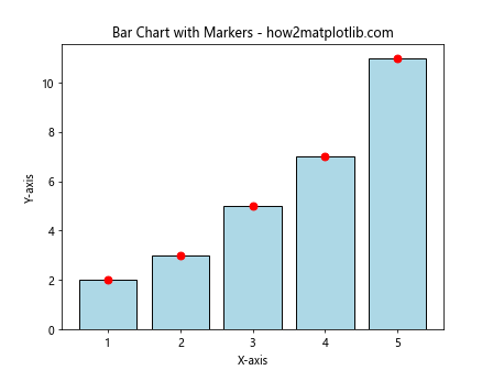
Example 7: Bar Chart with Markers
import matplotlib.pyplot as plt
import numpy as np

x = np.arange(1, 6)
y = [2, 3, 5, 7, 11]

plt.bar(x, y, color='lightblue', edgecolor='black')
for i in range(len(x)):
    plt.scatter(x[i], y[i], marker='o', color='red', s=50)  # Adding a red circle marker at the top of each bar

plt.title("Bar Chart with Markers - how2matplotlib.com")
plt.xlabel("X-axis")
plt.ylabel("Y-axis")
plt.show()
Output:
Conclusion
In this article, we explored how to add markers to graph plots using Matplotlib in Python. We covered various types of markers, how to customize them, and how to apply them to different types of plots. Markers are a powerful tool for enhancing the readability and aesthetics of your graphs, allowing viewers to quickly identify key data points and trends. By mastering the use of markers, you can create more effective and visually appealing data visualizations.
This guide provides a foundation for using markers in Matplotlib, but there is much more to explore. Experiment with different marker styles, sizes, and colors to discover what works best for your specific data visualization needs.