How Can I Make the Xtick Labels of a Plot Be Simple Drawings Using Matplotlib
Creating plots with Matplotlib is a common task in data visualization. Sometimes, the standard text labels for the x-ticks are not sufficient, and we may want to use simple drawings or icons to represent categories or specific data points. This can be particularly useful when dealing with categorical data where a pictorial representation can convey more meaning than text.
In this article, we will explore how to replace standard x-tick labels with simple drawings using Matplotlib. We will go through a series of examples that demonstrate different techniques for achieving this effect.
Example 1: Basic Plot with Custom Xtick Drawings
In this example, we will create a basic plot and replace the x-tick labels with simple drawings created using Matplotlib’s Annotation feature.
import matplotlib.pyplot as plt
from matplotlib.text import Annotation

# Data for plotting
x = [1, 2, 3, 4, 5]
y = [10, 20, 15, 25, 30]

# Create the plot
fig, ax = plt.subplots()

# Plot the data
ax.plot(x, y)

# Define a simple drawing function for x-tick labels
def draw_simple_drawing(ax, x, y, text):
    ax.annotate(text, (x, y), textcoords="offset points", xytext=(0,10), ha='center')

# Replace x-tick labels with simple drawings
for i in x:
    draw_simple_drawing(ax, i, 0, 'how2matplotlib.com')

# Remove original x-tick labels
ax.set_xticklabels([])

# Display the plot
plt.show()
Output:

Example 2: Using Images as Xtick Labels
In this example, we will use images as x-tick labels. We will load an image and use it to replace the x-tick labels.
import matplotlib.pyplot as plt
from matplotlib.offsetbox import OffsetImage, AnnotationBbox

# Data for plotting
x = [1, 2, 3, 4, 5]
y = [10, 20, 15, 25, 30]

# Create the plot
fig, ax = plt.subplots()

# Plot the data
ax.plot(x, y)

# Load an image
image_path = 'path_to_image.png'  # Replace with the path to your image
image = plt.imread(image_path)

# Function to create an image label
def add_image_label(ax, img, x, y):
    im = OffsetImage(img, zoom=0.1)
    ab = AnnotationBbox(im, (x, y), frameon=False, box_alignment=(0.5, -0.1))
    ax.add_artist(ab)

# Replace x-tick labels with images
for i in x:
    add_image_label(ax, image, i, 0)

# Remove original x-tick labels
ax.set_xticklabels([])

# Display the plot
plt.show()
Example 3: Custom Shapes as Xtick Labels
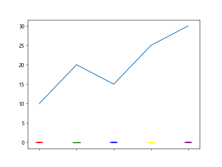
In this example, we will create custom shapes to use as x-tick labels using Matplotlib’s patches.
import matplotlib.pyplot as plt
import matplotlib.patches as mpatches

# Data for plotting
x = [1, 2, 3, 4, 5]
y = [10, 20, 15, 25, 30]

# Create the plot
fig, ax = plt.subplots()

# Plot the data
ax.plot(x, y)

# Function to add a custom shape label
def add_shape_label(ax, x, y, shape, color):
    if shape == 'circle':
        circle = mpatches.Circle((x, y), radius=0.1, color=color, transform=ax.transData)
        ax.add_patch(circle)
    elif shape == 'square':
        square = mpatches.Rectangle((x-0.1, y-0.1), 0.2, 0.2, color=color, transform=ax.transData)
        ax.add_patch(square)
    # Add more shapes as needed

# Replace x-tick labels with custom shapes
colors = ['red', 'green', 'blue', 'yellow', 'purple']
shapes = ['circle', 'square', 'circle', 'square', 'circle']
for i, color, shape in zip(x, colors, shapes):
    add_shape_label(ax, i, 0, shape, color)

# Remove original x-tick labels
ax.set_xticklabels([])

# Display the plot
plt.show()
Output:
Example 4: Drawing with PathPatch as Xtick Labels
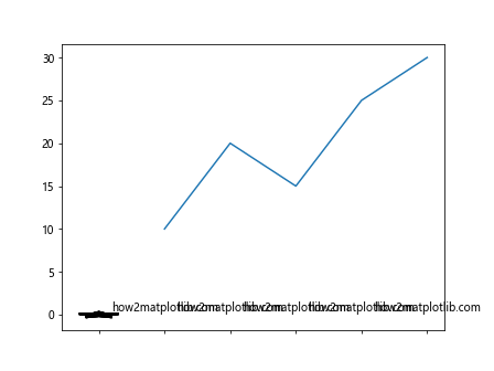
In this example, we will use Matplotlib’s PathPatch to create more complex drawings for x-tick labels.
import matplotlib.pyplot as plt
from matplotlib.path import Path
from matplotlib.patches import PathPatch

# Data for plotting
x = [1, 2, 3, 4, 5]
y = [10, 20, 15, 25, 30]

# Create the plot
fig, ax = plt.subplots()

# Plot the data
ax.plot(x, y)

# Function to add a PathPatch label
def add_pathpatch_label(ax, x, y, path_data):
    codes, verts = zip(*path_data)
    path = Path(verts, codes)
    patch = PathPatch(path, color='black', lw=2, transform=ax.transData)
    patch.set_transform(ax.transData)
    ax.add_patch(patch)
    ax.text(x, y, 'how2matplotlib.com', ha='center', va='bottom')

# Define the path data for a simple drawing
star_path_data = [
    (Path.MOVETO, (0, 0.3)),
    (Path.LINETO, (0.1, 0.1)),
    (Path.LINETO, (0.3, 0.1)),
    (Path.LINETO, (0.15, -0.05)),
    (Path.LINETO, (0.2, -0.3)),
    (Path.LINETO, (0, -0.15)),
    (Path.LINETO, (-0.2, -0.3)),
    (Path.LINETO, (-0.15, -0.05)),
    (Path.LINETO, (-0.3, 0.1)),
    (Path.LINETO, (-0.1, 0.1)),
    (Path.CLOSEPOLY, (0, 0.3)),
]

# Replace x-tick labels with PathPatch drawings
for i in x:
    add_pathpatch_label(ax, i, 0, star_path_data)

# Remove original x-tick labels
ax.set_xticklabels([])

# Display the plot
plt.show()
Output:
Example 5: Using Scatter Plot for Xtick Drawings
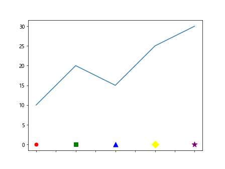
In this example, we will use a scatter plot to create simple drawings as x-tick labels.
import matplotlib.pyplot as plt

# Data for plotting
x = [1, 2, 3, 4, 5]
y = [10, 20, 15, 25, 30]

# Create the plot
fig, ax = plt.subplots()

# Plot the data
ax.plot(x, y)

# Function to add scatter plot labels
def add_scatter_label(ax, x, y, marker, color, size):
    ax.scatter([x], [y], marker=marker, color=color, s=size)

# Replace x-tick labels with scatter plot markers
markers = ['o', 's', '^', 'D', '*']
colors = ['red', 'green', 'blue', 'yellow', 'purple']
sizes = [50, 70, 90, 110, 130]
for i, marker, color, size in zip(x, markers, colors, sizes):
    add_scatter_label(ax, i, 0, marker, color, size)

# Remove original x-tick labels
ax.set_xticklabels([])

# Display the plot
plt.show()
Output:
Example 6: Custom Text Drawing as Xtick Labels
In this example, we will create custom text drawings to use as x-tick labels.
import matplotlib.pyplot as plt

# Data for plotting
x = [1, 2, 3, 4, 5]
y = [10, 20, 15, 25, 30]

# Create the plot
fig, ax = plt.subplots()

# Plot the data
ax.plot(x, y)

# Function to add text labels
def add_text_label(ax, x, y, text, fontsize, color):
    ax.text(x, y, text, ha='center', va='bottom', fontsize=fontsize, color=color)

# Replace x-tick labels with custom text
texts = ['how2matplotlib.com', 'how2matplotlib.com', 'how2matplotlib.com', 'how2matplotlib.com', 'how2matplotlib.com']
colors = ['red', 'green', 'blue', 'black', 'purple']
for i, text, color in zip(x, texts, colors):
    add_text_label(ax, i, -5, text, 10, color)

# Remove original x-tick labels
ax.set_xticklabels([])

# Display the plot
plt.show()
Output:
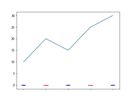
Example 7: Using Matplotlib Patches as Xtick Icons
In this example, we will use Matplotlib’s patches to create icon-like images for x-tick labels.
import matplotlib.pyplot as plt
import matplotlib.patches as mpatches

# Data for plotting
x = [1, 2, 3, 4, 5]
y = [10, 20, 15, 25, 30]

# Create the plot
fig, ax = plt.subplots()

# Plot the data
ax.plot(x, y)

# Function to add icon-like patches
def add_icon_patch(ax, x, y, patch_type):
    if patch_type == 'circle':
        patch = mpatches.Circle((x, y), radius=0.1, color='blue', transform=ax.transData)
    elif patch_type == 'square':
        patch = mpatches.Rectangle((x-0.1, y-0.1), 0.2, 0.2, color='red', transform=ax.transData)
    ax.add_patch(patch)

# Replace x-tick labels with patches
patch_types = ['circle', 'square', 'circle', 'square', 'circle']
for i, patch_type in zip(x, patch_types):
    add_icon_patch(ax, i, -0.1, patch_type)

# Remove original x-tick labels
ax.set_xticklabels([])

# Display the plot
plt.show()
Output:
Example 8: Using FancyArrowPatch for Directional Xtick Labels
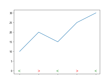
In this example, we will use FancyArrowPatch to create directional arrows as x-tick labels.
import matplotlib.pyplot as plt
from matplotlib.patches import FancyArrowPatch

# Data for plotting
x = [1, 2, 3, 4, 5]
y = [10, 20, 15, 25, 30]

# Create the plot
fig, ax = plt.subplots()

# Plot the data
ax.plot(x, y)

# Function to add arrow labels
def add_arrow_label(ax, x, y, direction):
    if direction == 'left':
        arrow = FancyArrowPatch((x, y), (x-0.1, y), color='green', arrowstyle='->', mutation_scale=20)
    elif direction == 'right':
        arrow = FancyArrowPatch((x, y), (x+0.1, y), color='red', arrowstyle='->', mutation_scale=20)
    ax.add_patch(arrow)

# Replace x-tick labels with arrows
directions = ['left', 'right', 'left', 'right', 'left']
for i, direction in zip(x, directions):
    add_arrow_label(ax, i, -0.1, direction)

# Remove original x-tick labels
ax.set_xticklabels([])

# Display the plot
plt.show()
Output:
Conclusion
In this article, we explored various ways to replace standard x-tick labels with simple drawings or icons using Matplotlib. These techniques enhance the visual appeal of plots and can provide a more intuitive representation of data categories. By using annotations, images, custom shapes, and patches, we can create more engaging and informative visualizations.