How to Master Grids in Matplotlib
Grids in Matplotlib are an essential feature for creating clear and informative visualizations. Matplotlib, a popular plotting library in Python, offers various options for adding grids to your plots. In this comprehensive guide, we’ll explore the ins and outs of working with grids in Matplotlib, covering everything from basic grid creation to advanced customization techniques.
Understanding the Importance of Grids in Matplotlib
Grids in Matplotlib serve several crucial purposes in data visualization:
- Enhancing readability: Grids help viewers easily interpret data points and their relative positions within the plot.
- Improving accuracy: With grids, it’s easier to estimate values and compare data points across different areas of the plot.
- Providing structure: Grids add a visual structure to the plot, making it more organized and professional-looking.
- Facilitating comparisons: When comparing multiple plots, consistent grids make it easier to align and compare data across different visualizations.
Let’s start by exploring the basics of adding grids to Matplotlib plots.
Adding Basic Grids in Matplotlib
To add a basic grid to your Matplotlib plot, you can use the grid() function. Here’s a simple example:
import matplotlib.pyplot as plt
import numpy as np

x = np.linspace(0, 10, 100)
y = np.sin(x)

plt.plot(x, y)
plt.title('Sine Wave with Grid - how2matplotlib.com')
plt.grid(True)
plt.show()
Output:
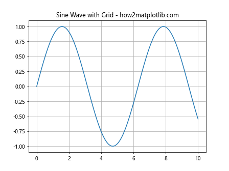
In this example, we’re plotting a sine wave and adding a basic grid using plt.grid(True). The True argument enables the grid, while False would disable it.
Customizing Grid Appearance in Matplotlib
Matplotlib offers various options to customize the appearance of grids. Let’s explore some of these options:
Changing Grid Line Style
You can modify the grid line style using the linestyle parameter:
import matplotlib.pyplot as plt
import numpy as np

x = np.linspace(0, 10, 100)
y = np.cos(x)

plt.plot(x, y)
plt.title('Cosine Wave with Dashed Grid - how2matplotlib.com')
plt.grid(True, linestyle='--')
plt.show()
Output:
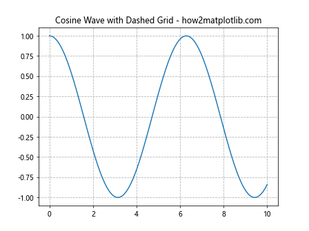
This example uses a dashed line style for the grid. Other options include ‘-‘ (solid), ‘:’ (dotted), and ‘-.’ (dash-dot).
Adjusting Grid Line Color
To change the color of the grid lines, use the color parameter:
import matplotlib.pyplot as plt
import numpy as np

x = np.linspace(0, 10, 100)
y = np.tan(x)

plt.plot(x, y)
plt.title('Tangent Function with Colored Grid - how2matplotlib.com')
plt.grid(True, color='red', alpha=0.5)
plt.show()
Output:
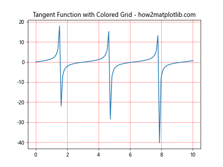
This example sets the grid color to red with 50% opacity using the alpha parameter.
Controlling Grid Line Width
You can adjust the thickness of grid lines using the linewidth parameter:
import matplotlib.pyplot as plt
import numpy as np

x = np.linspace(0, 10, 100)
y = x**2

plt.plot(x, y)
plt.title('Quadratic Function with Thick Grid - how2matplotlib.com')
plt.grid(True, linewidth=2)
plt.show()
Output:
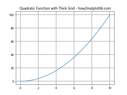
This example increases the grid line width to 2 points.
Working with Major and Minor Grids in Matplotlib
Matplotlib allows you to display both major and minor grids. Major grids correspond to major tick marks, while minor grids provide finer divisions between major grid lines.
Displaying Major and Minor Grids
Here’s how to display both major and minor grids:
import matplotlib.pyplot as plt
import numpy as np

x = np.linspace(0, 5, 100)
y = np.exp(x)

plt.plot(x, y)
plt.title('Exponential Function with Major and Minor Grids - how2matplotlib.com')
plt.grid(True)
plt.minorticks_on()
plt.grid(which='minor', linestyle=':', alpha=0.5)
plt.show()
Output:
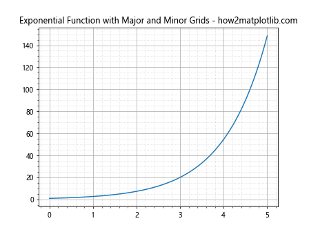
In this example, we first enable the major grid with plt.grid(True). Then, we turn on minor ticks with plt.minorticks_on() and add a minor grid with different styling.
Customizing Major and Minor Grids Separately
You can customize major and minor grids independently:
import matplotlib.pyplot as plt
import numpy as np

x = np.linspace(0, 10, 100)
y = np.log(x)

plt.plot(x, y)
plt.title('Logarithmic Function with Custom Major and Minor Grids - how2matplotlib.com')
plt.grid(which='major', color='blue', linestyle='-', alpha=0.5)
plt.grid(which='minor', color='red', linestyle=':', alpha=0.3)
plt.minorticks_on()
plt.show()
Output:
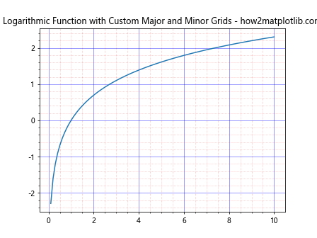
This example uses different colors and styles for major and minor grids.
Controlling Grid Placement in Matplotlib
By default, grids in Matplotlib are placed on both x and y axes. However, you can control which axes display grids.
Adding Grids to Specific Axes
To add a grid to only one axis:
import matplotlib.pyplot as plt
import numpy as np

x = np.linspace(0, 10, 100)
y = np.sqrt(x)

plt.plot(x, y)
plt.title('Square Root Function with X-axis Grid - how2matplotlib.com')
plt.grid(axis='x')
plt.show()
Output:
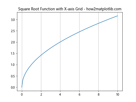
This example adds a grid only to the x-axis. You can use axis='y' for y-axis only, or axis='both' for both axes (default).
Placing Grids Behind or In Front of Plot Elements
You can control whether the grid appears behind or in front of plot elements:
import matplotlib.pyplot as plt
import numpy as np

x = np.linspace(0, 10, 100)
y = x**3

plt.plot(x, y, linewidth=3)
plt.title('Cubic Function with Grid Behind - how2matplotlib.com')
plt.grid(True, zorder=0)
plt.show()
Output:
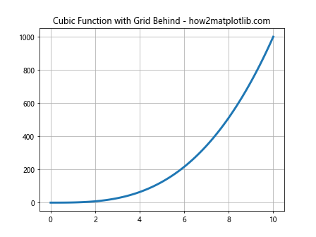
By setting zorder=0, we ensure the grid is drawn behind the plot elements.
Advanced Grid Customization in Matplotlib
Let’s explore some advanced techniques for customizing grids in Matplotlib.
Creating Custom Grid Patterns
You can create custom grid patterns by combining major and minor grids:
import matplotlib.pyplot as plt
import numpy as np

x = np.linspace(0, 10, 100)
y = np.sin(x) * np.exp(-0.1 * x)

plt.plot(x, y)
plt.title('Damped Sine Wave with Custom Grid Pattern - how2matplotlib.com')
plt.grid(which='major', color='black', linestyle='-', alpha=0.5)
plt.grid(which='minor', color='gray', linestyle=':', alpha=0.3)
plt.minorticks_on()
plt.gca().xaxis.set_minor_locator(plt.MultipleLocator(0.5))
plt.gca().yaxis.set_minor_locator(plt.MultipleLocator(0.1))
plt.show()
Output:
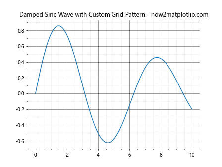
This example creates a custom grid pattern by adjusting the placement of minor ticks.
Using Different Grid Styles for X and Y Axes
You can apply different grid styles to x and y axes:
import matplotlib.pyplot as plt
import numpy as np

x = np.linspace(0, 10, 100)
y = np.cos(x) * np.sin(x)

fig, ax = plt.subplots()
ax.plot(x, y)
ax.set_title('Function with Different X and Y Grid Styles - how2matplotlib.com')
ax.grid(axis='x', color='red', linestyle='-', linewidth=0.5)
ax.grid(axis='y', color='blue', linestyle='--', linewidth=0.5)
plt.show()
Output:
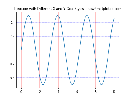
This example uses different colors and styles for x and y axis grids.
Grids in Subplots with Matplotlib
When working with multiple subplots, you can apply grids to individual subplots or all at once.
Adding Grids to Multiple Subplots
Here’s how to add grids to multiple subplots:
import matplotlib.pyplot as plt
import numpy as np

x = np.linspace(0, 10, 100)

fig, (ax1, ax2) = plt.subplots(2, 1, figsize=(8, 8))

ax1.plot(x, np.sin(x))
ax1.set_title('Sine Wave - how2matplotlib.com')
ax1.grid(True)

ax2.plot(x, np.cos(x))
ax2.set_title('Cosine Wave - how2matplotlib.com')
ax2.grid(True)

plt.tight_layout()
plt.show()
Output:
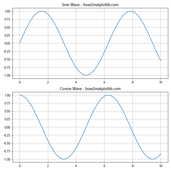
This example adds grids to two separate subplots.
Customizing Grids for Each Subplot
You can customize grids differently for each subplot:
import matplotlib.pyplot as plt
import numpy as np

x = np.linspace(0, 10, 100)

fig, (ax1, ax2) = plt.subplots(1, 2, figsize=(12, 5))

ax1.plot(x, np.sin(x))
ax1.set_title('Sine Wave with Major Grid - how2matplotlib.com')
ax1.grid(which='major', color='red', linestyle='-', alpha=0.5)

ax2.plot(x, np.cos(x))
ax2.set_title('Cosine Wave with Minor Grid - how2matplotlib.com')
ax2.grid(which='minor', color='blue', linestyle=':', alpha=0.5)
ax2.minorticks_on()

plt.tight_layout()
plt.show()
Output:
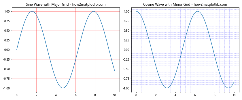
This example applies different grid styles to each subplot.
Grids in Polar Plots with Matplotlib
Matplotlib also supports grids in polar plots, which can be particularly useful for certain types of data.
Adding Grids to Polar Plots
Here’s how to add a grid to a polar plot:
import matplotlib.pyplot as plt
import numpy as np

theta = np.linspace(0, 2*np.pi, 100)
r = np.cos(4*theta)

fig, ax = plt.subplots(subplot_kw=dict(projection='polar'))
ax.plot(theta, r)
ax.set_title('Polar Plot with Grid - how2matplotlib.com')
ax.grid(True)
plt.show()
Output:
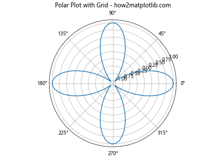
This example creates a polar plot with a default grid.
Customizing Polar Plot Grids
You can customize the appearance of polar plot grids:
import matplotlib.pyplot as plt
import numpy as np

theta = np.linspace(0, 2*np.pi, 100)
r = 1 + np.sin(3*theta)

fig, ax = plt.subplots(subplot_kw=dict(projection='polar'))
ax.plot(theta, r)
ax.set_title('Customized Polar Plot Grid - how2matplotlib.com')
ax.grid(color='r', linestyle='--', alpha=0.5)
ax.set_rmax(2)
ax.set_rticks([0.5, 1, 1.5, 2])
plt.show()
Output:
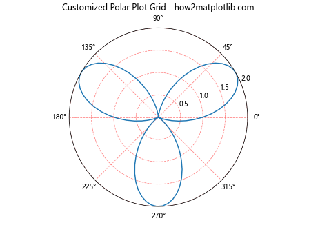
This example customizes the color, style, and placement of the polar plot grid.
Grids in 3D Plots with Matplotlib
Matplotlib’s 3D plotting capabilities also include support for grids, which can greatly enhance the readability of 3D visualizations.
Adding Grids to 3D Plots
Here’s how to add grids to a 3D plot:
import matplotlib.pyplot as plt
import numpy as np
from mpl_toolkits.mplot3d import Axes3D

fig = plt.figure()
ax = fig.add_subplot(111, projection='3d')

x = np.linspace(-5, 5, 100)
y = np.linspace(-5, 5, 100)
X, Y = np.meshgrid(x, y)
Z = np.sin(np.sqrt(X**2 + Y**2))

ax.plot_surface(X, Y, Z)
ax.set_title('3D Surface Plot with Grid - how2matplotlib.com')
ax.grid(True)
plt.show()
Output:
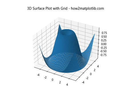
This example creates a 3D surface plot with a default grid.
Customizing 3D Plot Grids
You can customize the appearance of 3D plot grids:
import matplotlib.pyplot as plt
import numpy as np
from mpl_toolkits.mplot3d import Axes3D

fig = plt.figure()
ax = fig.add_subplot(111, projection='3d')

x = np.linspace(-5, 5, 100)
y = np.linspace(-5, 5, 100)
X, Y = np.meshgrid(x, y)
Z = np.cos(np.sqrt(X**2 + Y**2))

ax.plot_surface(X, Y, Z)
ax.set_title('Customized 3D Plot Grid - how2matplotlib.com')
ax.grid(color='r', linestyle='--', alpha=0.5)
ax.xaxis.set_pane_color((0.8, 0.8, 0.8, 1.0))
ax.yaxis.set_pane_color((0.8, 0.8, 0.8, 1.0))
ax.zaxis.set_pane_color((0.8, 0.8, 0.8, 1.0))
plt.show()
Output:
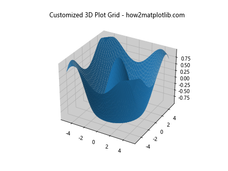
This example customizes the color and style of the 3D plot grid and adjusts the background pane colors.
Advanced Grid Techniques in Matplotlib
Let’s explore some advanced techniques for working with grids in Matplotlib.
Creating Irregular Grids
You can create irregular grids by manually specifying grid lines:
import matplotlib.pyplot as plt
import numpy as np

x = np.linspace(0, 10, 100)
y = np.sin(x)

plt.plot(x, y)
plt.title('Sine Wave with Irregular Grid - how2matplotlib.com')
plt.grid(False)
plt.axhline(y=0, color='gray', linestyle='--')
plt.axvline(x=np.pi, color='gray', linestyle='--')
plt.axvline(x=2*np.pi, color='gray', linestyle='--')
plt.show()
Output:
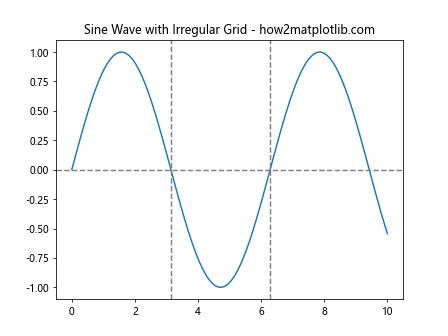
This example creates an irregular grid by adding specific horizontal and vertical lines.
Combining Different Grid Types
You can combine different types of grids for more complex visualizations:
import matplotlib.pyplot as plt
import numpy as np

x = np.linspace(0, 10, 100)
y1 = np.sin(x)
y2 = np.cos(x)

fig, ax1 = plt.subplots()

ax1.plot(x, y1, 'b-')
ax1.set_xlabel('X-axis')
ax1.set_ylabel('Sine', color='b')
ax1.tick_params(axis='y', labelcolor='b')
ax1.grid(axis='x', color='gray', linestyle='-', alpha=0.5)

ax2 = ax1.twinx()
ax2.plot(x, y2, 'r-')
ax2.set_ylabel('Cosine', color='r')
ax2.tick_params(axis='y', labelcolor='r')
ax2.grid(axis='y', color='red', linestyle='--', alpha=0.5)

plt.title('Combined Grid Types - how2matplotlib.com')
plt.show()
Output:
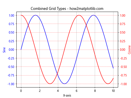
This example combines different grid types for the x and y axes on a plot with two y-axes.
Best Practices for UsingGrids in Matplotlib
When working with grids in Matplotlib, it’s important to follow some best practices to ensure your visualizations are clear, informative, and visually appealing. Here are some key considerations:
- Use grids sparingly: While grids can enhance readability, overuse can lead to cluttered plots. Only use grids when they genuinely improve data interpretation.
Choose appropriate grid density: The density of your grid should match the scale of your data. Too many grid lines can be distracting, while too few may not provide enough reference points.
Adjust grid opacity: Setting the grid opacity (alpha value) to less than 1 can help it blend into the background, making it less obtrusive while still providing guidance.
Coordinate grid style with plot theme: Ensure your grid style complements the overall aesthetic of your plot. For example, use lighter grid colors for dark-themed plots.
Consider axis scales: When using logarithmic or other non-linear scales, adjust your grid accordingly to provide meaningful reference points.
Let’s explore these best practices with some examples: