Adjusting Gridlines and Ticks in Matplotlib Imshow
Matplotlib is a powerful library for creating static, interactive, and animated visualizations in Python. One of the common tasks when working with images in Matplotlib is adjusting the appearance of gridlines and ticks to enhance the readability and aesthetics of the image plots. This article provides a comprehensive guide on how to adjust gridlines and ticks in Matplotlib’s imshow function, which is widely used for displaying image data.
Introduction to Matplotlib’s imshow
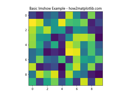
The imshow function in Matplotlib is used to display image data. It is particularly useful for visualizing matrices or 2D arrays as images. Before diving into how to adjust gridlines and ticks, let’s first understand the basic usage of imshow.
Basic Example of imshow
import matplotlib.pyplot as plt
import numpy as np

# Create a sample 2D array
data = np.random.rand(10, 10)

# Display the data
plt.imshow(data, cmap='viridis')
plt.title('Basic Imshow Example - how2matplotlib.com')
plt.show()
Output:
Adjusting Gridlines
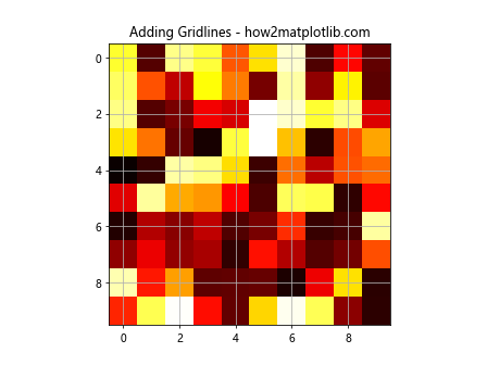
Gridlines can be helpful in interpreting image plots by providing a reference for the eye. However, by default, gridlines are not displayed in imshow. Let’s see how we can add and customize gridlines.
Adding Gridlines to an Image Plot
import matplotlib.pyplot as plt
import numpy as np

data = np.random.rand(10, 10)
plt.imshow(data, cmap='hot')
plt.grid(True)
plt.title('Adding Gridlines - how2matplotlib.com')
plt.show()
Output:
Customizing Gridline Color and Style
import matplotlib.pyplot as plt
import numpy as np

data = np.random.rand(10, 10)
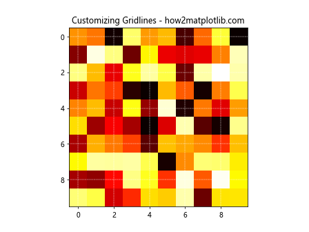
plt.imshow(data, cmap='hot')
plt.grid(color='white', linestyle='--', linewidth=0.5)
plt.title('Customizing Gridlines - how2matplotlib.com')
plt.show()
Output:
Adjusting Ticks
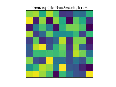
Ticks are the markers denoting data points on axes. In the context of images, adjusting ticks can help in precisely identifying the position of pixels.
Removing Ticks
import matplotlib.pyplot as plt
import numpy as np

data = np.random.rand(10, 10)
plt.imshow(data)
plt.xticks([])
plt.yticks([])
plt.title('Removing Ticks - how2matplotlib.com')
plt.show()
Output:
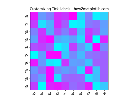
Customizing Tick Labels
import matplotlib.pyplot as plt
import numpy as np

data = np.random.rand(10, 10)
plt.imshow(data, cmap='cool')
plt.xticks(np.arange(0, 10, 1), labels=[f'x{i}' for i in range(10)])
plt.yticks(np.arange(0, 10, 1), labels=[f'y{i}' for i in range(10)])
plt.title('Customizing Tick Labels - how2matplotlib.com')
plt.show()
Output:
Advanced Grid and Tick Customization
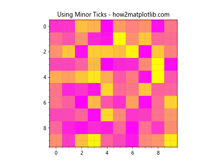
Using Minor Ticks
import matplotlib.pyplot as plt
import numpy as np
from matplotlib.ticker import MultipleLocator

data = np.random.rand(10, 10)
plt.imshow(data, cmap='spring')
plt.minorticks_on()
plt.grid(which='minor', color='gray', linestyle=':', linewidth=0.5)
plt.title('Using Minor Ticks - how2matplotlib.com')
plt.show()
Output:
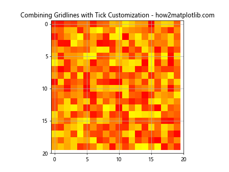
Combining Gridlines with Tick Customization
import matplotlib.pyplot as plt
import numpy as np

data = np.random.rand(20, 20)
plt.imshow(data, cmap='autumn')
plt.grid(True)
plt.xticks(np.arange(0, 21, 5))
plt.yticks(np.arange(0, 21, 5))
plt.title('Combining Gridlines with Tick Customization - how2matplotlib.com')
plt.show()
Output:
Conclusion
Adjusting gridlines and ticks in Matplotlib’s imshow function allows for better visualization and interpretation of image data. By customizing the appearance of gridlines and ticks, you can make your plots more informative and visually appealing. This guide has covered several techniques to adjust these elements, providing you with the tools to enhance your image plots effectively.
Remember, the key to mastering Matplotlib lies in experimentation and practice. Try applying these techniques to your data visualizations to see how they can improve the clarity and aesthetics of your plots.