Box Plot in Matplotlib
The box plot, also known as a whisker plot, is a graphical representation of statistical data. It displays the summary of a set of data values, such as the minimum, first quartile, median, third quartile, and maximum values. Box plots are particularly useful to identify the distribution, outliers, and skewness of a dataset.
In this article, we will explore box plots and how to create them using the Matplotlib library in Python. We will cover the basic syntax and parameters to customize our plots, and provide multiple code examples for a hands-on approach.
1. Introduction to Box Plots in Matplotlib
A box plot consists of several key components:
- Minimum (Min): The lowest value in the dataset.
- First Quartile (Q1): The value below which 25% of the data falls.
- Median (Q2): The value that separates the dataset into two equal parts.
- Third Quartile (Q3): The value below which 75% of the data falls.
- Maximum (Max): The highest value in the dataset.
- Outliers: Data points that fall significantly outside of the dataset’s distribution.
The box plot visualizes these components using a rectangular box and two whiskers. The box represents the interquartile range (IQR), which is the range between the first and third quartiles. The line inside the box denotes the median, while the whiskers extend from the box to the minimum and maximum values. Outliers are displayed as individual points.
Box plots are widely used to compare distributions, analyze the spread and skewness of data, and identify potential outliers.
2. Installing Matplotlib
Before we can create box plots in Matplotlib, we need to install the library. If you haven’t done it yet, use the following installation command:
pip install matplotlib
Now that we have Matplotlib installed, we can proceed to create our box plots.
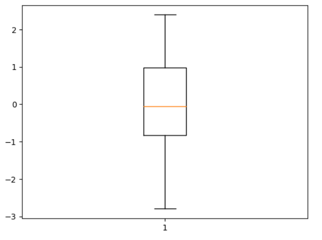
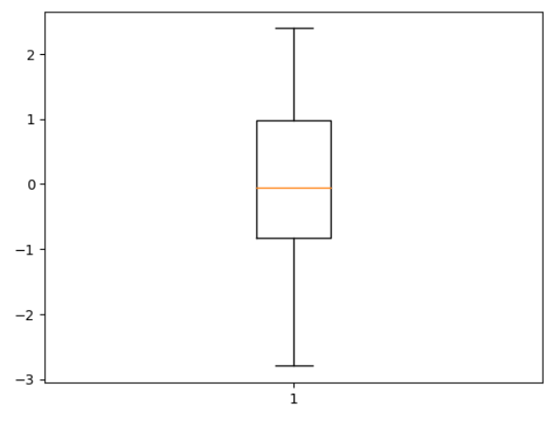
3. Creating a Basic Box Plot in Matplotlib
Let’s start by importing the necessary modules and creating a basic box plot using random data. Follow the code example below:
import matplotlib.pyplot as plt
import numpy as np

# Generate random data
np.random.seed(123)
data = np.random.normal(0, 1, 100)

# Create a basic box plot
plt.boxplot(data)
plt.show()
This code imports the pyplot module from Matplotlib as plt and the numpy module as np. We then generate 100 random numbers from a normal distribution using numpy.random.normal(). Finally, we create a box plot using plt.boxplot() and display it using plt.show().
To execute the code, save it in a Python file such as basic_boxplot.py and run the file using python basic_boxplot.py. The output should show a simple box plot representing the randomly generated data.
4. Customizing the Box Plot in Matplotlib
Matplotlib provides various parameters to customize the appearance of box plots. You can modify the colors, line styles, widths, and add additional elements such as gridlines, titles, and labels.
Let’s examine some common customization options and demonstrate them with code examples.
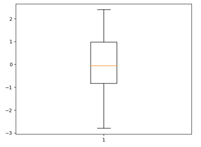
Show Outliers
By default, box plots display outliers as individual points. However, you can disable this feature by setting the showfliers parameter to False. Here’s an example:
# Create a box plot without outliers
plt.boxplot(data, showfliers=False)
plt.show()
This code will create a box plot without displaying the outliers.
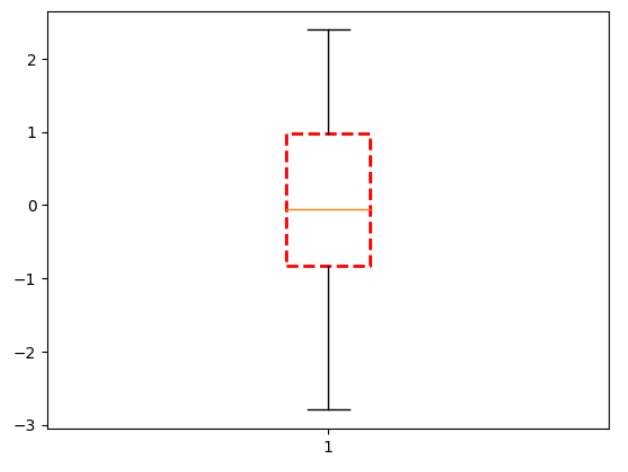
Change Box Style
You can change the appearance of the box using the boxprops parameter. This allows you to modify properties such as the box color, line style, and width. Here’s an example:
# Customize box style
box_style = dict(color='red', linestyle='--', linewidth=2)
plt.boxplot(data, boxprops=box_style)
plt.show()
This code changes the box color to red, the line style to dashed, and the line width to 2 pixels.
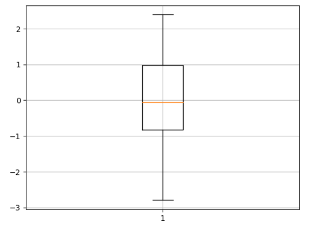
Add Gridlines
To add gridlines to the plot, use the grid() function. Here’s an example:
# Add gridlines
plt.boxplot(data)
plt.grid(True)
plt.show()
This code displays a box plot with gridlines.
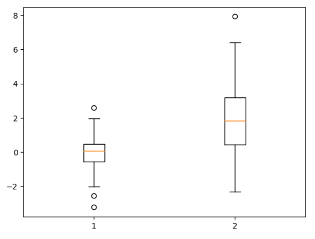
5. Adding Multiple Box Plots in Matplotlib
Often, we need to compare multiple datasets using box plots. Matplotlib allows us to create multiple box plots in a single figure, making it easier to analyze and compare the distributions.
To create multiple box plots, pass a list of data arrays to the boxplot() function. Each array represents a different dataset. Here’s an example:
# Generate random data for two datasets
data1 = np.random.normal(0, 1, 100)
data2 = np.random.normal(2, 2, 100)

# Create multiple box plots
plt.boxplot([data1, data2])
plt.show()
This code creates two separate datasets using numpy.random.normal(). It then creates two box plots side by side for comparison.
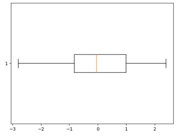
6. Creating Horizontal Box Plots in Matplotlib
By default, box plots are vertical. However, you can also create horizontal box plots using the vert parameter. If you set vert to False, the box plot will be horizontal. Here’s an example:
# Create a horizontal box plot
plt.boxplot(data, vert=False)
plt.show()
This code creates a horizontal box plot for the data array.
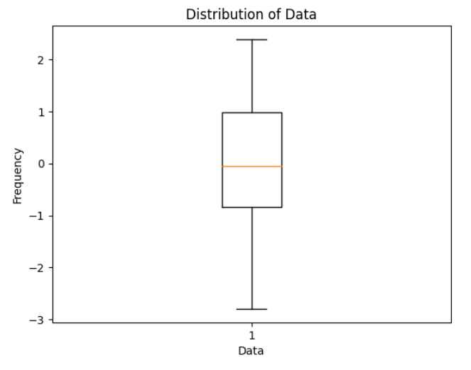
7. Adding Titles and Labels in Matplotlib
To make our box plots more informative, we can add titles and labels to the plot. Matplotlib provides functions to set the title, x-axis label, and y-axis label.
Let’s use the previous example to add a title and axis labels:
# Create a box plot with title and labels
plt.boxplot(data)
plt.title('Distribution of Data')
plt.xlabel('Data')
plt.ylabel('Frequency')
plt.show()
This code adds a title to the plot, sets the x-axis label to ‘Data’, and the y-axis label to ‘Frequency’.
8. Styling the Box Plot in Matplotlib
Matplotlib allows you to further customize the style of your box plots. You can modify the whiskers, caps, medians, and fliers using the whiskerprops, capprops, medianprops, and flierprops parameters.
Let’s customize the whiskers and caps and change their color to green:
# Customizing the style of the box plot
custom_style = dict(whiskerprops=dict(color='green'), capprops=dict(color='green'))
plt.boxplot(data, boxprops=custom_style)
plt.show()
This code changes the color of the whiskers and caps of the box plot to green.
9. Saving and Displaying the Box Plot in Matplotlib
Matplotlib allows us to save our box plots as image files in various formats, such as PNG, PDF, or SVG. To save a box plot, use the savefig() function. For example:
# Saving the box plot as a PNG file
plt.boxplot(data)
plt.savefig('box_plot.png')
This code saves the box plot as a PNG image named box_plot.png. You can also specify the file format in the file name, such as box_plot.pdf or box_plot.svg.
To display the box plot directly within the Jupyter Notebook or an interactive Python environment, use plt.show() as we have seen in the previous examples.
10. Box Plot Examples in Matplotlib
Here are 10 additional code examples to showcase the versatility and usefulness of box plots:
- Box plot with vertical and horizontal gridlines:
plt.boxplot(data)
plt.grid(True)
plt.grid(axis='x', linestyle='--', linewidth=0.5)
plt.show()
- Box plot with different whisker lengths:
plt.boxplot(data, whis=[5, 95])
plt.show()
- Notched box plot:
plt.boxplot(data, notch=True)
plt.show()
- Adding mean markers to the box plot:
plt.boxplot(data, showmeans=True)
plt.show()
- Changing the width of the box plot:
plt.boxplot(data, widths=0.5)
plt.show()
- Customizing the fliers:
plt.boxplot(data, flierprops=dict(marker='o', markerfacecolor='red', markersize=6, linestyle='none'))
plt.show()
- Adding a horizontal gridline at the median:
plt.boxplot(data)
plt.axhline(np.median(data), color='red', linestyle='--')
plt.show()
- Box plot with different notch widths:
plt.boxplot(data, notch=True, bootstrap=10000, notchwidth=0.2)
plt.show()
- Changing the symbol style of the outliers:
plt.boxplot(data, marker='o', markerfacecolor='blue', markersize=8, markeredgecolor='black')
plt.show()
- Box plot with log scale:
plt.boxplot(np.log10(data))
plt.show()
These examples demonstrate different ways to customize box plots and visualize various types of data using Matplotlib.
In conclusion, box plots are a powerful tool for visualizing statistical data. They provide a clear and concise summary of the distribution of a dataset, including measures of central tendency, spread, and outliers. Matplotlib offers a flexible and customizable framework for creating box plots, allowing users to display and analyze their data effectively.
Remember to experiment with different parameters and styles to tailor your box plots to your specific needs. The more you explore and practice, the better you will become at creating informative box plots with Matplotlib.